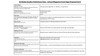
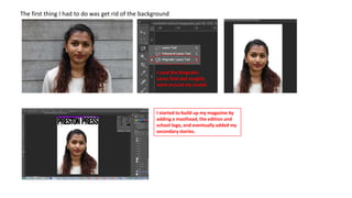
A brief
I was asked to create a school magazine
front cover, and a school magazine
contents page for my preliminary task.
• I did my own research by analysing other school magazine front covers
• I did a quick questionnaire asking what people expected to be in a school magazine, and also a proposal form to
give me ideas on what I was going to include on my magazine and who m audience was going to be.
• I then did rough copies of my magazine
School logo attract
the attention of
pupils/parents who
may want to read the
magazine.

The white text
goes over the
white shirt so it is
hard for people
to read.
Good use of pictures to
show to demonstrate what
the magazine is going to
be talking about.

Short secondary
stories to show what
else is inside the

The date of when the
magazine was published, so
people will know if it’s a new
or old edition.
The masthead is the biggest
font and matches the colour
scheme of the magazine, also it
is a pun on the word “Sixth
Form”, will make the readers
laugh and want to read what is
inside.

Not a very appealing
background so people might
not want to read on as its not
eye catching. Also, it doesn’t
show the school, when it is a
school magazine.

There is no school
website or contact details
so people can’t find out
more information.
The school logo is
so faded that it is
really hard to see.
Shows the price of
the magazine, cheap
so people would want
to buy it.

The lighting on the
school building makes
it look very appealing
and eye catching.

The word “new” appeals
to the readers because
they would want to
know what it is
They have space to write
the school details such as
the website, or phone
number but they have left it
blank.

Giving readers to
input in the school
community.

Teaser story – shows what will
be inside but in a snappy
sentence so the audience know
whether they would want to read
inside if it appeals to them.
All the font on the
magazine is
different so it lacks
consistency.
What do you
look for in a
school
magazine?

Tally

Reviews on books
Top tips for
homework
How to beat bullies
How to balance
school and social
life
How to stay healthy

(25 people asked)
AS Media Studies Preliminary Task – School Magazine Front Page Proposal Form
Target audience:
(age range, interests)
Although it is a school newsletter you still have to think about
your audience and how to appeal to them.
Possible title ideas:
(masthead / title block)
What is your magazine going to be called?
Main image:
What will be the focal point of your front page, remember, your
work “must include a photograph of a student in a medium
close-up”
Main cover line:
What will be the main story?

The age would range from 11- 18 (Year 7 to sixth form)
Preston manor press
Preston press
press
A picture of a student in a working background, or a picture of them in front of an
appealing part of the school.
Head girl wants to make big changes to the school

Additional key images:
What other images will be on your front cover?
Remember, it is a school magazine.

Pictures of the sixth form, head teacher, school logo, housing logos

Additional cover lines:
Other features, stories or selling points which will be inside the
magazine, these need to be audience appropriate.

Network issues, student ID cards, do the sixth formers like the new study area,

Typography:
(style, size, colour of copy)
Think about the writing and the style of the writing on your front
page.

Big, bold masthead in the colour black.
Highlighted points in the colour purple

Background colour/image:
What will be in the background, remember you don’t want to take
the focus away from the main image.

School colours – navy and red with grey to match it OR purple to match the website.

Technical considerations:
(equipment, setting, props, costume, lighting)
Be realistic and creative, think about what you have access to and
how you could use it.

DSLR Camera, green screen, box lighting/natural lighting, school background, classroom
background, photoshop
The first thing I had to do was get rid of the background

I used the Magnetic
Lasso Tool and roughly
went around my model.

I started to build up my magazine by
adding a masthead, the edition and
school logo, and eventually added my
secondary stories.
To feather out the image, I selected the part of the image I wanted
and changed the feathering to 100 as it was at 0. I then dragged
the image onto a new page and positioned it where I wanted. I
also did this for the other photos I added onto the contents.
I clicked ‘fx’ and then Drop
Shadow.

This page then came up and I started to
play around with the different levels of
opacity, distance, spread and size, until I
got it how I wanted.
What have I learnt?
I learnt how to edit photos in different ways to give them a more interesting look, and I will use the techniques
I have learnt in my music magazine when I come to it.
I have also learnt how to clean up a photo whether its been cut slightly wrong or if it needs touch ups. There
are many tools on photoshop that helps me to achieve this.

A brief

  • 1.
    A brief I wasasked to create a school magazine front cover, and a school magazine contents page for my preliminary task. • I did my own research by analysing other school magazine front covers • I did a quick questionnaire asking what people expected to be in a school magazine, and also a proposal form to give me ideas on what I was going to include on my magazine and who m audience was going to be. • I then did rough copies of my magazine
  • 2.
    School logo attract theattention of pupils/parents who may want to read the magazine. The white text goes over the white shirt so it is hard for people to read. Good use of pictures to show to demonstrate what the magazine is going to be talking about. Short secondary stories to show what else is inside the The date of when the magazine was published, so people will know if it’s a new or old edition. The masthead is the biggest font and matches the colour scheme of the magazine, also it is a pun on the word “Sixth Form”, will make the readers laugh and want to read what is inside. Not a very appealing background so people might not want to read on as its not eye catching. Also, it doesn’t show the school, when it is a school magazine. There is no school website or contact details so people can’t find out more information.
  • 3.
    The school logois so faded that it is really hard to see. Shows the price of the magazine, cheap so people would want to buy it. The lighting on the school building makes it look very appealing and eye catching. The word “new” appeals to the readers because they would want to know what it is They have space to write the school details such as the website, or phone number but they have left it blank. Giving readers to input in the school community. Teaser story – shows what will be inside but in a snappy sentence so the audience know whether they would want to read inside if it appeals to them. All the font on the magazine is different so it lacks consistency.
  • 4.
    What do you lookfor in a school magazine? Tally Reviews on books Top tips for homework How to beat bullies How to balance school and social life How to stay healthy (25 people asked)
  • 5.
    AS Media StudiesPreliminary Task – School Magazine Front Page Proposal Form Target audience: (age range, interests) Although it is a school newsletter you still have to think about your audience and how to appeal to them. Possible title ideas: (masthead / title block) What is your magazine going to be called? Main image: What will be the focal point of your front page, remember, your work “must include a photograph of a student in a medium close-up” Main cover line: What will be the main story? The age would range from 11- 18 (Year 7 to sixth form) Preston manor press Preston press press A picture of a student in a working background, or a picture of them in front of an appealing part of the school. Head girl wants to make big changes to the school Additional key images: What other images will be on your front cover? Remember, it is a school magazine. Pictures of the sixth form, head teacher, school logo, housing logos Additional cover lines: Other features, stories or selling points which will be inside the magazine, these need to be audience appropriate. Network issues, student ID cards, do the sixth formers like the new study area, Typography: (style, size, colour of copy) Think about the writing and the style of the writing on your front page. Big, bold masthead in the colour black. Highlighted points in the colour purple Background colour/image: What will be in the background, remember you don’t want to take the focus away from the main image. School colours – navy and red with grey to match it OR purple to match the website. Technical considerations: (equipment, setting, props, costume, lighting) Be realistic and creative, think about what you have access to and how you could use it. DSLR Camera, green screen, box lighting/natural lighting, school background, classroom background, photoshop
  • 8.
    The first thingI had to do was get rid of the background I used the Magnetic Lasso Tool and roughly went around my model. I started to build up my magazine by adding a masthead, the edition and school logo, and eventually added my secondary stories.
  • 9.
    To feather outthe image, I selected the part of the image I wanted and changed the feathering to 100 as it was at 0. I then dragged the image onto a new page and positioned it where I wanted. I also did this for the other photos I added onto the contents.
  • 10.
    I clicked ‘fx’and then Drop Shadow. This page then came up and I started to play around with the different levels of opacity, distance, spread and size, until I got it how I wanted.
  • 11.
    What have Ilearnt? I learnt how to edit photos in different ways to give them a more interesting look, and I will use the techniques I have learnt in my music magazine when I come to it. I have also learnt how to clean up a photo whether its been cut slightly wrong or if it needs touch ups. There are many tools on photoshop that helps me to achieve this.