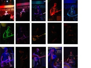
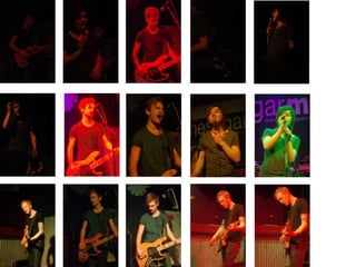
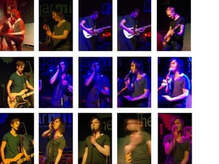
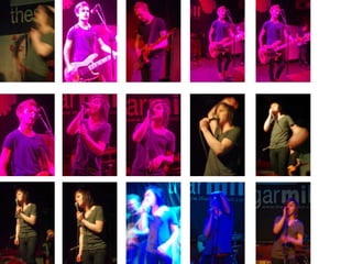
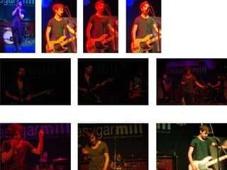
The document discusses images that were taken of a band playing music. The photographer took the pictures because the band's style seemed to fit the genre of a particular magazine. The images could potentially be featured in that magazine.
The document discusses rejected photos for a horror poster and magazine cover. It contains photos that were not selected for the final horror poster and magazine cover. The document serves as a record of photos that were considered but ultimately not used for the horror-related promotional materials.
These 3 images were chosen for a music magazine but require editing to look more professional as they are currently raw images straight from the camera.
The document discusses photos the author has taken and edited to use for a magazine, including a possible poster of a band member from the band tent peg.
The document discusses photos taken during a photography shoot that the author thought could also be used for media work. The photos were from a photography shoot the author did and believed they could utilize the images for both their photography as well as other media-related projects.
This document provides an overview of the front cover, contents page, and double page spread designs for a magazine article about a band. The front cover will feature the author's photo and magazine name. The contents page will include quotes from band members and layout articles about the band and other featured pieces. The double page spread will focus on an interview with the band and include photos related to their album.
The image takes up a whole page and shows the importance of the artist. The artist is wearing glasses and looks serious, while a red light shines on him. The headline is in bold and spaced out to highlight the artist. The text is separated into columns for readability. Red and black dominate the color scheme, matching the magazine, and emphasizing danger and the artist's power.
This magazine draft includes a self-made logo with the school's color scheme, a strapline, and a headline. It also features two slightly opaque rectangles containing text to help structure the information on the page.
The document discusses draft reasoning for a Digipak poster. It notes conventions of posters in this genre include featuring the album cover prominently and including the artist and album name. For this poster, the author decided not to follow many conventions and try something different from posters that just feature the cover, artist, and album name. The goal is to create a poster that links to the album cover and insert in a unique way that stands out from typical posters and better achieves the author's aims.
Michael Baddeley drafted several interior designs for a digipak after researching common conventions, which included lyrics booklets, advertisements, or limited edition posters. While his designs departed from the simplicity of some covers, he maintained features like a plain white background and central symbol, and felt his professional-looking designs were authentic despite differing from genres that include many artist images. He created four drafts for the interior cover.
The document discusses five drafts of inside covers created for a digipak. It notes that most digipaks contain booklets with lyrics or advertisements. While originally wanting a simple, minimalist design to match the covers, the designer decided to make the inside more substantial. Draft 5 is highlighted as departing from the simple style of the covers but still incorporating plain backgrounds and central symbols. The designs are deemed professional as they resemble those by professional designers.
This document discusses draft reasoning for a digipak side panel. The author wanted the side panel to convey that the artwork is less important than the music on the CD. Therefore, the drafts experiment with displaying either the artist or album name in small text to inform audiences while emphasizing that the information does not really matter compared to the music. The author considered a plain side panel but decided it needed some element to it.
This document appears to be drafts of a backing cover for a digipak. It contains the title "DIGIPAK BACKING COVER" and lists "DRAFTING" and "MICHAEL BADDELEY" possibly as the drafter and designer. There are draft numbers 1, 3, and 5 listed but no other information on the content of the drafts.
The document discusses drafts created for the backing cover of a digipak. It describes researching backing covers from similar genres which generally had a plain backing with a track list or image with track list. To keep with the simplistic minimalist front cover design, the creator decided the backing would have a plain background and track list in plain writing. Several drafts were made with some keeping the front cover symbol, and the creator felt the drafts had a professional authentic style resembling those by professionals.
This document contains draft designs for the front cover of a digipak, with Michael Baddeley creating several drafts and variations that either have a standard orientation or are inverted. The drafts explore different visual compositions and layouts for the cover without providing details on the content or purpose of the digipak.
The document discusses drafts of a digipak cover for an album. It notes that the cover will be for an album instead of a single, as the song is part of an album. After reviewing covers in the genre, which typically feature photos of the artist, the author decided on a minimalist design with just the artist and album name on a black background. This was chosen because the album has more of a political statement than others in the genre. The drafts of the cover are then presented over the next nine slides.
After creating a simplistic front cover with minimal features and a white background, the designer created backing drafts that were similarly minimalistic. Most album backings in this genre have a plain backing with the track list written in plain text or an image with the track list. To keep consistency with the front cover, the designer's drafts featured a plain background with the track list written plainly in some drafts, and also included the front cover symbol. The designer created 5 drafts that they felt were professional and authentic to professionally designed albums in this genre.
This document contains draft designs for a digipak front cover, with Michael Baddeley providing 8 draft versions and their inverted counterparts for consideration in the final design. The drafts offer different layouts and orientations as the designer works to determine the optimal visual presentation of content on the cover.
The document discusses different genres of music videos and provides examples. It describes typical elements found in rap videos like artists repping their hometowns and wearing popular brands. It also notes rap videos often feature short anecdotes relating to the song lyrics, as seen in Kanye West and Jay Z's "No Church in the Wild" video. Rock videos commonly show bands performing at concerts or house parties with high energy, exemplified by Enter Shikari's "Sssnakepit". Pop videos aim to appeal to younger viewers, seen in Jessie J's "Nobody's Perfect" which uses an Alice in Wonderland theme to convey its message.
The document discusses different genres of music videos and provides examples for each genre. For rap videos, it notes they typically feature artists repping their hometowns and wearing popular brands. It gives A$AP Rocky's "Peso" video as an example. For rock videos, it states they often show bands performing at concerts or house parties with dancing, such as Enter Shikari's "Sssnakepit." Finally, it mentions pop videos aim to appeal to younger viewers, like Jessie J's "Nobody's Perfect" which uses an Alice in Wonderland theme to convey its message of individuality.
The document discusses different genres of music videos and provides examples for each genre. For rap videos, it notes they typically feature artists repping their hometowns and wearing popular brands. It gives A$AP Rocky's "Peso" video as an example. For rock videos, it states they often show bands performing at concerts or house parties with dancing, like Enter Shikari's "Sssnakepit." Finally, it mentions pop videos aim to appeal to younger viewers, such as Jessie J's "Nobody's Perfect" which uses an Alice in Wonderland theme.
The document describes the process of drafting and revising a front cover design over several iterations. Key changes included modifying the color scheme, moving design elements around, adding and changing images, and filling empty spaces. The final draft was selected because it had the best visual appeal with the intended color scheme, included relevant images, lacked dead space, and followed conventions of magazine design.
This document contains multiple sections with headlines and images. It discusses several topics across different sections based on the headlines. While the details and examples are not provided, the document touches on various issues at a high level through the use of headlines and images in each section.
The document lists different typefaces and their font styles (normal, bold, italics, bold italics). It includes typefaces like Century Gothic, Aharoni, Berlin Sans, Impact, Calibri, Verdana, Rockwell Extra Bold, Times New Roman, and Edwarian Script. The last section explains that the author will use Calibri, Times New Roman, and Impact for their work, with Calibri for the contents page and double page spread, Times New Roman for quotes, and Impact for titles to make them stand out.
The document provides information about a band, including their name in the title and images of band members. It discusses the band's background and history in multiple sections with headlines and images. The document aims to give readers an overview of the band through text, images, and organized content sections.
The document discusses the development of skills in creating a music magazine. It summarizes conventions used in other magazines and how they were applied or challenged in the design. It also discusses refining the target audience and developing technical skills in Adobe Fireworks through practice merging layers, editing images, and exploring different tools. The document reflects on improvements from an earlier preliminary task through more drafting, research, planning, and use of software capabilities.
This document describes the author's process of drafting and revising their magazine cover design over 5 iterations. The author experimented with different masthead fonts, layouts, and color schemes to make the masthead stand out and use empty space effectively. In the final draft, the author was satisfied that the masthead stood out against the background colors chosen to complement the main image.
This document describes the author's process of drafting a magazine cover over three iterations. In the first draft, the author did not like the layout and font used. For the second draft, the author added more elements but felt the font did not make the magazine stand out. In the third draft, the author changed the font of the masthead but was unsatisfied with the layout. The author plans to further refine the masthead layout.