
Recommended
More Related Content
What's hot
What's hot (18)
Similar to Analysis of Magazine Front Covers Focusing on Music Artists
Similar to Analysis of Magazine Front Covers Focusing on Music Artists (20)
Recently uploaded
Recently uploaded (16)
Analysis of Magazine Front Covers Focusing on Music Artists
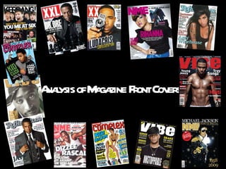
- 1. Analysis of Magazine Front Covers
- 2. Cover 1 NME September 2009 Dizzee Rascal Edition
- 3. FRONT COVER ANALYSIS THE MASTHEAD The masthead of the magazine uses three colours, red, white and black. This colour scheme is uses throughout the magazine and cover. THE HEADER This highlight what is special about the magazine and why the audience should buy it, attracting their attention. THE SELL LINES/COVER LINES There are not that many sell lines as the magazine is dominated by the image. However the sell lines used gives the audience information as to what artists are featured in the magazine. THE MAIN IMAGE The main image of Dizzee Rascal is a long shot though he is crouching down. Because this is slanted is shows that this artist is fun and not ordinary. It gives the magazine a sense of chaos. The image dominates the cover showing that he is the main feature, THE MAIN COVER LINE The main cover line is in bold and has a drop shadow as it is the main article. It is placed at a slant to show that it is chaotic and that Dizzee Rascals music doesn’t abide the ‘rules.’ BARCODE – DATE/ ISSUE/ PRICE This is important and it allows NME to know how many they have sold and also tells the audience the price of the magazine. THE FOOTER This gives the audience more information on what is included in the magazine allowing the audience to decide if the magazine is for them. USE OF A PULL QUOTE The pull quote gives the audience a ‘taster’ on what the main article includes and is used the attract the audience. BACKGROUND The background of the magazine is of graffiti. This matches the genre of the music that the cover artist makes and makes it clear to people who are not familiar with him, what music he produces. USE OF A FLASHER The flasher is used to gives something extra to the magazine and to try and attract the audience. RULE OF THIRDS/THE LEFT THIRD The artists eyes, his name and the pull quote align with the intersections when the magazine in divided into 9. The magazine doesn’t follow the left third rule (left blank,) again showing chaos.
- 4. Cover 2 NME April 2010 Rihanna Special Edition Cover
- 5. FRONT COVER ANALYSIS THE MASTHEAD The masthead of the magazine is of the colour pink. The usual colour of the NME masthead is red black and white. This shows that there is something different and new about this edition, attracting the audiences attention. THE HEADER This highlight what is special about the magazine and why the audience should buy it, attracting their attention. THE SELL LINES/COVER LINES There are not that many sell lines as the magazine is dominated by the image. However the sell lines used gives the audience information as to what artists are featured in the magazine. THE MAIN IMAGE The main image of Rihanna is a mid shot though she is bending over. The mid shot is used to show her expression. Her expression as well as her posture shows attitude and that her music is not plain and boring. THE MAIN COVER LINE The main cover line is in bold and has been placed in the centre of the magazine showing that it is the main article of the magazine. The colour of the cover line stands out to make sure it gets noticed. BARCODE – DATE/ ISSUE/ PRICE This is important and it allows NME to know how many they have sold and also tells the audience the price of the magazine. THE FOOTER A footer has not been used for this issue with is unusual as there normally is on NME magazines. This makes the magazine special as it is ‘special edition; USE OF A PULL QUOTE The pull quote gives the audience a ‘taster’ on what the main article includes and is used the attract the audience. BACKGROUND The background of the magazine is plain with a blend of two colours. The colour pink stands out from the grey and white background again making it attract the audience. The plain background also makes sure that the attention isn't drawn away from the main image. RULE OF THIRDS/THE LEFT THIRD The intersections of the lines cross Rihanna’s mouth and just below sell line. Also the centre of the sections is filled with ‘Rihanna,’ pointing out that she is main focus.
- 6. Cover 3 Vibe December 2009 Drake Edition
- 7. FRONT COVER ANALYSIS THE MASTHEAD The masthead of the magazine is of the colour white which stand out from the dark background allowing usual buyers to notice it out from a magazine stand. THE HEADER This highlights the artists included in this issue of the magazine which helps buyers to decide is they would like to buy the magazine. THE SELL LINES/COVER LINES The sell lines of the magazine are placed around the main image to make sure that the attentions isn’t drawn away from the main article. The sell lines colour scheme match the rest of the magazine to have a consistent house style. THE MAIN IMAGE The main image of Drake is a medium close up which is close enough for us to see his facial expression. From his facial expression, he looks like he has more attitude than a bit aggressive. This like the previous magazines, which show that his music is not boring and has slight aggro to them. THE MAIN COVER LINE The main cover line is in bold and is slightly larger than the other sell lines pointing out that it is the main article of the magazine. It is unusual that the main cover line is not in the centre or a lot larger than the other sell lines. However the main image makes it pretty clear. BARCODE – DATE/ ISSUE/ PRICE This is important and it allows Vibe to know how many they have sold and also tells the audience the price of the magazine. BACKGROUND The background of the magazine is plain with a blend of two colours. The white stand out from the dark background. The plain background doesn’t distract the audience from the main focus of the magazine, Drake, RULE OF THIRDS/THE LEFT THIRD The intersections of the lines when the page is divided into 9, cross through Drake’s mouth, above ‘Unstoppable’ and through his shoulders. This makes him the main focus of the cover. The left third of the magazine contains the sell lines and the barcode. This makes it clear for the audience to find out what is included in the magazine
- 8. Target Audience of These Magazines