The document describes the process of designing a festival ticket webpage. The designer started with a black and white background and used red for the masthead and main heading to make them stand out. Yellow, black, and red were chosen as the color scheme to match the festival colors and keep the festival theme consistent. Words like "Exclusive" were added in yellow outline and plus signs were used to separate subheadings to draw the reader in. Descriptions were added in yellow with key words in red. Drop shadows and borders were added to certain elements to make them stand out more to the reader. Finally, subheadings were shortened and rearranged to flow better and stand out more to the reader.
Boost Fertility New Invention Ups Success Rates.pdf
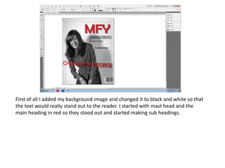
Front
1. First of all I added my background image and changed it to black and white so that
the text would really stand out to the reader. I started with mast head and the
main heading in red so they stood out and started making sub headings.
2. Then I added a skyline for tickets to Reading and Leeds festival. Also my colour scheme
starts to appear which is black, yellow and red which is the festival colours so also
keeps the festival theme flowing throughout.
3. I then added the buzz word ‘Exclusive’ to draw the reader in putting it in yellow
outline to stand out to the reader. Also I added a + sign to make the sub headings
flow.
4. I then added the description to the main article putting it in yellow and main words in
red to really stand out to the reader.
5. Then within my sub headings I decided to highlight words so the stood out a lot more.
6. Next I decided to put drop shadows on certain things so they stood out and put border
on certain words so again they stood out to the reader.
7. Finally I decided to change the sub headings around as the didn’t stand out to the reader.
I chose to shorten them and make them flow more to stand out to the reader.