SlideShare a Scribd company logo
1 of 7
Features Page- Pitching to an Audience Collette Howard
Genre of Music My artist is a new artist, who has recently just received a record label. The genre of music is pop, with a young female artist singing. This article introduces her, as she has never been announced before and gives some brief information on her.
Style, Features and Layout I included under my heading, a subheading containing a small paragraph on basically what my article is going to be about. I included a quote on my actual image, giving people a better understanding of the new artist. I included a folio, in order for the features page to look more realistic. I included all my text in a small paragraph, as there wasn’t a lot, and also it made it look much neater. I sectioned my heading and my subheading apart, I did this because I didn’t want too much going on in one part of the page. I placed my image along the right hand side of my features page, as commonly the right side is what people look at first.
House Colours I haven’t specifically created an house colour here. However, black seems to run quite a lot throughout the page, so this could be seen as a house colour. Black shows no emotion and suits both genders. With my front cover and contents page, I also want red to be a house colour, as red is commonly known to be quite a ‘wild’ colour.
Language Style/Mode of Address In my article, I didn’t specifically make the reader feel as if they personally knew the artist, this was hard because as they was a new artist, nobody had heard of them, so making it more personal was a lot harder. As the article was just information about the new artist, I didn’t really include humour. However if I did an interview with the artist, I would of then included humour and catchy language. I did use rhetorical questions, because as the magazine is aimed at teenagers, the article related in a way, making it seem more realistic.
Typeface I used serif font. I did this because although my magazine is a teenage magazine, I wanted my magazine with the features page as a ‘black and white’ theme to have more formal font than the rest of the magazine. I did this to reflect back on to the artist, of a more ‘formal approach’.
Photography The photography in my features page is indirect. The artist is looking down, as if they are in action. It isn’t supposed to be a posed image, it is supposed to look live as if they are actually recording in a music studio, but also as she is a new artist, that reflecting through the picture too. The image is on the right so it is the first thing you look at. Text overlaps the image, to show the use of ICT correctly but also to show layers, and make it look much more effective.

More Related Content

What's hot (19)

My images
My imagesMy images
My images
 
Q5
Q5Q5
Q5
 
Front page research
Front page researchFront page research
Front page research
 
Evaluation question 5
Evaluation question 5Evaluation question 5
Evaluation question 5
 
Album inspiration
Album inspiration Album inspiration
Album inspiration
 
Evaluation q2
Evaluation q2Evaluation q2
Evaluation q2
 
Magazine research
Magazine researchMagazine research
Magazine research
 
Evaluation 7
Evaluation 7Evaluation 7
Evaluation 7
 
Photos
PhotosPhotos
Photos
 
Contents Page Images
Contents Page ImagesContents Page Images
Contents Page Images
 
Music magazine ideas
Music magazine ideasMusic magazine ideas
Music magazine ideas
 
contents Page Analysis
contents Page Analysiscontents Page Analysis
contents Page Analysis
 
Fonts and design
Fonts and designFonts and design
Fonts and design
 
Question 2
Question 2Question 2
Question 2
 
double page spread with commentary
double page spread with commentarydouble page spread with commentary
double page spread with commentary
 
Double page spread 2
Double page spread 2Double page spread 2
Double page spread 2
 
Blog evaluation q2
Blog evaluation q2Blog evaluation q2
Blog evaluation q2
 
Question 2
Question 2Question 2
Question 2
 
Representation of Particular Social Groups
Representation of Particular Social GroupsRepresentation of Particular Social Groups
Representation of Particular Social Groups
 

Similar to Features page pitching to an audience (20)

Evaluation Questions
Evaluation QuestionsEvaluation Questions
Evaluation Questions
 
Evaluation 7
Evaluation 7Evaluation 7
Evaluation 7
 
Q7
Q7Q7
Q7
 
Evaluation Question One; front cover of digipak.
Evaluation Question One; front cover of digipak.Evaluation Question One; front cover of digipak.
Evaluation Question One; front cover of digipak.
 
Evaluation question 7
Evaluation question 7Evaluation question 7
Evaluation question 7
 
Print Project – Music Magazine (Evaluation)
Print Project – Music Magazine (Evaluation)Print Project – Music Magazine (Evaluation)
Print Project – Music Magazine (Evaluation)
 
Print project – music magazine (evaluation)
Print project – music magazine (evaluation)Print project – music magazine (evaluation)
Print project – music magazine (evaluation)
 
Draft Contents Page Analysis
Draft Contents Page Analysis Draft Contents Page Analysis
Draft Contents Page Analysis
 
Yasmine
YasmineYasmine
Yasmine
 
Evaluation 5
Evaluation 5Evaluation 5
Evaluation 5
 
Eval 7
Eval 7Eval 7
Eval 7
 
Progress of contents page
Progress of contents pageProgress of contents page
Progress of contents page
 
Photography research
Photography researchPhotography research
Photography research
 
Photography research
Photography researchPhotography research
Photography research
 
Evaluation 7 f
Evaluation 7 fEvaluation 7 f
Evaluation 7 f
 
In what ways does your media product use
In what ways does your media product useIn what ways does your media product use
In what ways does your media product use
 
Digi pack evaluation
Digi pack evaluationDigi pack evaluation
Digi pack evaluation
 
Rr
RrRr
Rr
 
Double page spread analysis
Double page spread analysisDouble page spread analysis
Double page spread analysis
 
Contents Page Pictures Analysis
Contents Page Pictures AnalysisContents Page Pictures Analysis
Contents Page Pictures Analysis
 

Features page pitching to an audience

  • 1. Features Page- Pitching to an Audience Collette Howard
  • 2. Genre of Music My artist is a new artist, who has recently just received a record label. The genre of music is pop, with a young female artist singing. This article introduces her, as she has never been announced before and gives some brief information on her.
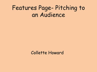
  • 3. Style, Features and Layout I included under my heading, a subheading containing a small paragraph on basically what my article is going to be about. I included a quote on my actual image, giving people a better understanding of the new artist. I included a folio, in order for the features page to look more realistic. I included all my text in a small paragraph, as there wasn’t a lot, and also it made it look much neater. I sectioned my heading and my subheading apart, I did this because I didn’t want too much going on in one part of the page. I placed my image along the right hand side of my features page, as commonly the right side is what people look at first.
  • 4. House Colours I haven’t specifically created an house colour here. However, black seems to run quite a lot throughout the page, so this could be seen as a house colour. Black shows no emotion and suits both genders. With my front cover and contents page, I also want red to be a house colour, as red is commonly known to be quite a ‘wild’ colour.
  • 5. Language Style/Mode of Address In my article, I didn’t specifically make the reader feel as if they personally knew the artist, this was hard because as they was a new artist, nobody had heard of them, so making it more personal was a lot harder. As the article was just information about the new artist, I didn’t really include humour. However if I did an interview with the artist, I would of then included humour and catchy language. I did use rhetorical questions, because as the magazine is aimed at teenagers, the article related in a way, making it seem more realistic.
  • 6. Typeface I used serif font. I did this because although my magazine is a teenage magazine, I wanted my magazine with the features page as a ‘black and white’ theme to have more formal font than the rest of the magazine. I did this to reflect back on to the artist, of a more ‘formal approach’.
  • 7. Photography The photography in my features page is indirect. The artist is looking down, as if they are in action. It isn’t supposed to be a posed image, it is supposed to look live as if they are actually recording in a music studio, but also as she is a new artist, that reflecting through the picture too. The image is on the right so it is the first thing you look at. Text overlaps the image, to show the use of ICT correctly but also to show layers, and make it look much more effective.