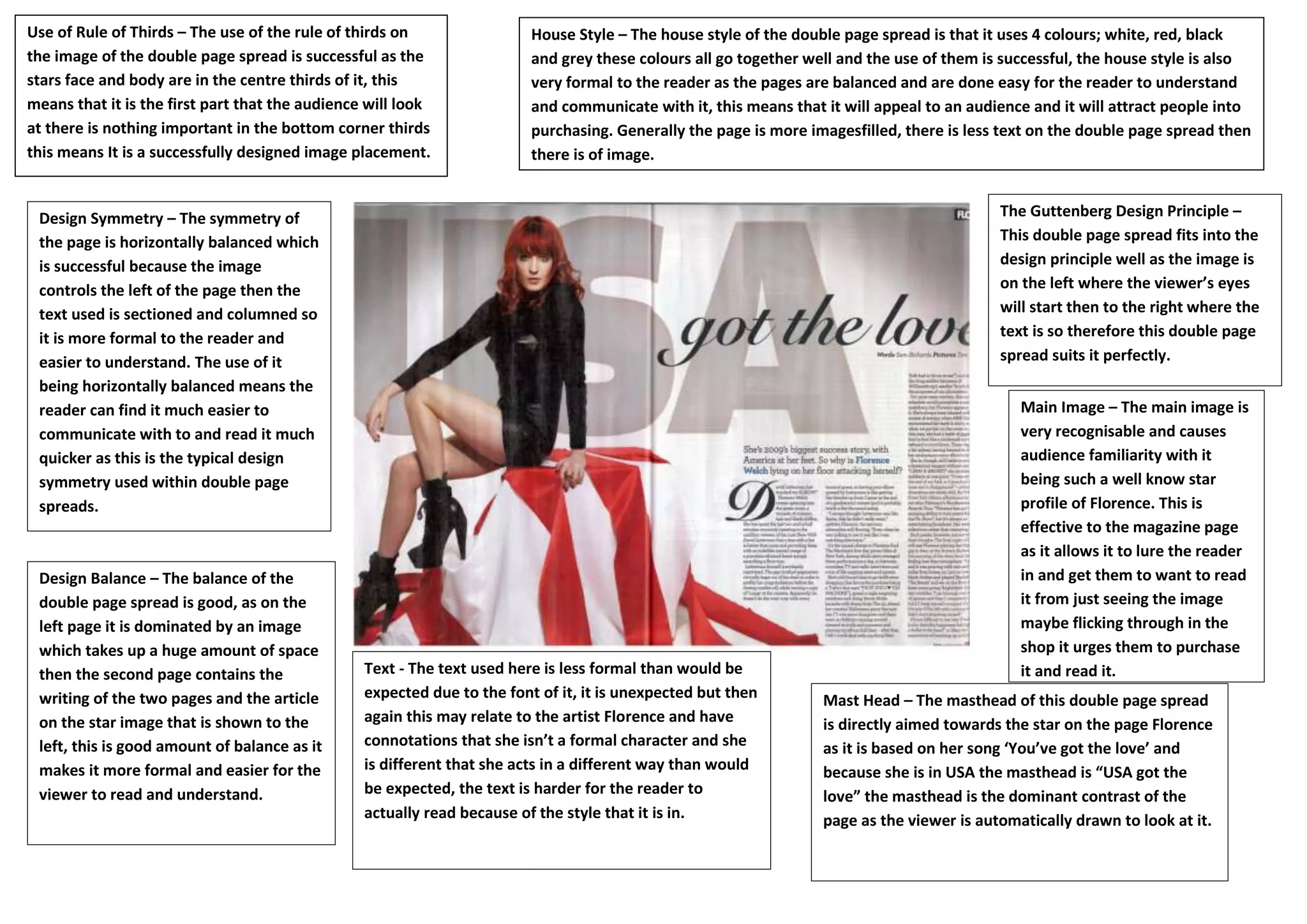
The double page spread uses the rule of thirds successfully by placing the main image of the star in the center thirds. It has a symmetrical and balanced design with images on the left page and text on the right. The large recognizable image of the star Florence draws the reader in, while the columned text on the opposing page is easier to read. Overall the design follows principles to guide the reader's eyes through the spread in an accessible way.