Final Little White Lies Cover Evaluation
•
0 likes•288 views

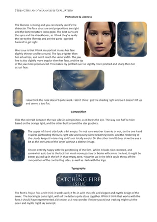
The document provides a strengths and weaknesses evaluation of a book cover design. The likeness of the portrait is strong, though some features like the nose and lips are not perfectly accurate. The composition draws the eye with contrasting orange and blue sides, but the upper left area feels empty. The font fits the design but could be better integrated and the leading is inconsistent. Overall, the design effectively uses complementary colors that tie into the story's themes, but some elements could be improved.
Report
Share
Report
Share
Download to read offline

Recommended
Digital graphics evaluation pro forma
The document provides an evaluation of the creator's graphic narrative project. It discusses the planning and execution of the images, use of text, suitability for the target audience, techniques used, and strengths and weaknesses. The creator made some changes from the original plans, such as changing character positions on pages. Images were constructed consistently with character resizing. Text was well-anchored except for one page. Images and simple language make the book suitable for ages 4-8. Shape and brush tools were useful techniques. Earlier planning helped execution.
15 analysis'
The color scheme uses contrasting black, white and red. The central image depicts Tupac mysteriously clasping his hands under low lighting, appearing serious yet business-
Magazne cover analysis
This magazine cover uses a large main image of a red devil character overlapping the masthead to make it stand out. The masthead has been altered to look burned with fire to match the devil image. Secondary features are listed on the left in white text against the black background. The main headline is placed on the image in white to link it clearly. The second cover again uses a large overlapping main image, this time of two characters, with text placed strategically around it. The third cover stands out with its big bright red magazine title not overlapped by the image. It features a recognizable Harry Potter face needing no film title. All covers strategically place additional text to enhance the color schemes and draw the eye without over
Digital graphics evaluation pro forma
The document is an evaluation of a graphic narrative created by the author. Some key points:
- The author made some changes from their original plans during production for improved effectiveness.
- They feel the images were constructed fairly well with consistent characters and backgrounds, though character positioning could be more consistent.
- Most pages effectively anchor the images to the text, though some could have stronger links.
- The story is suitable for its 4-8 year old audience with simple language and bright, non-distracting images.
- The author discusses techniques used and likes the shape tool, but dislikes some design aspects on page 9.
Poster and Magazine Drafts
This document contains draft designs for a film poster and magazine cover for a movie called "Best Friends". It describes several iterations of designs for both the poster and magazine cover, with changes to images, layouts, fonts, and colors. The goal is to create eye-catching designs that advertise the movie and magazine contents effectively.
Development pro forma rich b
Here are some areas of the proposal that could be further developed:
- Provide more details on the story's plot, characters, setting, themes, etc. to give a clearer sense of the full narrative.
- Consider including sketches or visual examples of your character and environment designs to help bring them to life.
- Expand on your production methods, materials, and timeline. Provide estimated durations for tasks like illustration, coloring, etc.
- Consider adding a section on marketing and distribution plans. How will you promote and sell the book? Through what channels?
- Strengthen your audience analysis by including details like age ranges, interests, reading levels, etc. Tailor the story and design accordingly.
-
Overview
The document describes a series of photographs taken in a low-key lighting studio setting. The first photo features a hooded woman holding a mask, hiding her identity. The lighting helps set a mysterious tone. Subsequent photos show different characters and props in intriguing poses, leaving the story and meaning open to interpretation. The document discusses how the lighting is used to highlight important details while keeping other aspects hidden, creating intrigue.
Fmp pre production 1
This document provides planning details for a stop motion animation called "Desktop Diaries". It includes character descriptions, style guides for colors, fonts and images, storyboards, scripts, and a production schedule. The characters are everyday office supplies that will be brought to life through stop motion. Color palettes and shapes are analyzed to reflect each character's personality. Equipment, locations, health and safety are also addressed to prepare for a week-long production.
Fmp pre production
This document provides planning details for a stop-motion animation called "Desktop Diaries". It includes character descriptions, style guides for colors, fonts and imagery, storyboards, scripts, and a production schedule. The main characters are stationary items that come to life, including a stapler, pencil, scissors, hole punch, and ruler. Color schemes and shapes are analyzed to reflect each character's personality. Equipment, locations, health and safety are also addressed to prepare for a week-long production.
Spiderman poster analysis
The document analyzes a Spiderman movie poster. It notes that the poster uses bold, outlined fonts in different colors to make the text stand out against the background. It features a mid-shot of Spiderman taking up most of the cover to draw attention, with lighting making him appear like he will jump out at viewers. Smaller images around the edges provide insights into the magazine's other contents. The faded background draws the eyes to Spiderman in the center.
Digital Graphic Narrative!
Here is a revised script for the storyboards that addresses the feedback:
The Three Little Martians
By [Your Name]
Narrator: Once upon a time, there was an old Martian mother with three little Martians. She couldn't afford to keep them on Mars anymore, so she sent them off into space to make their fortunes.
The first little Martian met an asteroid miner with a bundle of space rocks. "Please, sir, may I have these rocks to build a house?" asked the Martian. The miner agreed.
With the rocks, the little Martian built a house on a small planet. Soon after, a bigger alien approached. "Little Martian,
6. production reflection(1) (2)
The document describes the process of creating a magazine cover and double page spread with a futuristic theme. For the cover, the artist started with a simple background of space and Earth, and added layers including a moon, spaceman, and custom title font to achieve a clean, detailed yet minimalistic design. For the double page spread, the artist used a backdrop of a futuristic city from Blade Runner, and centered a Nike shoe within an "aura" of glowing city lights to bridge future and present. Minor adjustments like toning and shadowing helped blend the elements into a cohesive, professional and impactful design relating the futuristic theme to everyday life.
Development pro forma(1)
The original script tells the story of St. George and how he traveled to Libya where he heard that a dragon was terrorizing the kingdom and demanding sacrifices. St. George decides to fight the dragon to save the princess. In their battle, St. George's spear and sword break against the dragon's scales. Though injured by the dragon's poison, St. George is able to kill the dragon by piercing it under its wing.
CONTENTS PAGE ANALYSIS 1
The document provides an analysis of the content and design of a magazine page. It summarizes that the page uses dark colors and black and white photos to create a serious tone fitting an article about loss. While the tone is serious, the language uses informal words to have a conversational tone with readers. Pull quotes are used to attract readers' attention to different articles. The main photo features the artist with one eye hidden, implying she is still private about her experiences with loss. Overall, the page is designed to connect emotionally with readers through its somber tone and vulnerable photo of the artist.
Development pro forma(3)
The document outlines a student's digital graphic narrative development project, providing evaluations of various assignments including shape tasks, rotoscoping, film quotes, text-based work, comic books, photo stories, illustrations, and a narrative environment. The student effectively critiques their own work and identifies areas for improvement in future projects.
Digital graphics evaluation pro forma
The document provides a template for evaluating a graphic narrative project. It prompts the user to provide specific details about their work, including written and visual examples. It also prompts the user to identify strengths and areas for improvement. The user should add additional slides as needed and delete any blank slides before submission.
Magazine textual analysis
This document analyzes and summarizes several magazine covers. Key points include:
1) Magazine covers use bold mastheads, prominent images, and well-positioned text in complementary colors to look professional and catch readers' attention.
2) Main images should highlight important characters and convey meaning through poses, expressions, and props. Backgrounds should relate to the film.
3) Text uses a variety of fonts and sizes strategically to emphasize important information like the title and story. Sell lines are also organized effectively.
4) Simplicity works well, avoiding clutter, while still including necessary details like barcodes. Color schemes and layouts should complement the film's themes.
Poster creation
The document describes the process taken to design a movie poster. Key steps included:
1) Creating the initial poster design based on the movie "You're Next" and customizing it for the project.
2) Adding layers, fonts, title, rating, and web address in Photoshop.
3) Choosing an appropriate background photo and logos.
4) Manipulating elements like brightness, colors, and effects to improve visuals and focus.
5) Centering elements, adding a release date, and refining text for clarity and cohesion.
Similar products
The document analyzes and compares the layout, design elements, and aesthetics of three magazine contents pages. For the first magazine, the layout balances a lot of information visually while keeping a minimal color scheme. The second magazine has a very plain and minimal design with limited text and images. The third magazine has the busiest design with vibrant colors, central title, local advertisements, and emphasis on visuals over text to present regional information.
Lili brewin digital graphics evaluation
The document provides guidance for evaluating a graphic narrative project. It instructs the reader to provide specific details about their work, including written and visual examples. It also prompts the reader to identify areas of their project to praise and areas that could be improved, with specific details. The reader is told they can add additional slides as needed and should delete any blank slides before submission.
Horror magazine production
Zoya created a magazine cover for Empire magazine by following conventions of the genre and magazine style. She began by analyzing covers of similar magazines to select a professional looking template. Next, she added the magazine masthead to make it instantly recognizable. Zoya then chose a central image from photos taken, manipulating it in Photoshop to sharpen it and adjust lighting and saturation. Additional graphics, text, and features were included to give the cover a realistic feel typical of magazines. The final cover incorporated key icons to tie the elements together cohesively while varying the central image.
Magazine front cover analysis
The document provides an analysis of the process taken to design the front cover of a magazine for a horror film trailer. Key details include:
- Multiple photographs were edited in Photoshop to create disturbing effects and highlight important characters.
- Techniques like transparency, lighting adjustments, and overlays were used to draw attention to characters and suggest plot elements.
- Design conventions from Total Film magazine such as layout, fonts, and sections were emulated to make the cover look professional.
- Last minute changes like added blood effects and alterations to colors and images further emphasized the horror genre.
Magazine front cover analysis
The document analyzes the process of creating a magazine front cover for a horror film trailer. Photographs were chosen and edited in Photoshop to create disturbing effects and highlight important characters. Conventions from Total Film magazine such as placement of text, colors, and sections were followed to make the cover look professional. The front cover features characters and themes from the horror trailer to create a cohesive package and appeal to audiences.
Development pro forma
The document contains evaluations of digital graphic narratives and illustrations created by a student. For a storybook proposal, the student outlines a story about a T-Rex who can't scratch an itch due to short arms and seeks help from other animals. The production methods will include hand-drawn characters scanned and colored digitally alongside rotoscoped backgrounds. The target audience is ages 3-6 and the deadline is October 16. Feedback notes the language is suitable and the story interesting, while suggesting expanding on editing techniques. Idea generation shows ideas developed from a mind map to a mood board, and could benefit from additional setting research in a storyboard.
Development pro forma
The document contains evaluations of various digital graphic narrative assignments, including shape tasks, rotoscoping, text-based images, comic books, and photography. For each assignment, the student provides what they liked about their image and what they would improve. They note effective use of textures, colors, and capturing the style of the assignment. Areas for improvement include accuracy, details, cropping, and adding texture or contrast. The feedback provides analysis of strengths and weaknesses and suggestions for further developing ideas and proposals.
Reasearch contents pages
The layout of the contents page is grid-like with many small images and one large central image. The masthead is in a sans-serif font at the top right. Text is limited and placed on the left side, with page numbers and titles in bold to emphasize sections. The style uses orange, white and black colors and coordinated fonts.
Clase 1 lc1
Este documento contiene una serie de 20 ejercicios de velocidad y 20 ejercicios de cantidad relacionados con la identificación y comprensión de elementos en recetas culinarias, como ingredientes, pasos de preparación, objetos utilizados y cantidades. Los ejercicios incluyen preguntas de selección múltiple, ordenamiento y completado de oraciones relacionadas con distintos aspectos de recetas de cocina.
Detailed AC Resume
The document summarizes the applicant's experience as an AmeriCorps National Civilian Community Corps member from February 2013 to November 2013. During this time, they completed over 1,800 hours of community service on projects focused on natural resources, public safety, education, disaster relief, and more. They held leadership roles coordinating service events and promoting the program. The applicant also worked with various non-profits on projects like habitat restoration, controlled burns, disaster relief, office work, and youth programs. Duties included construction, landscaping, event planning, case work, and volunteer supervision.
Τα οφέλη της χρήσης των εργαλείων σχεδιασμού και ανάπτυξης ψηφιακού εκπαιδευτ...
Τα οφέλη της χρήσης των εργαλείων σχεδιασμού και ανάπτυξης ψηφιακού εκπαιδευτ...Antonia - Maria Hartofylaka
Παρουσίαση στο Συνέδριο "Η Εκπαίδευση στην Εποχή των ΤΠΕ και της Καινοτομίας" που πραγματοποιήθηκε στο Ευγενίδιο στις 6 Νοεμβρίου 2016.LogiSYM Magazine - May 2016
This issue of LogiSYM magazine focuses on challenges in last mile delivery for e-commerce businesses, leading with emotional intelligence, and contract logistics in 2015. The magazine includes articles on these topics as well as managing fresh food demand in Asia. It also provides news on air, maritime, logistics and supply chain industries, and information on upcoming events.
More Related Content
What's hot
Fmp pre production
This document provides planning details for a stop-motion animation called "Desktop Diaries". It includes character descriptions, style guides for colors, fonts and imagery, storyboards, scripts, and a production schedule. The main characters are stationary items that come to life, including a stapler, pencil, scissors, hole punch, and ruler. Color schemes and shapes are analyzed to reflect each character's personality. Equipment, locations, health and safety are also addressed to prepare for a week-long production.
Spiderman poster analysis
The document analyzes a Spiderman movie poster. It notes that the poster uses bold, outlined fonts in different colors to make the text stand out against the background. It features a mid-shot of Spiderman taking up most of the cover to draw attention, with lighting making him appear like he will jump out at viewers. Smaller images around the edges provide insights into the magazine's other contents. The faded background draws the eyes to Spiderman in the center.
Digital Graphic Narrative!
Here is a revised script for the storyboards that addresses the feedback:
The Three Little Martians
By [Your Name]
Narrator: Once upon a time, there was an old Martian mother with three little Martians. She couldn't afford to keep them on Mars anymore, so she sent them off into space to make their fortunes.
The first little Martian met an asteroid miner with a bundle of space rocks. "Please, sir, may I have these rocks to build a house?" asked the Martian. The miner agreed.
With the rocks, the little Martian built a house on a small planet. Soon after, a bigger alien approached. "Little Martian,
6. production reflection(1) (2)
The document describes the process of creating a magazine cover and double page spread with a futuristic theme. For the cover, the artist started with a simple background of space and Earth, and added layers including a moon, spaceman, and custom title font to achieve a clean, detailed yet minimalistic design. For the double page spread, the artist used a backdrop of a futuristic city from Blade Runner, and centered a Nike shoe within an "aura" of glowing city lights to bridge future and present. Minor adjustments like toning and shadowing helped blend the elements into a cohesive, professional and impactful design relating the futuristic theme to everyday life.
Development pro forma(1)
The original script tells the story of St. George and how he traveled to Libya where he heard that a dragon was terrorizing the kingdom and demanding sacrifices. St. George decides to fight the dragon to save the princess. In their battle, St. George's spear and sword break against the dragon's scales. Though injured by the dragon's poison, St. George is able to kill the dragon by piercing it under its wing.
CONTENTS PAGE ANALYSIS 1
The document provides an analysis of the content and design of a magazine page. It summarizes that the page uses dark colors and black and white photos to create a serious tone fitting an article about loss. While the tone is serious, the language uses informal words to have a conversational tone with readers. Pull quotes are used to attract readers' attention to different articles. The main photo features the artist with one eye hidden, implying she is still private about her experiences with loss. Overall, the page is designed to connect emotionally with readers through its somber tone and vulnerable photo of the artist.
Development pro forma(3)
The document outlines a student's digital graphic narrative development project, providing evaluations of various assignments including shape tasks, rotoscoping, film quotes, text-based work, comic books, photo stories, illustrations, and a narrative environment. The student effectively critiques their own work and identifies areas for improvement in future projects.
Digital graphics evaluation pro forma
The document provides a template for evaluating a graphic narrative project. It prompts the user to provide specific details about their work, including written and visual examples. It also prompts the user to identify strengths and areas for improvement. The user should add additional slides as needed and delete any blank slides before submission.
Magazine textual analysis
This document analyzes and summarizes several magazine covers. Key points include:
1) Magazine covers use bold mastheads, prominent images, and well-positioned text in complementary colors to look professional and catch readers' attention.
2) Main images should highlight important characters and convey meaning through poses, expressions, and props. Backgrounds should relate to the film.
3) Text uses a variety of fonts and sizes strategically to emphasize important information like the title and story. Sell lines are also organized effectively.
4) Simplicity works well, avoiding clutter, while still including necessary details like barcodes. Color schemes and layouts should complement the film's themes.
Poster creation
The document describes the process taken to design a movie poster. Key steps included:
1) Creating the initial poster design based on the movie "You're Next" and customizing it for the project.
2) Adding layers, fonts, title, rating, and web address in Photoshop.
3) Choosing an appropriate background photo and logos.
4) Manipulating elements like brightness, colors, and effects to improve visuals and focus.
5) Centering elements, adding a release date, and refining text for clarity and cohesion.
Similar products
The document analyzes and compares the layout, design elements, and aesthetics of three magazine contents pages. For the first magazine, the layout balances a lot of information visually while keeping a minimal color scheme. The second magazine has a very plain and minimal design with limited text and images. The third magazine has the busiest design with vibrant colors, central title, local advertisements, and emphasis on visuals over text to present regional information.
Lili brewin digital graphics evaluation
The document provides guidance for evaluating a graphic narrative project. It instructs the reader to provide specific details about their work, including written and visual examples. It also prompts the reader to identify areas of their project to praise and areas that could be improved, with specific details. The reader is told they can add additional slides as needed and should delete any blank slides before submission.
Horror magazine production
Zoya created a magazine cover for Empire magazine by following conventions of the genre and magazine style. She began by analyzing covers of similar magazines to select a professional looking template. Next, she added the magazine masthead to make it instantly recognizable. Zoya then chose a central image from photos taken, manipulating it in Photoshop to sharpen it and adjust lighting and saturation. Additional graphics, text, and features were included to give the cover a realistic feel typical of magazines. The final cover incorporated key icons to tie the elements together cohesively while varying the central image.
Magazine front cover analysis
The document provides an analysis of the process taken to design the front cover of a magazine for a horror film trailer. Key details include:
- Multiple photographs were edited in Photoshop to create disturbing effects and highlight important characters.
- Techniques like transparency, lighting adjustments, and overlays were used to draw attention to characters and suggest plot elements.
- Design conventions from Total Film magazine such as layout, fonts, and sections were emulated to make the cover look professional.
- Last minute changes like added blood effects and alterations to colors and images further emphasized the horror genre.
Magazine front cover analysis
The document analyzes the process of creating a magazine front cover for a horror film trailer. Photographs were chosen and edited in Photoshop to create disturbing effects and highlight important characters. Conventions from Total Film magazine such as placement of text, colors, and sections were followed to make the cover look professional. The front cover features characters and themes from the horror trailer to create a cohesive package and appeal to audiences.
Development pro forma
The document contains evaluations of digital graphic narratives and illustrations created by a student. For a storybook proposal, the student outlines a story about a T-Rex who can't scratch an itch due to short arms and seeks help from other animals. The production methods will include hand-drawn characters scanned and colored digitally alongside rotoscoped backgrounds. The target audience is ages 3-6 and the deadline is October 16. Feedback notes the language is suitable and the story interesting, while suggesting expanding on editing techniques. Idea generation shows ideas developed from a mind map to a mood board, and could benefit from additional setting research in a storyboard.
Development pro forma
The document contains evaluations of various digital graphic narrative assignments, including shape tasks, rotoscoping, text-based images, comic books, and photography. For each assignment, the student provides what they liked about their image and what they would improve. They note effective use of textures, colors, and capturing the style of the assignment. Areas for improvement include accuracy, details, cropping, and adding texture or contrast. The feedback provides analysis of strengths and weaknesses and suggestions for further developing ideas and proposals.
Reasearch contents pages
The layout of the contents page is grid-like with many small images and one large central image. The masthead is in a sans-serif font at the top right. Text is limited and placed on the left side, with page numbers and titles in bold to emphasize sections. The style uses orange, white and black colors and coordinated fonts.
What's hot (18)
Viewers also liked
Clase 1 lc1
Este documento contiene una serie de 20 ejercicios de velocidad y 20 ejercicios de cantidad relacionados con la identificación y comprensión de elementos en recetas culinarias, como ingredientes, pasos de preparación, objetos utilizados y cantidades. Los ejercicios incluyen preguntas de selección múltiple, ordenamiento y completado de oraciones relacionadas con distintos aspectos de recetas de cocina.
Detailed AC Resume
The document summarizes the applicant's experience as an AmeriCorps National Civilian Community Corps member from February 2013 to November 2013. During this time, they completed over 1,800 hours of community service on projects focused on natural resources, public safety, education, disaster relief, and more. They held leadership roles coordinating service events and promoting the program. The applicant also worked with various non-profits on projects like habitat restoration, controlled burns, disaster relief, office work, and youth programs. Duties included construction, landscaping, event planning, case work, and volunteer supervision.
Τα οφέλη της χρήσης των εργαλείων σχεδιασμού και ανάπτυξης ψηφιακού εκπαιδευτ...
Τα οφέλη της χρήσης των εργαλείων σχεδιασμού και ανάπτυξης ψηφιακού εκπαιδευτ...Antonia - Maria Hartofylaka
Παρουσίαση στο Συνέδριο "Η Εκπαίδευση στην Εποχή των ΤΠΕ και της Καινοτομίας" που πραγματοποιήθηκε στο Ευγενίδιο στις 6 Νοεμβρίου 2016.LogiSYM Magazine - May 2016
This issue of LogiSYM magazine focuses on challenges in last mile delivery for e-commerce businesses, leading with emotional intelligence, and contract logistics in 2015. The magazine includes articles on these topics as well as managing fresh food demand in Asia. It also provides news on air, maritime, logistics and supply chain industries, and information on upcoming events.
2016 PowerPoints (Scroll Down to View)
This document contains a list of 16 PowerPoint presentations about various topics related to Canada, including its history, indigenous peoples, government, economy, and geography. The presentations are grouped into three categories: presentations from the 2016 IBMA Educators Workshop, the 2016 NCSS Conference, and the 2016 STUDY CANADA Summer Institute.
Boletín de novidades de Outubro de 2016 (Só de literatura)
Este documento presenta un boletín de novedades de la biblioteca que incluye resúmenes de varios libros recientemente adquiridos. El boletín incluye títulos como "Acompáñame a estar solo", "Rayos", "El periodista deportivo", "Aqueles días en que eramos malas", "El Despertar del corazón", "Fiebre al amanecer", "Asamblea ordinaria", "Lolly Willowes o el amante cazador", "Don Quijote de Manhattan" y otros. El propósito del boletín
Guia da mostra bibliográfica 70 anos de rock. biblioteca provincial da deputa...
Mostra bibliográfica na Biblioteca Provincial da Deputación da Coruña adicada ao Rock
Jacob Daniel Resume
The document is a resume for Jacob Daniel, a mechanical engineer with 5 years of experience in design, project management, and product development in various industries including oil and gas. His experience includes designing tools for pressure controlled environments, managing lean projects, and working with vendors. He has a Master's degree in engineering management and a Bachelor's in mechanical engineering. His current role is as a mechanical engineer at Halliburton where he designs downhole completion tools and provides technical support to other teams.
Joseph Giardino Resume
This document is a resume for Joseph Giardino applying for a Maintenance Technician position. It summarizes his objective, education history including degrees from Bellingham High School, Universal Technical Institute, and Custom Machine Group. It also outlines his employment history over the past 10 years including roles as a Maintenance Technician at Rose F. Kennedy Greenway Conservancy, Maintenance Mechanic at Raytheon Company, Mechanical Assembly at Raytheon Company, and Technician at National Tire and Battery. References are available upon request.
RESUME
Willie Jackson is seeking a position where he can contribute to an organization's success through extensive labor and productivity. He has over 10 years of experience in various roles including editor, home health aide, driver, warehouse assembler, warehouse worker, and machine operator. His experience spans industries such as publishing, transportation, manufacturing, and healthcare. He has a diploma from High School of Commerce in Springfield, MA.
Presentacion sae 9
El documento resume la historia y la evolución del jazz desde sus orígenes en Nueva Orleans a principios del siglo XX hasta estilos posteriores como el cool jazz y el hard bop. Explica cómo el jazz se expandió desde Nueva Orleans a otras ciudades como Chicago y Nueva York, dando lugar a nuevos estilos como el dixieland, el swing y el bebop. También destaca a importantes músicos de jazz como Louis Armstrong, Miles Davis y John Coltrane y sus contribuciones a la transformación continua del jazz a lo largo de los años.
Prima e dopo Bretton Woods
I rapporti tra politica ed economia prima e dopo Bretton Woods, ovvero il passaggio dallo stato liberale, centrato sulla libera economia di mercato, al welfare state, nel quale lo stato si fa carico delle condizioni dei ceti meno abbienti, ponendo limiti e restrizioni all'economia.
I.C.T Slide
This Slide talks about Spreadsheets. How to use them and so much more .
Some Information was gotten from : BBC Bitesize
Schneider electrics building_business_presentation
This document provides an overview of Schneider Electric's Buildings Business. It discusses Schneider Electric's vision, mission, and positioning in energy management. It then describes the Buildings Business, the markets and customers it serves, the challenges customers face related to energy and connectivity, and how Schneider Electric addresses these challenges through integrated solutions across five domains: process and machine management, building management, security management, power management, and white space management. The document also outlines Schneider Electric's product offerings, routes to market, and leadership in the buildings ecosystem.
Strengths presentation
Here are some examples of child prodigies in sport:
- Michelle Wie - Began playing golf at age 4 and turned professional at age 16. Won numerous amateur tournaments.
- Michael Phelps - Began competitive swimming at age 7. Won 28 Olympic medals, including 23 gold medals.
- Simone Biles - Started gymnastics at age 6. Has won 25 World Championship medals, including 19 gold medals. Most decorated American gymnast.
- LeBron James - Considered a basketball prodigy in high school. Drafted straight out of high school by the NBA. 4x NBA champion.
- Lionel Messi - Began playing soccer for Newell's Old Boys
VIA
The VIA Survey is a self-report questionnaire that measures 24 character strengths which are classified under 6 core virtues. It was developed by the VIA Institute on Character and is based on the VIA Classification of Character Strengths. The VIA Survey has established good reliability and validity and has been translated into several languages. Interpretation of results focuses on identifying a person's top 5 signature strengths. The survey provides a strengths-based perspective and framework that can be applied in various settings.
Viewers also liked (16)
Τα οφέλη της χρήσης των εργαλείων σχεδιασμού και ανάπτυξης ψηφιακού εκπαιδευτ...
Τα οφέλη της χρήσης των εργαλείων σχεδιασμού και ανάπτυξης ψηφιακού εκπαιδευτ...
Boletín de novidades de Outubro de 2016 (Só de literatura)
Boletín de novidades de Outubro de 2016 (Só de literatura)
Guia da mostra bibliográfica 70 anos de rock. biblioteca provincial da deputa...
Guia da mostra bibliográfica 70 anos de rock. biblioteca provincial da deputa...
Schneider electrics building_business_presentation
Schneider electrics building_business_presentation
Similar to Final Little White Lies Cover Evaluation
Masthead design and analysis
The document discusses the design process for a magazine masthead called "Retro". The author created several design iterations using different color schemes and shapes. Their favorite design used basic shapes edited to form the title, which they thought looked more sophisticated and unique than their initial "Wave" design. However, they felt the colors could be improved by making them brighter and more contrasting to better catch the viewer's eye. In later iterations, they experimented with changing the colors to green with blue outline, yellow with blue outline, and orange with blue outline, but were not fully satisfied with how eye-catching or effective these appeared.
Masthead design and analysis
The document discusses the design process for a magazine masthead called "Retro". The author created several design iterations using different color schemes and shapes. Their favorite design used basic shapes edited to form the title, which they thought looked more sophisticated and unique than their initial "Wave" design. However, they felt the colors could be improved by making them brighter and more contrasting to better catch the viewer's eye. In subsequent edits, they experimented with different color combinations like green with blue outline and yellow with blue outline, but were still seeking a design that was bold and visually striking.
My Development Pro-Forma
This document contains evaluations from a student of various digital graphic narrative development tasks they completed. For a clown fish image, the student liked the accurate colors but would improve the face details. They were pleased with the colors and shape of a penguin image but would adjust the body shape. The student captured photo detail well in a Dexter character but would smooth edges. Feedback on further assignments included improving backgrounds, textures, shapes and adding more details. Overall the student seemed pleased with learning experiences but identified aspects to refine in future iterations.
Digital graphic narrative
The proposal provides an overview of a children's book involving two friends following the ringing of a bell through a forest to a seaside cliff. Key details include an 8-9 page A4 landscape format, JPEG export, a June 9th deadline, and a 3-6 year old audience. Production methods will involve rough page layouts in Photoshop to plan illustrations before finalizing each page. Further details on intended Photoshop tools could strengthen the production methods section.
Print Development Pro Forma
This document contains evaluations of various digital graphic narrative assignments completed by Chris Bailey. For the first penguin image, Bailey likes the simplicity of the bold block colors and curved shape of the penguin. For the second orca image, Bailey improved the shaping of the animal and added more background detail. Other assignments included a Rotoscope image of Mr. Bean where Bailey focused on facial details, a text-based image combining text and a race car, and comic book style images where Bailey aimed to balance thresholds. Overall, Bailey provides feedback on what aspects were successful and opportunities for improvement in future iterations.
Development Pro Forma - Chris Bailey (11/02/15)
This summary provides the key details from the document in 3 sentences:
The document describes the beginning of the classic Little Red Riding Hood story, where Little Red Riding Hood is sent by her mother to bring cake and wine to her ill grandmother who lives in the woods. On her way to grandmother's house, Little Red Riding Hood has a conversation with a wolf who asks her details about where she is going. The wolf plans to trick Little Red Riding Hood and eat her grandmother, as told in the dialogue between Little Red Riding Hood and the wolf.
evaluation
The document discusses cultural competence in understanding media texts. It explains that cultural competence involves being able to interpret signs and symbols that are used as visual shorthand to communicate ideas. While some signs and symbols are recognizable within one's own culture, it can be harder to understand those from other cultures. Media producers create and attach meaning to signs and symbols in many different forms through choices of color, style, character design, tone and more.
Overview
The document describes a series of photographs taken in a low-key lighting studio setting. The first photo features a hooded woman with her face partially obscured, giving a mysterious vibe. The second photo highlights the woman's posture and a prop she is holding, with smoke visible from her mouth, conveying a sense of relief. The remaining photos discuss using props and lighting to anonymize identities while still revealing emotions and messages.
Digital graphics Evaluation pro forma
Here is a summary of the peer feedback and my thoughts on it:
- Peers praised the simplistic cartoon style of the images and said it would appeal to children. I agree that the bright colors and clear lines help engage younger readers.
- Some felt the lack of character movement/poses was repetitive. I acknowledge this as an area for improvement, as reusing poses limited expression.
- Feedback noted the text generally anchored the images well but could be strengthened in a few spots. I agree the story could be clearer in those instances mentioned.
- Peers felt the 8-10 age range was appropriate. I'm glad the language and themes seem suitable.
- One peer said the story followed the
Digital graphics evaluation pro forma
The visual style of your graphic narrative draws inspiration from classic children's books like The Hungry Caterpillar and The Birthday Crown. Your use of simple shapes for backgrounds and rotoscoped characters in a minimalist style echoes visual conventions from books aimed at young audiences.
You also incorporated textual elements commonly found in children's literature, such as speech bubbles, to help tell the story visually. Text is integrated with the images in a way that builds on techniques used successfully in books like The Gruffalo.
While your work does not necessarily reflect professional graphic design standards, it demonstrates an understanding
Double page spread draft and commentary
This document discusses the process of creating a double page magazine spread. It includes commentary on choosing a font, writing an article in interview format, selecting a pull quote, evaluating potential photos, and editing the final chosen photo. The document also comments on eye flow across the designed double page spread.
Feedback
The feedback provided suggestions to improve the album cover and double page spread. For the album cover, making the text brighter was suggested to make it stand out more from the dark background. For the double page spread, adding images or graphics was proposed to fill empty space and make it more eye catching. Both pieces were said to look professional due to the colors and images used. Overall, the double page spread was preferred but improvements could be made by addressing the darkness of the text and simplicity of the backgrounds.
Digital graphics evaluation pro forma
The document provides guidance for evaluating a graphic narrative project. It instructs the reader to provide both written and visual examples from the project, praise strong areas, and identify areas for improvement. It suggests adding slides as needed and deleting any blank slides before submission. The reader is then prompted to evaluate how well their final product achieved their original intentions, how they constructed images, used text, and whether the work is suitable for their intended audience. They also reflect on what techniques they liked and disliked using.
Digital graphics evaluation pro forma
The document provides guidance for evaluating a graphic narrative project. It prompts the user to:
- Provide specific details about their work using written and visual examples.
- Find areas to praise, being specific about what is good or why they are proud.
- Find areas that could be improved and what they would change if doing it again.
- Compare their final product to original plans and intentions.
- Discuss how well images were constructed in terms of appearance, texture and color.
- Evaluate how text was used to anchor images.
- Consider if the product is suitable for the intended audience.
Digital graphics evaluation pro forma
The document provides a template for evaluating a graphic narrative project. It prompts the creator to provide written and visual examples from their work, praise strong elements, and identify areas for improvement. The creator is also asked to reflect on how well their final product achieved their original intentions and was suitable for their intended audience.
My development pro forma.pptx
The document contains evaluations of several digital graphic narratives and images created by Samuel Woodhouse. For each image, Samuel notes what he liked such as accurate colors, distinctive shapes, and cartoon-like appearances. He also identifies areas for improvement like adding more detail to faces, changing body shapes, and including backgrounds. Overall, the evaluations provide feedback on how Samuel captured elements effectively and how he could enhance the images further.
Design portfolio waugh
The document discusses various design principles for creating effective visual communication, including use of proximity to group related elements, alignment to create order, repetition to emphasize relationships, contrast to highlight important information, emphasis to draw attention to the main message, and style to give a unified look and feel. Examples are provided showcasing good and poor applications of these principles.
Development pro forma
The proposal outlines a children's story book project that involves illustrating and digitally designing an 8-page story. The story is about a boy named Jack who lives in poverty with his mother. Through his work, Jack receives rewards like a donkey that makes a girl laugh, leading to an offer of marriage. The proposal provides details on the story, format, audience, and production methods. Feedback notes the clear story overview and visual plans as strengths, recommending expanding the audience details and mind map ideas. The mood board's colors are praised for suiting the story, while adding more character/setting images and mind map details are suggested areas for development.
Human: You are an expert at summarizing documents. You
Digital graphics evaluation pro forma
The document provides guidance for evaluating a graphic narrative project. It prompts the user to compare their original plans to the final product, discuss how well images and text were constructed, and whether the intended audience and content were suitable. The user is then asked to reflect on specific techniques used, what they liked and disliked, and why certain creative choices were made regarding colors, fonts, effects and included content.
Digital graphics evaluation pro forma
The document is a graphic narrative evaluation by the creator of a children's book. In their evaluation, the creator discusses several aspects of their final product compared to their original intentions and plans. Some key points:
- The creator's final product largely reflects their original plan, though some pages were adjusted for stylistic or clarity reasons.
- Shape manipulation and rotoscoping techniques allowed the creator to achieve their simple graphic style while constructing images.
- Text placement was improved in some instances by splitting text between pages to better anchor images.
- The intended target audience of 6-9 year olds from middle-upper class backgrounds remains suitable.
- Facial features were added despite not fully fitting the
Similar to Final Little White Lies Cover Evaluation (20)
More from Phoenix Smith
Graphic Design Presentation
This document contains notes and work by Phoenix Smith related to graphic design projects for a game called "Squidiverse". It includes analysis of app store logos, market segmentation, representing the target audience, feedback on a logo design, considerations around content in the game, sketches for improving a logo composition, exploring colour schemes, and research into designing a banner ad. The document shows the process of refining a logo design based on feedback, exploring t-shirt and banner ad designs, and receiving client feedback to further improve the designs.
Graphic design Schedule
This graphic design schedule outlines key milestones and deadlines for an app, t-shirt, and banner ad design project. It includes selecting final concepts for the app logo by May 16th, finalizing the app design grid in black and white by May 22nd, developing t-shirt concepts by June 3rd, exploring app color options by June 5th, establishing the final app logo by June 7th, choosing the final t-shirt design by June 17th, finalizing the t-shirt and banner ad designs by June 21st and June 23rd respectively, and completing all final designs by June 24th.
Squidiverse Marketing Presentation
The marketing plan summarizes Squidiverse, an upcoming puzzle platformer game featuring a squid boy character. The plan details the game's gameplay, competition, and target audience of casual and indie gamers aged 14-20. Key promotions include a Twitter account to share development updates and images, advertising at indie game conventions like REZZED, YouTube lets play videos, banner ads on gaming sites, and a comedy video advert on YouTube to introduce the character. The free app will have optional in-app purchases of new worlds. It will launch on the Apple App Store on November 20th and be monitored through social media engagement and click-through rates. The total budget is estimated at £2969.34.
Advanced animation & motion capture
Motion capture is a process that tracks live actor performances and applies that data to animate game characters. It allows for more realistic character animations that resemble film acting. While motion capture has improved animations, it is also very expensive due to costs of equipment, studio space, and processing power needed. The high costs mean that cutting-edge motion capture is out of reach for many smaller game studios. Motion capture also risks appearing uncanny if animations do not match the quality of graphics, so further work by animators is often still needed.
Animation Studio Research
Walt Disney Studios began in the 1920s and has produced animated feature films since the 1930s. Their animation style is characterized by round, soft characters with exaggerated motions. Disney had early success with Mickey Mouse and Snow White but struggled in the 1970s. The studio was revived in the 1980s and transitioned to computer animation around 2006. Current projects include Frozen and Big Hero 6. Key people who shaped Disney animation include Walt Disney, the Nine Old Men animators, and John Lasseter who oversaw the transition to CGI.
Animation Character Study
Buzz Lightyear is a character from Pixar's Toy Story franchise. He is a space ranger action figure who believes he is a real space hero. Buzz was created for the 1995 film Toy Story and has appeared in all three Toy Story movies. He contrasts with and complements the design of Woody, the other main toy character. Buzz went through many design changes during development, from a one-man band toy to a military space action figure, before arriving at his final look as a toy-like astronaut character.
Hunted Evaluation
The document summarizes the production of a short film titled "Hunted." It describes the initial idea for a psychological thriller following a man being stalked through a series of shots. It outlines the roles and responsibilities of the film crew, including directing, camera operating, editing, and production design. It discusses the filming process, which was improvised and energetic. Editing techniques like color correction and adding static were used. Feedback was generally positive, praising the production design and confusing storyline, while noting room for improvement in editing.
Photoshoot Plan
The document provides details for photographing subjects for the cover of a science fiction, fantasy, and horror magazine called SFX. It outlines that the shoot will take place in a studio space and focus on one main subject, Aaron, with optional additional subjects. Props like futuristic helmets or long coats may be used. Portrait shots will be the primary focus to show facial expressions and place the subject in context. Color correction, brightness/contrast adjustments, and simple compositing may be done in post-production to emphasize each character's mood and personality. The overall goal is to make the images look synthetic and film-like to capture the fantasy genre.
T-shirt Comparison research
This document discusses and compares two different Doctor Who t-shirt designs - one mainstream and one niche. The mainstream shirt features the TARDIS and Doctor Who logo, making it recognizable and casually wearable by both fans and non-fans. The niche shirt depicts a specific costume from the 1980s classic series, meaning only deep fans familiar with that era would understand the reference. This niche design is bold and not stylized, intended to connect the wearer with other serious fans rather than be casually worn.
Graphic Design: App store logo
The document analyzes and summarizes the visual elements of a game logo. The background uses blue gradients and structures to imply platforms and levels. The ninja figure is drawn in a vector comic book style with thick outlines, heavy shadows, and green eyes to draw attention. Detailed skin shading and an angry expression convey a dark, dramatic character ready for combat. A large throwing star and hand use extreme perspective to emphasize the comic book style and dramatic action of the game, differing from the in-game pixel art graphics. The logo exaggerates key features like combat and the ninja theme to sell the game.
Gamesalad Evaluation
The document evaluates the strengths and difficulties of the game development platform Gamesalad. Some key strengths include the intuitive drag-and-drop interface, visual programming approach, and helpful community tutorials. Some difficulties include the inability to zoom in scenes, incompatibilities between the PC and Mac versions, and bugs appearing during the publishing process when rules turned off in development were reactivated.
Game Designer Job Role
A game designer creates the core gameplay elements and vision for a game. They work with the development team to implement this vision. Game designers need strong logical thinking and understanding of game theory to plan out the game mechanics. Key skills for game designers include strong communication both written and verbal to convey the vision to different teams working on the game. Game designers also need a creative imagination and storytelling ability to create engaging worlds and characters. Most game designers work their way up from lower positions like programming or art and gain experience before becoming a game designer.
Games Artist Job Role
Games artists work under the supervision of a lead artist and perform a variety of tasks including concept art, 3D modeling, and texture creation. They need strong observational skills and an understanding of anatomy and architecture to quickly draw what they see. A background in comic books or storytelling is beneficial to convey emotion and story visually. Key skills include 3D modeling software proficiency, independent work, and effective communication. A degree in art, graphic design, or illustration provides relevant education, as do internships to build skills and portfolio.
Squidiverse Production Pipeline
Phoenix and Aaron came up with the concept for Squidiverse, a platformer game starring a squid character. They established an 8-bit art style inspired by classic Mario and Sonic games. Phoenix created concept art for the squid and villains while Aaron composed the soundtrack. Throughout production, they refined the user interface and gameplay based on testing feedback. To promote the game, they shared concept art, videos, and gameplay footage on social media and YouTube. While the gameplay was fun and engaging, they noted that adding more enemy variety and fixing minor glitches could improve the game.
Game Directors Profile
Neil Druckmann and Bruce Straley served as co-directors for The Last of Us. Druckmann focused on the story and characters as creative director, writing the script and directing voice actors. Straley managed gameplay as game director, overseeing game designers. Both directors worked their way up through Naughty Dog on previous games like Uncharted, and collaborated closely to ensure the story and gameplay complemented each other.
Titanfall Box Art Anotation
The cover art summarizes the key elements of the game. It depicts a combat setting with weaponry and a war-torn landscape, indicating the game is set in a war or combat scenario. It also shows the unique mechanic of piloting a large robot (Titan) by depicting a small soldier standing next to an open hatch on the robot, suggesting the soldier can enter and control the Titan. Additional details like a glowing light from inside the robot and the soldier crouching low to the hatch further reinforce this core gameplay element. The cover art establishes the genre as a combat first-person shooter and conveys the mood and tone through stylistic design choices like sharp, angular text and glowing elements that reference the technology of
Squidiverse walkthrough
The document provides instructions for navigating a level in a video game where the player controls Squid. Squid must collect all the clues in the level while avoiding enemies like crabs and hazards like crushers and water bursts. There are moving platforms and turtles that can help Squid navigate. The document outlines how to access the first clue by hitting a button with a rock to activate a platform. It also describes navigating the crusher obstacle course to get the second clue and platform jumping puzzles to find the final clue and complete the level.
'Squidiverse' 10 point Design Document
This document provides an overview of the web-based platformer game "Squidiverse". The player controls Squid to complete levels across different planets by finding clues. Squid can jump, throw rocks to solve puzzles and defeat enemies. Each level introduces new obstacles and mechanics for the player to master. The game's target audience is teenagers and has a rating of PEGI 7. It aims to be challenging but provide a sense of achievement upon completing levels.
More from Phoenix Smith (20)
Recently uploaded
一比一原版(Hull毕业证)英国哈珀亚当斯大学毕业证如何办理
原件一模一样【微信:WP101A】【(Hull毕业证)英国哈珀亚当斯大学毕业证学位证成绩单】【微信:WP101A】(留信学历认证永久存档查询)采用学校原版纸张、特殊工艺完全按照原版一比一制作(包括:隐形水印,阴影底纹,钢印LOGO烫金烫银,LOGO烫金烫银复合重叠,文字图案浮雕,激光镭射,紫外荧光,温感,复印防伪)行业标杆!精益求精,诚心合作,真诚制作!多年品质 ,按需精细制作,24小时接单,全套进口原装设备,十五年致力于帮助留学生解决难题,业务范围有加拿大、英国、澳洲、韩国、美国、新加坡,新西兰等学历材料,包您满意。
【业务选择办理准则】
一、工作未确定,回国需先给父母、亲戚朋友看下文凭的情况,办理一份就读学校的毕业证【微信:WP101A】文凭即可
二、回国进私企、外企、自己做生意的情况,这些单位是不查询毕业证真伪的,而且国内没有渠道去查询国外文凭的真假,也不需要提供真实教育部认证。鉴于此,办理一份毕业证【微信:WP101A】即可
三、进国企,银行,事业单位,考公务员等等,这些单位是必需要提供真实教育部认证的,办理教育部认证所需资料众多且烦琐,所有材料您都必须提供原件,我们凭借丰富的经验,快捷的绿色通道帮您快速整合材料,让您少走弯路。
留信网认证的作用:
1:该专业认证可证明留学生真实身份【微信:WP101A】
2:同时对留学生所学专业登记给予评定
3:国家专业人才认证中心颁发入库证书
4:这个认证书并且可以归档倒地方
5:凡事获得留信网入网的信息将会逐步更新到个人身份内,将在公安局网内查询个人身份证信息后,同步读取人才网入库信息
6:个人职称评审加20分
7:个人信誉贷款加10分
8:在国家人才网主办的国家网络招聘大会中纳入资料,供国家高端企业选择人才
→ 【关于价格问题(保证一手价格)
我们所定的价格是非常合理的,而且我们现在做得单子大多数都是代理和回头客户介绍的所以一般现在有新的单子 我给客户的都是第一手的代理价格,因为我想坦诚对待大家 不想跟大家在价格方面浪费时间
对于老客户或者被老客户介绍过来的朋友,我们都会适当给一些优惠。
选择实体注册公司办理,更放心,更安全!我们的承诺:可来公司面谈,可签订合同,会陪同客户一起到教育部认证窗口递交认证材料,客户在教育部官方认证查询网站查询到认证通过结果后付款,不成功不收费!
办理(Hull毕业证)英国哈珀亚当斯大学毕业证学位证【微信:WP101A 】外观非常精致,由特殊纸质材料制成,上面印有校徽、校名、毕业生姓名、专业等信息。
办理(Hull毕业证)英国哈珀亚当斯大学毕业证学位证【微信:WP101A 】格式相对统一,各专业都有相应的模板。通常包括以下部分:
校徽:象征着学校的荣誉和传承。
校名:学校英文全称
授予学位:本部分将注明获得的具体学位名称。
毕业生姓名:这是最重要的信息之一,标志着该证书是由特定人员获得的。
颁发日期:这是毕业正式生效的时间,也代表着毕业生学业的结束。
其他信息:根据不同的专业和学位,可能会有一些特定的信息或章节。
办理(Hull毕业证)英国哈珀亚当斯大学毕业证学位证【微信:WP101A 】价值很高,需要妥善保管。一般来说,应放置在安全、干燥、防潮的地方,避免长时间暴露在阳光下。如需使用,最好使用复印件而不是原件,以免丢失。
综上所述,办理(Hull毕业证)英国哈珀亚当斯大学毕业证学位证【微信:WP101A 】是证明身份和学历的高价值文件。外观简单庄重,格式统一,包括重要的个人信息和发布日期。对持有人来说,妥善保管是非常重要的。
一比一原版(UWS毕业证)澳洲西悉尼大学毕业证如何办理
原件一模一样【微信:WP101A】【(UWS毕业证)澳洲西悉尼大学毕业证学位证成绩单】【微信:WP101A】(留信学历认证永久存档查询)采用学校原版纸张、特殊工艺完全按照原版一比一制作(包括:隐形水印,阴影底纹,钢印LOGO烫金烫银,LOGO烫金烫银复合重叠,文字图案浮雕,激光镭射,紫外荧光,温感,复印防伪)行业标杆!精益求精,诚心合作,真诚制作!多年品质 ,按需精细制作,24小时接单,全套进口原装设备,十五年致力于帮助留学生解决难题,业务范围有加拿大、英国、澳洲、韩国、美国、新加坡,新西兰等学历材料,包您满意。
【业务选择办理准则】
一、工作未确定,回国需先给父母、亲戚朋友看下文凭的情况,办理一份就读学校的毕业证【微信:WP101A】文凭即可
二、回国进私企、外企、自己做生意的情况,这些单位是不查询毕业证真伪的,而且国内没有渠道去查询国外文凭的真假,也不需要提供真实教育部认证。鉴于此,办理一份毕业证【微信:WP101A】即可
三、进国企,银行,事业单位,考公务员等等,这些单位是必需要提供真实教育部认证的,办理教育部认证所需资料众多且烦琐,所有材料您都必须提供原件,我们凭借丰富的经验,快捷的绿色通道帮您快速整合材料,让您少走弯路。
留信网认证的作用:
1:该专业认证可证明留学生真实身份【微信:WP101A】
2:同时对留学生所学专业登记给予评定
3:国家专业人才认证中心颁发入库证书
4:这个认证书并且可以归档倒地方
5:凡事获得留信网入网的信息将会逐步更新到个人身份内,将在公安局网内查询个人身份证信息后,同步读取人才网入库信息
6:个人职称评审加20分
7:个人信誉贷款加10分
8:在国家人才网主办的国家网络招聘大会中纳入资料,供国家高端企业选择人才
→ 【关于价格问题(保证一手价格)
我们所定的价格是非常合理的,而且我们现在做得单子大多数都是代理和回头客户介绍的所以一般现在有新的单子 我给客户的都是第一手的代理价格,因为我想坦诚对待大家 不想跟大家在价格方面浪费时间
对于老客户或者被老客户介绍过来的朋友,我们都会适当给一些优惠。
选择实体注册公司办理,更放心,更安全!我们的承诺:可来公司面谈,可签订合同,会陪同客户一起到教育部认证窗口递交认证材料,客户在教育部官方认证查询网站查询到认证通过结果后付款,不成功不收费!
办理(UWS毕业证)澳洲西悉尼大学毕业证学位证【微信:WP101A 】外观非常精致,由特殊纸质材料制成,上面印有校徽、校名、毕业生姓名、专业等信息。
办理(UWS毕业证)澳洲西悉尼大学毕业证学位证【微信:WP101A 】格式相对统一,各专业都有相应的模板。通常包括以下部分:
校徽:象征着学校的荣誉和传承。
校名:学校英文全称
授予学位:本部分将注明获得的具体学位名称。
毕业生姓名:这是最重要的信息之一,标志着该证书是由特定人员获得的。
颁发日期:这是毕业正式生效的时间,也代表着毕业生学业的结束。
其他信息:根据不同的专业和学位,可能会有一些特定的信息或章节。
办理(UWS毕业证)澳洲西悉尼大学毕业证学位证【微信:WP101A 】价值很高,需要妥善保管。一般来说,应放置在安全、干燥、防潮的地方,避免长时间暴露在阳光下。如需使用,最好使用复印件而不是原件,以免丢失。
综上所述,办理(UWS毕业证)澳洲西悉尼大学毕业证学位证【微信:WP101A 】是证明身份和学历的高价值文件。外观简单庄重,格式统一,包括重要的个人信息和发布日期。对持有人来说,妥善保管是非常重要的。
一比一原版美国明尼苏达大学双城分校毕业证(UMTC学位证)如何办理
原件一模一样【微信:WP101A】【美国明尼苏达大学双城分校毕业证(UMTC学位证)成绩单】【微信:WP101A】(留信学历认证永久存档查询)采用学校原版纸张、特殊工艺完全按照原版一比一制作(包括:隐形水印,阴影底纹,钢印LOGO烫金烫银,LOGO烫金烫银复合重叠,文字图案浮雕,激光镭射,紫外荧光,温感,复印防伪)行业标杆!精益求精,诚心合作,真诚制作!多年品质 ,按需精细制作,24小时接单,全套进口原装设备,十五年致力于帮助留学生解决难题,业务范围有加拿大、英国、澳洲、韩国、美国、新加坡,新西兰等学历材料,包您满意。
【业务选择办理准则】
一、工作未确定,回国需先给父母、亲戚朋友看下文凭的情况,办理一份就读学校的毕业证【微信:WP101A】文凭即可
二、回国进私企、外企、自己做生意的情况,这些单位是不查询毕业证真伪的,而且国内没有渠道去查询国外文凭的真假,也不需要提供真实教育部认证。鉴于此,办理一份毕业证【微信:WP101A】即可
三、进国企,银行,事业单位,考公务员等等,这些单位是必需要提供真实教育部认证的,办理教育部认证所需资料众多且烦琐,所有材料您都必须提供原件,我们凭借丰富的经验,快捷的绿色通道帮您快速整合材料,让您少走弯路。
留信网认证的作用:
1:该专业认证可证明留学生真实身份【微信:WP101A】
2:同时对留学生所学专业登记给予评定
3:国家专业人才认证中心颁发入库证书
4:这个认证书并且可以归档倒地方
5:凡事获得留信网入网的信息将会逐步更新到个人身份内,将在公安局网内查询个人身份证信息后,同步读取人才网入库信息
6:个人职称评审加20分
7:个人信誉贷款加10分
8:在国家人才网主办的国家网络招聘大会中纳入资料,供国家高端企业选择人才
→ 【关于价格问题(保证一手价格)
我们所定的价格是非常合理的,而且我们现在做得单子大多数都是代理和回头客户介绍的所以一般现在有新的单子 我给客户的都是第一手的代理价格,因为我想坦诚对待大家 不想跟大家在价格方面浪费时间
对于老客户或者被老客户介绍过来的朋友,我们都会适当给一些优惠。
选择实体注册公司办理,更放心,更安全!我们的承诺:可来公司面谈,可签订合同,会陪同客户一起到教育部认证窗口递交认证材料,客户在教育部官方认证查询网站查询到认证通过结果后付款,不成功不收费!
办理美国明尼苏达大学双城分校毕业证(UMTC学位证)学位证【微信:WP101A 】外观非常精致,由特殊纸质材料制成,上面印有校徽、校名、毕业生姓名、专业等信息。
办理美国明尼苏达大学双城分校毕业证(UMTC学位证)学位证【微信:WP101A 】格式相对统一,各专业都有相应的模板。通常包括以下部分:
校徽:象征着学校的荣誉和传承。
校名:学校英文全称
授予学位:本部分将注明获得的具体学位名称。
毕业生姓名:这是最重要的信息之一,标志着该证书是由特定人员获得的。
颁发日期:这是毕业正式生效的时间,也代表着毕业生学业的结束。
其他信息:根据不同的专业和学位,可能会有一些特定的信息或章节。
办理美国明尼苏达大学双城分校毕业证(UMTC学位证)学位证【微信:WP101A 】价值很高,需要妥善保管。一般来说,应放置在安全、干燥、防潮的地方,避免长时间暴露在阳光下。如需使用,最好使用复印件而不是原件,以免丢失。
综上所述,办理美国明尼苏达大学双城分校毕业证(UMTC学位证)学位证【微信:WP101A 】是证明身份和学历的高价值文件。外观简单庄重,格式统一,包括重要的个人信息和发布日期。对持有人来说,妥善保管是非常重要的。
一比一原版(KPU毕业证)加拿大昆特兰理工大学毕业证如何办理
原件一模一样【微信:WP101A】【(KPU毕业证)加拿大昆特兰理工大学毕业证学位证成绩单】【微信:WP101A】(留信学历认证永久存档查询)采用学校原版纸张、特殊工艺完全按照原版一比一制作(包括:隐形水印,阴影底纹,钢印LOGO烫金烫银,LOGO烫金烫银复合重叠,文字图案浮雕,激光镭射,紫外荧光,温感,复印防伪)行业标杆!精益求精,诚心合作,真诚制作!多年品质 ,按需精细制作,24小时接单,全套进口原装设备,十五年致力于帮助留学生解决难题,业务范围有加拿大、英国、澳洲、韩国、美国、新加坡,新西兰等学历材料,包您满意。
【业务选择办理准则】
一、工作未确定,回国需先给父母、亲戚朋友看下文凭的情况,办理一份就读学校的毕业证【微信:WP101A】文凭即可
二、回国进私企、外企、自己做生意的情况,这些单位是不查询毕业证真伪的,而且国内没有渠道去查询国外文凭的真假,也不需要提供真实教育部认证。鉴于此,办理一份毕业证【微信:WP101A】即可
三、进国企,银行,事业单位,考公务员等等,这些单位是必需要提供真实教育部认证的,办理教育部认证所需资料众多且烦琐,所有材料您都必须提供原件,我们凭借丰富的经验,快捷的绿色通道帮您快速整合材料,让您少走弯路。
留信网认证的作用:
1:该专业认证可证明留学生真实身份【微信:WP101A】
2:同时对留学生所学专业登记给予评定
3:国家专业人才认证中心颁发入库证书
4:这个认证书并且可以归档倒地方
5:凡事获得留信网入网的信息将会逐步更新到个人身份内,将在公安局网内查询个人身份证信息后,同步读取人才网入库信息
6:个人职称评审加20分
7:个人信誉贷款加10分
8:在国家人才网主办的国家网络招聘大会中纳入资料,供国家高端企业选择人才
→ 【关于价格问题(保证一手价格)
我们所定的价格是非常合理的,而且我们现在做得单子大多数都是代理和回头客户介绍的所以一般现在有新的单子 我给客户的都是第一手的代理价格,因为我想坦诚对待大家 不想跟大家在价格方面浪费时间
对于老客户或者被老客户介绍过来的朋友,我们都会适当给一些优惠。
选择实体注册公司办理,更放心,更安全!我们的承诺:可来公司面谈,可签订合同,会陪同客户一起到教育部认证窗口递交认证材料,客户在教育部官方认证查询网站查询到认证通过结果后付款,不成功不收费!
办理(KPU毕业证)加拿大昆特兰理工大学毕业证学位证【微信:WP101A 】外观非常精致,由特殊纸质材料制成,上面印有校徽、校名、毕业生姓名、专业等信息。
办理(KPU毕业证)加拿大昆特兰理工大学毕业证学位证【微信:WP101A 】格式相对统一,各专业都有相应的模板。通常包括以下部分:
校徽:象征着学校的荣誉和传承。
校名:学校英文全称
授予学位:本部分将注明获得的具体学位名称。
毕业生姓名:这是最重要的信息之一,标志着该证书是由特定人员获得的。
颁发日期:这是毕业正式生效的时间,也代表着毕业生学业的结束。
其他信息:根据不同的专业和学位,可能会有一些特定的信息或章节。
办理(KPU毕业证)加拿大昆特兰理工大学毕业证学位证【微信:WP101A 】价值很高,需要妥善保管。一般来说,应放置在安全、干燥、防潮的地方,避免长时间暴露在阳光下。如需使用,最好使用复印件而不是原件,以免丢失。
综上所述,办理(KPU毕业证)加拿大昆特兰理工大学毕业证学位证【微信:WP101A 】是证明身份和学历的高价值文件。外观简单庄重,格式统一,包括重要的个人信息和发布日期。对持有人来说,妥善保管是非常重要的。
一比一原版美国哥伦比亚大学毕业证Columbia成绩单一模一样
原件一模一样【微信:6496090】【美国哥伦比亚大学毕业证Columbia学位证成绩单】【微信:6496090】(留信学历认证永久存档查询)采用学校原版纸张、特殊工艺完全按照原版一比一制作(包括:隐形水印,阴影底纹,钢印LOGO烫金烫银,LOGO烫金烫银复合重叠,文字图案浮雕,激光镭射,紫外荧光,温感,复印防伪)行业标杆!精益求精,诚心合作,真诚制作!多年品质 ,按需精细制作,24小时接单,全套进口原装设备,十五年致力于帮助留学生解决难题,业务范围有加拿大、英国、澳洲、韩国、美国、新加坡,新西兰等学历材料,包您满意。
【业务选择办理准则】
一、工作未确定,回国需先给父母、亲戚朋友看下文凭的情况,办理一份就读学校的毕业证【微信:6496090】文凭即可
二、回国进私企、外企、自己做生意的情况,这些单位是不查询毕业证真伪的,而且国内没有渠道去查询国外文凭的真假,也不需要提供真实教育部认证。鉴于此,办理一份毕业证【微信:6496090】即可
三、进国企,银行,事业单位,考公务员等等,这些单位是必需要提供真实教育部认证的,办理教育部认证所需资料众多且烦琐,所有材料您都必须提供原件,我们凭借丰富的经验,快捷的绿色通道帮您快速整合材料,让您少走弯路。
留信网认证的作用:
1:该专业认证可证明留学生真实身份【微信:6496090】
2:同时对留学生所学专业登记给予评定
3:国家专业人才认证中心颁发入库证书
4:这个认证书并且可以归档倒地方
5:凡事获得留信网入网的信息将会逐步更新到个人身份内,将在公安局网内查询个人身份证信息后,同步读取人才网入库信息
6:个人职称评审加20分
7:个人信誉贷款加10分
8:在国家人才网主办的国家网络招聘大会中纳入资料,供国家高端企业选择人才
→ 【关于价格问题(保证一手价格)
我们所定的价格是非常合理的,而且我们现在做得单子大多数都是代理和回头客户介绍的所以一般现在有新的单子 我给客户的都是第一手的代理价格,因为我想坦诚对待大家 不想跟大家在价格方面浪费时间
对于老客户或者被老客户介绍过来的朋友,我们都会适当给一些优惠。
选择实体注册公司办理,更放心,更安全!我们的承诺:可来公司面谈,可签订合同,会陪同客户一起到教育部认证窗口递交认证材料,客户在教育部官方认证查询网站查询到认证通过结果后付款,不成功不收费!
办理美国哥伦比亚大学毕业证Columbia学位证【微信:6496090 】外观非常精致,由特殊纸质材料制成,上面印有校徽、校名、毕业生姓名、专业等信息。
办理美国哥伦比亚大学毕业证Columbia学位证【微信:6496090 】格式相对统一,各专业都有相应的模板。通常包括以下部分:
校徽:象征着学校的荣誉和传承。
校名:学校英文全称
授予学位:本部分将注明获得的具体学位名称。
毕业生姓名:这是最重要的信息之一,标志着该证书是由特定人员获得的。
颁发日期:这是毕业正式生效的时间,也代表着毕业生学业的结束。
其他信息:根据不同的专业和学位,可能会有一些特定的信息或章节。
办理美国哥伦比亚大学毕业证Columbia学位证【微信:6496090 】价值很高,需要妥善保管。一般来说,应放置在安全、干燥、防潮的地方,避免长时间暴露在阳光下。如需使用,最好使用复印件而不是原件,以免丢失。
综上所述,办理美国哥伦比亚大学毕业证Columbia学位证【微信:6496090 】是证明身份和学历的高价值文件。外观简单庄重,格式统一,包括重要的个人信息和发布日期。对持有人来说,妥善保管是非常重要的。
一比一原版布兰登大学毕业证(BU毕业证书)如何办理
学校原件一模一样【微信:6496090】【布兰登大学毕业证(BU毕业证书)成绩单学位证】【微信:6496090】(留信学历认证永久存档查询)采用学校原版纸张、特殊工艺完全按照原版一比一制作(包括:隐形水印,阴影底纹,钢印LOGO烫金烫银,LOGO烫金烫银复合重叠,文字图案浮雕,激光镭射,紫外荧光,温感,复印防伪)行业标杆!精益求精,诚心合作,真诚制作!多年品质 ,按需精细制作,24小时接单,全套进口原装设备,十五年致力于帮助留学生解决难题,业务范围有加拿大、英国、澳洲、韩国、美国、新加坡,新西兰等学历材料,包您满意。
【业务选择办理准则】
一、工作未确定,回国需先给父母、亲戚朋友看下文凭的情况,办理一份就读学校的毕业证【微信:6496090】文凭即可
二、回国进私企、外企、自己做生意的情况,这些单位是不查询毕业证真伪的,而且国内没有渠道去查询国外文凭的真假,也不需要提供真实教育部认证。鉴于此,办理一份毕业证【微信:6496090】即可
三、进国企,银行,事业单位,考公务员等等,这些单位是必需要提供真实教育部认证的,办理教育部认证所需资料众多且烦琐,所有材料您都必须提供原件,我们凭借丰富的经验,快捷的绿色通道帮您快速整合材料,让您少走弯路。
留信网认证的作用:
1:该专业认证可证明留学生真实身份【微信:6496090】
2:同时对留学生所学专业登记给予评定
3:国家专业人才认证中心颁发入库证书
4:这个认证书并且可以归档倒地方
5:凡事获得留信网入网的信息将会逐步更新到个人身份内,将在公安局网内查询个人身份证信息后,同步读取人才网入库信息
6:个人职称评审加20分
7:个人信誉贷款加10分
8:在国家人才网主办的国家网络招聘大会中纳入资料,供国家高端企业选择人才
→ 【关于价格问题(保证一手价格)
我们所定的价格是非常合理的,而且我们现在做得单子大多数都是代理和回头客户介绍的所以一般现在有新的单子 我给客户的都是第一手的代理价格,因为我想坦诚对待大家 不想跟大家在价格方面浪费时间
对于老客户或者被老客户介绍过来的朋友,我们都会适当给一些优惠。
选择实体注册公司办理,更放心,更安全!我们的承诺:可来公司面谈,可签订合同,会陪同客户一起到教育部认证窗口递交认证材料,客户在教育部官方认证查询网站查询到认证通过结果后付款,不成功不收费!
办理布兰登大学毕业证(BU毕业证书)【微信:6496090 】外观非常简单,由纸质材料制成,上面印有校徽、校名、毕业生姓名、专业等信息。
办理布兰登大学毕业证(BU毕业证书)【微信:6496090 】格式相对统一,各专业都有相应的模板。通常包括以下部分:
校徽:象征着学校的荣誉和传承。
校名:学校英文全称
授予学位:本部分将注明获得的具体学位名称。
毕业生姓名:这是最重要的信息之一,标志着该证书是由特定人员获得的。
颁发日期:这是毕业正式生效的时间,也代表着毕业生学业的结束。
其他信息:根据不同的专业和学位,可能会有一些特定的信息或章节。
办理布兰登大学毕业证(BU毕业证书)【微信:6496090 】价值很高,需要妥善保管。一般来说,应放置在安全、干燥、防潮的地方,避免长时间暴露在阳光下。如需使用,最好使用复印件而不是原件,以免丢失。
综上所述,办理布兰登大学毕业证(BU毕业证书)【微信:6496090 】是证明身份和学历的高价值文件。外观简单庄重,格式统一,包括重要的个人信息和发布日期。对持有人来说,妥善保管是非常重要的。
一比一原版英国伦敦大学毕业证(London学位证)如何办理
原件一模一样【微信:WP101A】【英国伦敦大学毕业证(London学位证)学位证)成绩单】【微信:WP101A】(留信学历认证永久存档查询)采用学校原版纸张、特殊工艺完全按照原版一比一制作(包括:隐形水印,阴影底纹,钢印LOGO烫金烫银,LOGO烫金烫银复合重叠,文字图案浮雕,激光镭射,紫外荧光,温感,复印防伪)行业标杆!精益求精,诚心合作,真诚制作!多年品质 ,按需精细制作,24小时接单,全套进口原装设备,十五年致力于帮助留学生解决难题,业务范围有加拿大、英国、澳洲、韩国、美国、新加坡,新西兰等学历材料,包您满意。
【业务选择办理准则】
一、工作未确定,回国需先给父母、亲戚朋友看下文凭的情况,办理一份就读学校的毕业证【微信:WP101A】文凭即可
二、回国进私企、外企、自己做生意的情况,这些单位是不查询毕业证真伪的,而且国内没有渠道去查询国外文凭的真假,也不需要提供真实教育部认证。鉴于此,办理一份毕业证【微信:WP101A】即可
三、进国企,银行,事业单位,考公务员等等,这些单位是必需要提供真实教育部认证的,办理教育部认证所需资料众多且烦琐,所有材料您都必须提供原件,我们凭借丰富的经验,快捷的绿色通道帮您快速整合材料,让您少走弯路。
留信网认证的作用:
1:该专业认证可证明留学生真实身份【微信:WP101A】
2:同时对留学生所学专业登记给予评定
3:国家专业人才认证中心颁发入库证书
4:这个认证书并且可以归档倒地方
5:凡事获得留信网入网的信息将会逐步更新到个人身份内,将在公安局网内查询个人身份证信息后,同步读取人才网入库信息
6:个人职称评审加20分
7:个人信誉贷款加10分
8:在国家人才网主办的国家网络招聘大会中纳入资料,供国家高端企业选择人才
→ 【关于价格问题(保证一手价格)
我们所定的价格是非常合理的,而且我们现在做得单子大多数都是代理和回头客户介绍的所以一般现在有新的单子 我给客户的都是第一手的代理价格,因为我想坦诚对待大家 不想跟大家在价格方面浪费时间
对于老客户或者被老客户介绍过来的朋友,我们都会适当给一些优惠。
选择实体注册公司办理,更放心,更安全!我们的承诺:可来公司面谈,可签订合同,会陪同客户一起到教育部认证窗口递交认证材料,客户在教育部官方认证查询网站查询到认证通过结果后付款,不成功不收费!
办理英国伦敦大学毕业证(London学位证)学位证)学位证【微信:WP101A 】外观非常精致,由特殊纸质材料制成,上面印有校徽、校名、毕业生姓名、专业等信息。
办理英国伦敦大学毕业证(London学位证)学位证)学位证【微信:WP101A 】格式相对统一,各专业都有相应的模板。通常包括以下部分:
校徽:象征着学校的荣誉和传承。
校名:学校英文全称
授予学位:本部分将注明获得的具体学位名称。
毕业生姓名:这是最重要的信息之一,标志着该证书是由特定人员获得的。
颁发日期:这是毕业正式生效的时间,也代表着毕业生学业的结束。
其他信息:根据不同的专业和学位,可能会有一些特定的信息或章节。
办理英国伦敦大学毕业证(London学位证)学位证)学位证【微信:WP101A 】价值很高,需要妥善保管。一般来说,应放置在安全、干燥、防潮的地方,避免长时间暴露在阳光下。如需使用,最好使用复印件而不是原件,以免丢失。
综上所述,办理英国伦敦大学毕业证(London学位证)学位证)学位证【微信:WP101A 】是证明身份和学历的高价值文件。外观简单庄重,格式统一,包括重要的个人信息和发布日期。对持有人来说,妥善保管是非常重要的。
一比一原版美国俄勒冈大学毕业证(UO,UofO学位证)如何办理
原件一模一样【微信:WP101A】【美国俄勒冈大学毕业证(UO,UofO学位证)成绩单】【微信:WP101A】(留信学历认证永久存档查询)采用学校原版纸张、特殊工艺完全按照原版一比一制作(包括:隐形水印,阴影底纹,钢印LOGO烫金烫银,LOGO烫金烫银复合重叠,文字图案浮雕,激光镭射,紫外荧光,温感,复印防伪)行业标杆!精益求精,诚心合作,真诚制作!多年品质 ,按需精细制作,24小时接单,全套进口原装设备,十五年致力于帮助留学生解决难题,业务范围有加拿大、英国、澳洲、韩国、美国、新加坡,新西兰等学历材料,包您满意。
【业务选择办理准则】
一、工作未确定,回国需先给父母、亲戚朋友看下文凭的情况,办理一份就读学校的毕业证【微信:WP101A】文凭即可
二、回国进私企、外企、自己做生意的情况,这些单位是不查询毕业证真伪的,而且国内没有渠道去查询国外文凭的真假,也不需要提供真实教育部认证。鉴于此,办理一份毕业证【微信:WP101A】即可
三、进国企,银行,事业单位,考公务员等等,这些单位是必需要提供真实教育部认证的,办理教育部认证所需资料众多且烦琐,所有材料您都必须提供原件,我们凭借丰富的经验,快捷的绿色通道帮您快速整合材料,让您少走弯路。
留信网认证的作用:
1:该专业认证可证明留学生真实身份【微信:WP101A】
2:同时对留学生所学专业登记给予评定
3:国家专业人才认证中心颁发入库证书
4:这个认证书并且可以归档倒地方
5:凡事获得留信网入网的信息将会逐步更新到个人身份内,将在公安局网内查询个人身份证信息后,同步读取人才网入库信息
6:个人职称评审加20分
7:个人信誉贷款加10分
8:在国家人才网主办的国家网络招聘大会中纳入资料,供国家高端企业选择人才
→ 【关于价格问题(保证一手价格)
我们所定的价格是非常合理的,而且我们现在做得单子大多数都是代理和回头客户介绍的所以一般现在有新的单子 我给客户的都是第一手的代理价格,因为我想坦诚对待大家 不想跟大家在价格方面浪费时间
对于老客户或者被老客户介绍过来的朋友,我们都会适当给一些优惠。
选择实体注册公司办理,更放心,更安全!我们的承诺:可来公司面谈,可签订合同,会陪同客户一起到教育部认证窗口递交认证材料,客户在教育部官方认证查询网站查询到认证通过结果后付款,不成功不收费!
办理美国俄勒冈大学毕业证(UO,UofO学位证)学位证【微信:WP101A 】外观非常精致,由特殊纸质材料制成,上面印有校徽、校名、毕业生姓名、专业等信息。
办理美国俄勒冈大学毕业证(UO,UofO学位证)学位证【微信:WP101A 】格式相对统一,各专业都有相应的模板。通常包括以下部分:
校徽:象征着学校的荣誉和传承。
校名:学校英文全称
授予学位:本部分将注明获得的具体学位名称。
毕业生姓名:这是最重要的信息之一,标志着该证书是由特定人员获得的。
颁发日期:这是毕业正式生效的时间,也代表着毕业生学业的结束。
其他信息:根据不同的专业和学位,可能会有一些特定的信息或章节。
办理美国俄勒冈大学毕业证(UO,UofO学位证)学位证【微信:WP101A 】价值很高,需要妥善保管。一般来说,应放置在安全、干燥、防潮的地方,避免长时间暴露在阳光下。如需使用,最好使用复印件而不是原件,以免丢失。
综上所述,办理美国俄勒冈大学毕业证(UO,UofO学位证)学位证【微信:WP101A 】是证明身份和学历的高价值文件。外观简单庄重,格式统一,包括重要的个人信息和发布日期。对持有人来说,妥善保管是非常重要的。
一比一原版(CSUEB毕业证)美国加州州立大学东湾分校毕业证如何办理
原件一模一样【微信:WP101A】【(CSUEB毕业证)美国加州州立大学东湾分校毕业证学位证成绩单】【微信:WP101A】(留信学历认证永久存档查询)采用学校原版纸张、特殊工艺完全按照原版一比一制作(包括:隐形水印,阴影底纹,钢印LOGO烫金烫银,LOGO烫金烫银复合重叠,文字图案浮雕,激光镭射,紫外荧光,温感,复印防伪)行业标杆!精益求精,诚心合作,真诚制作!多年品质 ,按需精细制作,24小时接单,全套进口原装设备,十五年致力于帮助留学生解决难题,业务范围有加拿大、英国、澳洲、韩国、美国、新加坡,新西兰等学历材料,包您满意。
【业务选择办理准则】
一、工作未确定,回国需先给父母、亲戚朋友看下文凭的情况,办理一份就读学校的毕业证【微信:WP101A】文凭即可
二、回国进私企、外企、自己做生意的情况,这些单位是不查询毕业证真伪的,而且国内没有渠道去查询国外文凭的真假,也不需要提供真实教育部认证。鉴于此,办理一份毕业证【微信:WP101A】即可
三、进国企,银行,事业单位,考公务员等等,这些单位是必需要提供真实教育部认证的,办理教育部认证所需资料众多且烦琐,所有材料您都必须提供原件,我们凭借丰富的经验,快捷的绿色通道帮您快速整合材料,让您少走弯路。
留信网认证的作用:
1:该专业认证可证明留学生真实身份【微信:WP101A】
2:同时对留学生所学专业登记给予评定
3:国家专业人才认证中心颁发入库证书
4:这个认证书并且可以归档倒地方
5:凡事获得留信网入网的信息将会逐步更新到个人身份内,将在公安局网内查询个人身份证信息后,同步读取人才网入库信息
6:个人职称评审加20分
7:个人信誉贷款加10分
8:在国家人才网主办的国家网络招聘大会中纳入资料,供国家高端企业选择人才
→ 【关于价格问题(保证一手价格)
我们所定的价格是非常合理的,而且我们现在做得单子大多数都是代理和回头客户介绍的所以一般现在有新的单子 我给客户的都是第一手的代理价格,因为我想坦诚对待大家 不想跟大家在价格方面浪费时间
对于老客户或者被老客户介绍过来的朋友,我们都会适当给一些优惠。
选择实体注册公司办理,更放心,更安全!我们的承诺:可来公司面谈,可签订合同,会陪同客户一起到教育部认证窗口递交认证材料,客户在教育部官方认证查询网站查询到认证通过结果后付款,不成功不收费!
办理(CSUEB毕业证)美国加州州立大学东湾分校毕业证学位证【微信:WP101A 】外观非常精致,由特殊纸质材料制成,上面印有校徽、校名、毕业生姓名、专业等信息。
办理(CSUEB毕业证)美国加州州立大学东湾分校毕业证学位证【微信:WP101A 】格式相对统一,各专业都有相应的模板。通常包括以下部分:
校徽:象征着学校的荣誉和传承。
校名:学校英文全称
授予学位:本部分将注明获得的具体学位名称。
毕业生姓名:这是最重要的信息之一,标志着该证书是由特定人员获得的。
颁发日期:这是毕业正式生效的时间,也代表着毕业生学业的结束。
其他信息:根据不同的专业和学位,可能会有一些特定的信息或章节。
办理(CSUEB毕业证)美国加州州立大学东湾分校毕业证学位证【微信:WP101A 】价值很高,需要妥善保管。一般来说,应放置在安全、干燥、防潮的地方,避免长时间暴露在阳光下。如需使用,最好使用复印件而不是原件,以免丢失。
综上所述,办理(CSUEB毕业证)美国加州州立大学东湾分校毕业证学位证【微信:WP101A 】是证明身份和学历的高价值文件。外观简单庄重,格式统一,包括重要的个人信息和发布日期。对持有人来说,妥善保管是非常重要的。
一比一原版(McGill毕业证)加拿大麦吉尔大学毕业证如何办理
原件一模一样【微信:WP101A】【(McGill毕业证)加拿大麦吉尔大学毕业证学位证成绩单】【微信:WP101A】(留信学历认证永久存档查询)采用学校原版纸张、特殊工艺完全按照原版一比一制作(包括:隐形水印,阴影底纹,钢印LOGO烫金烫银,LOGO烫金烫银复合重叠,文字图案浮雕,激光镭射,紫外荧光,温感,复印防伪)行业标杆!精益求精,诚心合作,真诚制作!多年品质 ,按需精细制作,24小时接单,全套进口原装设备,十五年致力于帮助留学生解决难题,业务范围有加拿大、英国、澳洲、韩国、美国、新加坡,新西兰等学历材料,包您满意。
【业务选择办理准则】
一、工作未确定,回国需先给父母、亲戚朋友看下文凭的情况,办理一份就读学校的毕业证【微信:WP101A】文凭即可
二、回国进私企、外企、自己做生意的情况,这些单位是不查询毕业证真伪的,而且国内没有渠道去查询国外文凭的真假,也不需要提供真实教育部认证。鉴于此,办理一份毕业证【微信:WP101A】即可
三、进国企,银行,事业单位,考公务员等等,这些单位是必需要提供真实教育部认证的,办理教育部认证所需资料众多且烦琐,所有材料您都必须提供原件,我们凭借丰富的经验,快捷的绿色通道帮您快速整合材料,让您少走弯路。
留信网认证的作用:
1:该专业认证可证明留学生真实身份【微信:WP101A】
2:同时对留学生所学专业登记给予评定
3:国家专业人才认证中心颁发入库证书
4:这个认证书并且可以归档倒地方
5:凡事获得留信网入网的信息将会逐步更新到个人身份内,将在公安局网内查询个人身份证信息后,同步读取人才网入库信息
6:个人职称评审加20分
7:个人信誉贷款加10分
8:在国家人才网主办的国家网络招聘大会中纳入资料,供国家高端企业选择人才
→ 【关于价格问题(保证一手价格)
我们所定的价格是非常合理的,而且我们现在做得单子大多数都是代理和回头客户介绍的所以一般现在有新的单子 我给客户的都是第一手的代理价格,因为我想坦诚对待大家 不想跟大家在价格方面浪费时间
对于老客户或者被老客户介绍过来的朋友,我们都会适当给一些优惠。
选择实体注册公司办理,更放心,更安全!我们的承诺:可来公司面谈,可签订合同,会陪同客户一起到教育部认证窗口递交认证材料,客户在教育部官方认证查询网站查询到认证通过结果后付款,不成功不收费!
办理(McGill毕业证)加拿大麦吉尔大学毕业证学位证【微信:WP101A 】外观非常精致,由特殊纸质材料制成,上面印有校徽、校名、毕业生姓名、专业等信息。
办理(McGill毕业证)加拿大麦吉尔大学毕业证学位证【微信:WP101A 】格式相对统一,各专业都有相应的模板。通常包括以下部分:
校徽:象征着学校的荣誉和传承。
校名:学校英文全称
授予学位:本部分将注明获得的具体学位名称。
毕业生姓名:这是最重要的信息之一,标志着该证书是由特定人员获得的。
颁发日期:这是毕业正式生效的时间,也代表着毕业生学业的结束。
其他信息:根据不同的专业和学位,可能会有一些特定的信息或章节。
办理(McGill毕业证)加拿大麦吉尔大学毕业证学位证【微信:WP101A 】价值很高,需要妥善保管。一般来说,应放置在安全、干燥、防潮的地方,避免长时间暴露在阳光下。如需使用,最好使用复印件而不是原件,以免丢失。
综上所述,办理(McGill毕业证)加拿大麦吉尔大学毕业证学位证【微信:WP101A 】是证明身份和学历的高价值文件。外观简单庄重,格式统一,包括重要的个人信息和发布日期。对持有人来说,妥善保管是非常重要的。
一比一原版(Coventry毕业证)英国考文垂大学毕业证如何办理
原件一模一样【微信:WP101A】【(Coventry毕业证)英国考文垂大学毕业证学位证成绩单】【微信:WP101A】(留信学历认证永久存档查询)采用学校原版纸张、特殊工艺完全按照原版一比一制作(包括:隐形水印,阴影底纹,钢印LOGO烫金烫银,LOGO烫金烫银复合重叠,文字图案浮雕,激光镭射,紫外荧光,温感,复印防伪)行业标杆!精益求精,诚心合作,真诚制作!多年品质 ,按需精细制作,24小时接单,全套进口原装设备,十五年致力于帮助留学生解决难题,业务范围有加拿大、英国、澳洲、韩国、美国、新加坡,新西兰等学历材料,包您满意。
【业务选择办理准则】
一、工作未确定,回国需先给父母、亲戚朋友看下文凭的情况,办理一份就读学校的毕业证【微信:WP101A】文凭即可
二、回国进私企、外企、自己做生意的情况,这些单位是不查询毕业证真伪的,而且国内没有渠道去查询国外文凭的真假,也不需要提供真实教育部认证。鉴于此,办理一份毕业证【微信:WP101A】即可
三、进国企,银行,事业单位,考公务员等等,这些单位是必需要提供真实教育部认证的,办理教育部认证所需资料众多且烦琐,所有材料您都必须提供原件,我们凭借丰富的经验,快捷的绿色通道帮您快速整合材料,让您少走弯路。
留信网认证的作用:
1:该专业认证可证明留学生真实身份【微信:WP101A】
2:同时对留学生所学专业登记给予评定
3:国家专业人才认证中心颁发入库证书
4:这个认证书并且可以归档倒地方
5:凡事获得留信网入网的信息将会逐步更新到个人身份内,将在公安局网内查询个人身份证信息后,同步读取人才网入库信息
6:个人职称评审加20分
7:个人信誉贷款加10分
8:在国家人才网主办的国家网络招聘大会中纳入资料,供国家高端企业选择人才
→ 【关于价格问题(保证一手价格)
我们所定的价格是非常合理的,而且我们现在做得单子大多数都是代理和回头客户介绍的所以一般现在有新的单子 我给客户的都是第一手的代理价格,因为我想坦诚对待大家 不想跟大家在价格方面浪费时间
对于老客户或者被老客户介绍过来的朋友,我们都会适当给一些优惠。
选择实体注册公司办理,更放心,更安全!我们的承诺:可来公司面谈,可签订合同,会陪同客户一起到教育部认证窗口递交认证材料,客户在教育部官方认证查询网站查询到认证通过结果后付款,不成功不收费!
办理(Coventry毕业证)英国考文垂大学毕业证学位证【微信:WP101A 】外观非常精致,由特殊纸质材料制成,上面印有校徽、校名、毕业生姓名、专业等信息。
办理(Coventry毕业证)英国考文垂大学毕业证学位证【微信:WP101A 】格式相对统一,各专业都有相应的模板。通常包括以下部分:
校徽:象征着学校的荣誉和传承。
校名:学校英文全称
授予学位:本部分将注明获得的具体学位名称。
毕业生姓名:这是最重要的信息之一,标志着该证书是由特定人员获得的。
颁发日期:这是毕业正式生效的时间,也代表着毕业生学业的结束。
其他信息:根据不同的专业和学位,可能会有一些特定的信息或章节。
办理(Coventry毕业证)英国考文垂大学毕业证学位证【微信:WP101A 】价值很高,需要妥善保管。一般来说,应放置在安全、干燥、防潮的地方,避免长时间暴露在阳光下。如需使用,最好使用复印件而不是原件,以免丢失。
综上所述,办理(Coventry毕业证)英国考文垂大学毕业证学位证【微信:WP101A 】是证明身份和学历的高价值文件。外观简单庄重,格式统一,包括重要的个人信息和发布日期。对持有人来说,妥善保管是非常重要的。
一比一原版(UofM毕业证)美国密歇根大学毕业证如何办理
原件一模一样【微信:WP101A】【(UofM毕业证)美国密歇根大学毕业证学位证成绩单】【微信:WP101A】(留信学历认证永久存档查询)采用学校原版纸张、特殊工艺完全按照原版一比一制作(包括:隐形水印,阴影底纹,钢印LOGO烫金烫银,LOGO烫金烫银复合重叠,文字图案浮雕,激光镭射,紫外荧光,温感,复印防伪)行业标杆!精益求精,诚心合作,真诚制作!多年品质 ,按需精细制作,24小时接单,全套进口原装设备,十五年致力于帮助留学生解决难题,业务范围有加拿大、英国、澳洲、韩国、美国、新加坡,新西兰等学历材料,包您满意。
【业务选择办理准则】
一、工作未确定,回国需先给父母、亲戚朋友看下文凭的情况,办理一份就读学校的毕业证【微信:WP101A】文凭即可
二、回国进私企、外企、自己做生意的情况,这些单位是不查询毕业证真伪的,而且国内没有渠道去查询国外文凭的真假,也不需要提供真实教育部认证。鉴于此,办理一份毕业证【微信:WP101A】即可
三、进国企,银行,事业单位,考公务员等等,这些单位是必需要提供真实教育部认证的,办理教育部认证所需资料众多且烦琐,所有材料您都必须提供原件,我们凭借丰富的经验,快捷的绿色通道帮您快速整合材料,让您少走弯路。
留信网认证的作用:
1:该专业认证可证明留学生真实身份【微信:WP101A】
2:同时对留学生所学专业登记给予评定
3:国家专业人才认证中心颁发入库证书
4:这个认证书并且可以归档倒地方
5:凡事获得留信网入网的信息将会逐步更新到个人身份内,将在公安局网内查询个人身份证信息后,同步读取人才网入库信息
6:个人职称评审加20分
7:个人信誉贷款加10分
8:在国家人才网主办的国家网络招聘大会中纳入资料,供国家高端企业选择人才
→ 【关于价格问题(保证一手价格)
我们所定的价格是非常合理的,而且我们现在做得单子大多数都是代理和回头客户介绍的所以一般现在有新的单子 我给客户的都是第一手的代理价格,因为我想坦诚对待大家 不想跟大家在价格方面浪费时间
对于老客户或者被老客户介绍过来的朋友,我们都会适当给一些优惠。
选择实体注册公司办理,更放心,更安全!我们的承诺:可来公司面谈,可签订合同,会陪同客户一起到教育部认证窗口递交认证材料,客户在教育部官方认证查询网站查询到认证通过结果后付款,不成功不收费!
办理(UofM毕业证)美国密歇根大学毕业证学位证【微信:WP101A 】外观非常精致,由特殊纸质材料制成,上面印有校徽、校名、毕业生姓名、专业等信息。
办理(UofM毕业证)美国密歇根大学毕业证学位证【微信:WP101A 】格式相对统一,各专业都有相应的模板。通常包括以下部分:
校徽:象征着学校的荣誉和传承。
校名:学校英文全称
授予学位:本部分将注明获得的具体学位名称。
毕业生姓名:这是最重要的信息之一,标志着该证书是由特定人员获得的。
颁发日期:这是毕业正式生效的时间,也代表着毕业生学业的结束。
其他信息:根据不同的专业和学位,可能会有一些特定的信息或章节。
办理(UofM毕业证)美国密歇根大学毕业证学位证【微信:WP101A 】价值很高,需要妥善保管。一般来说,应放置在安全、干燥、防潮的地方,避免长时间暴露在阳光下。如需使用,最好使用复印件而不是原件,以免丢失。
综上所述,办理(UofM毕业证)美国密歇根大学毕业证学位证【微信:WP101A 】是证明身份和学历的高价值文件。外观简单庄重,格式统一,包括重要的个人信息和发布日期。对持有人来说,妥善保管是非常重要的。
欧洲杯足彩-欧洲杯足彩比赛投注-欧洲杯足彩比赛投注官网|【网址🎉ac10.net🎉】
【网址🎉ac10.net🎉】欧洲杯足彩是世界上历史最悠久的博彩公司之一。其历史可以追溯到十九世纪末,确切时间是1886年。这家英国公司拥有超过15000名员工,是博彩行业规模最大的公司。欧洲杯足彩是英国最受欢迎的实体博彩公司之一,其排名仅次于欧洲杯足彩,旗下2800家投注站遍布全英国。
一比一原版(brunel毕业证书)布鲁内尔大学毕业证如何办理
原版一模一样【微信:6496090 】【(brunel毕业证书)布鲁内尔大学毕业证成绩单】【微信:6496090 】学位证,留信认证(真实可查,永久存档)原件一模一样纸张工艺/offer、雅思、外壳等材料/诚信可靠,可直接看成品样本,帮您解决无法毕业带来的各种难题!外壳,原版制作,诚信可靠,可直接看成品样本。行业标杆!精益求精,诚心合作,真诚制作!多年品质 ,按需精细制作,24小时接单,全套进口原装设备。十五年致力于帮助留学生解决难题,包您满意。
本公司拥有海外各大学样板无数,能完美还原。
1:1完美还原海外各大学毕业材料上的工艺:水印,阴影底纹,钢印LOGO烫金烫银,LOGO烫金烫银复合重叠。文字图案浮雕、激光镭射、紫外荧光、温感、复印防伪等防伪工艺。材料咨询办理、认证咨询办理请加学历顾问Q/微6496090
【主营项目】
一.毕业证【q微6496090】成绩单、使馆认证、教育部认证、雅思托福成绩单、学生卡等!
二.真实使馆公证(即留学回国人员证明,不成功不收费)
三.真实教育部学历学位认证(教育部存档!教育部留服网站永久可查)
四.办理各国各大学文凭(一对一专业服务,可全程监控跟踪进度)
如果您处于以下几种情况:
◇在校期间,因各种原因未能顺利毕业……拿不到官方毕业证【q/微6496090】
◇面对父母的压力,希望尽快拿到;
◇不清楚认证流程以及材料该如何准备;
◇回国时间很长,忘记办理;
◇回国马上就要找工作,办给用人单位看;
◇企事业单位必须要求办理的
◇需要报考公务员、购买免税车、落转户口
◇申请留学生创业基金
留信网认证的作用:
1:该专业认证可证明留学生真实身份
2:同时对留学生所学专业登记给予评定
3:国家专业人才认证中心颁发入库证书
4:这个认证书并且可以归档倒地方
5:凡事获得留信网入网的信息将会逐步更新到个人身份内,将在公安局网内查询个人身份证信息后,同步读取人才网入库信息
6:个人职称评审加20分
7:个人信誉贷款加10分
8:在国家人才网主办的国家网络招聘大会中纳入资料,供国家高端企业选择人才
办理(brunel毕业证书)布鲁内尔大学毕业证【微信:6496090 】外观非常简单,由纸质材料制成,上面印有校徽、校名、毕业生姓名、专业等信息。
办理(brunel毕业证书)布鲁内尔大学毕业证【微信:6496090 】格式相对统一,各专业都有相应的模板。通常包括以下部分:
校徽:象征着学校的荣誉和传承。
校名:学校英文全称
授予学位:本部分将注明获得的具体学位名称。
毕业生姓名:这是最重要的信息之一,标志着该证书是由特定人员获得的。
颁发日期:这是毕业正式生效的时间,也代表着毕业生学业的结束。
其他信息:根据不同的专业和学位,可能会有一些特定的信息或章节。
办理(brunel毕业证书)布鲁内尔大学毕业证【微信:6496090 】价值很高,需要妥善保管。一般来说,应放置在安全、干燥、防潮的地方,避免长时间暴露在阳光下。如需使用,最好使用复印件而不是原件,以免丢失。
综上所述,办理(brunel毕业证书)布鲁内尔大学毕业证【微信:6496090 】是证明身份和学历的高价值文件。外观简单庄重,格式统一,包括重要的个人信息和发布日期。对持有人来说,妥善保管是非常重要的。
一比一原版(UW毕业证书)华盛顿大学毕业证如何办理
原件一模一样【微信:WP101A】【(UW毕业证书)华盛顿大学毕业证学位证成绩单】【微信:WP101A】(留信学历认证永久存档查询)采用学校原版纸张、特殊工艺完全按照原版一比一制作(包括:隐形水印,阴影底纹,钢印LOGO烫金烫银,LOGO烫金烫银复合重叠,文字图案浮雕,激光镭射,紫外荧光,温感,复印防伪)行业标杆!精益求精,诚心合作,真诚制作!多年品质 ,按需精细制作,24小时接单,全套进口原装设备,十五年致力于帮助留学生解决难题,业务范围有加拿大、英国、澳洲、韩国、美国、新加坡,新西兰等学历材料,包您满意。
【业务选择办理准则】
一、工作未确定,回国需先给父母、亲戚朋友看下文凭的情况,办理一份就读学校的毕业证【微信:WP101A】文凭即可
二、回国进私企、外企、自己做生意的情况,这些单位是不查询毕业证真伪的,而且国内没有渠道去查询国外文凭的真假,也不需要提供真实教育部认证。鉴于此,办理一份毕业证【微信:WP101A】即可
三、进国企,银行,事业单位,考公务员等等,这些单位是必需要提供真实教育部认证的,办理教育部认证所需资料众多且烦琐,所有材料您都必须提供原件,我们凭借丰富的经验,快捷的绿色通道帮您快速整合材料,让您少走弯路。
留信网认证的作用:
1:该专业认证可证明留学生真实身份【微信:WP101A】
2:同时对留学生所学专业登记给予评定
3:国家专业人才认证中心颁发入库证书
4:这个认证书并且可以归档倒地方
5:凡事获得留信网入网的信息将会逐步更新到个人身份内,将在公安局网内查询个人身份证信息后,同步读取人才网入库信息
6:个人职称评审加20分
7:个人信誉贷款加10分
8:在国家人才网主办的国家网络招聘大会中纳入资料,供国家高端企业选择人才
→ 【关于价格问题(保证一手价格)
我们所定的价格是非常合理的,而且我们现在做得单子大多数都是代理和回头客户介绍的所以一般现在有新的单子 我给客户的都是第一手的代理价格,因为我想坦诚对待大家 不想跟大家在价格方面浪费时间
对于老客户或者被老客户介绍过来的朋友,我们都会适当给一些优惠。
选择实体注册公司办理,更放心,更安全!我们的承诺:可来公司面谈,可签订合同,会陪同客户一起到教育部认证窗口递交认证材料,客户在教育部官方认证查询网站查询到认证通过结果后付款,不成功不收费!
办理(UW毕业证书)华盛顿大学毕业证学位证【微信:WP101A 】外观非常精致,由特殊纸质材料制成,上面印有校徽、校名、毕业生姓名、专业等信息。
办理(UW毕业证书)华盛顿大学毕业证学位证【微信:WP101A 】格式相对统一,各专业都有相应的模板。通常包括以下部分:
校徽:象征着学校的荣誉和传承。
校名:学校英文全称
授予学位:本部分将注明获得的具体学位名称。
毕业生姓名:这是最重要的信息之一,标志着该证书是由特定人员获得的。
颁发日期:这是毕业正式生效的时间,也代表着毕业生学业的结束。
其他信息:根据不同的专业和学位,可能会有一些特定的信息或章节。
办理(UW毕业证书)华盛顿大学毕业证学位证【微信:WP101A 】价值很高,需要妥善保管。一般来说,应放置在安全、干燥、防潮的地方,避免长时间暴露在阳光下。如需使用,最好使用复印件而不是原件,以免丢失。
综上所述,办理(UW毕业证书)华盛顿大学毕业证学位证【微信:WP101A 】是证明身份和学历的高价值文件。外观简单庄重,格式统一,包括重要的个人信息和发布日期。对持有人来说,妥善保管是非常重要的。
一比一原版(USQ毕业证书)南昆士兰大学毕业证如何办理
原件一模一样【微信:WP101A】【(USQ毕业证书)南昆士兰大学毕业证学位证成绩单】【微信:WP101A】(留信学历认证永久存档查询)采用学校原版纸张、特殊工艺完全按照原版一比一制作(包括:隐形水印,阴影底纹,钢印LOGO烫金烫银,LOGO烫金烫银复合重叠,文字图案浮雕,激光镭射,紫外荧光,温感,复印防伪)行业标杆!精益求精,诚心合作,真诚制作!多年品质 ,按需精细制作,24小时接单,全套进口原装设备,十五年致力于帮助留学生解决难题,业务范围有加拿大、英国、澳洲、韩国、美国、新加坡,新西兰等学历材料,包您满意。
【业务选择办理准则】
一、工作未确定,回国需先给父母、亲戚朋友看下文凭的情况,办理一份就读学校的毕业证【微信:WP101A】文凭即可
二、回国进私企、外企、自己做生意的情况,这些单位是不查询毕业证真伪的,而且国内没有渠道去查询国外文凭的真假,也不需要提供真实教育部认证。鉴于此,办理一份毕业证【微信:WP101A】即可
三、进国企,银行,事业单位,考公务员等等,这些单位是必需要提供真实教育部认证的,办理教育部认证所需资料众多且烦琐,所有材料您都必须提供原件,我们凭借丰富的经验,快捷的绿色通道帮您快速整合材料,让您少走弯路。
留信网认证的作用:
1:该专业认证可证明留学生真实身份【微信:WP101A】
2:同时对留学生所学专业登记给予评定
3:国家专业人才认证中心颁发入库证书
4:这个认证书并且可以归档倒地方
5:凡事获得留信网入网的信息将会逐步更新到个人身份内,将在公安局网内查询个人身份证信息后,同步读取人才网入库信息
6:个人职称评审加20分
7:个人信誉贷款加10分
8:在国家人才网主办的国家网络招聘大会中纳入资料,供国家高端企业选择人才
→ 【关于价格问题(保证一手价格)
我们所定的价格是非常合理的,而且我们现在做得单子大多数都是代理和回头客户介绍的所以一般现在有新的单子 我给客户的都是第一手的代理价格,因为我想坦诚对待大家 不想跟大家在价格方面浪费时间
对于老客户或者被老客户介绍过来的朋友,我们都会适当给一些优惠。
选择实体注册公司办理,更放心,更安全!我们的承诺:可来公司面谈,可签订合同,会陪同客户一起到教育部认证窗口递交认证材料,客户在教育部官方认证查询网站查询到认证通过结果后付款,不成功不收费!
办理(USQ毕业证书)南昆士兰大学毕业证学位证【微信:WP101A 】外观非常精致,由特殊纸质材料制成,上面印有校徽、校名、毕业生姓名、专业等信息。
办理(USQ毕业证书)南昆士兰大学毕业证学位证【微信:WP101A 】格式相对统一,各专业都有相应的模板。通常包括以下部分:
校徽:象征着学校的荣誉和传承。
校名:学校英文全称
授予学位:本部分将注明获得的具体学位名称。
毕业生姓名:这是最重要的信息之一,标志着该证书是由特定人员获得的。
颁发日期:这是毕业正式生效的时间,也代表着毕业生学业的结束。
其他信息:根据不同的专业和学位,可能会有一些特定的信息或章节。
办理(USQ毕业证书)南昆士兰大学毕业证学位证【微信:WP101A 】价值很高,需要妥善保管。一般来说,应放置在安全、干燥、防潮的地方,避免长时间暴露在阳光下。如需使用,最好使用复印件而不是原件,以免丢失。
综上所述,办理(USQ毕业证书)南昆士兰大学毕业证学位证【微信:WP101A 】是证明身份和学历的高价值文件。外观简单庄重,格式统一,包括重要的个人信息和发布日期。对持有人来说,妥善保管是非常重要的。
Intel-Centrino-Mobile-Technology-guidelines
Trademark and logo usage guidelines for Intel Centrino Mobile Technology
原版制作(MDIS毕业证书)新加坡管理发展学院毕业证学位证一模一样
学校原件一模一样【微信:741003700 】《(MDIS毕业证书)新加坡管理发展学院毕业证学位证》【微信:741003700 】学位证,留信认证(真实可查,永久存档)原件一模一样纸张工艺/offer、雅思、外壳等材料/诚信可靠,可直接看成品样本,帮您解决无法毕业带来的各种难题!外壳,原版制作,诚信可靠,可直接看成品样本。行业标杆!精益求精,诚心合作,真诚制作!多年品质 ,按需精细制作,24小时接单,全套进口原装设备。十五年致力于帮助留学生解决难题,包您满意。
本公司拥有海外各大学样板无数,能完美还原。
1:1完美还原海外各大学毕业材料上的工艺:水印,阴影底纹,钢印LOGO烫金烫银,LOGO烫金烫银复合重叠。文字图案浮雕、激光镭射、紫外荧光、温感、复印防伪等防伪工艺。材料咨询办理、认证咨询办理请加学历顾问Q/微741003700
【主营项目】
一.毕业证【q微741003700】成绩单、使馆认证、教育部认证、雅思托福成绩单、学生卡等!
二.真实使馆公证(即留学回国人员证明,不成功不收费)
三.真实教育部学历学位认证(教育部存档!教育部留服网站永久可查)
四.办理各国各大学文凭(一对一专业服务,可全程监控跟踪进度)
如果您处于以下几种情况:
◇在校期间,因各种原因未能顺利毕业……拿不到官方毕业证【q/微741003700】
◇面对父母的压力,希望尽快拿到;
◇不清楚认证流程以及材料该如何准备;
◇回国时间很长,忘记办理;
◇回国马上就要找工作,办给用人单位看;
◇企事业单位必须要求办理的
◇需要报考公务员、购买免税车、落转户口
◇申请留学生创业基金
留信网认证的作用:
1:该专业认证可证明留学生真实身份
2:同时对留学生所学专业登记给予评定
3:国家专业人才认证中心颁发入库证书
4:这个认证书并且可以归档倒地方
5:凡事获得留信网入网的信息将会逐步更新到个人身份内,将在公安局网内查询个人身份证信息后,同步读取人才网入库信息
6:个人职称评审加20分
7:个人信誉贷款加10分
8:在国家人才网主办的国家网络招聘大会中纳入资料,供国家高端企业选择人才
一比一原版肯特大学毕业证UKC成绩单一模一样
原件一模一样【微信:6496090】【肯特大学毕业证UKC学位证成绩单】【微信:6496090】(留信学历认证永久存档查询)采用学校原版纸张、特殊工艺完全按照原版一比一制作(包括:隐形水印,阴影底纹,钢印LOGO烫金烫银,LOGO烫金烫银复合重叠,文字图案浮雕,激光镭射,紫外荧光,温感,复印防伪)行业标杆!精益求精,诚心合作,真诚制作!多年品质 ,按需精细制作,24小时接单,全套进口原装设备,十五年致力于帮助留学生解决难题,业务范围有加拿大、英国、澳洲、韩国、美国、新加坡,新西兰等学历材料,包您满意。
【业务选择办理准则】
一、工作未确定,回国需先给父母、亲戚朋友看下文凭的情况,办理一份就读学校的毕业证【微信:6496090】文凭即可
二、回国进私企、外企、自己做生意的情况,这些单位是不查询毕业证真伪的,而且国内没有渠道去查询国外文凭的真假,也不需要提供真实教育部认证。鉴于此,办理一份毕业证【微信:6496090】即可
三、进国企,银行,事业单位,考公务员等等,这些单位是必需要提供真实教育部认证的,办理教育部认证所需资料众多且烦琐,所有材料您都必须提供原件,我们凭借丰富的经验,快捷的绿色通道帮您快速整合材料,让您少走弯路。
留信网认证的作用:
1:该专业认证可证明留学生真实身份【微信:6496090】
2:同时对留学生所学专业登记给予评定
3:国家专业人才认证中心颁发入库证书
4:这个认证书并且可以归档倒地方
5:凡事获得留信网入网的信息将会逐步更新到个人身份内,将在公安局网内查询个人身份证信息后,同步读取人才网入库信息
6:个人职称评审加20分
7:个人信誉贷款加10分
8:在国家人才网主办的国家网络招聘大会中纳入资料,供国家高端企业选择人才
→ 【关于价格问题(保证一手价格)
我们所定的价格是非常合理的,而且我们现在做得单子大多数都是代理和回头客户介绍的所以一般现在有新的单子 我给客户的都是第一手的代理价格,因为我想坦诚对待大家 不想跟大家在价格方面浪费时间
对于老客户或者被老客户介绍过来的朋友,我们都会适当给一些优惠。
选择实体注册公司办理,更放心,更安全!我们的承诺:可来公司面谈,可签订合同,会陪同客户一起到教育部认证窗口递交认证材料,客户在教育部官方认证查询网站查询到认证通过结果后付款,不成功不收费!
办理肯特大学毕业证UKC学位证【微信:6496090 】外观非常精致,由特殊纸质材料制成,上面印有校徽、校名、毕业生姓名、专业等信息。
办理肯特大学毕业证UKC学位证【微信:6496090 】格式相对统一,各专业都有相应的模板。通常包括以下部分:
校徽:象征着学校的荣誉和传承。
校名:学校英文全称
授予学位:本部分将注明获得的具体学位名称。
毕业生姓名:这是最重要的信息之一,标志着该证书是由特定人员获得的。
颁发日期:这是毕业正式生效的时间,也代表着毕业生学业的结束。
其他信息:根据不同的专业和学位,可能会有一些特定的信息或章节。
办理肯特大学毕业证UKC学位证【微信:6496090 】价值很高,需要妥善保管。一般来说,应放置在安全、干燥、防潮的地方,避免长时间暴露在阳光下。如需使用,最好使用复印件而不是原件,以免丢失。
综上所述,办理肯特大学毕业证UKC学位证【微信:6496090 】是证明身份和学历的高价值文件。外观简单庄重,格式统一,包括重要的个人信息和发布日期。对持有人来说,妥善保管是非常重要的。
一比一原版(ututaustin毕业证书)美国德克萨斯大学奥斯汀分校毕业证如何办理
原版一模一样【微信:741003700 】【(ututaustin毕业证书)美国德克萨斯大学奥斯汀分校毕业证成绩单】【微信:741003700 】学位证,留信认证(真实可查,永久存档)原件一模一样纸张工艺/offer、雅思、外壳等材料/诚信可靠,可直接看成品样本,帮您解决无法毕业带来的各种难题!外壳,原版制作,诚信可靠,可直接看成品样本。行业标杆!精益求精,诚心合作,真诚制作!多年品质 ,按需精细制作,24小时接单,全套进口原装设备。十五年致力于帮助留学生解决难题,包您满意。
本公司拥有海外各大学样板无数,能完美还原。
1:1完美还原海外各大学毕业材料上的工艺:水印,阴影底纹,钢印LOGO烫金烫银,LOGO烫金烫银复合重叠。文字图案浮雕、激光镭射、紫外荧光、温感、复印防伪等防伪工艺。材料咨询办理、认证咨询办理请加学历顾问Q/微741003700
【主营项目】
一.毕业证【q微741003700】成绩单、使馆认证、教育部认证、雅思托福成绩单、学生卡等!
二.真实使馆公证(即留学回国人员证明,不成功不收费)
三.真实教育部学历学位认证(教育部存档!教育部留服网站永久可查)
四.办理各国各大学文凭(一对一专业服务,可全程监控跟踪进度)
如果您处于以下几种情况:
◇在校期间,因各种原因未能顺利毕业……拿不到官方毕业证【q/微741003700】
◇面对父母的压力,希望尽快拿到;
◇不清楚认证流程以及材料该如何准备;
◇回国时间很长,忘记办理;
◇回国马上就要找工作,办给用人单位看;
◇企事业单位必须要求办理的
◇需要报考公务员、购买免税车、落转户口
◇申请留学生创业基金
留信网认证的作用:
1:该专业认证可证明留学生真实身份
2:同时对留学生所学专业登记给予评定
3:国家专业人才认证中心颁发入库证书
4:这个认证书并且可以归档倒地方
5:凡事获得留信网入网的信息将会逐步更新到个人身份内,将在公安局网内查询个人身份证信息后,同步读取人才网入库信息
6:个人职称评审加20分
7:个人信誉贷款加10分
8:在国家人才网主办的国家网络招聘大会中纳入资料,供国家高端企业选择人才
办理(ututaustin毕业证书)美国德克萨斯大学奥斯汀分校毕业证【微信:741003700 】外观非常简单,由纸质材料制成,上面印有校徽、校名、毕业生姓名、专业等信息。
办理(ututaustin毕业证书)美国德克萨斯大学奥斯汀分校毕业证【微信:741003700 】格式相对统一,各专业都有相应的模板。通常包括以下部分:
校徽:象征着学校的荣誉和传承。
校名:学校英文全称
授予学位:本部分将注明获得的具体学位名称。
毕业生姓名:这是最重要的信息之一,标志着该证书是由特定人员获得的。
颁发日期:这是毕业正式生效的时间,也代表着毕业生学业的结束。
其他信息:根据不同的专业和学位,可能会有一些特定的信息或章节。
办理(ututaustin毕业证书)美国德克萨斯大学奥斯汀分校毕业证【微信:741003700 】价值很高,需要妥善保管。一般来说,应放置在安全、干燥、防潮的地方,避免长时间暴露在阳光下。如需使用,最好使用复印件而不是原件,以免丢失。
综上所述,办理(ututaustin毕业证书)美国德克萨斯大学奥斯汀分校毕业证【微信:741003700 】是证明身份和学历的高价值文件。外观简单庄重,格式统一,包括重要的个人信息和发布日期。对持有人来说,妥善保管是非常重要的。
Recently uploaded (20)
Final Little White Lies Cover Evaluation
- 1. Strengths and Weaknesses Evaluation Portraiture & Likeness The likeness is strong and you can clearly see it’s the character. The face structure and propor7ons are right and the bone structure looks good. The best parts are the eyes and the cheekbones, as I think they’re really the key to the likeness and are the parts I worked hardest to get right. One issue is that I think my portrait makes her face slightly thinner and less round. The lips a 7ghter then her actual lips, and don’t reach the same width. The jaw line is also slightly more angular then her face, and the 7p of the jaw more pronounced. This makes my portrait ever so slightly more pinched and sharp then her actual face. I also think the nose doesn’t quite work. I don’t think I got the shading right and so it doesn't liB up and seems a too flat. Composi2on I like the contrast between the two sides in composi7on, as it draws the eye. The way one half is more based on the orange light, and the other built around the star graphics. The upper leB hand side looks a bit empty. I’m not sure weather it works or not, on the one hand it works contras7ng the busy right side and leaving some breathing room, and the rendering of the clouds keeps it interes7ng so it’s not totally empty. On the other hand it does draw the eye a bit as the only area of the cover without a dis7nct image. I’m not en7rely happy with the posi7oning of the font. Whilst it looks nice centered, and somewhat epic due to the fact that most movie posters or books will center the text, it might be beFer placed up in the leB in that empty zone. However up in the leB it could throw off the composi7on of the contras7ng sides, as well as clash with the logo. Typography The font is Trajan Pro, and I think it works well; it fits in with the cold and elegant and mys7c design of the cover. The tracking is quite 7ght, with all the leFers quite close together. Whilst I think that works with the font, I should have experimented a bit more, as I now wonder if more spaced out tracking might suit the open and mys7c night sky concept.
- 2. Strengths and Weaknesses Evaluation The leading could also do with improvement as the top line is close to the second, but the third line has more spacing, making it look like it’s driBing. The way it has different leading from the top line breaks symmetry and basic consistency and is quite off puMng to look at. This is the main thing about the typography I would want to change. I think I should have made it blend a bit more, making it slightly transparent like the lines of the images in the stars, or making the colour bluer. I tried to make the font prominent with the colour and the tracking, but now I think this was a bit of mistake. Looking at other LWL covers the issue 7tle can some7mes be very integrated and some7mes even quite hidden, like on the ‘Shame’ cover. I think I made it to bold and obvious. Colour The colours fit well blue and orange being complimentary colours. They work together as well as contras7ng; a look of hot and cold bouncing off each other that makes the cover pop and draws the eye. The blue and orange colour scheme 7es in with the consistent colour scheme for the Hunger games; a warm burnt orange, with a cold metallic blue. The warm glow also slightly evokes fire. The colours really 7e in with both the 'Catching Fire' film and the concept of the cover. The image is based on the more mythic nature of the Hunger Games, mainly with parallels that can be drawn with the Greek Goddess Artemis, and the way the character of Katniss becomes a sort of legendary figure in the story. So I think the colours very nicely use both magical images of Greek myth I found as inspira7on, as well as the colours of the film. The orange could be more integrated into the cover. It's not quite clear that the moon is the source of light, as the moon it's self is quite dark with no outer glow. Brightening up the moon would have helped colour as well as composi7on, as it would have been a pure orange center, with the glow coming off of it into the rest of the image. It could also be a bit stronger in the clouds. I tried to dim the orange in the background to accentuate the face, however it might liB it off the background just a bit too much. I struggled with weather to make the orange really bold and contras7ng, or soBer and more blended. This middle ground I ended up with looks a bit too muddled and murky.