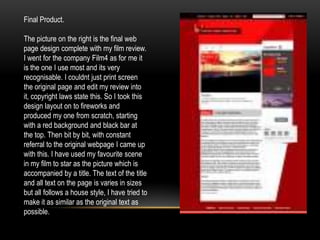
1. Final Product.
The picture on the right is the final web
page design complete with my film review.
I went for the company Film4 as for me it
is the one I use most and its very
recognisable. I couldnt just print screen
the original page and edit my review into
it, copyright laws state this. So I took this
design layout on to fireworks and
produced my one from scratch, starting
with a red background and black bar at
the top. Then bit by bit, with constant
referral to the original webpage I came up
with this. I have used my favourite scene
in my film to star as the picture which is
accompanied by a title. The text of the title
and all text on the page is varies in sizes
but all follows a house style, I have tried to
make it as similar as the original text as
possible.
2. My interpretation of the film 4 logo, I tried to get it
as exact as possible, I think the outcome is
decent.
This here is a screenshot of the process of the
webpage being created in fireworks. Here is
have started the background, simply filling it with
red then drawing a curve with a darker red, note
I have also started the task bar.
Here is a box that gives the reader the option to
share their findings with their friends on social
networking sites such as Facebook and twitter and
via email. I created this by making a white box adding
text, the logos were very hard to copy so I print
screened them and added them in, but changed the
colour slightly.
Every webpage has a search bar to make the audiences navigation around the
page a lot easier, here is the start of mine. I drew a white box and rounded the
edges with the eraser tool, then entered my chosen text, difficulty came when I
needed the magnifying glass, I saw no other option that to copy it in. Here the
background is red, this is because when it was screenshot it hadn't been
moved into place along the black bar