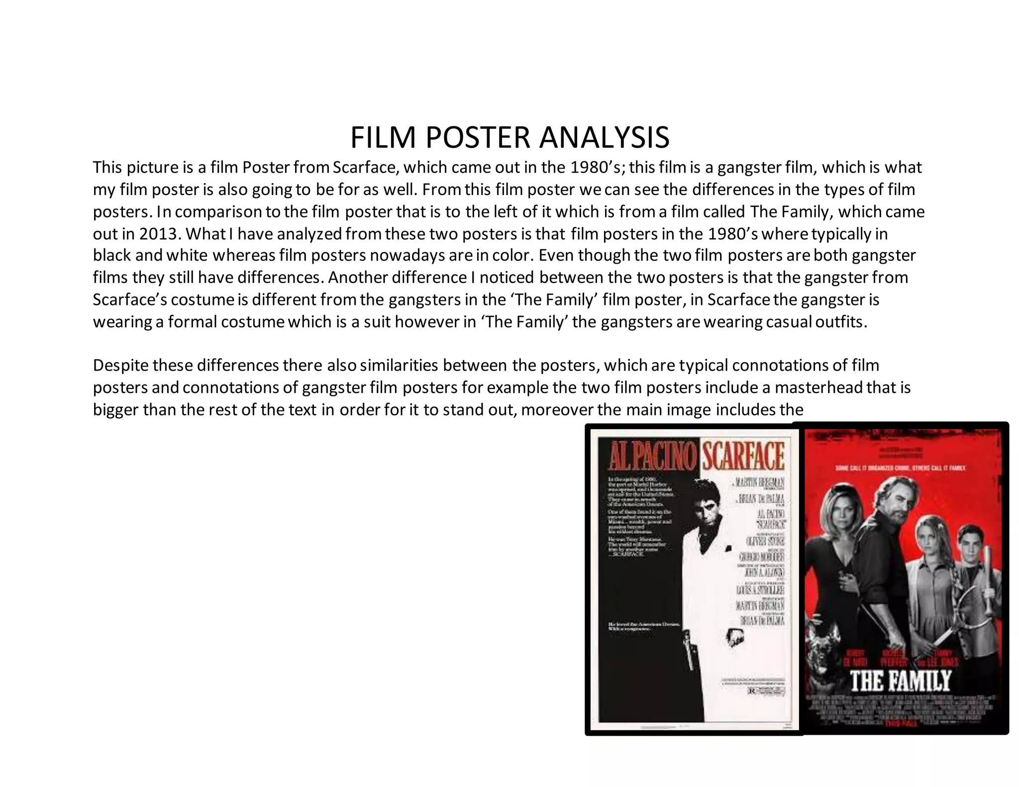
FILM POSTER ANALYSIS
This picture is a film Poster fromScarface, which came out in the 1980’s; this filmis a gangster film, which is what
my film poster is also going to be for as well. Fromthis film poster wecan see the differences in the types of film
posters. In comparison to the film poster that is to the left of it which is froma film called The Family, which came
out in 2013. WhatI have analyzed fromthese two posters is that film posters in the 1980’s wheretypically in
black and white whereas film posters nowadays arein color. Even though the two film posters areboth gangster
films they still have differences. Another difference I noticed between the two posters is that the gangster from
Scarface’s costumeis different fromthe gangsters in the ‘The Family’ film poster, in Scarfacethe gangster is
wearing a formal costumewhich is a suit however in ‘The Family’ the gangsters arewearing casualoutfits.
Despite these differences there also similarities between the posters, which are typical connotations of film
posters and connotations of gangster film posters for example the two film posters include a masterhead that is
bigger than the rest of the text in order for it to stand out, moreover the main image includes the
character/characters. Moreover thereis also smaller writing on both of the film posters that talks about the
characters in the film, producers, directors etc. Likewisethere also conations of gangster films that is included in
both of the film posters, for instancethe main characters in both film posters are holding weapons this tells the
audience that there is going to be violence in the film which is a typical feature of a gangster film. Another
connotation that both film posters haveis that there poster includes mostly dark and ominous colors this
connotes how the characters personalities are like which in most gangster films there personalities are dark and
ominous. Additionally the two film posters havered somewherein the posters this a connotation of blood which
indicates there will be shedding of blood in the film.
To conclude fromthis analysis I can see whatI need to include in my own film poster to make it similar other
Hollywood film posters. Fromlooking at the Scarfacefilm poster I can see that I will not use the same costume or
color schemebecause of the era that we in currently, including thosefeatures will make the film poster out of
time in history. However the other connotations fromboth of the film posters has given me ideas of how to
connote the rightmessage and make my film poster fit in with the right genre for example adding weapons to the
film poster and using a dark color scheme.
Film poster analysis

Film poster analysis

  • 1.
    FILM POSTER ANALYSIS Thispicture is a film Poster fromScarface, which came out in the 1980’s; this filmis a gangster film, which is what my film poster is also going to be for as well. Fromthis film poster wecan see the differences in the types of film posters. In comparison to the film poster that is to the left of it which is froma film called The Family, which came out in 2013. WhatI have analyzed fromthese two posters is that film posters in the 1980’s wheretypically in black and white whereas film posters nowadays arein color. Even though the two film posters areboth gangster films they still have differences. Another difference I noticed between the two posters is that the gangster from Scarface’s costumeis different fromthe gangsters in the ‘The Family’ film poster, in Scarfacethe gangster is wearing a formal costumewhich is a suit however in ‘The Family’ the gangsters arewearing casualoutfits. Despite these differences there also similarities between the posters, which are typical connotations of film posters and connotations of gangster film posters for example the two film posters include a masterhead that is bigger than the rest of the text in order for it to stand out, moreover the main image includes the
  • 2.
    character/characters. Moreover thereisalso smaller writing on both of the film posters that talks about the characters in the film, producers, directors etc. Likewisethere also conations of gangster films that is included in both of the film posters, for instancethe main characters in both film posters are holding weapons this tells the audience that there is going to be violence in the film which is a typical feature of a gangster film. Another connotation that both film posters haveis that there poster includes mostly dark and ominous colors this connotes how the characters personalities are like which in most gangster films there personalities are dark and ominous. Additionally the two film posters havered somewherein the posters this a connotation of blood which indicates there will be shedding of blood in the film. To conclude fromthis analysis I can see whatI need to include in my own film poster to make it similar other Hollywood film posters. Fromlooking at the Scarfacefilm poster I can see that I will not use the same costume or color schemebecause of the era that we in currently, including thosefeatures will make the film poster out of time in history. However the other connotations fromboth of the film posters has given me ideas of how to connote the rightmessage and make my film poster fit in with the right genre for example adding weapons to the film poster and using a dark color scheme.