Download as PDF, PPTX


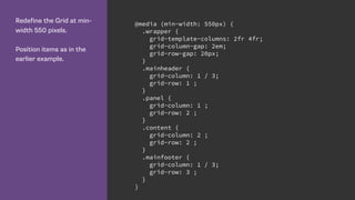
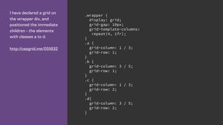
![Using line names
We name lines when
creating the grid. The name
goes in square brackets.
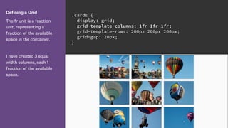
.cards {
display: grid;
grid-gap: 20px;
grid-template-columns: [side-start] 1fr
[main-start] 1fr 1fr
[main-end];
grid-template-rows: [main-start] 200px 200px
[main-end];
}](https://image.slidesharecdn.com/css-grid-50-wd-code-2016-160727212823/85/CSS-Grid-Layout-28-320.jpg)

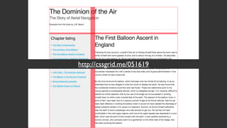
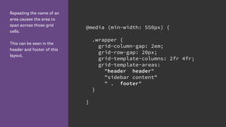
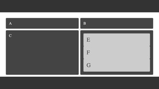
![Lines define Grid Areas
By creating lines named
main-start and end for
rows and columns, grid has
created me a named grid
area called ‘main’.
I can use that to position
my element rather than the
line numbers or names.
http://cssgrid.me/051617
.cards {
display: grid;
grid-gap: 20px;
grid-template-columns: [side-start] 1fr
[main-start] 1fr 1fr
[main-end];
grid-template-rows: [main-start] 200px 200px
[main-end];
}
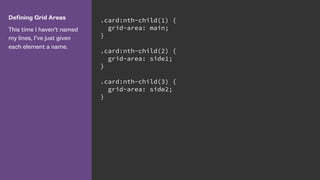
.card:nth-child(1) {
grid-area: main;
}](https://image.slidesharecdn.com/css-grid-50-wd-code-2016-160727212823/85/CSS-Grid-Layout-30-320.jpg)


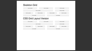
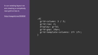
![Name lines with the name
in square brackets.
Remember we are naming
grid lines and not grid
tracks. .wrapper {
display: grid;
grid-row-gap: 10px;
grid-template-rows:
[row-header-start] auto
[row-content-start] auto
[row-panel-start] auto
[row-footer-start] auto [row-footer-end];
}](https://image.slidesharecdn.com/css-grid-50-wd-code-2016-160727212823/85/CSS-Grid-Layout-54-320.jpg)


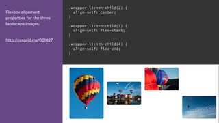
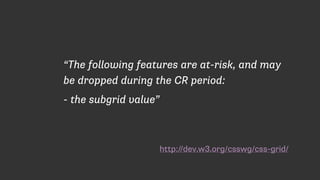
![We can give multiple grid
lines the same name.
This means we can use
the span keyword to span
n number of lines, rather
than specifying a specific
grid line.
.wrapper {
grid-template-columns:
repeat(4, [col-a] 200px [col-b] 100px);
}
.content {
grid-column: col-a 2 / span 2;
}
.aside {
grid-column: col-a 2 / span col-b 2;
}](https://image.slidesharecdn.com/css-grid-50-wd-code-2016-160727212823/85/CSS-Grid-Layout-74-320.jpg)


![Defining the 12 column
grid.
The repeat keyword
repeats the pattern of
columns or rows the
number of times specified
before the comma.
.wrapper {
display: grid;
grid-template-columns: repeat(12, [col] 1fr );
grid-template-rows: repeat(5, [row] auto) ;
grid-column-gap: 1em;
grid-row-gap: 15px;
}](https://image.slidesharecdn.com/css-grid-50-wd-code-2016-160727212823/85/CSS-Grid-Layout-78-320.jpg)


This document discusses CSS Grid Layout and provides examples of how to define grids and place items on grids. Some key points: - CSS Grid Layout allows dividing available space into columns and rows to position elements. - Grids are defined on parent elements using properties like grid-template-columns, grid-template-rows, and grid-template-areas. - Child elements can be placed on the grid using line-based placement with properties like grid-column and grid-row, or by targeting named lines and areas. - Grids can be redefined at different breakpoints to create responsive layouts without changing HTML structure.