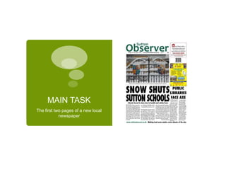
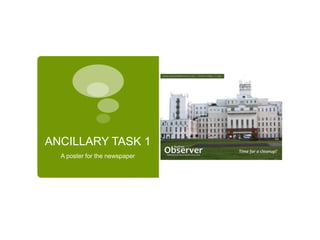
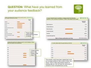
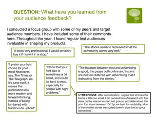
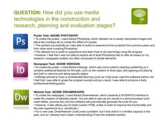
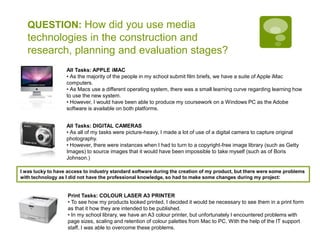
Evaluation Tom Sutherland – 4122Wilson’s School - 14743
BriefMAIN TASK: The first two pages of a new local newspaperANCILLARY TEXT 1: a poster for the newspaperANCILLARY TEXT 2: two hyperlinked pages from the paper’s website
MAIN TASKThe first two pages of a new local newspaper
ANCILLARY TASK 1A poster for the newspaper
ANCILLARY TASK 2Two hyperlinked pages from the paper’s website
QUESTION: In what ways does your media product use, develop or challenge forms and conventions of real media products?Advertising was necessary in order to make sure that the newspaper would be financially viable. As my newspaper is a pay publication, and the Sutton Guardian is free, I have included less advertising in my work.Large, sans-serif masthead font replicatedLarge, impact photography is of vital importance as it is also one of the audience’s  hook. As such, I made sure that in my publication, there was a photograph to grab the audience’s attention.Large, sans-serif, bold, black font for attracting the gaze of the target audience when on the news stand. Differences in density of font choices, based on research and audience feedback.Subhead works in conjunction with the headline to summarise the story and attract attention.Although a column style of text is retained across the two publications, I have conducted research into various fonts’ readability and have found that a darker print is often easier on the eyes than a lighter font.Cross-media convergence made evident, which is typical of a modern newspaper trying to sustain its readership by exploring more modern and digital platforms.
QUESTION: In what ways does your media product use, develop or challenge forms and conventions of real media products?Masthead colour schemes are representative of brand images. I chose green as my colour set to represent the local area.All of these newspapers have large headlines, in a black, bold and sans-serif headline font for maximum readability and impact. I chose to adhere to this convention.
QUESTION: How effective is the combination of your main product and ancillary texts?Embracing modern media for communication of the news. Audience members are able to search for a story that interests them, look at the most read/shared/commented stories, or select a menu at the top of the page to select a type of story.Colour scheme is kept consistent; logo appears across texts to encourage brand continuity and audience recognitionPublication details are included here to inform audiences of when they can buy the newspaper – this is fairly conventional information to include on a poster. Otherwise, the value of the promotional material would be diminished.Here, the colour of the logo was changed, to improve the contrast against the green of the grass. However, as the logo itself if the same (i.e. the text font/size,) there was no impact on recognition. Additionally, as it was placed against a green background, the brand was anchored.I removed the sky from this photograph using the Magic Wand tool in Photoshop in order to avoid over-burdening the page with colour. Additionally, it contributes to the overall feel of the poster by making the building seem strange, and thus “time for a cleanup.”Large image, representative of the local area. This anchors the publication as being local as the majority of the target audience will recognise the landmark.
QUESTION: In what ways does your media product use, develop or challenge forms and conventions of real media products?The poster on the left for The Guardian subverts the convention of Newspaper posters; instead of an image, it simply has text. The lack of an image helps to create universal appeal. However, this can be done with an image also, as seen below.Large background image has an impact; attracts attention of the audience. For a local newspaper, locally recognised landmarks help to anchor the audience.
QUESTION: How effective is the combination of your main product and ancillary texts?Brand continuity is maintained by including the masthead across multiple media both in reality and in my coursework.Constantly updating headlines; appeal of online newsAll of these websites have search functionality and allow users to select stories based on categories (generally at the top.) I included this on my website.This website (right) proved least popular with the audience, due to its dark background colour schemeEncourages user interaction; digital media; Web 2.0
QUESTION: How effective is the combination of your main product and ancillary texts?A large proportion of the inspiration for my tasks came from the Sutton Council website, which represents their colour scheme well.The website uses lots of dark greens and large, sans-serif fonts, which I have largely mimicked in my coursework.Furthermore, they encourage interaction with social media / Web 2.0 so I decided to integrate social media such as Facebook, Twitter and citizen journalism (in the form of comments and user submissions) into my own project.I feel that although my products anchor and connote Sutton to the intended target audience (Sutton residents), the products work well on their own and the colour scheme is appealing even without that reference.
QUESTION: What have you learned from your audience feedback?Before starting my production, I emailed East Surrey and Sussex News and Media, who currently publish several local newspapers and magazines.From this, I was able to see that there is a gap in the market for a pay-publication in the Sutton area.Most publications are funded by advertising, and I learnt that prices are determined by readership figures (often produced by ABC) and advertising space is charged per column inch/cm. As this was only a coursework task, there was limited scope for setting advertising costs and there were no real charges involved. For the purposes of mimicking reality, I chose a price point of £4.50/inch
QUESTION: What have you learned from your audience feedback?These results influenced my choice of stories.Both of these publications are freeI chose a price point in the middle of this range; 50pThis answer could have been researched more, as my target audience data is fairly limited. As a result, I had to make assumptions based on existing data as I did not have the resources to conduct a more comprehensive survey.
QUESTION: What have you learned from your audience feedback?I conducted a focus group with some of my peers and target audience members. I have included some of their comments here. Throughout the year, I found regular test audiences invaluable in shaping my products.“The stories seem to represent what the community wants very well.”“It looks very professional, I would certainly buy it if I saw it in a shop.”“I prefer your font choice for your mast-head over, say, The Times or The Telegraph. As it’s sans-serif, it makes the publication look more modern and forward-thinking, instead of being lumbered with traditions to uphold”“I think that your font size is sometimes a bit small, and could be hard to read, especially for people with sight problems."“The balance between cost and advertising is good, the pages both online and in print are not too cluttered with advertising that it distracting from the stories.”MYRESPONSE: after consideration, I agree that at times the font is a little too small. I did conduct lots of research into font sizes on the internet and on test groups, and determined that print font sizes between 10-12pt are best for readability. Most of the smaller stories are scaled down in size due to space constraints.
QUESTION: How did you use media technologies in the construction and research, planning and evaluation stages?Poster Task: ADOBE PHOTOSHOPTo create the poster, I used Adobe Photoshop, which allowed me to easily manipulate images and place text overlays etc to create the effect of a poster.
This worked successfully as I was able to build on experience from projects from previous years and from other work involving Photoshop.

Evaluation - T Sutherland 4122

  • 1.
    Evaluation Tom Sutherland– 4122Wilson’s School - 14743
  • 2.
    BriefMAIN TASK: Thefirst two pages of a new local newspaperANCILLARY TEXT 1: a poster for the newspaperANCILLARY TEXT 2: two hyperlinked pages from the paper’s website
  • 3.
    MAIN TASKThe firsttwo pages of a new local newspaper
  • 4.
    ANCILLARY TASK 1Aposter for the newspaper
  • 5.
    ANCILLARY TASK 2Twohyperlinked pages from the paper’s website
  • 6.
    QUESTION: In whatways does your media product use, develop or challenge forms and conventions of real media products?Advertising was necessary in order to make sure that the newspaper would be financially viable. As my newspaper is a pay publication, and the Sutton Guardian is free, I have included less advertising in my work.Large, sans-serif masthead font replicatedLarge, impact photography is of vital importance as it is also one of the audience’s hook. As such, I made sure that in my publication, there was a photograph to grab the audience’s attention.Large, sans-serif, bold, black font for attracting the gaze of the target audience when on the news stand. Differences in density of font choices, based on research and audience feedback.Subhead works in conjunction with the headline to summarise the story and attract attention.Although a column style of text is retained across the two publications, I have conducted research into various fonts’ readability and have found that a darker print is often easier on the eyes than a lighter font.Cross-media convergence made evident, which is typical of a modern newspaper trying to sustain its readership by exploring more modern and digital platforms.
  • 7.
    QUESTION: In whatways does your media product use, develop or challenge forms and conventions of real media products?Masthead colour schemes are representative of brand images. I chose green as my colour set to represent the local area.All of these newspapers have large headlines, in a black, bold and sans-serif headline font for maximum readability and impact. I chose to adhere to this convention.
  • 8.
    QUESTION: How effectiveis the combination of your main product and ancillary texts?Embracing modern media for communication of the news. Audience members are able to search for a story that interests them, look at the most read/shared/commented stories, or select a menu at the top of the page to select a type of story.Colour scheme is kept consistent; logo appears across texts to encourage brand continuity and audience recognitionPublication details are included here to inform audiences of when they can buy the newspaper – this is fairly conventional information to include on a poster. Otherwise, the value of the promotional material would be diminished.Here, the colour of the logo was changed, to improve the contrast against the green of the grass. However, as the logo itself if the same (i.e. the text font/size,) there was no impact on recognition. Additionally, as it was placed against a green background, the brand was anchored.I removed the sky from this photograph using the Magic Wand tool in Photoshop in order to avoid over-burdening the page with colour. Additionally, it contributes to the overall feel of the poster by making the building seem strange, and thus “time for a cleanup.”Large image, representative of the local area. This anchors the publication as being local as the majority of the target audience will recognise the landmark.
  • 9.
    QUESTION: In whatways does your media product use, develop or challenge forms and conventions of real media products?The poster on the left for The Guardian subverts the convention of Newspaper posters; instead of an image, it simply has text. The lack of an image helps to create universal appeal. However, this can be done with an image also, as seen below.Large background image has an impact; attracts attention of the audience. For a local newspaper, locally recognised landmarks help to anchor the audience.
  • 10.
    QUESTION: How effectiveis the combination of your main product and ancillary texts?Brand continuity is maintained by including the masthead across multiple media both in reality and in my coursework.Constantly updating headlines; appeal of online newsAll of these websites have search functionality and allow users to select stories based on categories (generally at the top.) I included this on my website.This website (right) proved least popular with the audience, due to its dark background colour schemeEncourages user interaction; digital media; Web 2.0
  • 11.
    QUESTION: How effectiveis the combination of your main product and ancillary texts?A large proportion of the inspiration for my tasks came from the Sutton Council website, which represents their colour scheme well.The website uses lots of dark greens and large, sans-serif fonts, which I have largely mimicked in my coursework.Furthermore, they encourage interaction with social media / Web 2.0 so I decided to integrate social media such as Facebook, Twitter and citizen journalism (in the form of comments and user submissions) into my own project.I feel that although my products anchor and connote Sutton to the intended target audience (Sutton residents), the products work well on their own and the colour scheme is appealing even without that reference.
  • 12.
    QUESTION: What haveyou learned from your audience feedback?Before starting my production, I emailed East Surrey and Sussex News and Media, who currently publish several local newspapers and magazines.From this, I was able to see that there is a gap in the market for a pay-publication in the Sutton area.Most publications are funded by advertising, and I learnt that prices are determined by readership figures (often produced by ABC) and advertising space is charged per column inch/cm. As this was only a coursework task, there was limited scope for setting advertising costs and there were no real charges involved. For the purposes of mimicking reality, I chose a price point of £4.50/inch
  • 13.
    QUESTION: What haveyou learned from your audience feedback?These results influenced my choice of stories.Both of these publications are freeI chose a price point in the middle of this range; 50pThis answer could have been researched more, as my target audience data is fairly limited. As a result, I had to make assumptions based on existing data as I did not have the resources to conduct a more comprehensive survey.
  • 14.
    QUESTION: What haveyou learned from your audience feedback?I conducted a focus group with some of my peers and target audience members. I have included some of their comments here. Throughout the year, I found regular test audiences invaluable in shaping my products.“The stories seem to represent what the community wants very well.”“It looks very professional, I would certainly buy it if I saw it in a shop.”“I prefer your font choice for your mast-head over, say, The Times or The Telegraph. As it’s sans-serif, it makes the publication look more modern and forward-thinking, instead of being lumbered with traditions to uphold”“I think that your font size is sometimes a bit small, and could be hard to read, especially for people with sight problems."“The balance between cost and advertising is good, the pages both online and in print are not too cluttered with advertising that it distracting from the stories.”MYRESPONSE: after consideration, I agree that at times the font is a little too small. I did conduct lots of research into font sizes on the internet and on test groups, and determined that print font sizes between 10-12pt are best for readability. Most of the smaller stories are scaled down in size due to space constraints.
  • 15.
    QUESTION: How didyou use media technologies in the construction and research, planning and evaluation stages?Poster Task: ADOBE PHOTOSHOPTo create the poster, I used Adobe Photoshop, which allowed me to easily manipulate images and place text overlays etc to create the effect of a poster.
  • 16.
    This worked successfullyas I was able to build on experience from projects from previous years and from other work involving Photoshop.