Evaluation Question 7
Looking back at your preliminary what do you feel
you have learnt from it to your final product?
Research and Planning
When comparing my preliminary magazine to my final product it is clear that
researching has definitely helped me to incorporate more commonly used
conventions into my magazine. Recognising dead space is also something my
research helped m fix as it is clear i have tried to replace all dead space with
headings or images to make the magazine look more realistic. By researching for
my magazine I also became more of aware of the important of colours and fonts
and how they can completely change the image of a magazine. It is clear when
comparing the preliminary product and final product that researching and planning
has allowed me to manage time better to create a product with more conventions
and similarities to those of an actual magazine.
Mast heads
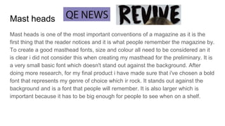
Mast heads is one of the most important conventions of a magazine as it is the
first thing that the reader notices and it is what people remember the magazine by.
To create a good masthead fonts, size and colour all need to be considered an it
is clear i did not consider this when creating my masthead for the preliminary. It is
a very small basic font which doesn't stand out against the background. After
doing more research, for my final product i have made sure that i've chosen a bold
font that represents my genre of choice which ir rock. It stands out against the
background and is a font that people will remember. It is also larger which is
important because it has to be big enough for people to see when on a shelf.
Image and Shot type
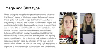
When taking the image for my preliminary product it is clear
that I wasn't aware of lighting or angles. I also wasn't aware
that to get a high quality image that fits the image of your
magazine you need to take pictures from different angles and
positions and possible change costume or use props so there
are options. This is something I learned when producing my
final product and this gave me the opportunity to choose
between different high quality images to product the most
realistic looking product possible. It is very clear that lighting
wasn't considered on the preliminary task as the model's face
is dark and doesn't stand out whereas on the final product
research has allowed me to know that using high key lighting is
important to make the image stand out and look professional.
Titles and sell lines
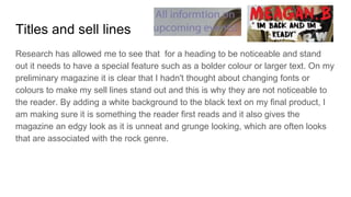
Research has allowed me to see that for a heading to be noticeable and stand
out it needs to have a special feature such as a bolder colour or larger text. On my
preliminary magazine it is clear that I hadn't thought about changing fonts or
colours to make my sell lines stand out and this is why they are not noticeable to
the reader. By adding a white background to the black text on my final product, I
am making sure it is something the reader first reads and it also gives the
magazine an edgy look as it is unneat and grunge looking, which are often looks
that are associated with the rock genre.

Evaluation question 7

  • 1.
    Evaluation Question 7 Lookingback at your preliminary what do you feel you have learnt from it to your final product?
  • 3.
    Research and Planning Whencomparing my preliminary magazine to my final product it is clear that researching has definitely helped me to incorporate more commonly used conventions into my magazine. Recognising dead space is also something my research helped m fix as it is clear i have tried to replace all dead space with headings or images to make the magazine look more realistic. By researching for my magazine I also became more of aware of the important of colours and fonts and how they can completely change the image of a magazine. It is clear when comparing the preliminary product and final product that researching and planning has allowed me to manage time better to create a product with more conventions and similarities to those of an actual magazine.
  • 4.
    Mast heads Mast headsis one of the most important conventions of a magazine as it is the first thing that the reader notices and it is what people remember the magazine by. To create a good masthead fonts, size and colour all need to be considered an it is clear i did not consider this when creating my masthead for the preliminary. It is a very small basic font which doesn't stand out against the background. After doing more research, for my final product i have made sure that i've chosen a bold font that represents my genre of choice which ir rock. It stands out against the background and is a font that people will remember. It is also larger which is important because it has to be big enough for people to see when on a shelf.
  • 5.
    Image and Shottype When taking the image for my preliminary product it is clear that I wasn't aware of lighting or angles. I also wasn't aware that to get a high quality image that fits the image of your magazine you need to take pictures from different angles and positions and possible change costume or use props so there are options. This is something I learned when producing my final product and this gave me the opportunity to choose between different high quality images to product the most realistic looking product possible. It is very clear that lighting wasn't considered on the preliminary task as the model's face is dark and doesn't stand out whereas on the final product research has allowed me to know that using high key lighting is important to make the image stand out and look professional.
  • 6.
    Titles and selllines Research has allowed me to see that for a heading to be noticeable and stand out it needs to have a special feature such as a bolder colour or larger text. On my preliminary magazine it is clear that I hadn't thought about changing fonts or colours to make my sell lines stand out and this is why they are not noticeable to the reader. By adding a white background to the black text on my final product, I am making sure it is something the reader first reads and it also gives the magazine an edgy look as it is unneat and grunge looking, which are often looks that are associated with the rock genre.