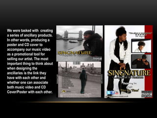
The document discusses how effectively the main music video product and accompanying ancillary texts of a poster and CD cover were designed to promote an artist. Key points made include:
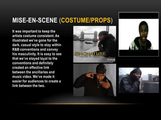
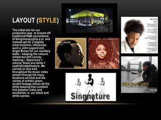
- Costume, props, and locations were kept consistent between the products to clearly link them and position the artist as a mainstream city musician.
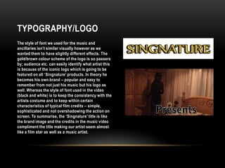
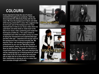
- Font, logo, and color scheme choices were made to represent the artist as their own recognizable brand across all products.
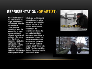
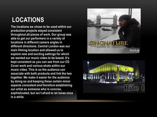
- Locations in and around London were used to portray the artist as both emotionally deep but also modern and urban.
- Color, especially red, was used consistently to imply themes of passion and strength within the artist's relationship and music.


![Nicola media dont_delete[1]](https://cdn.slidesharecdn.com/ss_thumbnails/nicolamediadontdelete1-130108174209-phpapp02-thumbnail.jpg?width=640&height=640&fit=bounds)


