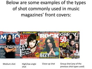
The document discusses conventions of real rock music magazines that the media product does or does not follow. It follows conventions like using the genre's common color scheme of black, red, brown, and yellow. It also uses standard shot types like medium and close-up shots for cover photos. However, it challenges conventions by using a wide variety of fonts instead of the same ones throughout, and by including a smiling cover photo subject rather than a serious expression. The document analyzes examples from magazines like MOJO and NME to make these points.