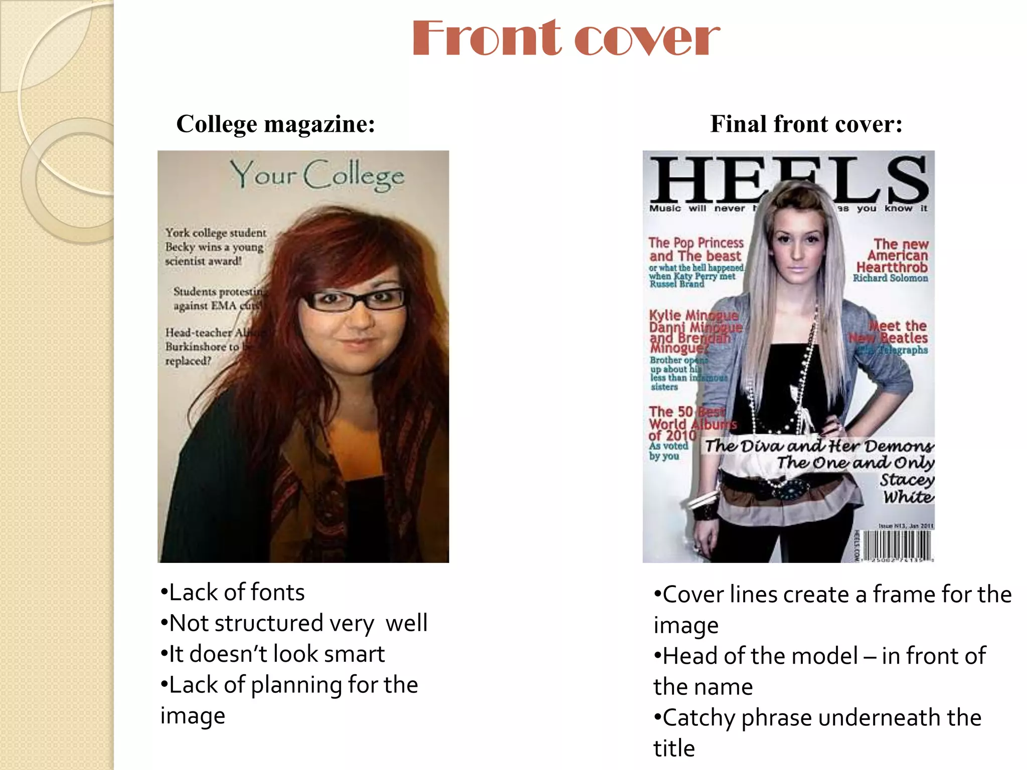
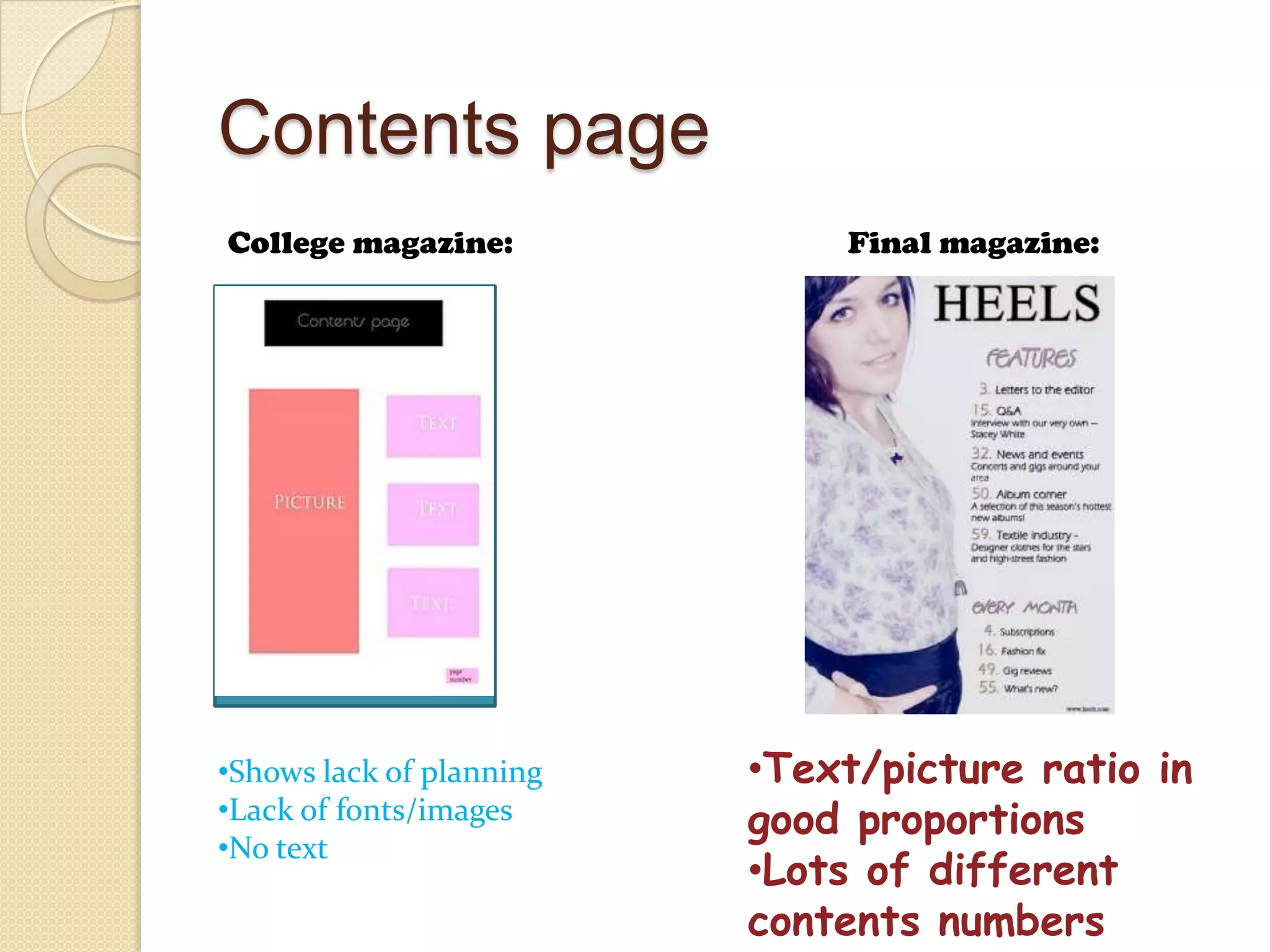
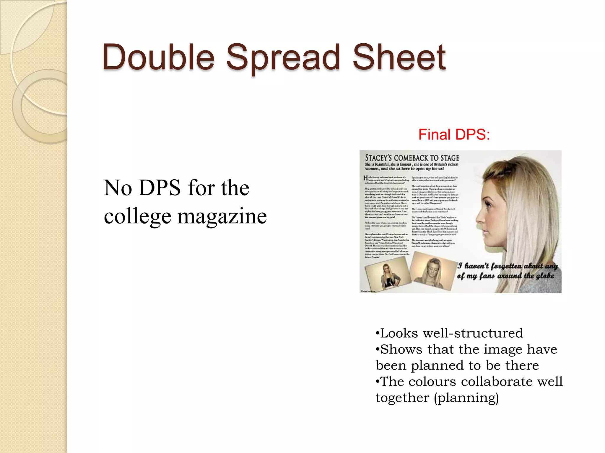
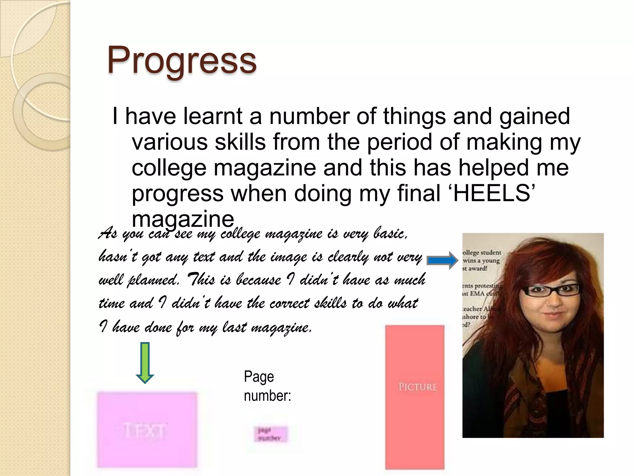
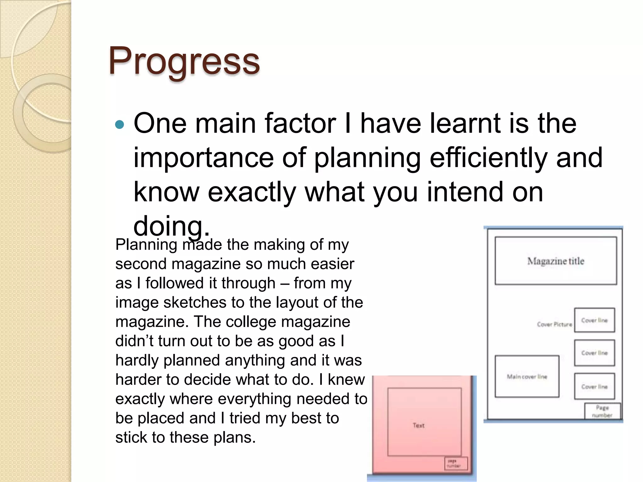
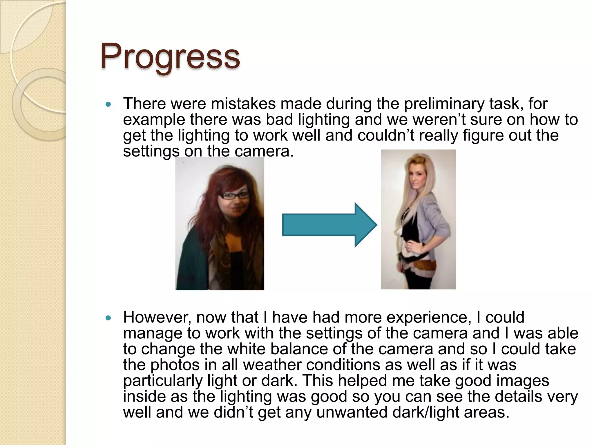
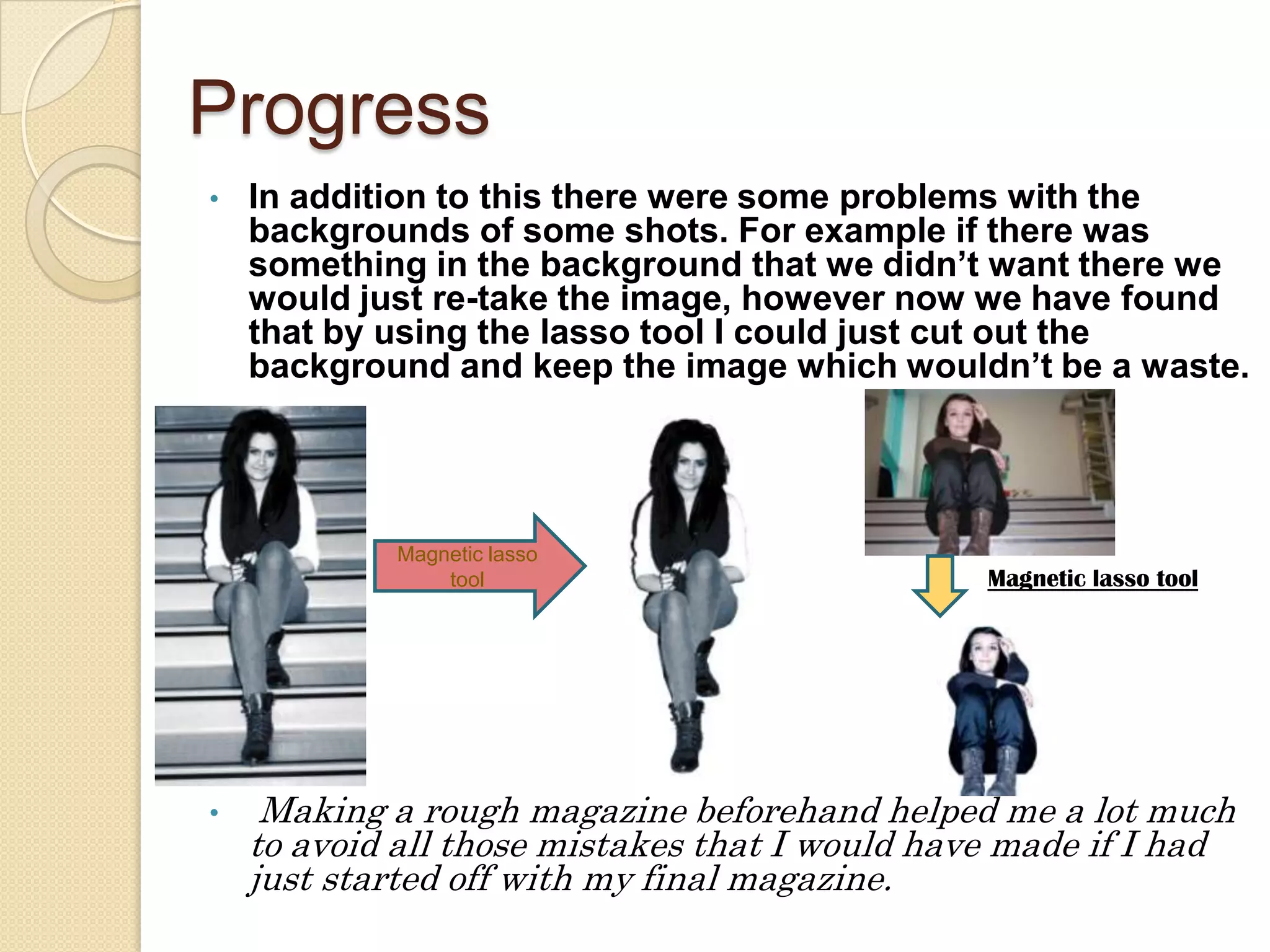
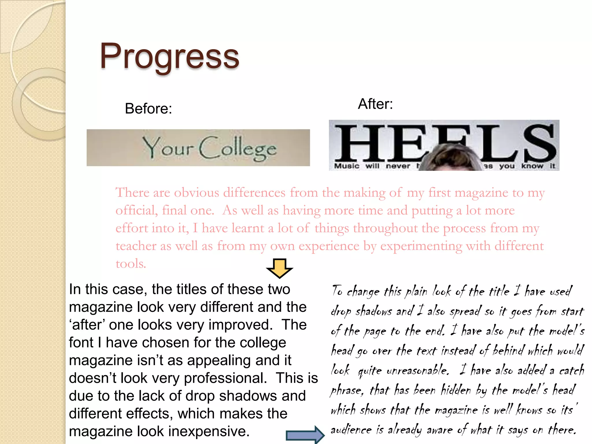
The document compares the student's preliminary college magazine to their final magazine project. They learned that planning is essential, as their preliminary magazine lacked structure and planning. Their final magazine benefited from thorough planning, including sketches and layout plans. The student also gained photography skills, like managing lighting and using photo editing tools. Overall, their final magazine showed significant improvement in design, structure, and professionalism compared to their earlier preliminary work.
These are a few of the many tasks that you will have to do while you are making your Camera ready copy. Once you are done with all the tasks, the copy will get published and you will get your book ready.
Geo-Targeting Paid Search Tactics: Have We All Been Doing It Wrong?Mediative
Pay Per Click Advertising case studies showing what happened when Mediative tested an opt-out versus the traditional opt-in approach to geo-targeting in AdWords.
You're on LinkedIn so now what? This presentation provides insight into how your business can benefit from utilizing LinkedIn is ways that you might not of realized were even possible. Learn to leverage LinkedIn's robust business features to leverage the true power of LinkedIn for your business.
This is me looking at different techniques that magazine publishers use to draw the reader in and to define their audience. This is giving me a better understanding of what my magazine should look like according to my audience and is making me understand how important it is to look everything in detail and make sure that people are going to like it.
16. Progress One main factor I have learnt is the importance of planning efficiently and know exactly what you intend on doing. Planning made the making of my second magazine so much easier as I followed it through – from my image sketches to the layout of the magazine. The college magazine didn’t turn out to be as good as I hardly planned anything and it was harder to decide what to do. I knew exactly where everything needed to be placed and I tried my best to stick to these plans.
17. Progress There were mistakes made during the preliminary task, for example there was bad lighting and we weren’t sure on how to get the lighting to work well and couldn’t really figure out the settings on the camera. However, now that I have had more experience, I could manage to work with the settings of the camera and I was able to change the white balance of the camera and so I could take the photos in all weather conditions as well as if it was particularly light or dark. This helped me take good images inside as the lighting was good so you can see the details very well and we didn’t get any unwanted dark/light areas.
18.
19. Making a rough magazine beforehand helped me a lot much to avoid all those mistakes that I would have made if I had just started off with my final magazine. Magnetic lasso tool Magnetic lasso tool
20. Progress After: Before: There are obvious differences from the making of my first magazine to my official, final one. As well as having more time and putting a lot more effort into it, I have learnt a lot of things throughout the process from my teacher as well as from my own experience by experimenting with different tools. In this case, the titles of these two magazine look very different and the ‘after’ one looks very improved. The font I have chosen for the college magazine isn’t as appealing and it doesn’t look very professional. This is due to the lack of drop shadows and different effects, which makes the magazine look inexpensive. To change this plain look of the title I have used drop shadows and I also spread so it goes from start of the page to the end. I have also put the model’s head go over the text instead of behind which would look quite unreasonable. I have also added a catch phrase, that has been hidden by the model’s head which shows that the magazine is well knows so its’ audience is already aware of what it says on there.