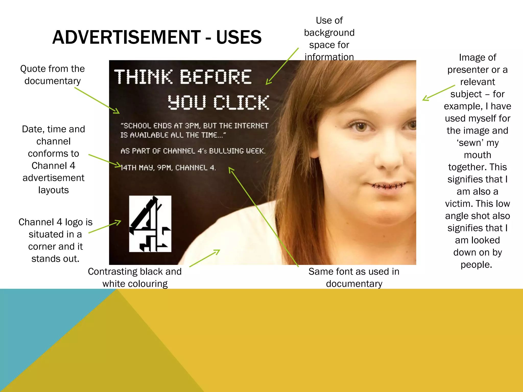
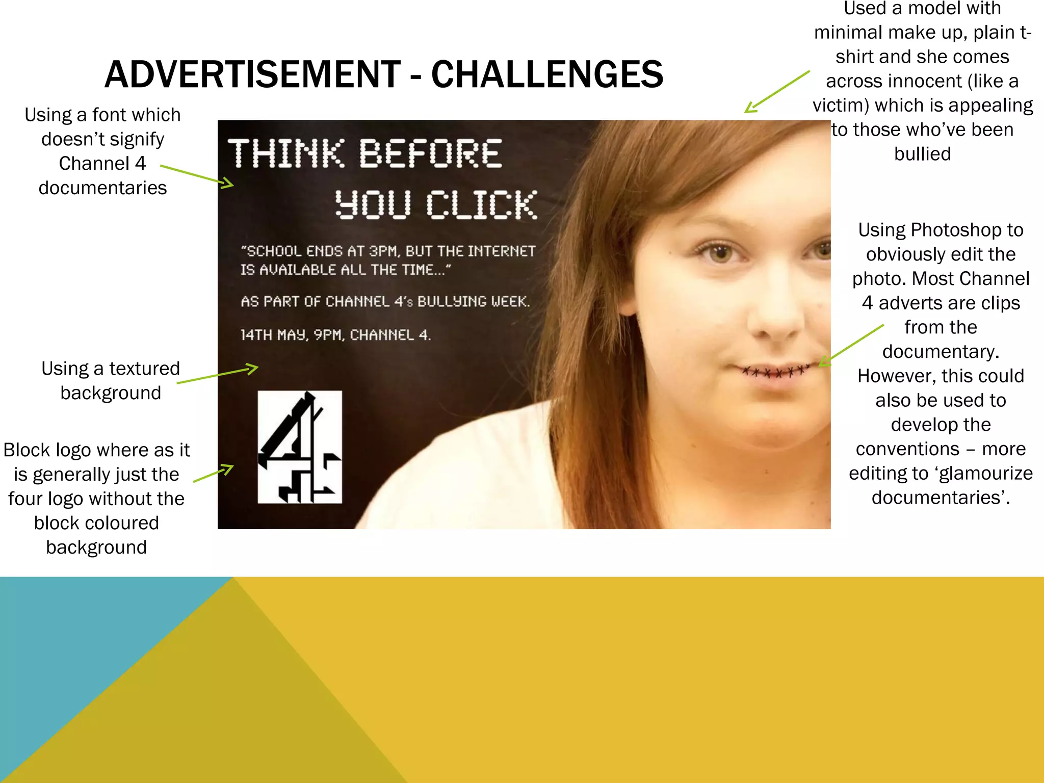
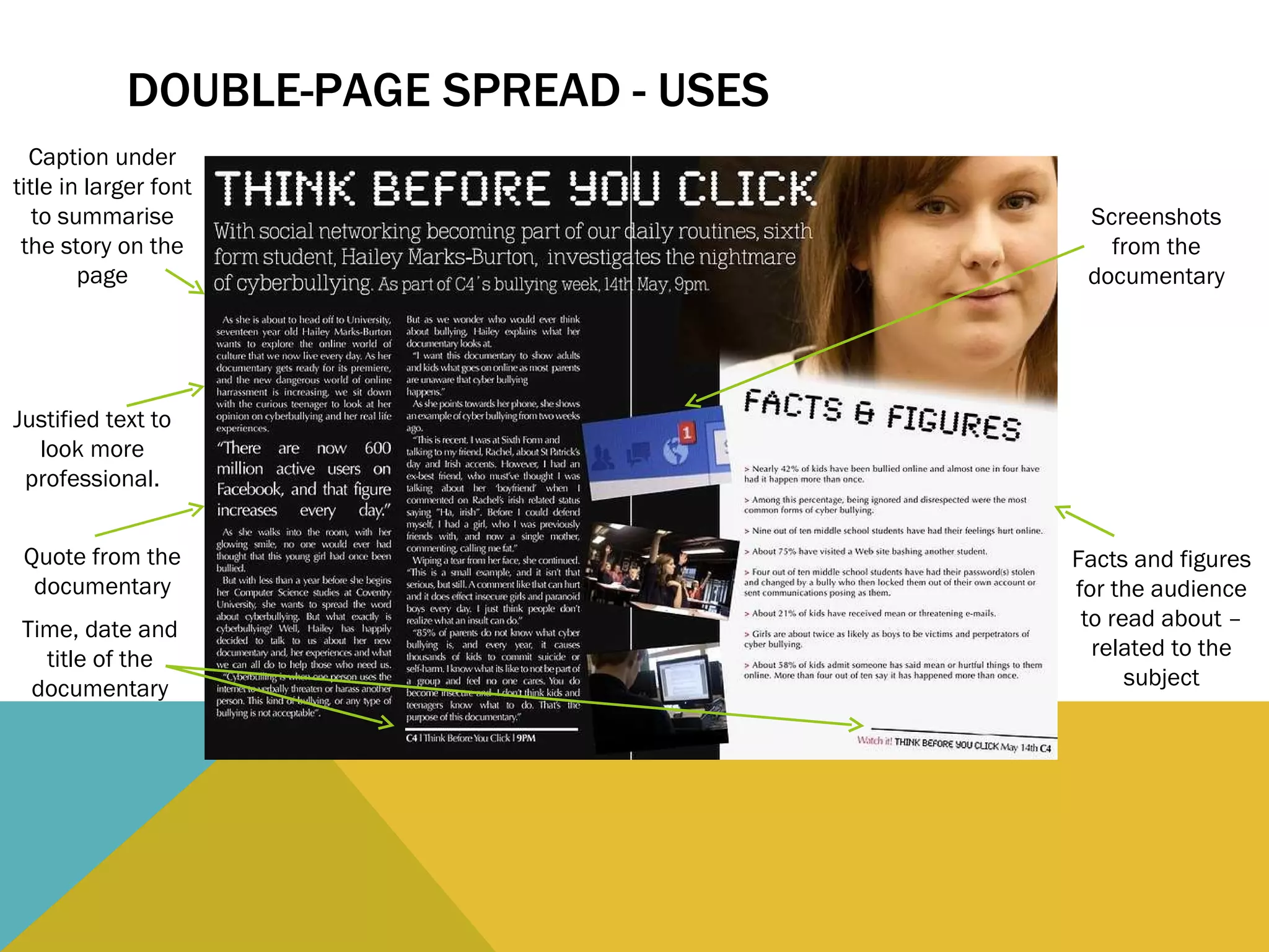
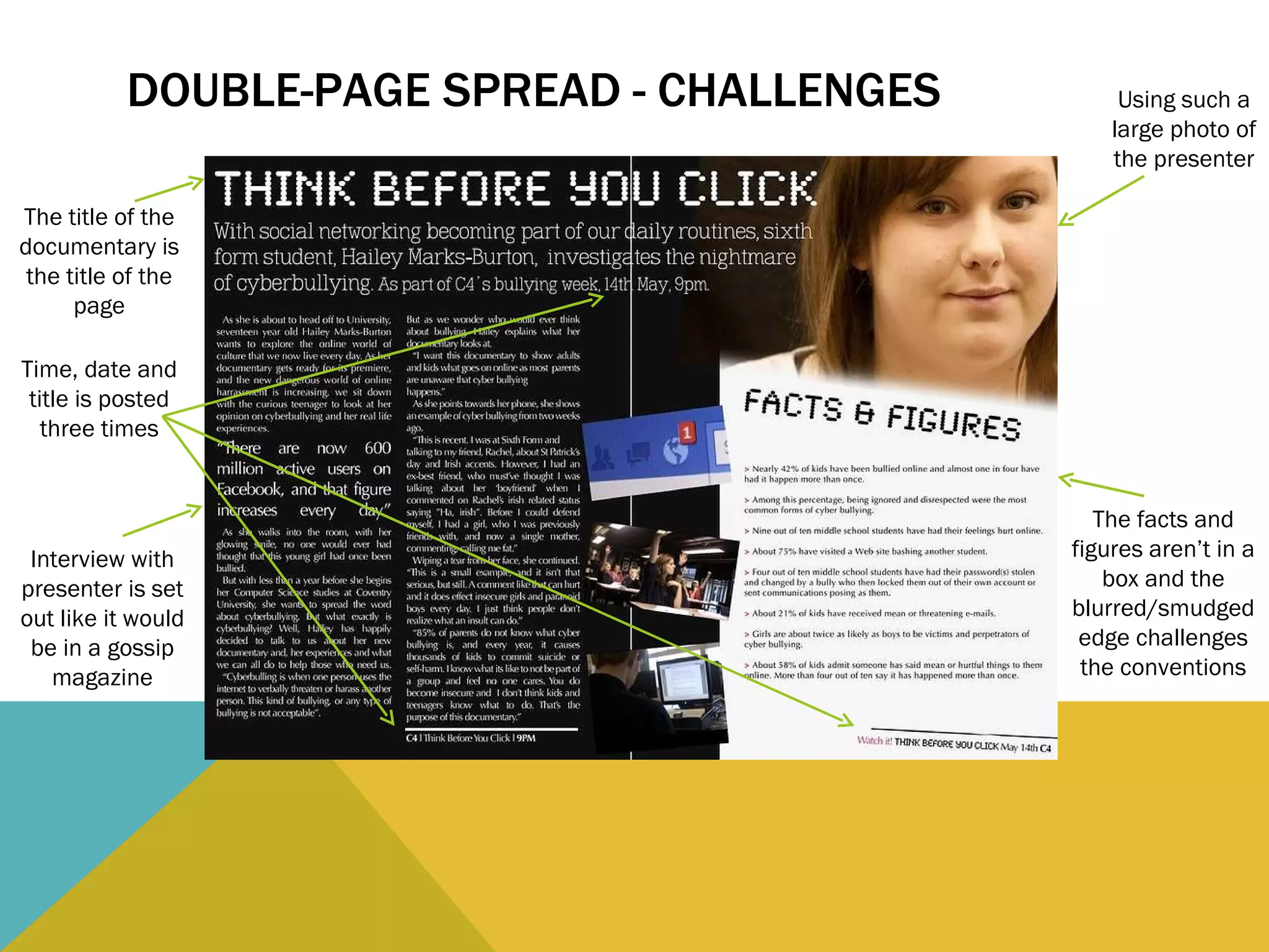
This document evaluates the design of a Channel 4 advertisement and double-page spread for a documentary. It identifies conventions that are used effectively, such as including the Channel 4 logo, relevant images, and style elements consistent with the channel. It also notes some challenges, such as obvious photo editing, repetitive text, and a layout that resembles a gossip magazine more than an informational documentary. The goal is to develop conventions while still attracting viewers to learn about important issues.
