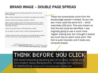
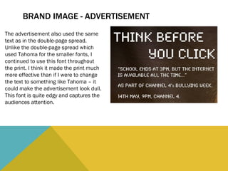
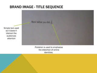
The document discusses the branding and design choices made for a documentary project and accompanying materials. For the double-page spread and advertisement, the author kept a consistent brand image using a specific futuristic font resembling LED print. However, a simpler font was used for the documentary's opening titles to avoid distraction and allow easier reading when filmed. Pixilation was also used in the titles to emphasize the distortion of online identities.