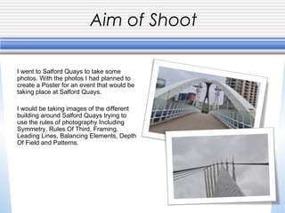
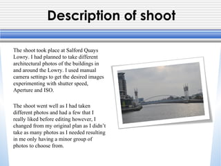
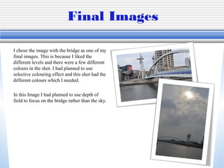
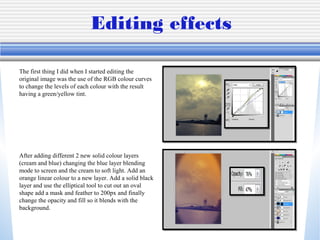
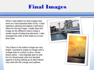
Photo Shoot Review
Callum Harrison
Unit 57: Photography and
Photographic Practice
Task 3 Selection of final images &
review
Aim of Shoot
I went to Salford Quays to take some
photos. With the photos I had planned to
create a Poster for an event that would be
taking place at Salford Quays.
I would be taking images of the different
building around Salford Quays trying to
use the rules of photography Including
Symmetry, Rules Of Third, Framing,
Leading Lines, Balancing Elements, Depth
Of Field and Patterns.
Description of shoot
The shoot took place at Salford Quays
Lowry. I had planned to take different
architectural photos of the buildings in
and around the Lowry. I used manual
camera settings to get the desired images
experimenting with shutter speed,
Aperture and ISO.
The shoot went well as I had taken
different photos and had a few that I
really liked before editing however, I
changed from my original plan as I didn’t
take as many photos as I needed resulting
in me only having a minor group of
photos to choose from.
Final Images
I chose the image with the bridge as one of my
final images. This is because I liked the
different levels and there were a few different
colours in the shot. I had planned to use
selective colouring effect and this shot had the
different colours which I needed.
In this Image I had planned to use depth of
field to focus on the bridge rather than the sky.
Editing effects
The first thing I did when I started editing the
original image was the use of the RGB colour curves
to change the levels of each colour with the result
having a green/yellow tint.

After adding different 2 new solid colour layers
(cream and blue) changing the blue layer blending
mode to screen and the cream to soft light. Add an
orange linear colour to a new layer. Add a solid black
layer and use the elliptical tool to cut out an oval
shape add a mask and feather to 200px and finally
change the opacity and fill so it blends with the
background.
Final Images
When I had edited my final images they
were as I had expected them to be. I used
selective coloring and added a soft focus
effect for the top image. I really liked this
image as the different colors create a
similar result of balancing elements. I also
changed the color of the water to a more
blue color.

The Colors in the bottom image are very
bright, I wanted to create an image with a
vintage look to it which is why I chose
these colors, I did originally plan to add
tint of a blue/purple color but decided
against it during editing as id didn’t blend
very well with the orange and yellows.
Capture log
• Setting – Manual
• Aperture 4.7
• ISO: ISO-100
Rejected Images
After looking at the images I had taken, there
were a few that I didn’t believe were good
enough to use.
The images on the left are a few examples of
the images that I didn’t use. There are different
reasons why I didn’t use each of the images, I
didn’t use the top image because there was
nothing about it that I liked, the depth of field
on the bottom right image was too strong for
the image. Finally the bottom right image I had
tried to use reflection but I the reflection
wasn’t anything special.

Evaluation of photos

  • 1.
    Photo Shoot Review CallumHarrison Unit 57: Photography and Photographic Practice Task 3 Selection of final images & review
  • 2.
    Aim of Shoot Iwent to Salford Quays to take some photos. With the photos I had planned to create a Poster for an event that would be taking place at Salford Quays. I would be taking images of the different building around Salford Quays trying to use the rules of photography Including Symmetry, Rules Of Third, Framing, Leading Lines, Balancing Elements, Depth Of Field and Patterns.
  • 3.
    Description of shoot Theshoot took place at Salford Quays Lowry. I had planned to take different architectural photos of the buildings in and around the Lowry. I used manual camera settings to get the desired images experimenting with shutter speed, Aperture and ISO. The shoot went well as I had taken different photos and had a few that I really liked before editing however, I changed from my original plan as I didn’t take as many photos as I needed resulting in me only having a minor group of photos to choose from.
  • 4.
    Final Images I chosethe image with the bridge as one of my final images. This is because I liked the different levels and there were a few different colours in the shot. I had planned to use selective colouring effect and this shot had the different colours which I needed. In this Image I had planned to use depth of field to focus on the bridge rather than the sky.
  • 5.
    Editing effects The firstthing I did when I started editing the original image was the use of the RGB colour curves to change the levels of each colour with the result having a green/yellow tint. After adding different 2 new solid colour layers (cream and blue) changing the blue layer blending mode to screen and the cream to soft light. Add an orange linear colour to a new layer. Add a solid black layer and use the elliptical tool to cut out an oval shape add a mask and feather to 200px and finally change the opacity and fill so it blends with the background.
  • 6.
    Final Images When Ihad edited my final images they were as I had expected them to be. I used selective coloring and added a soft focus effect for the top image. I really liked this image as the different colors create a similar result of balancing elements. I also changed the color of the water to a more blue color. The Colors in the bottom image are very bright, I wanted to create an image with a vintage look to it which is why I chose these colors, I did originally plan to add tint of a blue/purple color but decided against it during editing as id didn’t blend very well with the orange and yellows.
  • 7.
    Capture log • Setting– Manual • Aperture 4.7 • ISO: ISO-100
  • 8.
    Rejected Images After lookingat the images I had taken, there were a few that I didn’t believe were good enough to use. The images on the left are a few examples of the images that I didn’t use. There are different reasons why I didn’t use each of the images, I didn’t use the top image because there was nothing about it that I liked, the depth of field on the bottom right image was too strong for the image. Finally the bottom right image I had tried to use reflection but I the reflection wasn’t anything special.