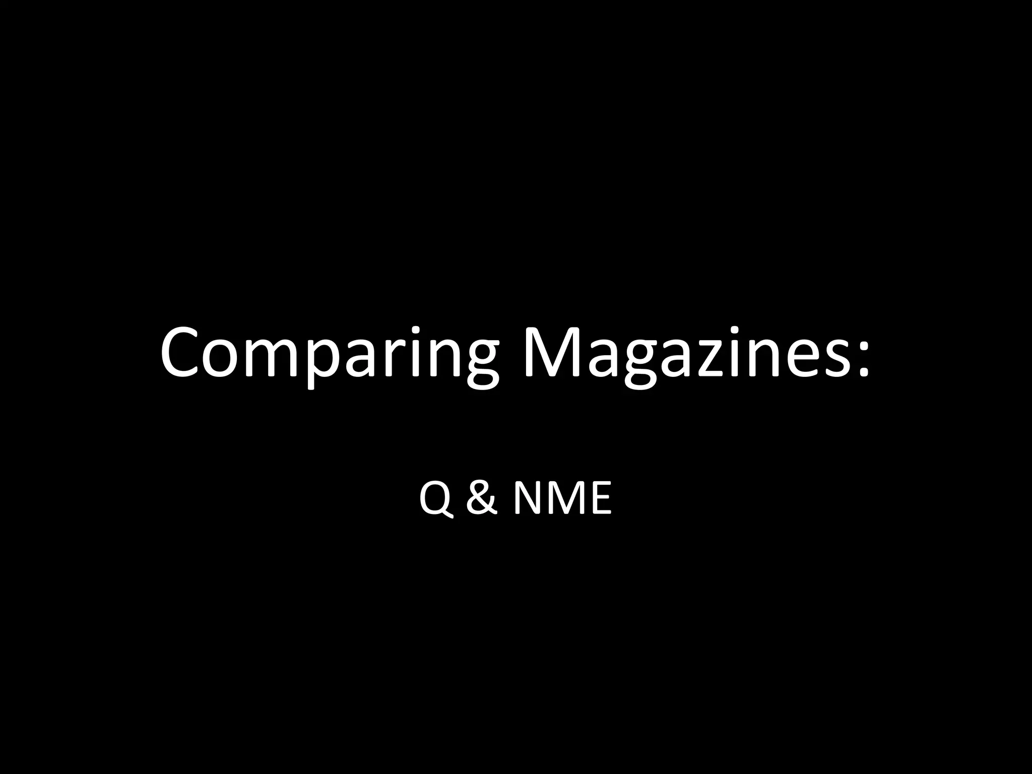
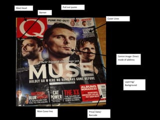
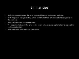
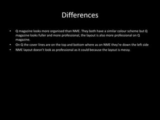
Both Q and NME magazines target music enthusiasts with eye-catching covers using bold fonts and capital letters to grab attention. While they share similarities like masthead placement and genre, Q displays a more organized and professional layout with cover lines evenly placed at top and bottom, compared to NME's messier left-side text placement.