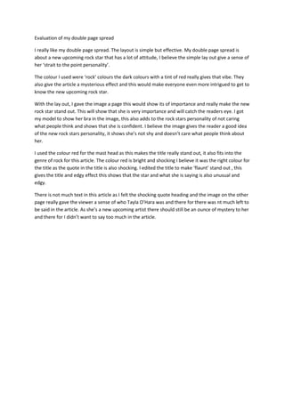
1. Evaluation of my double page spread<br />I really like my double page spread. The layout is simple but effective. My double page spread is about a new upcoming rock star that has a lot of attitude, I believe the simple lay out give a sense of her ‘strait to the point personality’.<br />The colour I used were ‘rock’ colours the dark colours with a tint of red really gives that vibe. They also give the article a mysterious effect and this would make everyone even more intrigued to get to know the new upcoming rock star.<br />With the lay out, I gave the image a page this would show its of importance and really make the new rock star stand out. This will show that she is very importance and will catch the readers eye. I got my model to show her bra in the image, this also adds to the rock stars personality of not caring what people think and shows that she is confident. I believe the image gives the reader a good idea of the new rock stars personality, it shows she’s not shy and doesn’t care what people think about her.<br />I used the colour red for the mast head as this makes the title really stand out, it also fits into the genre of rock for this article. The colour red is bright and shocking I believe it was the right colour for the title as the quote in the title is also shocking. I edited the title to make ‘flaunt’ stand out , this gives the title and edgy effect this shows that the star and what she is saying is also unusual and edgy.<br />There is not much text in this article as I felt the shocking quote heading and the image on the other page really gave the viewer a sense of who Tayla O’Hara was and there for there was nt much left to be said in the article. As she’s a new upcoming artist there should still be an ounce of mystery to her and there for I didn’t want to say too much in the article.<br />