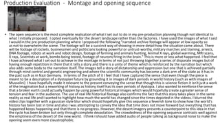
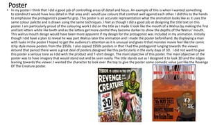
The document provides an evaluation of the narration and opening sequences in the student's animation project. Some key points:
- The opening montage sequence effectively sets the dystopian context through a series of blurred historical footage paired with the narration. However, the narration could be shortened as it tries to explain too many details.
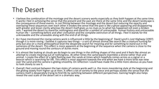
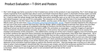
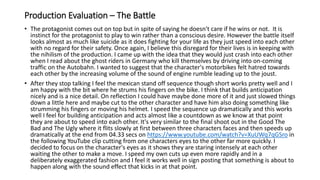
- The desert landscape contrasts well with the crowded montage and effectively conveys a sense of nothingness. The roving camera work searches the landscape for meaning or life.
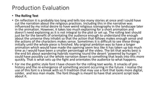
- The rolling text sequence is too long and explains unnecessary details. It should just orient the audience to understand the plot.
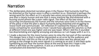
- The distorted dual-voice narration adds an unsettling quality to