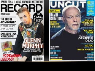
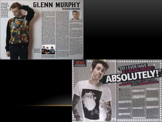
Cameron Mould
EVALUATION
QUESTION ONE
I have created a magazine called ‘Record’ which is magazine that focuses mostly on music
that wouldn’t be classed as indie. There were two main reasons as to why I chose to do my
magazine on this genre of music. One would be that it’s the genre of music that I listen to on
a daily basis, the other would be that I had a poll and this type of music scored the highest
when it came to the amount of reader.
I deliberately made my magazine develop the conventions of a music magazine. One of the
conventions I tried to challenge was the one that this type of music was mainly for males.
The way I did this was to only use colours that aren’t stereotypically connected to a gender.
I’ve chosen a lot of greys and blacks which aren’t connected to a gender.
The image on the front is a very strong and I think, manages to convey the mood of the
magazine. The clothes the model is wearing are reminiscent of the style that performers of
stereotypically indie musicians wear.
QUESTION ONE
For the cover line on the front cover, I introduced some red into the background to make the
colour of the writing stand out. I chose red for this because I figured that it’s the only colour
that’ll actually look go on the background, I felt like any other colours wouldn’t look very
good, that’s another reason that I used a colour scheme that some people may call bland.
The shade of red chosen for the highlighted background was sampled from the jumper the
model is wearing, that way it doesn’t look as artificial and blends in a bit more.
All the fonts in the magazine work together very well, they all look similar whilst at the same
time be easily distinguished from each other. All the writing is either coloured black or white,
this is to maintain a house style throughout the magazine.
The inclusion of a new album from Glenn Murphy is a good way to introduce a bit of colour
into the front cover, and the deliberate lack of detail in explaining what the album is like, it’ll
force a reader to open up and read about the magazine to get the information about the artist
and album.
QUESTION TWO
I designed my magazine to be for everyone to enjoy, not just a specific gender or age. The
way I did this was to avoid any colours that could be stereotypically tied to a gender, like
pink. Most of the magazine is in black, white or grey. The only things that aren’t are the
images and one patch of red that’s on the front cover although this colour was still sampled
from the images behind and it had black text over it.
It was made to be for everyone who likes this genre of music, there are very few things that
would be difficult of people of different genders and ages to understand. The only thing like
this is that some people that don’t like the genre of music might not know who some of the
bands and artists I’m referencing. But other than that there’s very little that would be
considered specialist knowledge.
QUESTION TWO
The models are dressed very plain overall apart from the individual on the
front cover who is wearing a brightly decorated jumper. I used male models
a for three reasons, one was the fact that they’re very plain and they’ll
appeal to everyone, another one is that the industry is very male
dominated so it’ll fit the demographics more and then the final reason is
that they’re the only people that would agree to do it.
They way all of the models are looking directly at the camera and wearing
dark clothing, it draws the reader's eyes to their eyes so they feel a
connection and want to read about it. The exception to this is the model on
the front cover who’s wearing a bright jumper so the eyes get drawn to it
and the magazine gets picked up and read.
QUESTION THREE
I would want to publish my magazine with Bauer Media. One of the reasons is because
they’re one of the largest and most successful companies in that line of work so they know
what sells, if I made a mistake in something or wrote something that wouldn’t work for the
audience I trust them to be able to stop it and help until it’s fixed.
The price of £3.90 came from my market research. The mode of the collected data on this
was £2 but I decided to raise it so we can afford to give things away in every issue and
maximise revenue. so I decided to go somewhere in the middle to try and please as many
people as I could, and make it affordable for people who’re shopping on a budget. I am
aware that this is on the higher end of the pricing spectrum but I am confident that the
premium quality of the magazine will convince people that it’s worth the extra money.
QUESTION FOUR
The audience for my magazine would mainly be anyone from the age of fourteen to about
twenty five although I feel there would be people above this age still reading it. There isn’t a
concrete upper boundary as it’s all about the content of the magazine.I think the only reason
someone would dislike the magazine is that they don’t like the genre of music it’s made
about.
It appeals to both genders because I deliberately tried to stay away from colours that could
be linked stereotypically to a gender, colours like pink and purple for example. I think this was
a good thing to do as it increases the amount of potential readers.
One of the reasons I think a teenager would pick this magazine over another of the same
genre would be that in this magazine I gave the chance to win festival tickets, festivals are a
thing that a lot of teenagers do.
QUESTION FIVE
My magazine attracts my audience in a number of ways. One would be the image on the
cover. The model is wearing the type of clothing that performers of this music genre
stereotypically wear.
The font I’ve chosen is one that stands out, even though it’s coloured in black it still has the
same effect. They are very easy to read, even at a distance so the name of magazine will
stick in their head.
The reason I chose who went on the front cover and double page spread and who went on
the contents page purely came down to who I had the better photos of, the one on the front
cover is the best one out of all shoots I did.
I decided to keep it largely colourless except from the colours on the photos and the red
background behind. All the others are shades of black, white and in between.
The feedback from the questionnaire was that people like magazines more when they use
more black and white instead of lots of colours.
I included a competition to win festival tickets so this will attract people of the younger
generation mainly but anyone could want to go to a festival.
QUESTION SIX
Compared to the start of the process, I am a now very proficient at using various programs
like Photoshop and InDesign, when I first started the project I had a basic idea of what to do
but I was always hesitant as I wasn’t always sure what I was doing and I would get stuck
doing something and have to get someone else to help.
Starting right from the beginning, I had never picked up a DSLR camera let alone know how
to get the best quality pictures from it. But with all the practice photo shoots I became more
comfortable using the camera and eventually it became second nature. It wasn’t just trial and
error though, that would’ve taken a while to get right. I watched a few videos on youtube and
read articles online that described the ways to get the highest quality photos, I took a bit from
each video and article and created a way that I found easy and effective.
QUESTION SIX
After I’d taken the photos there was the small matter of editing them as they couldn’t go into
the magazine as they were, they wouldn’t fit with the theme. Because I’d used it briefly in
secondary school, I had a rough idea of what I was doing in Photoshop in terms of cutting
something out and then putting it over another image, but that was the full extent of my
knowledge. This time it was trial and error that helped me through. Before I started the
proper magazine, I loaded up a random image to see what I could do it using the various
settings, this helped me greatly and when it came to producing the front cover of the
magazine I breezed through it with no problems.
I didn’t find it as easy in the beginning to use InDesign when I was constructing the double
page spread because I’d never heard of it before we started this and was completely
different from everything I’d ever used in the past. I soon got the hang of because of the fact
I started using it just as I was getting good at using Photoshop and they’re quite similar in
way they work so it wasn’t overly hard. In the end my double page spread worked out rather
well.
QUESTION SEVEN
The preliminary task was completed at a time when I knew nothing about how photoshop
worked, so as you can imagine it wasn’t very good. I didn’t know how to wrap text around
photographs or how to put text behind people. I feel that I’ve learned how to use a
completely new piece of software.
The photos in the first task were taken using a mobile phone so the quality was pretty bad,
now I know how to use a DSLR camera and the photos I took for my final piece were so
much better.
I feel I have completed the task given in the brief to a high standard and learned how to use
numerous pieces of software along the way.

Evaluation

  • 1.
  • 2.
    QUESTION ONE I havecreated a magazine called ‘Record’ which is magazine that focuses mostly on music that wouldn’t be classed as indie. There were two main reasons as to why I chose to do my magazine on this genre of music. One would be that it’s the genre of music that I listen to on a daily basis, the other would be that I had a poll and this type of music scored the highest when it came to the amount of reader. I deliberately made my magazine develop the conventions of a music magazine. One of the conventions I tried to challenge was the one that this type of music was mainly for males. The way I did this was to only use colours that aren’t stereotypically connected to a gender. I’ve chosen a lot of greys and blacks which aren’t connected to a gender. The image on the front is a very strong and I think, manages to convey the mood of the magazine. The clothes the model is wearing are reminiscent of the style that performers of stereotypically indie musicians wear.
  • 3.
    QUESTION ONE For thecover line on the front cover, I introduced some red into the background to make the colour of the writing stand out. I chose red for this because I figured that it’s the only colour that’ll actually look go on the background, I felt like any other colours wouldn’t look very good, that’s another reason that I used a colour scheme that some people may call bland. The shade of red chosen for the highlighted background was sampled from the jumper the model is wearing, that way it doesn’t look as artificial and blends in a bit more. All the fonts in the magazine work together very well, they all look similar whilst at the same time be easily distinguished from each other. All the writing is either coloured black or white, this is to maintain a house style throughout the magazine. The inclusion of a new album from Glenn Murphy is a good way to introduce a bit of colour into the front cover, and the deliberate lack of detail in explaining what the album is like, it’ll force a reader to open up and read about the magazine to get the information about the artist and album.
  • 7.
    QUESTION TWO I designedmy magazine to be for everyone to enjoy, not just a specific gender or age. The way I did this was to avoid any colours that could be stereotypically tied to a gender, like pink. Most of the magazine is in black, white or grey. The only things that aren’t are the images and one patch of red that’s on the front cover although this colour was still sampled from the images behind and it had black text over it. It was made to be for everyone who likes this genre of music, there are very few things that would be difficult of people of different genders and ages to understand. The only thing like this is that some people that don’t like the genre of music might not know who some of the bands and artists I’m referencing. But other than that there’s very little that would be considered specialist knowledge.
  • 8.
    QUESTION TWO The modelsare dressed very plain overall apart from the individual on the front cover who is wearing a brightly decorated jumper. I used male models a for three reasons, one was the fact that they’re very plain and they’ll appeal to everyone, another one is that the industry is very male dominated so it’ll fit the demographics more and then the final reason is that they’re the only people that would agree to do it. They way all of the models are looking directly at the camera and wearing dark clothing, it draws the reader's eyes to their eyes so they feel a connection and want to read about it. The exception to this is the model on the front cover who’s wearing a bright jumper so the eyes get drawn to it and the magazine gets picked up and read.
  • 9.
    QUESTION THREE I wouldwant to publish my magazine with Bauer Media. One of the reasons is because they’re one of the largest and most successful companies in that line of work so they know what sells, if I made a mistake in something or wrote something that wouldn’t work for the audience I trust them to be able to stop it and help until it’s fixed. The price of £3.90 came from my market research. The mode of the collected data on this was £2 but I decided to raise it so we can afford to give things away in every issue and maximise revenue. so I decided to go somewhere in the middle to try and please as many people as I could, and make it affordable for people who’re shopping on a budget. I am aware that this is on the higher end of the pricing spectrum but I am confident that the premium quality of the magazine will convince people that it’s worth the extra money.
  • 10.
    QUESTION FOUR The audiencefor my magazine would mainly be anyone from the age of fourteen to about twenty five although I feel there would be people above this age still reading it. There isn’t a concrete upper boundary as it’s all about the content of the magazine.I think the only reason someone would dislike the magazine is that they don’t like the genre of music it’s made about. It appeals to both genders because I deliberately tried to stay away from colours that could be linked stereotypically to a gender, colours like pink and purple for example. I think this was a good thing to do as it increases the amount of potential readers. One of the reasons I think a teenager would pick this magazine over another of the same genre would be that in this magazine I gave the chance to win festival tickets, festivals are a thing that a lot of teenagers do.
  • 11.
    QUESTION FIVE My magazineattracts my audience in a number of ways. One would be the image on the cover. The model is wearing the type of clothing that performers of this music genre stereotypically wear. The font I’ve chosen is one that stands out, even though it’s coloured in black it still has the same effect. They are very easy to read, even at a distance so the name of magazine will stick in their head. The reason I chose who went on the front cover and double page spread and who went on the contents page purely came down to who I had the better photos of, the one on the front cover is the best one out of all shoots I did. I decided to keep it largely colourless except from the colours on the photos and the red background behind. All the others are shades of black, white and in between. The feedback from the questionnaire was that people like magazines more when they use more black and white instead of lots of colours. I included a competition to win festival tickets so this will attract people of the younger generation mainly but anyone could want to go to a festival.
  • 12.
    QUESTION SIX Compared tothe start of the process, I am a now very proficient at using various programs like Photoshop and InDesign, when I first started the project I had a basic idea of what to do but I was always hesitant as I wasn’t always sure what I was doing and I would get stuck doing something and have to get someone else to help. Starting right from the beginning, I had never picked up a DSLR camera let alone know how to get the best quality pictures from it. But with all the practice photo shoots I became more comfortable using the camera and eventually it became second nature. It wasn’t just trial and error though, that would’ve taken a while to get right. I watched a few videos on youtube and read articles online that described the ways to get the highest quality photos, I took a bit from each video and article and created a way that I found easy and effective.
  • 13.
    QUESTION SIX After I’dtaken the photos there was the small matter of editing them as they couldn’t go into the magazine as they were, they wouldn’t fit with the theme. Because I’d used it briefly in secondary school, I had a rough idea of what I was doing in Photoshop in terms of cutting something out and then putting it over another image, but that was the full extent of my knowledge. This time it was trial and error that helped me through. Before I started the proper magazine, I loaded up a random image to see what I could do it using the various settings, this helped me greatly and when it came to producing the front cover of the magazine I breezed through it with no problems. I didn’t find it as easy in the beginning to use InDesign when I was constructing the double page spread because I’d never heard of it before we started this and was completely different from everything I’d ever used in the past. I soon got the hang of because of the fact I started using it just as I was getting good at using Photoshop and they’re quite similar in way they work so it wasn’t overly hard. In the end my double page spread worked out rather well.
  • 14.
    QUESTION SEVEN The preliminarytask was completed at a time when I knew nothing about how photoshop worked, so as you can imagine it wasn’t very good. I didn’t know how to wrap text around photographs or how to put text behind people. I feel that I’ve learned how to use a completely new piece of software. The photos in the first task were taken using a mobile phone so the quality was pretty bad, now I know how to use a DSLR camera and the photos I took for my final piece were so much better. I feel I have completed the task given in the brief to a high standard and learned how to use numerous pieces of software along the way.