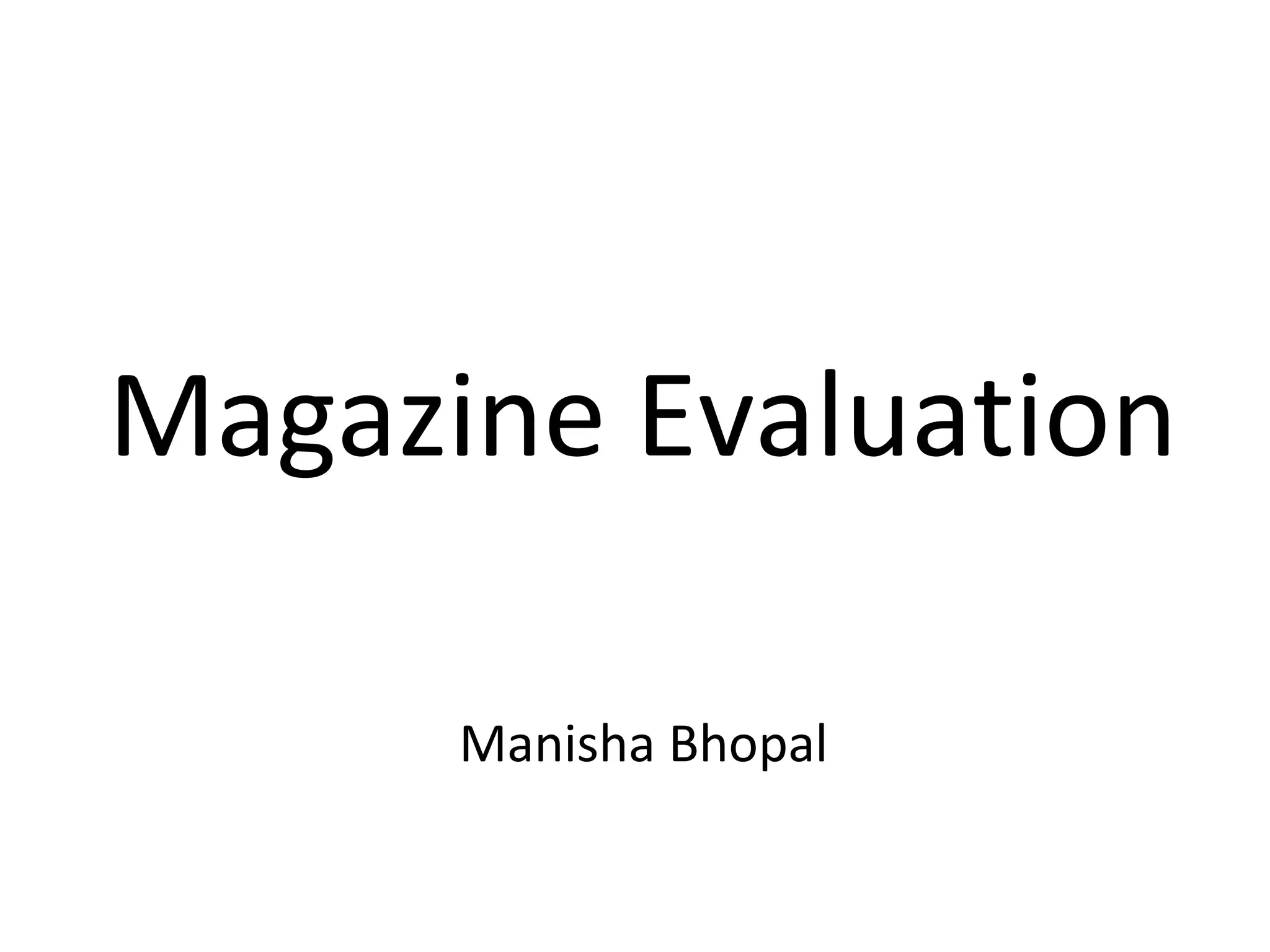
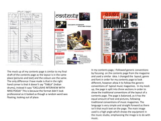
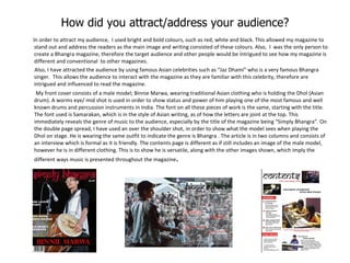
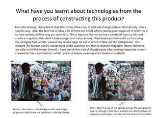
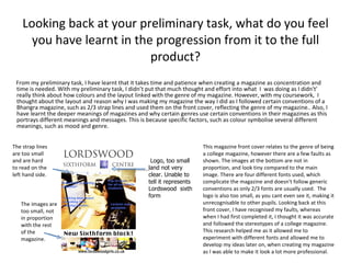
The document discusses the author's magazine project on the genre of Bhangra music. It evaluates how the magazine challenges and follows conventions of real magazines. Key points include using few strap lines on the cover to show simplicity while still including them, including balanced images and text on the double page spread to follow conventions, and representing the Bhangra music audience and culture through the colors, images, and topics chosen. The author also reflects on learning Photoshop skills like using the sponge tool and the importance of following conventions to make the magazine look professional.