2. Time management
• I think I managed my time reasonably well throughout this project. The reason for this
being the planning we did before each piece. In lesson I wasn’t too far behind anyone
and managed to move from piece to piece with good time. I think if I hadn't planned
my ideas it would have been a lot more difficult to begin with no goal. The planning I
did meant that I had a good idea of what fonts and images I wanted to use.
• If there were one of the three pieces that I could have managed better it would have
been my tabloid. It was my least favourite of the three pieces. I spent the most time
on my tabloid and yet it is still the least aesthetically pleasing. I did make plans for this
idea but they didn’t go as well when they were put down on the page. I wasted lots of
time trying to make it look right but I feel that in the end it looks unprofessional and
doesn’t quite fit together properly. I should have selected a better colour scheme in
the beginning and then I wouldn’t have wasted time with an idea I didn’t like that
much to start with. If I were to do it again I would make sure that I knew what I was
doing and create something I like. I think it would have gone better if I had just
scrapped it earlier on and then started again, because then I wouldn’t have wasted so
much time changing around the layout and colour scheme to still come out with
something I wasn’t completely happy with. With that said I do think that it fits the
brief, it just doesn’t have the full aesthetic qualities that I would like.
• One thing I managed well was my fanzine. I did this in good time and had extra time
to refine the look I wanted for it. I made a plan and had a good idea of what I wanted
it to look like before I had begun. I had decided fonts and knew what kind of images I
wanted to use. I completed the front cover and the inside page in better time than my
tabloid and I like the look of it a lot better. I think my fanzine is definitely my best
piece of work and I enjoyed doing it because there was more freedom in terms of
what you could of done.
• I think I also managed this topic on a whole, a lot better than I have with previous
topics. I have known what I have been doing throughout the project and have been
setting my self time related goals based on what has to be done. If I were to compare
this to topics earlier on in the first year I have done a lot more in a lot better time.
I spent too much time on my tabloid
newspaper. I don’t think it looks that good in
comparison to a professional piece. It hits
some of the basic criteria but I don’t think it
has anything special about it.
3. Technical competencies
• In this project we learned how to use In-design. I found In-design good for creating my broadsheet and my
tabloid, this was because they were supposed to look more professional. In-design was good for creating
accurate grids and margins, because the fanzine had more of an unprofessional approach I decided to use
Photoshop. I decided to use Photoshop for the fanzine because it gave me more freedom to do exactly
what I wanted to do.
• One thing I did with my broadsheet was create the grids and margins that I had to stick to. This gave my
broadsheet more of an organised and professional look to it. Without the grids it wouldn’t have the full
formal feel that I wanted it to have. I also have resized my main image and my adverts correctly. Its quite
easy in In-design to resize an image wrong because you are trying to stick to the grid layout you set at the
beginning. I made sure my images were resized as accurately as possible by putting the image into
Photoshop. I used the rectangle frame tool to create a box for where I was going to place the image in In-
design. I then found out the exact size of that box and then found an image of a similar size and shape and
then I accurately resized it by changing the image size in Photoshop. I also quite like my use of lines within
the broadsheet. I made sure all the lines were the same thickness, I also made sure that they stuck to the
grid I had originally created so that it still looked organised and like a traditional broadsheet. I also added
subtle blocks of colour behind certain pieces of text. I did this because I thought it made it look less bland. I
think the use of colour was quite successful and without it the page wouldn’t look properly complete.
• My fanzine has a few technical qualities that make it look interesting. I wanted to have the ‘HHF’ logo I
created in large text behind the main body copy. At first I couldn’t think of a way to incorporate it without
the body copy being unreadable. I then decided to alternate the text colour between black and white. This
gives the page a nice look and makes it look quite a lot like a fanzine. I made this fanzine in Photoshop so
resizing images wasn’t a problem. I used the rulers in Photoshop so that it was accurately laid out and still
looked somewhat professional although it’s a fanzine.
• My tabloid fitted the brief but still didn’t fit my expectations for how I wanted it to look. I spent a long time
in In-design trying to make it look good whilst sticking to my plan. I created an advert for a health pull out
which took quite a while. It only took longer than expected because I couldn’t make it look right with the
rest of the newspaper. If I were to do it again I would make sure I chose a better colour scheme and a
better layout. I managed to resize all my images well but I still think they don’t fit together properly.
• I think that my broadsheet does look slightly professional, I think this because all the colours, fonts and
images go well together. I think one thing that lets my broadsheet down is the placement and font of the
date. It looks slightly out of place but was the best font that I could find for the job. I also think both pages
of my fanzine look as professional as they need to do, to fit the brief. Its on the borderline of almost
looking too sleek and modern to be a fanzine yet still hitting the criteria.
In the fanzine above I made sure the main
photographs matched each other. It wasn’t
too difficult as its easy to match colours in
Photoshop. I used In design to make the
grids seen in the tabloid below.
4. Creative Abilities
• I think that I have managed to be somewhat creative in this project. The fanzine gave
the most creative freedom throughout this project and it’s the piece I like best of the
three I designed. I used In-design for my tabloid and broadsheet. I used Photoshop for
my fanzine because I know how to use it more competently and could manipulate
things within it more freely. I think that I wasn’t that creative with my broadsheet. I like
the finished product that I came up with but I think it looks very stereotypical, with
that said its not necessarily a bad thing because it meets all of the briefs criteria. With
my broadsheet I went for quite a conventional layout and quite a bland colour scheme.
I think the colour scheme and conventional layout is necessary for it to be a competent
broadsheet. The only possible creative thing within my broadsheet is the grey block of
colour behind the masthead. I incorporated this block of colour to break the page
down somewhat.
• My fanzine however I thought had much more creative freedom. I didn’t use the grids
or margins that you have with In-design. I just began making my idea based on the flat
plan that I had created. I used the rulers in Photoshop so that there was some kind of
accuracy involved. The idea for my inside page came from looking at some ‘Swiss
design’ pieces. I like the triangle shapes and the colour schemes that tend to be used
within ‘Swiss design’. I randomly created the triangles and then coloured them black. I
put a triangle behind each image so that there was some kind of continuity as I was
originally going to place them randomly. I chose a colour scheme that I was
comfortable with and I think it suits the fanzine well. My front page isn't hugely
experimental but I still think it has some creative aspects. I like the large font that’s in
orange, I wanted this to be replicated through both of the images. I think it has a
modern and flush feel to it and you could imagine this as an actual fanzine. The shapes
on my second page are quite abstract and I like the large ‘HHF logo’ being in large font
behind the body copy.
• My tabloid has a couple of creative initiatives like the adverts I tried to create. I think
the adverts didn’t go that well and slightly detour the piece from looking 100%
professional. If I were to do it again I wouldn’t have as many random adverts almost
popping from the page. I think with my tabloid, less would have been more.
I looked at lots of ‘Swiss design’ on
Google images and I thought it would be
a good start for my fanzine. I like the
simplicity and professionalism that
‘Swiss design’ tends to have. I didn’t
want it to look exactly like a ‘Swiss
design’ piece but I wanted it to have
aspects.
5. Reviewing work in progress
• Whilst I was creating my pieces I was internally reviewing them. I think I was reasonably competent at
reviewing my work but I didn’t prioritise it at any point. I was continuously comparing my work to existing
products as I was going along. I found that comparing my product to existing products was a great way to
improve my own work. It was helpful for making sure I was on the right track for making a piece of work I
was happy with.
• With my tabloid I was forever comparing it to existing products but still not coming up with anything I was
proud of. I took ideas from here and there and they just combined into a bit of a mess. I quite like the
masthead for my tabloid but I was hoping for a more complete piece that's well rounded. I probably did
the most self reviewing when I was on this piece but it didn’t lead to any better prospects.
• My fanzine does look consistent but I wasn’t really comparing it to existing fanzines. Although I do think
the inside page has more of a fanzine feel to it than the front. I wanted the front to be eye catching and to
look interesting to anyone who might be interested in the sub culture. I think I succeeded in that but I may
have made it look a bit too sleek in comparison to existing fanzines. The inside page is a bit more like a
fanzine with the alternating font colours and the slightly random elongated shapes.
• With my broadsheet I would often spend a while looking at other products trying to perfect the placement
of everything from the date to a main image. I liked my broadsheet on a whole and was happy with a lot of
the choices I had made. One minor detail I couldn’t fully satisfy was the font to put the date in. Eventually I
settled for the one on the page. Looking back on my broadsheet I also think I should have added a drop
capital at the start of the main story's first sentence.
6. To what extent have your intentions
been realised?
• I think that I managed to meet my intentions quite well based on my plans. My
broadsheet looks almost exactly how I wanted it too. There were a couple of
things that I couldn’t get completely right on paper but they were minor things
like the font for the date. I could find a font that fitted but not perfectly. I stuck
to my layout plan quite closely and I found that it looked quite good as a
conventional newspaper layout. All the fonts used are fonts that I selected in
the planning stages. I also had a good idea of what images I was going to use
too.
• My tabloid on the other hand didn’t fully reach my hopeful intentions. I
followed my flat plans and tried to create what I had envisioned. I didn’t like
the colour scheme I had selected, yet for some reason I stuck with it and tried
to move everything around it. This didn’t help me with creating a tabloid that I
would like. I used the fonts that I had selected in my plans and it didn’t seem
to match up perfectly well. I do think it does look like a tabloid but I don’t think
it looks near a professional standard. I do like the font that I chose for the
masthead. I added a drop shadow and a small stroke to it so that it looked
more like a tabloid. I also think it would have looked better if I had separated
the masthead from the main image a bit more. If I were to create a tabloid
again I think I would be able to create a much more solid piece. I think there
are some good elements to this piece but combined they all let each other
down.
• My fanzine went quite well in terms of what I had intended for it, in actual fact
I thought it turned out better. I had a good idea of what I wanted from my
fanzine before I begun creating it, I just needed to find appropriate images for
it all to fit well together. I wasn’t sure what the second page was going to turn
out like but I think after tweaking the colour scheme around I managed to
make it fit.
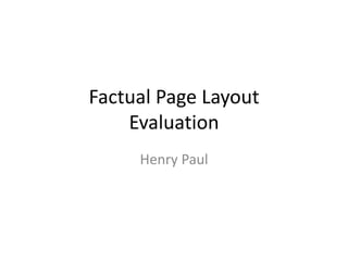
Mast
head
Image
Image
Body
copy
Body
copy
Body
copy
Body
copy
Body
copy
Image
Image
Image
Image
Image
I think I managed to reach my intentions quite
well as I stuck to my flat plans quite meticulously.
They weren't very difficult layouts to follow. My
ideas looked a bit differently in my head but
looked better when I was able to play around
with colour schemes. I had a good idea of what
images to use before I begun, this sped up the
production process.
7. Appropriateness/Content
• I think my fanzine was especially appropriate for the audience I was aiming for. My fanzine is aimed at people who are aged from
18-25 that are interested in hip hop. I think its appropriate for my target audience because it looks modern and interesting, two
things young people like. It has eye catching photographs on the front cover of famous hip hop artists. If you like hip hop you are
likely to know who those two people are. I also made the logo in a large bold font so that its easy to read, this will stand out and
stay in peoples minds. It looks sleek and has a professional feel, it doesn’t look cheesy and too stereotypical.
• The content for my fanzine varies in terms of its source. I found all the images that I used for my fanzine online, and I made sure
that they were all good sizes and appropriately suited. I looked at Swiss design and slightly based my second page around some of
their layouts. I wrote all the body copy as part of my fanzine earlier on in the year. I didn’t have to shorten down the amount of
text because I wanted as much information as possible to go alongside the images that I had selected. I acquired all of the fonts
from Dafont.com after researching the ones I wanted first.
• My broadsheet is also appropriate for the target audience. Its appropriate because of the way that it looks and the tick boxes it hits
for being seen as a broadsheet. Broadsheets are aimed at ages anywhere from 25 onwards. It tends to be quite formal and the
layout straight forward. It has a traditional layout with columns, a large masthead and a headline that stands out, clearly describing
the story. The font is clear and easy to read, stereotypical of a broadsheet. Everything is spaced out and easy to follow and the
second story is suitable to go alongside the main story. Nothing is too out of place and all the colours are just varied enough for the
page to not look that bland.
• The content within my broadsheet is quite solid and all seems to work reasonably well together. I gained all my images and adverts
from the internet. I selected a few that would be suitable and then chose the ones I wanted from those. My second story was a
story from 1996, in the year that Tupac died. It was also a big story from that year so I thought it would be good for a front page. I
gained all the information for the story from a news website. All the fonts were pre selected from Dafont.com.
• My tabloid is a bit different, although I do think it hits some of the criteria for being seen as a tabloid. I think a couple of things let it
down in looking like a somewhat professional piece. Tabloids do tend to have more obvious adverts than a broadsheet might but
with this I think they let it down a bit. The large ‘Womensfittness’ advert at the bottom could have been made smaller and less of a
main feature on the front page. The other advert offering the chance to win a car also looks slightly out of place. I believe that my
tabloid has potential to be a quality piece but there are a few things that keep it from being as good as it could be. The content for
this piece was acquired from a various different places. I looked at a few different tabloids to try and gain an idea of what I wanted
for the piece. I chose adverts and colour scheme based on what I thought would look good for my tabloid. In the end I wasn’t that
pleased with the content of this piece. I think everything feels a bit miss matched and I don’t think time would have been the cure
for that. I gained images for the adds I created on Google images. The second story is a story from 1996 that I found on a news
archive website. I think for the content of this piece to be recognisably better I would have to start again with a different colour
scheme and layout completely.
The broadsheet gave you
the least creative freedom
with that said I quite liked
creating mine. It has a
professional feel and fits
the brief well. The adverts
and images both look
appropriate.
8. Development/Areas for Improvement
• Within my broad sheet I developed my skills with In-design. I set up grids and margins before I begun making it so
I had a guide line to stick to. We learned how to set up grids and margins before we begun making any of the
pieces. I can now competently use In-design to create a page layout and to then go on to making some accurate
pieces of work. At the beginning I didn’t fully understand In-design and its usefulness as appose to Photoshop. I
now realise that its great for creating page layouts and making sure everything is evenly spaced out. In-design was
good for creating my broadsheet and my tabloid because they are more professional pieces. I wanted them to
have some definite structure and continuity so In-design was great for securing that. I became a lot better with
resizing images after fully understanding their dimensions and having to make sure I didn’t stretch them.
• My tabloid is something I definitely think could be improved. There are a few different aspects that I would change
if I were to do it again or had more time. I think my tabloid is the least convincing of the three and doesn’t quite fit
together properly. I would improve it in a number of ways, one being the large advert at the bottom left of the
page. I think the advert itself doesn’t look that bad but its too big and isn’t in the right place. If the advert took up
less space it wouldn’t be such a dominant feature on the page. I should have made the advert smaller and the
second story bigger. I also think that the colour scheme could be improved, I think that could be one major thing
that would improve the aesthetics of this piece.
• One thing that could have been improved in my broadsheet was to use a drop capital at the start of the first
sentence. This would have added another aspect of professionalism and would make it more believable as a
newspaper. Whilst doing my broadsheet I developed my skills in being able to find suitable fonts for things like the
body copy.
• Within my fanzine I developed my creative abilities and realised that I prefer more freedom in terms of what I can
do with the page. I didn’t use In-design for my fanzine so I was just developing skills I already had.