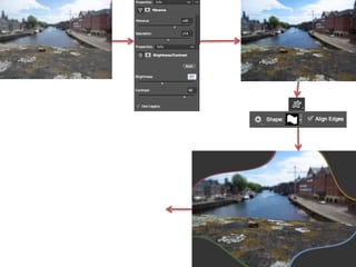
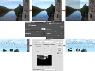
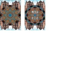
Samuel worked on the introduction spread for their product. They edited the background image to make it more visually appealing by adjusting the vibrancy, saturation, brightness, and contrast. This was done to make the colors stand out more and look more detailed. Custom shapes were used to create corner pieces for the page to give it a unique style. Colored edges were added to the corners so information could be placed inside and the colors would match the background image. Headings for each box were made and underlined in a unique style to stand out from other elements on the page.