Evaluation 2
•Download as DOCX, PDF•
0 likes•173 views
The document discusses how the magazine and film poster for a horror movie connect and reinforce each other. Both use the same font and color scheme of red, white, and blue to create consistency. They also feature low-key lighting and dark backgrounds common in horror works to set the mood. Additionally, the poster and trailer were shot in the same location and feature the same antagonist, challenging genre conventions. The target audience of 15-25 year old males and females is consistent across the materials. Overall, various design elements were deliberately chosen to clearly link the magazine, poster, and film trailer.
Report
Share
Report
Share

Recommended
Unconscious poster inspiration
This document analyzes and summarizes elements from movie posters for Dr. Who: The Day of the Doctor and The Dark Knight.
It notes that the positioning of the three doctors in the Dr. Who poster conveys disagreements between two that will be resolved by the central figure. An exploding Dalek hints at the Time War. Small credits and logos avoid distraction from the adventure.
For The Dark Knight poster, it observes the long shots of Batman and the Joker convey their distance but conflict. The subtle Batman logo in the fire appeals to mature audiences. A dark blue background suits the darker narrative.
The document concludes by stating elements it will apply to its own poster, like character positioning,
How effective is the combination of your main
The document discusses the effectiveness of combining a film trailer with ancillary products like a magazine cover and poster. Key elements that link the products include a consistent red background symbolizing danger, shots from the film trailer appearing on the magazine cover, and the same production company and slogan ("Who will watch the neighborhood watch?") featured across all items. This unique combination emphasizes the film's unconventional horror narrative within a neighborhood and establishes an "enigma code" to intrigue audiences. The interlinking elements ensure the products will be recognized as exclusively promoting the film "The Neighborhood."
Evaluation
The document discusses how synergy was used across multiple marketing pieces for a crime thriller film. Key elements like the main character, a handgun prop, navy blue suit costume, and gray-tinted bold text were consistently featured on the poster, magazine cover, and trailer to clearly indicate the genre and narrative. This use of recurring visual cues and themes across ancillary tasks effectively promoted genre recognition and ensured the target audience would be met. While the ancillary pieces had strong synergy, the document concludes the trailer was most successful at clearly representing the film as a crime thriller without confusion of other genres.
Question 1: How effective is the combination of your main product and ancilla...
The student's media studies coursework required them to create a film trailer along with accompanying poster and magazine cover that were all linked together through shared elements. To achieve this, the student analyzed other mass media productions to understand how to clearly connect the three pieces. Specifically, the student used consistent costumes, colors, fonts, and characters across the trailer, poster, and magazine cover to ensure the audience would recognize they were all promoting the same film.
Conventions of Film Posters
Through this analysis, I was able to determine the key features of a film poster, thus this will allow me to create my own film poster accordingly.
How effective is the combination of your main product and ancillary tasks
The document discusses the production and distribution of a psychological horror film trailer. It describes how the trailer incorporates intertextual references and adaptations from other genres and films. It features the main protagonist and killer character to contrast fear with a cold, inhuman danger. The trailer uses a consistent red, white, and black color scheme. It also mimics the style of films like Paranormal Activity by featuring first-person camerawork from the protagonist's perspective as she pursues the killer. The target audience for distributing the trailer is people aged 18-30 who would find the danger compelling.
The Martian Poster Analysis
The poster for The Martian directly features Matt Damon looking at the audience with a vulnerable expression to elicit a sense of needing help. It also uses imagery to depict the isolation and harshness of Mars compared to Earth. The bold font and sci-fi theme of the text and slogan "Help is only 140 million miles away" aim to attract middle-aged men and convey the genre and distance between Earth and Mars. Including Matt Damon and director Ridley Scott, known for sci-fi films, helps draw larger audiences familiar with their work.
Iron man 3 powerpoint
The document provides information about the 2013 film Iron Man 3, including its target audience, genres, directors, producers, box office earnings, and marketing strategies. The target audience is described as primarily being boys, men, fans of the Marvel comics and previous Iron Man films, and those who enjoy action genres. The film's producers targeted this audience through trailers in cinemas showing similar genres, leveraging the popularity of the known actors, using special effects to add excitement, and colorful imagery to draw attention in trailers.
Question2Eval
1) The document discusses the effectiveness of combining a main horror film project with ancillary promotional tasks like posters, a magazine cover, and trailer.
2) Each piece was designed to follow horror film conventions to appeal to the target genre audience. Unifying elements like the antagonist, his weapon, color scheme, and close-up shots create "symbiotic links" between the pieces.
3) By maintaining consistency in these linking elements, the package effectively promotes the fictional film and ensures the audience recognizes all the pieces are related.
Evaluation Question 2
my answer to the evaluation question
How effective is the combination of your main product and ancillary texts?
Media Coursework Evaluation
The document provides an evaluation of the student's media coursework project which was a thriller film. It discusses how the film used conventions of the thriller genre like quick camera cuts, hidden plot elements, and building suspense. It describes how the characters were constructed through costume and vehicle choices to represent different social groups. It also outlines the target audience for the film and how technology was used in the filming and editing process.
Evaluation 1
Evaluation Task 1 - In what ways does your media product use, develop or challenge forms and conventions of real media products?
PR1
The document discusses various methods used by media producers to analyze audiences and target marketing campaigns. It provides examples of how Blair Witch and Spectre used techniques like genre theory, audience profiling, and trailer analysis to effectively promote their films to specific demographics. An exit poll conducted for Blair Witch found that the majority of viewers were young adults who learned about the film from YouTube trailers. This showed the film's promotional strategy successfully reached its intended teenage and young adult audience online.
Film poster research analysis
This poster depicts a multi-layered image of buildings and characters from the film standing on different structures, defying gravity. There is a sense of postmodern cynicism as conventions of reality are rejected. This disorienting presentation implies multiple meanings without clear answers, allowing audience interpretation. A man holds a briefcase and gun, suggesting the film involves a heist in a dream world where minds can manipulate reality. The film's title, "Inception", is the only clear element, connoting the idea is unambiguous unlike the layered image. The tagline "Your mind is the scene of the crime" reinforces the science fiction genre and idea of stealing information from the subconscious. Credits are faintly printed to not
Film Poster Research Analysis
This poster depicts a multi-layered image of buildings and characters from the film standing on different structures, defying gravity. There is a sense of postmodern cynicism as conventions of reality are rejected. This disorienting presentation implies the film will examine the simulacra through dream-like states and manipulating the world within dreams. A man holds a briefcase and gun, signifying the film is a heist movie set within the subconscious mind. The title "Inception" provides the name but reveals little about the actual story.
Media evaluation
The document provides an analysis of a media product created by the author. It discusses how the product both adheres to and challenges conventions of thriller movies. It conforms to conventions like using guns, dark clothes, and fast-paced music. However, it challenges conventions by casting younger actors than typical for thriller movies. The document also discusses how the product represents teenagers in London through language, clothing, and behavior. It would be distributed by a major British company familiar with the thriller genre, like Paramount or Warner Bros UK, and target audiences over 13 interested in thrillers.
Film poster conventions and analysis
A slide share on conventions of a film poster, my analysis of different posters and how it will influence me.
Analysis for ‘attack the block’
The film poster for Attack the Block aims to appeal to its target audience of 15-25 year olds. It depicts a group of teenage boys dressed in urban streetwear standing ready to fight off meteors falling from the sky, signifying the science fiction genre. The tagline "INNER CITY VS OUTER SPACE" further conveys the hybrid comedy/sci-fi nature. Additional elements like a diverse cast of characters, London-based setting shown through city skyline imagery in the background, and promotional text connecting it to the popular film Shaun of the Dead help broaden the appeal to wider audiences.
Media evaluation
The document provides an analysis of a media product that was created as part of an assignment. It discusses how the product both adheres to and challenges conventions of the thriller genre. It uses appropriate elements like guns, dark clothing, and fast-paced music. However, it subverts expectations by casting younger actors than typically seen. The document also examines how the product represents teenagers in London through language, clothing, and behavior. It suggests the product would be distributed by a major British company like Paramount or Warner Bros. due to its genre and target audience of those over 13 interested in thrillers.
How effective is the combination of your main product and ancillary texts?
The three media products - a short film, film poster, and film review - work well together due to their similar dark tones and use of colors. Specifically, the short film and poster both use dark colors and themes to convey a dark genre. Additionally, all three products use the colors red, white, and black in their layouts and designs to create cohesion across the package. Extending the media package through a viral marketing campaign, as was done successfully for The Amazing Spider-Man, could help increase awareness and popularity.
Magazine research and planning
The document provides research on three film magazines: Entertainment, Empire, and Scream. For each magazine, it summarizes the types of films covered, target audiences, and conclusions on whether the magazine would be a good fit for marketing a teen horror film. Empire magazine is identified as the best choice due to its diversity of genres. Examples of covers are analyzed to understand effective micro and macro design features. A draft magazine cover is created, combining researched conventions.
Evaluation Question 2
The document discusses the goals and techniques used in creating a horror film and corresponding promotional materials, including a poster and radio trailer. It aimed to entertain audiences through thrills, suspense and fear while also exploring supernatural themes and psychological elements. Both the poster and radio trailer were designed to attract interest in the film and entice audiences to watch without revealing too much of the plot. The poster uses ominous imagery and a dramatic visual style while the radio trailer employs an eerie tone, snippets of dialogue and a cliffhanger ending to intrigue listeners.
Coursework film promotion lesson 1
- Synergy refers to the process of interlinking multiple media products from a franchise for commercial or artistic purposes, such as films, video games, soundtracks, and animated content. This allows properties to be experienced across different platforms.
- Major film studios like 20th Century Fox are actually part of larger media conglomerates that have holdings in film, television, publishing, and other industries. These conglomerates aim to promote their films through their various subsidiaries and platforms.
- Understanding the institutions that produce media content provides context for audiences, as the logos shown with films communicate the genre and type of content expected from that company.
L3 l4 -textual analysis of 2 soap opera trailers chris jacobs
This document provides a textual analysis of two soap opera trailers from Coronation Street and EastEnders. For each trailer, the analysis comments on verbal codes like dialogue and soundtrack, non-verbal codes like setting and costumes, and technical codes like camera angles and shot types. Areas of strength that would be repeated include the use of soundtracks and effects to build irony and tension, and quick cuts and close-ups to portray character personalities and build tension between them.
Evaluation - Question 2
The combination of the main film Crook and its ancillary products of a poster, magazine cover, and trailer were effective in establishing a brand. All three products featured the main characters from the film and used consistent font and coloring for the film title. A blood red color was used throughout to convey the film's tone. The production company logo was included on the poster and trailer to promote the brand. Consistent inclusion of the actors' names helped familiarize audiences with the cast. Credits were used across all products to provide information to audiences. The linking of these elements helped create a cohesive brand identity for the film.
Marketing plan for media product "Little Red"
This marketing plan summarizes the short film "Little Red" and its target audience. The film puts a unique spin on the classic Little Red Riding Hood story by having two narrators discuss adapting it into a film as the story plays out in live action. The target audience is males and females aged 17-25 who are familiar with the fairy tale from childhood. Social media sites and film festivals will be used to promote the film and generate interest among this demographic.
Secondary Research
The document discusses various aspects of film trailers, posters, and magazine covers from a secondary research perspective. It covers theories around how these marketing tools are designed to entice audiences through mystery and attractive visuals. Key points discussed include using an attractive lead actress to appeal to audiences, following common narrative structures in trailers, and employing symbolic colors and layouts to provide context and intrigue for the target demographic.
Film poster research
1) The document discusses codes and conventions used in film posters, such as using black space to draw in viewers, a large central image of the main character, and an unusual font for the title.
2) Two film posters are analyzed in detail: "The Woman in Black" uses a central image of the main character against a dark background with faint images, along with cast and crew information at the bottom. "The Girl With the Dragon Tattoo" uses a recognizable custom font and a monochrome primary image of the leading actor framed by a secondary actor.
3) Restrictions on film posters are also discussed, noting two posters that were banned for their inappropriate or disturbing content. The document establishes that
Evaluation 2
The document discusses the effectiveness of combining a main product (trailer) with ancillary texts (poster, magazine cover). Research and understanding conventions of real ancillary texts were important to produce an effective combination. The poster, magazine cover, and trailer employed similar fonts, imagery, and references to create uniformity. Understanding horror film conventions and incorporating relevant colors, images, and text helped ensure the ancillary texts complemented and promoted the trailer successfully. Audience reaction to the trailer premiere demonstrated the positive impact of an effective multi-text combination.
Magazine Front Cover Analysis Two
This magazine front cover uses techniques to attract its target horror film audience. The main image promotes the film "Black Swan" showing the protagonist with red eyes to suggest an evil or antagonist role. The masthead "Fangoria" immediately identifies it as a horror film magazine, using a unique font with flicks resembling fangs. Sell lines list films and actors in a small font, either black or red to match horror color schemes. The layout balances text and images, following conventions like the masthead at top and barcode at bottom, to be easily recognizable to loyal readers.
More Related Content
What's hot
Question2Eval
1) The document discusses the effectiveness of combining a main horror film project with ancillary promotional tasks like posters, a magazine cover, and trailer.
2) Each piece was designed to follow horror film conventions to appeal to the target genre audience. Unifying elements like the antagonist, his weapon, color scheme, and close-up shots create "symbiotic links" between the pieces.
3) By maintaining consistency in these linking elements, the package effectively promotes the fictional film and ensures the audience recognizes all the pieces are related.
Evaluation Question 2
my answer to the evaluation question
How effective is the combination of your main product and ancillary texts?
Media Coursework Evaluation
The document provides an evaluation of the student's media coursework project which was a thriller film. It discusses how the film used conventions of the thriller genre like quick camera cuts, hidden plot elements, and building suspense. It describes how the characters were constructed through costume and vehicle choices to represent different social groups. It also outlines the target audience for the film and how technology was used in the filming and editing process.
Evaluation 1
Evaluation Task 1 - In what ways does your media product use, develop or challenge forms and conventions of real media products?
PR1
The document discusses various methods used by media producers to analyze audiences and target marketing campaigns. It provides examples of how Blair Witch and Spectre used techniques like genre theory, audience profiling, and trailer analysis to effectively promote their films to specific demographics. An exit poll conducted for Blair Witch found that the majority of viewers were young adults who learned about the film from YouTube trailers. This showed the film's promotional strategy successfully reached its intended teenage and young adult audience online.
Film poster research analysis
This poster depicts a multi-layered image of buildings and characters from the film standing on different structures, defying gravity. There is a sense of postmodern cynicism as conventions of reality are rejected. This disorienting presentation implies multiple meanings without clear answers, allowing audience interpretation. A man holds a briefcase and gun, suggesting the film involves a heist in a dream world where minds can manipulate reality. The film's title, "Inception", is the only clear element, connoting the idea is unambiguous unlike the layered image. The tagline "Your mind is the scene of the crime" reinforces the science fiction genre and idea of stealing information from the subconscious. Credits are faintly printed to not
Film Poster Research Analysis
This poster depicts a multi-layered image of buildings and characters from the film standing on different structures, defying gravity. There is a sense of postmodern cynicism as conventions of reality are rejected. This disorienting presentation implies the film will examine the simulacra through dream-like states and manipulating the world within dreams. A man holds a briefcase and gun, signifying the film is a heist movie set within the subconscious mind. The title "Inception" provides the name but reveals little about the actual story.
Media evaluation
The document provides an analysis of a media product created by the author. It discusses how the product both adheres to and challenges conventions of thriller movies. It conforms to conventions like using guns, dark clothes, and fast-paced music. However, it challenges conventions by casting younger actors than typical for thriller movies. The document also discusses how the product represents teenagers in London through language, clothing, and behavior. It would be distributed by a major British company familiar with the thriller genre, like Paramount or Warner Bros UK, and target audiences over 13 interested in thrillers.
Film poster conventions and analysis
A slide share on conventions of a film poster, my analysis of different posters and how it will influence me.
Analysis for ‘attack the block’
The film poster for Attack the Block aims to appeal to its target audience of 15-25 year olds. It depicts a group of teenage boys dressed in urban streetwear standing ready to fight off meteors falling from the sky, signifying the science fiction genre. The tagline "INNER CITY VS OUTER SPACE" further conveys the hybrid comedy/sci-fi nature. Additional elements like a diverse cast of characters, London-based setting shown through city skyline imagery in the background, and promotional text connecting it to the popular film Shaun of the Dead help broaden the appeal to wider audiences.
Media evaluation
The document provides an analysis of a media product that was created as part of an assignment. It discusses how the product both adheres to and challenges conventions of the thriller genre. It uses appropriate elements like guns, dark clothing, and fast-paced music. However, it subverts expectations by casting younger actors than typically seen. The document also examines how the product represents teenagers in London through language, clothing, and behavior. It suggests the product would be distributed by a major British company like Paramount or Warner Bros. due to its genre and target audience of those over 13 interested in thrillers.
How effective is the combination of your main product and ancillary texts?
The three media products - a short film, film poster, and film review - work well together due to their similar dark tones and use of colors. Specifically, the short film and poster both use dark colors and themes to convey a dark genre. Additionally, all three products use the colors red, white, and black in their layouts and designs to create cohesion across the package. Extending the media package through a viral marketing campaign, as was done successfully for The Amazing Spider-Man, could help increase awareness and popularity.
Magazine research and planning
The document provides research on three film magazines: Entertainment, Empire, and Scream. For each magazine, it summarizes the types of films covered, target audiences, and conclusions on whether the magazine would be a good fit for marketing a teen horror film. Empire magazine is identified as the best choice due to its diversity of genres. Examples of covers are analyzed to understand effective micro and macro design features. A draft magazine cover is created, combining researched conventions.
Evaluation Question 2
The document discusses the goals and techniques used in creating a horror film and corresponding promotional materials, including a poster and radio trailer. It aimed to entertain audiences through thrills, suspense and fear while also exploring supernatural themes and psychological elements. Both the poster and radio trailer were designed to attract interest in the film and entice audiences to watch without revealing too much of the plot. The poster uses ominous imagery and a dramatic visual style while the radio trailer employs an eerie tone, snippets of dialogue and a cliffhanger ending to intrigue listeners.
Coursework film promotion lesson 1
- Synergy refers to the process of interlinking multiple media products from a franchise for commercial or artistic purposes, such as films, video games, soundtracks, and animated content. This allows properties to be experienced across different platforms.
- Major film studios like 20th Century Fox are actually part of larger media conglomerates that have holdings in film, television, publishing, and other industries. These conglomerates aim to promote their films through their various subsidiaries and platforms.
- Understanding the institutions that produce media content provides context for audiences, as the logos shown with films communicate the genre and type of content expected from that company.
L3 l4 -textual analysis of 2 soap opera trailers chris jacobs
This document provides a textual analysis of two soap opera trailers from Coronation Street and EastEnders. For each trailer, the analysis comments on verbal codes like dialogue and soundtrack, non-verbal codes like setting and costumes, and technical codes like camera angles and shot types. Areas of strength that would be repeated include the use of soundtracks and effects to build irony and tension, and quick cuts and close-ups to portray character personalities and build tension between them.
Evaluation - Question 2
The combination of the main film Crook and its ancillary products of a poster, magazine cover, and trailer were effective in establishing a brand. All three products featured the main characters from the film and used consistent font and coloring for the film title. A blood red color was used throughout to convey the film's tone. The production company logo was included on the poster and trailer to promote the brand. Consistent inclusion of the actors' names helped familiarize audiences with the cast. Credits were used across all products to provide information to audiences. The linking of these elements helped create a cohesive brand identity for the film.
Marketing plan for media product "Little Red"
This marketing plan summarizes the short film "Little Red" and its target audience. The film puts a unique spin on the classic Little Red Riding Hood story by having two narrators discuss adapting it into a film as the story plays out in live action. The target audience is males and females aged 17-25 who are familiar with the fairy tale from childhood. Social media sites and film festivals will be used to promote the film and generate interest among this demographic.
Secondary Research
The document discusses various aspects of film trailers, posters, and magazine covers from a secondary research perspective. It covers theories around how these marketing tools are designed to entice audiences through mystery and attractive visuals. Key points discussed include using an attractive lead actress to appeal to audiences, following common narrative structures in trailers, and employing symbolic colors and layouts to provide context and intrigue for the target demographic.
Film poster research
1) The document discusses codes and conventions used in film posters, such as using black space to draw in viewers, a large central image of the main character, and an unusual font for the title.
2) Two film posters are analyzed in detail: "The Woman in Black" uses a central image of the main character against a dark background with faint images, along with cast and crew information at the bottom. "The Girl With the Dragon Tattoo" uses a recognizable custom font and a monochrome primary image of the leading actor framed by a secondary actor.
3) Restrictions on film posters are also discussed, noting two posters that were banned for their inappropriate or disturbing content. The document establishes that
What's hot (20)
How effective is the combination of your main product and ancillary texts?
How effective is the combination of your main product and ancillary texts?
L3 l4 -textual analysis of 2 soap opera trailers chris jacobs
L3 l4 -textual analysis of 2 soap opera trailers chris jacobs
Similar to Evaluation 2
Evaluation 2
The document discusses the effectiveness of combining a main product (trailer) with ancillary texts (poster, magazine cover). Research and understanding conventions of real ancillary texts were important to produce an effective combination. The poster, magazine cover, and trailer employed similar fonts, imagery, and references to create uniformity. Understanding horror film conventions and incorporating relevant colors, images, and text helped ensure the ancillary texts complemented and promoted the trailer successfully. Audience reaction to the trailer premiere demonstrated the positive impact of an effective multi-text combination.
Magazine Front Cover Analysis Two
This magazine front cover uses techniques to attract its target horror film audience. The main image promotes the film "Black Swan" showing the protagonist with red eyes to suggest an evil or antagonist role. The masthead "Fangoria" immediately identifies it as a horror film magazine, using a unique font with flicks resembling fangs. Sell lines list films and actors in a small font, either black or red to match horror color schemes. The layout balances text and images, following conventions like the masthead at top and barcode at bottom, to be easily recognizable to loyal readers.
How effective is the combination of your main product and ancillary texts?
The document discusses the effectiveness of a poster, magazine cover, and trailer created to advertise a horror film called "Cold Blood". The poster, magazine cover, and trailer were designed to fit horror genre conventions and be cohesive. They feature a dark color scheme and images relating to the film's plot about a character undergoing a transformation. The materials are aimed at a target audience of males and females aged 18-25 by including elements of both sci-fi and psychological horror genres.
Media Evaluation Presentation Complete
The document is a reflection by Christina Fisher on their media coursework, which involved creating a magazine cover, movie poster, and teaser trailer to promote a fictional horror film called "The Cure". Christina analyzes how their products used conventions from real media, such as colors, fonts, imagery, and layout. Feedback from audiences suggested improving the movie poster and making the trailer feel more professional. New media technologies like iMovie and video cameras were used to construct and film elements of the project.
Q1 eveluation
The document discusses the design of marketing materials for a horror film. It describes how the magazine and poster were designed to incorporate typical horror conventions like red and black color schemes to clearly communicate the genre. Direct eye contact with the main character in the magazine and names of recognizable actors were used to intrigue audiences. While the poster featured atypical conventions by showing the character from behind to create mystery and suspense. Synergy between the magazine, poster and trailer was ensured to consistently market the film across different media.
Q2
The document discusses the use of fonts, colors, and other stylistic elements across a film poster, magazine cover, and teaser trailer for a film called "Reverie." There is consistency in using a red font for the film title across all pieces, while other fonts vary stylistically depending on the needs of each ancillary task. Character expressions also differ slightly between the poster and magazine to suit the tone and audience of each medium. Overall, the combination of main product and ancillary tasks effectively promotes the film through clear visual links tied to its mystery genre themes.
Question 1
The document discusses how the media product uses, develops, and challenges conventions of real media. It analyzes a film poster and magazine cover created for the media product. For the poster, conventions were followed such as including the title, antagonist, and location in the background. Colors and text placement also conformed to horror film conventions. Some conventions were initially challenged, such as the title font color, but were later adjusted to be more conventional. The magazine cover followed conventions like masthead placement and inclusion of a skyline. Conventions from magazines like Empire were utilized to create a professional look. Overall, the media product both conformed to and experimented with real media conventions in its promotional pieces.
Part 2 print work
The document discusses conventions used in magazine covers and film posters. It analyzes examples like World War Z's magazine cover to understand conventions like centering the main image, placing the masthead at the top, and positioning the title and cover lines. Following these conventions, the author created a magazine cover for their film "Tardigrade" featuring the main character with a serious expression, the masthead overlapped by the image, and other design elements in standard locations. The purpose was to communicate the film's genre of zombie apocalypse through a dark color scheme and rough design reflecting danger and violence.
Evaluation - Question 2
The document analyzes the ways in which a film trailer uses and develops conventions of real media products in the horror genre. It finds that the trailer uses many established horror conventions, including nightmares, characters being followed, jump scares, ominous music, research into evil antagonists, bloody violence, and cliffhanger endings. Some conventions are challenged through minor changes to layout and placement of elements, but overall the trailer firmly adheres to genre conventions to effectively convey a horror story and appeal to audiences familiar with the style.
Q2 evaluation
The document discusses how the main product (a horror film trailer) and ancillary texts (magazine cover and poster) work together effectively. It analyzes how consistency across the products helps audiences connect them and understand the horror themes. Specific design elements are described, like using the same colors (red, black, grey) and focusing on the final girl rather than revealing the killer. Close-ups in the trailer create tension, while the ancillary texts tease the story without giving too much away to build intrigue. Overall features like this ensure the products work cohesively to promote the film.
Q2
The document analyzes the effectiveness of combining the main products and ancillary texts in a marketing package for a film called "New Boy". It describes how each product - the poster, magazine cover, and teaser trailer - conveys key information about the film in a consistent manner through similar design elements, color schemes, fonts, and portrayal of characters and genre. These linking elements across the different media help create a cohesive brand identity and marketing strategy to promote the film.
How effective is the combination of your main product and ancillary text?
The student created a film trailer, poster, and magazine as part of a media studies coursework assignment. To effectively link these ancillary texts, certain elements were carried over between them - for example, the color red was used throughout to invoke the horror genre. On the trailer, poster, and magazine, props and costumes connected to the film's themes of anonymity and danger online were featured. Overall, the trailer, poster, and magazine were all effectively linked through shared characters, colors, fonts, and themes to present a cohesive promotional package for the student's short film.
Question 2
There are several similarities across the filmmaker's three media products of a poster, magazine cover, and film trailer. The poster and magazine cover both feature actresses in a similar pose looking at the camera. All three products use costume to hide the faces of antagonists and create mystery. The same font was used for the title in the poster and film trailer. The poster and magazine cover also share a common color scheme of red and blue with dark backgrounds to emphasize the horror genre of the film.
Question two
The promotional materials for "The Devil's Notebook" effectively maintain consistency through repeated use of the female protagonist, supernatural visual elements like scars and a cracked face, a dark color palette, and identical typography and positioning of the film title. This consistency across the poster, magazine cover, and trailer strengthens the horror film's brand identity and creates a symbiotic relationship that will more powerfully communicate the narrative and appeal to the target supernatural horror film audience.
Media Evaluation
Christina Fisher evaluated her media products for how they used, developed or challenged conventions of real media. She created a magazine cover, movie poster, and teaser trailer for a horror film called "The Cure". Across these products she employed conventions like colors, fonts, imagery, and layouts seen in real magazines, movies posters, and trailers. She received feedback showing her package was generally effective at promoting the horror genre and film. She plans to incorporate this feedback into further iterations.
Self evaluation
Our trailer will follow horror conventions by being set in the woods. Close-ups will be used to convey the characters' emotions and make the audience feel like they are experiencing the fear themselves. Although we will only use a limited number of characters, this may make it easier for the audience to identify with each character. We plan to include a scream in our trailer to create a sense of panic and excitement in the audience and keep them engaged in the story.
Evaluation - Question One
The document discusses conventions used in horror film trailers, magazines, and posters. It analyzes how the media product uses similar conventions, such as featuring mysterious characters, gore, and progressive music for the trailer. For the magazine, conventions like red/black color schemes, prominent images, and sub-stories are employed. Poster conventions replicated include the prominent title, tagline, related imagery, and ratings/quotes. The goal is to draw in audiences using familiar conventions while promoting the described horror film and media product.
Dan's evaluation powerpoint
The document discusses how effective the combination of a film's main product (poster, trailer, magazine) and ancillary texts are at conveying the film is a crime drama genre.
The poster uses police tape, hoodies on characters to invoke crime stereotypes. Font placement follows conventions. The magazine also uses police tape for brand consistency. It includes some non-crime elements but references other crime magazine covers. The trailer includes violent scenes and weapons to clearly signal the crime genre, matching the tone of the poster and magazine. While the company logo could be more professional, the violent content achieves genre communication goals.
Question 1 Print Work
The document discusses the forms and conventions of film magazines and horror film posters, providing examples from real products. It then analyzes how the magazine "Focus" and poster for the film "Wiccan" employ these conventions, including using close-up shots of the main actress, placing the title prominently, using common fonts and color schemes related to the genre, and including other typical design elements like the masthead, tagline, billing block and barcode/release information. The conclusion states that the fake products adhere to many conventions to appeal to audiences familiar with traditional magazine and poster formats.
Evaluation questionnn 2
The document discusses a movie promotion campaign using a poster and magazine.
The poster effectively promotes the horror movie through its bloody image showing violence and attracting a teen audience. However, the magazine contains too much text and conventions to be as effective, though the terrifying model expression and edgy background indicate its horror theme.
The campaign aims to synergistically promote the movie through the magazine informing horror fans of new releases, and the poster visually advertising the film's content on buses, billboards and magazines to notify audiences.
Similar to Evaluation 2 (20)
How effective is the combination of your main product and ancillary texts?
How effective is the combination of your main product and ancillary texts?
How effective is the combination of your main product and ancillary text?
How effective is the combination of your main product and ancillary text?
Recently uploaded
Natural birth techniques - Mrs.Akanksha Trivedi Rama University
Natural birth techniques - Mrs.Akanksha Trivedi Rama UniversityAkanksha trivedi rama nursing college kanpur.
Natural birth techniques are various type such as/ water birth , alexender method, hypnosis, bradley method, lamaze method etcAssessment and Planning in Educational technology.pptx
In an education system, it is understood that assessment is only for the students, but on the other hand, the Assessment of teachers is also an important aspect of the education system that ensures teachers are providing high-quality instruction to students. The assessment process can be used to provide feedback and support for professional development, to inform decisions about teacher retention or promotion, or to evaluate teacher effectiveness for accountability purposes.
The simplified electron and muon model, Oscillating Spacetime: The Foundation...
Discover the Simplified Electron and Muon Model: A New Wave-Based Approach to Understanding Particles delves into a groundbreaking theory that presents electrons and muons as rotating soliton waves within oscillating spacetime. Geared towards students, researchers, and science buffs, this book breaks down complex ideas into simple explanations. It covers topics such as electron waves, temporal dynamics, and the implications of this model on particle physics. With clear illustrations and easy-to-follow explanations, readers will gain a new outlook on the universe's fundamental nature.
Digital Artifact 1 - 10VCD Environments Unit
Digital Artifact 1 - 10VCD Environments Unit - NGV Pavilion Concept Design
RPMS TEMPLATE FOR SCHOOL YEAR 2023-2024 FOR TEACHER 1 TO TEACHER 3
RPMS Template 2023-2024 by: Irene S. Rueco
The History of Stoke Newington Street Names
Presented at the Stoke Newington Literary Festival on 9th June 2024
www.StokeNewingtonHistory.com
South African Journal of Science: Writing with integrity workshop (2024)
South African Journal of Science: Writing with integrity workshop (2024)Academy of Science of South Africa
A workshop hosted by the South African Journal of Science aimed at postgraduate students and early career researchers with little or no experience in writing and publishing journal articles.CACJapan - GROUP Presentation 1- Wk 4.pdf
Macroeconomics- Movie Location
This will be used as part of your Personal Professional Portfolio once graded.
Objective:
Prepare a presentation or a paper using research, basic comparative analysis, data organization and application of economic information. You will make an informed assessment of an economic climate outside of the United States to accomplish an entertainment industry objective.
Top five deadliest dog breeds in America
Thinking of getting a dog? Be aware that breeds like Pit Bulls, Rottweilers, and German Shepherds can be loyal and dangerous. Proper training and socialization are crucial to preventing aggressive behaviors. Ensure safety by understanding their needs and always supervising interactions. Stay safe, and enjoy your furry friends!
Introduction to AI for Nonprofits with Tapp Network
Dive into the world of AI! Experts Jon Hill and Tareq Monaur will guide you through AI's role in enhancing nonprofit websites and basic marketing strategies, making it easy to understand and apply.
Executive Directors Chat Leveraging AI for Diversity, Equity, and Inclusion
Let’s explore the intersection of technology and equity in the final session of our DEI series. Discover how AI tools, like ChatGPT, can be used to support and enhance your nonprofit's DEI initiatives. Participants will gain insights into practical AI applications and get tips for leveraging technology to advance their DEI goals.
ISO/IEC 27001, ISO/IEC 42001, and GDPR: Best Practices for Implementation and...
Denis is a dynamic and results-driven Chief Information Officer (CIO) with a distinguished career spanning information systems analysis and technical project management. With a proven track record of spearheading the design and delivery of cutting-edge Information Management solutions, he has consistently elevated business operations, streamlined reporting functions, and maximized process efficiency.
Certified as an ISO/IEC 27001: Information Security Management Systems (ISMS) Lead Implementer, Data Protection Officer, and Cyber Risks Analyst, Denis brings a heightened focus on data security, privacy, and cyber resilience to every endeavor.
His expertise extends across a diverse spectrum of reporting, database, and web development applications, underpinned by an exceptional grasp of data storage and virtualization technologies. His proficiency in application testing, database administration, and data cleansing ensures seamless execution of complex projects.
What sets Denis apart is his comprehensive understanding of Business and Systems Analysis technologies, honed through involvement in all phases of the Software Development Lifecycle (SDLC). From meticulous requirements gathering to precise analysis, innovative design, rigorous development, thorough testing, and successful implementation, he has consistently delivered exceptional results.
Throughout his career, he has taken on multifaceted roles, from leading technical project management teams to owning solutions that drive operational excellence. His conscientious and proactive approach is unwavering, whether he is working independently or collaboratively within a team. His ability to connect with colleagues on a personal level underscores his commitment to fostering a harmonious and productive workplace environment.
Date: May 29, 2024
Tags: Information Security, ISO/IEC 27001, ISO/IEC 42001, Artificial Intelligence, GDPR
-------------------------------------------------------------------------------
Find out more about ISO training and certification services
Training: ISO/IEC 27001 Information Security Management System - EN | PECB
ISO/IEC 42001 Artificial Intelligence Management System - EN | PECB
General Data Protection Regulation (GDPR) - Training Courses - EN | PECB
Webinars: https://pecb.com/webinars
Article: https://pecb.com/article
-------------------------------------------------------------------------------
For more information about PECB:
Website: https://pecb.com/
LinkedIn: https://www.linkedin.com/company/pecb/
Facebook: https://www.facebook.com/PECBInternational/
Slideshare: http://www.slideshare.net/PECBCERTIFICATION
ANATOMY AND BIOMECHANICS OF HIP JOINT.pdf
it describes the bony anatomy including the femoral head , acetabulum, labrum . also discusses the capsule , ligaments . muscle that act on the hip joint and the range of motion are outlined. factors affecting hip joint stability and weight transmission through the joint are summarized.
Recently uploaded (20)
Natural birth techniques - Mrs.Akanksha Trivedi Rama University
Natural birth techniques - Mrs.Akanksha Trivedi Rama University
Assessment and Planning in Educational technology.pptx
Assessment and Planning in Educational technology.pptx
The simplified electron and muon model, Oscillating Spacetime: The Foundation...
The simplified electron and muon model, Oscillating Spacetime: The Foundation...
RPMS TEMPLATE FOR SCHOOL YEAR 2023-2024 FOR TEACHER 1 TO TEACHER 3
RPMS TEMPLATE FOR SCHOOL YEAR 2023-2024 FOR TEACHER 1 TO TEACHER 3
South African Journal of Science: Writing with integrity workshop (2024)
South African Journal of Science: Writing with integrity workshop (2024)
Introduction to AI for Nonprofits with Tapp Network
Introduction to AI for Nonprofits with Tapp Network
Executive Directors Chat Leveraging AI for Diversity, Equity, and Inclusion
Executive Directors Chat Leveraging AI for Diversity, Equity, and Inclusion
ISO/IEC 27001, ISO/IEC 42001, and GDPR: Best Practices for Implementation and...
ISO/IEC 27001, ISO/IEC 42001, and GDPR: Best Practices for Implementation and...
Evaluation 2
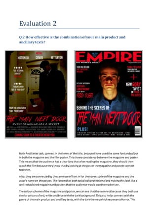
- 1. Evaluation 2 Q.2 How effective is the combinationofyour main product and ancillary texts? Both Ancillaries task,connectinthe termsof the title,because Ihave usedthe same fontandcolour inboth the magazine andthe filmposter.Thisshowsconsistencybetweenthe magazine andposter. Thismeansthat the audience hasa clearideathat afterreadingthe magazine,theyshouldthen watch the filmbecause theyknowthatbylookingatthe posterthe magazine andposterconnect together. Also,they are connectedbythe same use of fontinfor the coverstoriesof the magazine andthe actor's name on the poster. The font makesbothtaskslookprofessionalandmakingthislooklike a well-establishedmagazineand postersthatthe audience wouldwanttoreador see. The colour scheme of the magazine andposter,we can see thattheyconnectbecause theybothuse similarcolours of red,white andblue withthe darkbackground.Thisalsohelpsconnect withthe genre of the main productand ancillarytexts,withthe darkthemeswhichrepresentsHorror.This
- 2. connects to the audience because thatmeansitmakes themwanttogo and see thisfilmwiththe stabilityof these horrorconventions thathasbeenadoptedtopromote thisgenre. Also,itcanbe saidthat inthe title of the magazine. I have usedlowkeylightingintakingthe imagesbothonthe magazine andposter.The use of the lowkeylightingusedinhorrorfilmstocreate suspense orcontrol how muchof the surrounding scene isrevealed,especiallyonthe magazine how Idecidedtouse the protagonistinamysterious settingandmakingthe protagonistplaythe role of the antagonist. Alsowiththe conceptand layoutof the ancillaries followhorrorconventionsandhow itlinkswith the filmtrailerwithdarkbackgrounds. The locationinthe posteristhe same locationthatthe trailerwasshotin the same location tolink the posterand trailertogetherfromthe posteranalysisthatwasconducted.Theyuse locationsin the traileron the posterto make sure that the storylinesfollowandthe audience doesn’tget confused. The font usedonthe posterand magazine was pickedoutfroma fontanalysisthatI conducted. The font useditcalled‘true lies’.Ipickedthisfont because itrepresentshorrorandhas an enigmatic impressiontocatchthe audience attentionof whenthey see the poster,itwill connecttothe magazine andthen the filmtrailer. Alsowiththe colourred,withthe connotationswithdangeranddeath as itcan stimulate somanysensesinthe viewerandcanbe linkedtoanynumberof themesandmotives.Alsothe title’The mannextdoor’waschosenbecause it givesenigmatothe characterand mysteryto know that thiscouldbe a real life situationwith your neighborbutyoumightnotbe aware of the situationuntil muchlater.Therefore we decidedto use the title ‘The Man NextDoor’. The filmtrailerproductioncompanyisAVCN filmsandthisalsolinkstothe posterwiththe credits whichI alsodevelopedusingPhotoshop. AVCN issomethingthatwasmade upwiththe firstletters of the people ingroup.We decidedthisbecause we wantedtohave asophisticatedproduction company. The filmtrailerandposterconnectbecause theyfeature the role of the antagonist,whoisablack male.We didthisbecause to challenge the conventionsof horrorgenre because mostof the antagonistrolesthatare playedare majoritywhite male.Alsowiththe role of blackmeninhorror filmstheyare mostlythe firstcharacterto die or suspectedof beingthe antagonisteventhoughthey are innocent.
- 3. The primarytarget audience of the filmtraileris15-25 white males, thisisbecause fromresearchof target audience forhorror.Alsothere isasecondarytargetaudience thatisfemalesaged15-25. This isbecause the femalesare likelytowatchhorror filmsandplaythe role of the damsel’sindistress and therefore can hide behindthe males,if there are anygruesome scenes.Thisalsoconnectswith the posterand magazine coverbecause theyare mostlylikelytohave the same targetaudience across the 3 mediaplatforms. The filmtrailerwill be viewedinthe eveningthisisthe perfecttime forhorrorgenre because itgives the filma mysteriousatmosphere andthatthe audience are more likelytowantto see the filmin the evening/nightbecausethatiswhenmosthorror filmsare shownaccordingto some secondary researchthat wasconducted. Withthe five starreviewthatindicatesthatthe trailerandposterconnecttogetherbecause of the connotesof the phrase ‘gutretchingshivers’identifiesthatthatthishas strong meaningsandmakesthe audience imagine whatthe filmwouldbe like fromthe reviewsand that thisiswhat wouldhappenif theywere towatchthe trailer. The style of the photographyonthe ancillarytextandthe mainproductare different because,forthe magazine Iuseda close up shotof the protagonistlookinglike athe antagonistthiswasa deliberate because Ididn’twanttoreveal whothe antagonist was,but laterdecidedagainstitforthe poster,eventhoughIuseda mid- longshotof the antagonist for the posterbutI useda darktint to make the antagonistlookmysterious.