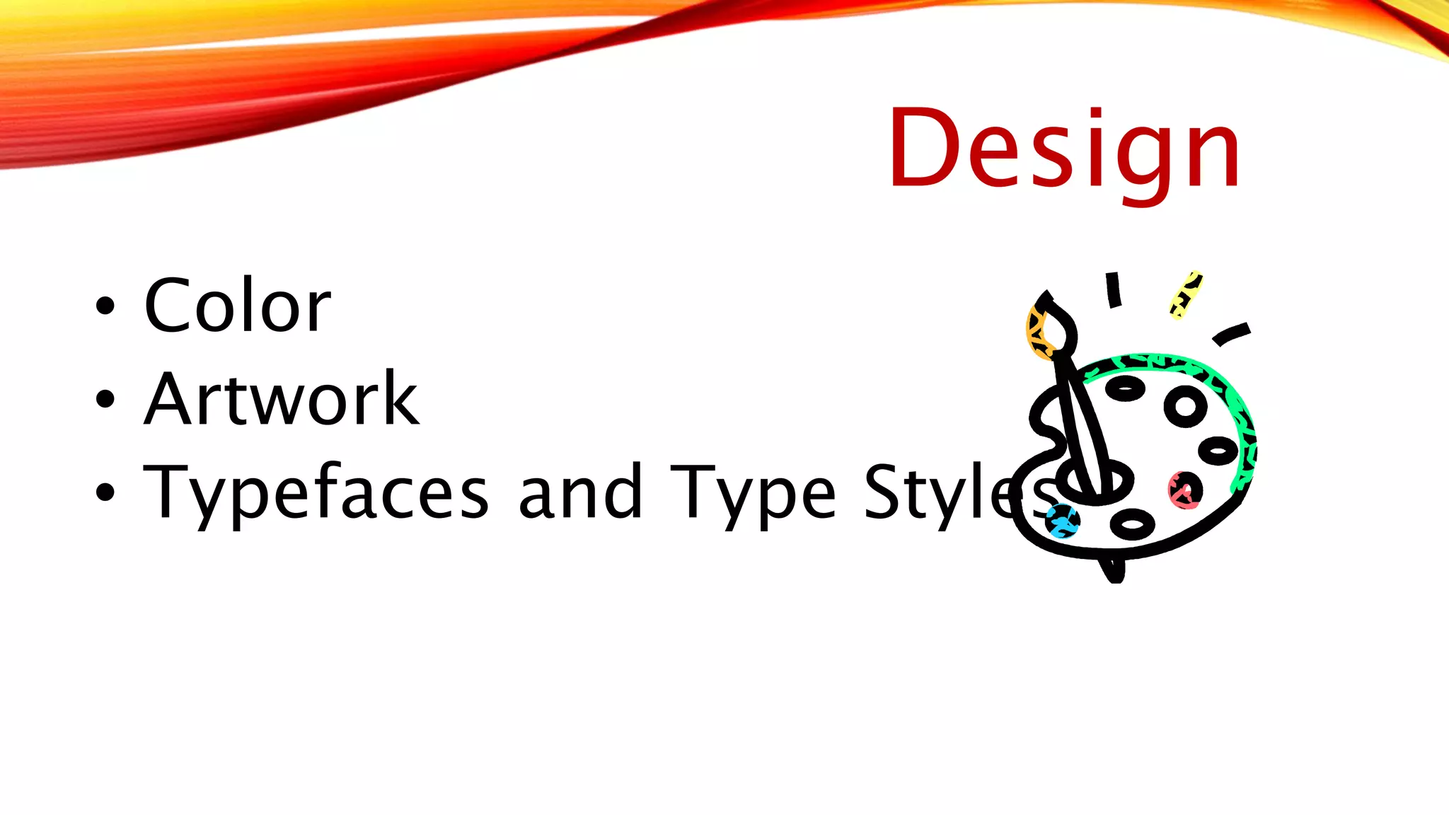
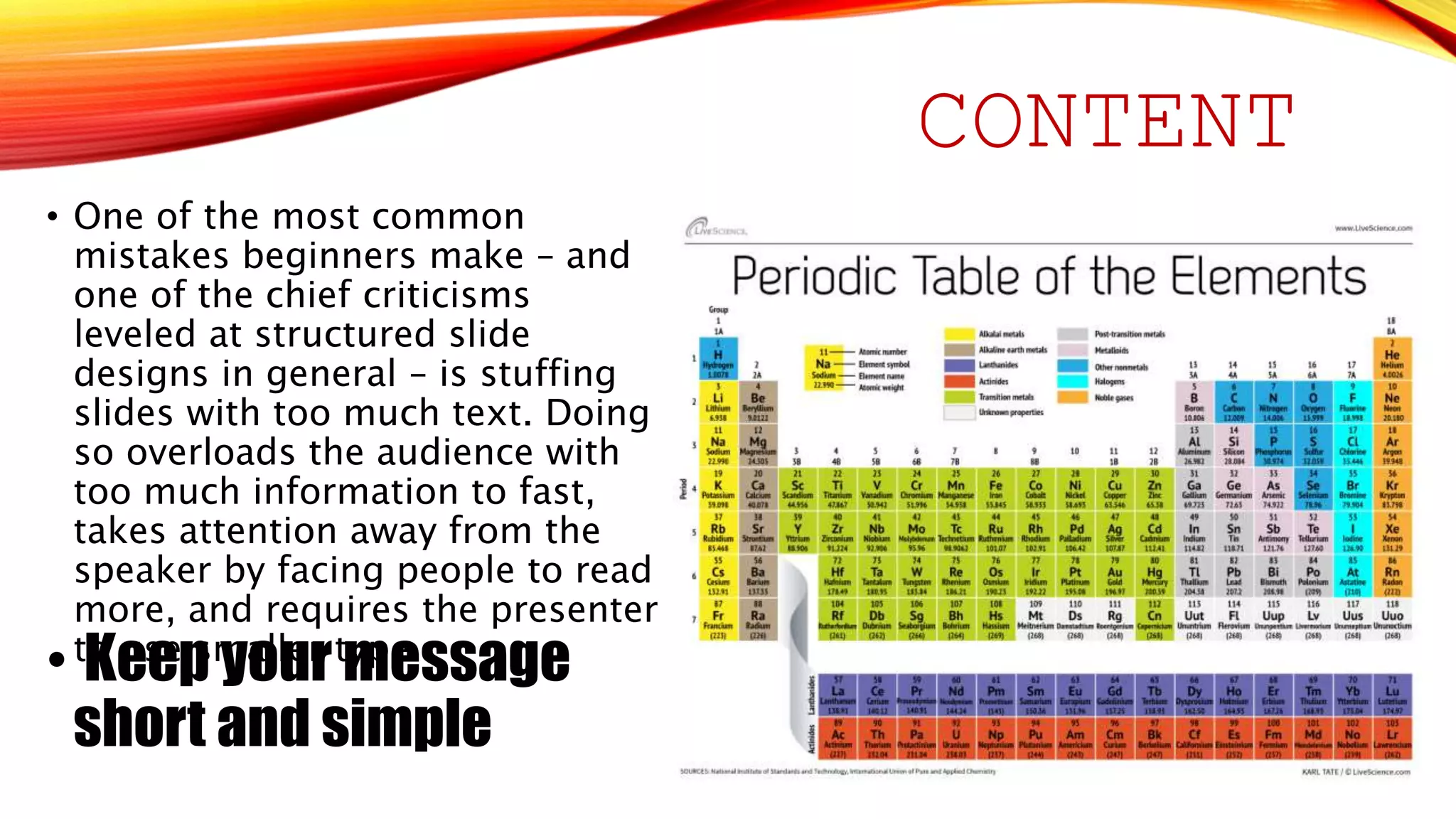
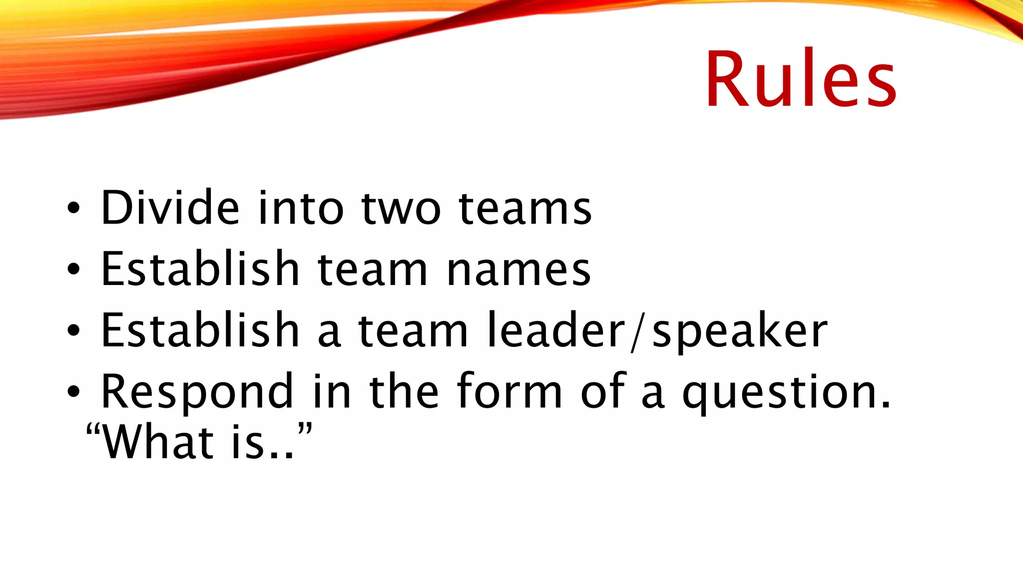
Enhancing Presentations 
with Slides and Other 
Visuals 
Lilia Huynh
Tonight’s topics 
• Planning your presentation visuals 
• Designing effective slides 
• Creating slide content
Plan
Design 
• Color 
• Artwork 
• Typefaces and Type Styles
CONTENT 
• One of the most common 
mistakes beginners make – and 
one of the chief criticisms 
leveled at structured slide 
designs in general – is stuffing 
slides with too much text. Doing 
so overloads the audience with 
too much information to fast, 
takes attention away from the 
speaker by facing people to read 
more, and requires the presenter 
• tKo euseep s myaolluerr tmypee.ssage 
short and simple
Rules 
• Divide into two teams 
• Establish team names 
• Establish a team leader/speaker 
• Respond in the form of a question. 
“What is..”

Enhancing presentations with slides and other visuals

  • 1.
    Enhancing Presentations withSlides and Other Visuals Lilia Huynh
  • 2.
    Tonight’s topics •Planning your presentation visuals • Designing effective slides • Creating slide content
  • 3.
  • 4.
    Design • Color • Artwork • Typefaces and Type Styles
  • 5.
    CONTENT • Oneof the most common mistakes beginners make – and one of the chief criticisms leveled at structured slide designs in general – is stuffing slides with too much text. Doing so overloads the audience with too much information to fast, takes attention away from the speaker by facing people to read more, and requires the presenter • tKo euseep s myaolluerr tmypee.ssage short and simple
  • 7.
    Rules • Divideinto two teams • Establish team names • Establish a team leader/speaker • Respond in the form of a question. “What is..”

Editor's Notes

  • #2 Introduction to topic and agenda
  • #3 Navigation slides – tell your audience where you’re going and where you’ve been.
  • #4 Types of Visuals: Electronic Slides Overhead transparencies – never malfunction; only need a marking pen; impossible to edit; forced to stand next to projector Chalkboards/Whiteboards – effective for small-group sessions Flip Charts – low tech tool for recording comments and questions; keep track of all the ideas the group generates Other visuals - examples include videos or mock-ups and models used by architects and designers
  • #5 Color – may have a different meaning in certain cultures Artwork – can be functional or decorative Only use decorative artwork if it supports the message The paint palette clipart is unprofessional and gives a cartoony appearance. Typefaces and Types Styles Basically limit to two fonts and be sure it is readable; boldface thinner fonts and try to avoid decorative typefaces
  • #6 What is wrong with this slide? Too much text, size is small - Guy Kawasaki’s 30-point rule ensures readable and memorable slide content Forces you to distill every idea down to its essential core Use of all caps Different typefaces Animations – transition and builds are distractive Charts – simplify the chart; complex charts and diagrams make good handouts
  • #8 Team leader will raise their hand and answer the question.