DPS Analysis 1
•Download as PPT, PDF•
0 likes•282 views
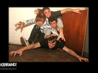
The document analyzes a double page spread from the magazine Kerrang featuring the band Enter Shikari. It discusses various design elements of the spread including the targeting of its alternative rock audience, use of language specific to rock music culture, layout with a mix of large images and brief text, and style that presents the band as iconic figures of rebellion through their appearance and quoted comments about rowdy live shows. The tone suggests addressing readers as informed fans in an "in crowd" through insider terminology and assumption of background knowledge about the featured band and genre.
Report
Share
Report
Share

Recommended
\\Stmary Bsffp01\Users$\Students-3$\97 Jb03\A Level Media\Music Mag\Presentat...
The document provides an analysis of a double page spread (DPS) interview with musician Kid Rock in Q Magazine. It examines the target audience, language, use of color, text styles, layout, tone used to address readers, how the artist is presented through images, how the style matches the front cover, and any prior knowledge demanded of readers. The analysis finds the DPS uses an informal tone and references to appeal to fans of the musician by asking specific questions they would want to know and including profanity, with a layout focused more on images than text to engage the intended audience.
E:\Media\Presentation
The document contains questions about analyzing the target audience, language, layout, and style of a magazine double page spread article and how it relates to the magazine's intended readers. Specifically, it asks about the band featured, language used, how color is used, font style and size, how the pages are laid out between images and text and what this says about the audience, the tone used to address readers, how the article style matches the cover, and if any prior knowledge is needed.
Purpose And Audience Powerpoint
This document discusses identifying the purpose and audience of writing. It provides examples of the three main purposes of writing: to inform, to persuade, and to entertain. It also discusses how the intended audience is reflected in aspects of writing like layout, formality, diction, content, and length. Readers are prompted to think about the purpose and intended audience of some video and writing examples.
Audience and Purpose
The document discusses identifying the purpose and audience of texts. It explains that the purpose can be to inform, persuade, or entertain. The intended audience should be reflected in the layout, formality, diction, content, and length. Readers are prompted to think about the purpose and intended audience of movies they've seen. They are also given examples and asked questions to help identify how purpose and audience are reflected in videos and writing. At the end, readers are instructed to write about a fun experience for either a peer or adult, reflecting the different purpose and audience.
Audience and purpose
The document provides guidance on choosing an appropriate writing style based on the purpose, audience, and subject matter. It discusses considering the purpose (such as informing or persuading), audience (whether you know them personally or not), and subject matter (whether it is factual or subjective). Based on these factors, it recommends choosing from several forms (such as reports, discussions, or instructions) and styles (formal, informal, personal, or impersonal). The goal is to use a style that clearly and explicitly conveys the intended message to the intended readers.
Music press 7 representation greg
This document discusses representation and stereotypes in the music industry and media. It begins by defining representation and how people and groups are portrayed. It then examines how the music industry creates and maintains images of performers to sell them as commodities and ideologies to target audiences. Several theories are introduced, such as Dyer's theory that stars are constructed by labels to make money. Gender, racial, and other stereotypes are pervasive in how magazines portray women, black people, and other groups. The document suggests that these representations normalize dominant societal views and can negatively influence audiences and limit diversity.
Lesson 4 analysing front covers greg
This document provides guidance on analyzing magazines and their target audiences. It introduces key terminology for describing magazine covers, including denotation and connotation. It prompts the reader to construct 3 sentences explaining the connotations of a magazine cover using proper terminology, and to identify and explain how the magazine appeals to its target audience. The document emphasizes the importance of using precise language and explaining appeals rather than making superficial statements when analyzing magazines.
Critical Thinking
The document discusses the hippie subculture. It begins with a teacher asking students what subcultures they know of and their characteristics. When the teacher mentions flowers, the students correctly guess it's referring to hippies. The document then has students read a text about hippie culture and fill out a chart about what they know and have learned. It provides discussion questions about the hippie movement that students answer as a group. Finally, the class has a discussion about hippie culture that a smaller group listens to and takes notes on.
Task 16 feedback questions
The document contains a series of questions about a magazine created for a school project, asking the audience about their perceptions of the genre of music featured in the magazine based on its visual elements like color scheme, models on the cover, and features included. It seeks feedback on whether the magazine successfully portrays and targets its intended genre and audience.
A2 media film poster analysis
The document provides guidance on analyzing film posters using various concepts from media studies. It discusses analyzing posters for connotation, anchorage, tone and register, target audience, representation, and effectiveness. It also provides examples of conventions in film posters like including previous credits, positive quotes, starring actors, title placement and font, and certificate rating. The document concludes by showing exemplar British film posters from different genres and budgets to illustrate techniques like key art, use of color, layout, and intertextual references.
Ci350 unit power point
This document outlines a 5-day lesson plan for teaching 23 third grade students about the fictional world of Harry Potter. Each day will focus on a different aspect of the Harry Potter universe and utilize various multimedia tools. The goal is for students to learn the 5 main literary elements, conduct research, and showcase their work using tools like podcasts, videos, and wikis. Activities will include reading assignments, watching videos, participating in online discussions, and creating multimedia projects. On the final day, students will complete an assessment by finishing a comprehensive wiki.
Source Analysis (OPVL)
This document provides guidance on using the OPVL method to analyze historical sources. OPVL stands for Origin, Purpose, Value, and Limitations. It explains that the Origin section establishes the author, publication details, and title. The Purpose explains why the source was created and its intended audience. Considering the Origin and Purpose helps determine the source's Value in providing historical context and perspectives, as well as its Limitations in potentially missing details or biases. The document provides examples analyzing a video about adopting shelter pets.
OPVL intro notes
This document provides an introduction to analyzing primary and secondary sources using the OPVL (Origin, Purpose, Value, Limitation) framework. It defines primary sources as those created during the event by eyewitnesses, and secondary sources as those created later by historians using primary sources. The document explains how to identify a source as primary or secondary, and provides examples of each. It then demonstrates how to analyze a sample primary source poem using the OPVL framework to understand the source's origin, purpose, value and limitations for historians. The document provides guidance on properly answering each OPVL section.
Q&a
The document outlines the results of a questionnaire for a new rap music magazine. Based on the responses, the magazine will be called "Rap", feature single artists on the cover, and have article types like interviews and reviews on the double page spread. The color scheme may include red and gold but not purple. The suggested price range is £1-3, in line with other rap magazines.
Comedy round up!
This document provides instructions for revising a PowerPoint presentation on British comedy films. It lists several topics to cover in the presentation, including describing the comedy genre, discussing character types found in comedy films, analyzing how the case studies fit aspects of "Britishness" and British humor, and mind mapping responses to exam questions about genre conventions and what makes the films British. Students are asked to create a new slide for each topic, using the case studies Love Actually and Four Lions as examples, and email the completed PowerPoint to the teacher.
Advertising Unit 15
The document provides details about a film pitch titled "The Replacement". It includes the film's title, a synopsis about a teenage girl being bullied and the murder of her two friends by an unknown hooded figure, and a proposed PG rating due to an implied murder scene. It suggests releasing the film around Halloween to appeal to the thriller genre. A survey was created to conduct primary research on audiences. Secondary research found that thrillers are most popular with the target age group. Based on the research, posters were designed to advertise the film and create intrigue by showing a character in a mask.
OPVL Overview
This document provides guidance on analyzing primary and secondary sources using the OPVL framework. It defines primary sources as those created during the event by eyewitnesses, such as diaries, photographs, letters, and tweets. Secondary sources are created later by historians using primary sources as evidence, like textbooks, historical fiction, and movies. The OPVL method involves analyzing the Origin, Purpose, Value, and Limitations of a source to evaluate its credibility and usefulness for historians. Questions are provided for each category to help guide critical analysis of sources.
Main Task - Research
Text platform conventions include headings, images, mastheads and text used to characterize different types of publications like magazines. Genre conventions use specific characteristics like color to portray different genres. Audience research found that magazine covers and contents pages that use colors, fonts and photos that match the genre are preferred, and layouts that are easy to read are good. Conclusions indicated the importance of using elements that suit the genre to appeal to audiences.
Conventions
This document discusses conventions for magazine design based on genre research. It provides guidance on elements like the masthead, cover lines, contents page, focal image, and double page spread. Key points covered include using a memorable masthead in red, multiple cover lines to showcase content, and pulling important text to specific areas of spreads. Gender, age, race and institutional representations within the indie music genre are also examined.
Purpose, Audience, Form and Tone
The document provides guidance on how to identify the purpose, form, and audience of a text. It discusses looking at word-level features like vocabulary, sentence-level features like tense and structure, and text-level features like layout and presentational devices to determine purpose. Form can be identified by text-level features and certain word-level features. Audience is identified through word choice and complexity, sentence structures, and presentational features designed for a particular reader group. The document also discusses how to identify a text's register and the difference between denotation and connotation of words.
Pitch
The document provides details about the planning and research for a student film project titled "The Replacement". It includes the film's synopsis, proposed rating, and planned release date. Primary research such as audience surveys was conducted to help inform marketing decisions. Fonts, imagery, and flatplans for potential posters are presented. Secondary research on similar films and genres was also reviewed to help with genre selection and marketing approaches. The document discusses how the research can be applied to poster designs, distribution, and building an audience for the film.
Double Page Spread Analygsis
The document analyzes a double page spread from a magazine featuring the band Paramore. It uses lyrics from Paramore songs that express feelings of pressure, loneliness, and trying to understand one's emotions. The analysis suggests the target audience is teenagers and young adults based on the choice of band. The language uses informal terms and phrases the target audience would understand. Color and fonts are used stylistically and match the magazine's informal image. Most of the two pages are taken up by a large image with text in pull quotes and captions, reflecting the audience's preference for visuals over dense text. The tone suggests an "in crowd" familiar with Paramore's music and members, demanding some prior knowledge to fully understand references.
Uses and Gratifications
The document discusses the four uses and gratifications of media: personal identity, personal relationships, escapism, and information. It defines each use and provides an example for how viewers may consume media texts for that purpose, such as forming their identity around shows they enjoy, discussing media with friends to foster relationships, escaping into magazines or shows to avoid reality, or reading newspapers to become informed.
Focus group questions
The document contains questions for a focus group about preferences for magazine design and content. It asks about what attracts readers to magazines, color preferences, expected language on covers, desired contents page contents and format preferences, preferences for double page spreads and articles, and types of artists to feature in a music-focused magazine.
Magazine cover analysis
The document discusses key elements of magazine covers when advertising movies. It notes that covers typically feature prominent actors to expand audience awareness. Covers also use images and design elements to intrigue viewers and convey the movie's genre. Text, fonts, and color schemes help grab attention and set expectations. Properly capturing these elements in covers is important to reach the right target audience for a film.
Essay planning
Stanley Kubrick is considered an auteur director due to his consistent artistic vision and themes across his films. As a director, Kubrick took on many roles such as cinematographer, editor, and soundman on his early films to maintain full control over his artistic vision. His films featured recurring themes of fear, desire, and violence that became hallmarks of his style. Kubrick's magnum opus 2001: A Space Odyssey exemplified his meticulous approach and cemented his status as an auteur through its innovative special effects and exploration of philosophical themes.
About Young Skal
Skal is the world's largest organization for tourism professionals with 23,000 members across 90 countries. Young Skal membership is open to students and junior executives aged 20-30 studying or working in tourism in Thailand. Young Skal's mission is to enroll all tourism training and industry professionals to familiarize them with Skal's values of friendship, peace, solidarity and industry cooperation.
Ice cold ppt 9 3-2010
IceCOLD is a synthetic refrigerant catalyst that consistently saves customers up to 20% on air conditioning and refrigeration electric costs through 20% less maintenance and 20% longer equipment life. It is added to AC/refrigeration systems like Freon and works by removing oil fouling, making the refrigerant evaporate at a lower temperature, and increasing compressor oil lubricity by 54%. This results in 15-30% increased system capacity and cooling. Major customers report significant cost savings, lower CO2 emissions, and payback periods under one year. Independent laboratories and major companies have validated IceCOLD's performance improvements.
CPE 07 - Póster
El Club de Ciencia como espacio para el logro de una actitud científica. - Resumen del Póster presentado durante el 3º Congreso Provincial de Educación desarrollado los días 18, 19 y 20 de Julio de 2007 en la ciudad de Trelew, Chubut bajo la temática "Calidad Educativa: Un Proceso de Construcción Conjunta."
Curricoolum, di loro chi sei - Ignite
L'Ignite del Codemotion di Roma di Curricoolum. Tu ti occupi del contenuto, noi della forma. :)
More Related Content
What's hot
Task 16 feedback questions
The document contains a series of questions about a magazine created for a school project, asking the audience about their perceptions of the genre of music featured in the magazine based on its visual elements like color scheme, models on the cover, and features included. It seeks feedback on whether the magazine successfully portrays and targets its intended genre and audience.
A2 media film poster analysis
The document provides guidance on analyzing film posters using various concepts from media studies. It discusses analyzing posters for connotation, anchorage, tone and register, target audience, representation, and effectiveness. It also provides examples of conventions in film posters like including previous credits, positive quotes, starring actors, title placement and font, and certificate rating. The document concludes by showing exemplar British film posters from different genres and budgets to illustrate techniques like key art, use of color, layout, and intertextual references.
Ci350 unit power point
This document outlines a 5-day lesson plan for teaching 23 third grade students about the fictional world of Harry Potter. Each day will focus on a different aspect of the Harry Potter universe and utilize various multimedia tools. The goal is for students to learn the 5 main literary elements, conduct research, and showcase their work using tools like podcasts, videos, and wikis. Activities will include reading assignments, watching videos, participating in online discussions, and creating multimedia projects. On the final day, students will complete an assessment by finishing a comprehensive wiki.
Source Analysis (OPVL)
This document provides guidance on using the OPVL method to analyze historical sources. OPVL stands for Origin, Purpose, Value, and Limitations. It explains that the Origin section establishes the author, publication details, and title. The Purpose explains why the source was created and its intended audience. Considering the Origin and Purpose helps determine the source's Value in providing historical context and perspectives, as well as its Limitations in potentially missing details or biases. The document provides examples analyzing a video about adopting shelter pets.
OPVL intro notes
This document provides an introduction to analyzing primary and secondary sources using the OPVL (Origin, Purpose, Value, Limitation) framework. It defines primary sources as those created during the event by eyewitnesses, and secondary sources as those created later by historians using primary sources. The document explains how to identify a source as primary or secondary, and provides examples of each. It then demonstrates how to analyze a sample primary source poem using the OPVL framework to understand the source's origin, purpose, value and limitations for historians. The document provides guidance on properly answering each OPVL section.
Q&a
The document outlines the results of a questionnaire for a new rap music magazine. Based on the responses, the magazine will be called "Rap", feature single artists on the cover, and have article types like interviews and reviews on the double page spread. The color scheme may include red and gold but not purple. The suggested price range is £1-3, in line with other rap magazines.
Comedy round up!
This document provides instructions for revising a PowerPoint presentation on British comedy films. It lists several topics to cover in the presentation, including describing the comedy genre, discussing character types found in comedy films, analyzing how the case studies fit aspects of "Britishness" and British humor, and mind mapping responses to exam questions about genre conventions and what makes the films British. Students are asked to create a new slide for each topic, using the case studies Love Actually and Four Lions as examples, and email the completed PowerPoint to the teacher.
Advertising Unit 15
The document provides details about a film pitch titled "The Replacement". It includes the film's title, a synopsis about a teenage girl being bullied and the murder of her two friends by an unknown hooded figure, and a proposed PG rating due to an implied murder scene. It suggests releasing the film around Halloween to appeal to the thriller genre. A survey was created to conduct primary research on audiences. Secondary research found that thrillers are most popular with the target age group. Based on the research, posters were designed to advertise the film and create intrigue by showing a character in a mask.
OPVL Overview
This document provides guidance on analyzing primary and secondary sources using the OPVL framework. It defines primary sources as those created during the event by eyewitnesses, such as diaries, photographs, letters, and tweets. Secondary sources are created later by historians using primary sources as evidence, like textbooks, historical fiction, and movies. The OPVL method involves analyzing the Origin, Purpose, Value, and Limitations of a source to evaluate its credibility and usefulness for historians. Questions are provided for each category to help guide critical analysis of sources.
Main Task - Research
Text platform conventions include headings, images, mastheads and text used to characterize different types of publications like magazines. Genre conventions use specific characteristics like color to portray different genres. Audience research found that magazine covers and contents pages that use colors, fonts and photos that match the genre are preferred, and layouts that are easy to read are good. Conclusions indicated the importance of using elements that suit the genre to appeal to audiences.
Conventions
This document discusses conventions for magazine design based on genre research. It provides guidance on elements like the masthead, cover lines, contents page, focal image, and double page spread. Key points covered include using a memorable masthead in red, multiple cover lines to showcase content, and pulling important text to specific areas of spreads. Gender, age, race and institutional representations within the indie music genre are also examined.
Purpose, Audience, Form and Tone
The document provides guidance on how to identify the purpose, form, and audience of a text. It discusses looking at word-level features like vocabulary, sentence-level features like tense and structure, and text-level features like layout and presentational devices to determine purpose. Form can be identified by text-level features and certain word-level features. Audience is identified through word choice and complexity, sentence structures, and presentational features designed for a particular reader group. The document also discusses how to identify a text's register and the difference between denotation and connotation of words.
Pitch
The document provides details about the planning and research for a student film project titled "The Replacement". It includes the film's synopsis, proposed rating, and planned release date. Primary research such as audience surveys was conducted to help inform marketing decisions. Fonts, imagery, and flatplans for potential posters are presented. Secondary research on similar films and genres was also reviewed to help with genre selection and marketing approaches. The document discusses how the research can be applied to poster designs, distribution, and building an audience for the film.
Double Page Spread Analygsis
The document analyzes a double page spread from a magazine featuring the band Paramore. It uses lyrics from Paramore songs that express feelings of pressure, loneliness, and trying to understand one's emotions. The analysis suggests the target audience is teenagers and young adults based on the choice of band. The language uses informal terms and phrases the target audience would understand. Color and fonts are used stylistically and match the magazine's informal image. Most of the two pages are taken up by a large image with text in pull quotes and captions, reflecting the audience's preference for visuals over dense text. The tone suggests an "in crowd" familiar with Paramore's music and members, demanding some prior knowledge to fully understand references.
Uses and Gratifications
The document discusses the four uses and gratifications of media: personal identity, personal relationships, escapism, and information. It defines each use and provides an example for how viewers may consume media texts for that purpose, such as forming their identity around shows they enjoy, discussing media with friends to foster relationships, escaping into magazines or shows to avoid reality, or reading newspapers to become informed.
Focus group questions
The document contains questions for a focus group about preferences for magazine design and content. It asks about what attracts readers to magazines, color preferences, expected language on covers, desired contents page contents and format preferences, preferences for double page spreads and articles, and types of artists to feature in a music-focused magazine.
Magazine cover analysis
The document discusses key elements of magazine covers when advertising movies. It notes that covers typically feature prominent actors to expand audience awareness. Covers also use images and design elements to intrigue viewers and convey the movie's genre. Text, fonts, and color schemes help grab attention and set expectations. Properly capturing these elements in covers is important to reach the right target audience for a film.
Essay planning
Stanley Kubrick is considered an auteur director due to his consistent artistic vision and themes across his films. As a director, Kubrick took on many roles such as cinematographer, editor, and soundman on his early films to maintain full control over his artistic vision. His films featured recurring themes of fear, desire, and violence that became hallmarks of his style. Kubrick's magnum opus 2001: A Space Odyssey exemplified his meticulous approach and cemented his status as an auteur through its innovative special effects and exploration of philosophical themes.
What's hot (18)
Viewers also liked
About Young Skal
Skal is the world's largest organization for tourism professionals with 23,000 members across 90 countries. Young Skal membership is open to students and junior executives aged 20-30 studying or working in tourism in Thailand. Young Skal's mission is to enroll all tourism training and industry professionals to familiarize them with Skal's values of friendship, peace, solidarity and industry cooperation.
Ice cold ppt 9 3-2010
IceCOLD is a synthetic refrigerant catalyst that consistently saves customers up to 20% on air conditioning and refrigeration electric costs through 20% less maintenance and 20% longer equipment life. It is added to AC/refrigeration systems like Freon and works by removing oil fouling, making the refrigerant evaporate at a lower temperature, and increasing compressor oil lubricity by 54%. This results in 15-30% increased system capacity and cooling. Major customers report significant cost savings, lower CO2 emissions, and payback periods under one year. Independent laboratories and major companies have validated IceCOLD's performance improvements.
CPE 07 - Póster
El Club de Ciencia como espacio para el logro de una actitud científica. - Resumen del Póster presentado durante el 3º Congreso Provincial de Educación desarrollado los días 18, 19 y 20 de Julio de 2007 en la ciudad de Trelew, Chubut bajo la temática "Calidad Educativa: Un Proceso de Construcción Conjunta."
Curricoolum, di loro chi sei - Ignite
L'Ignite del Codemotion di Roma di Curricoolum. Tu ti occupi del contenuto, noi della forma. :)
Play and toy ppt
The document discusses the benefits of meditation for reducing stress and anxiety. Regular meditation practice can help calm the mind and body by lowering heart rate and blood pressure. Studies have shown that meditating for just 10-20 minutes per day can have significant positive impacts on both mental and physical health over time.
Marketing of meatloaf
This documentary about Meatloaf uses a closed narrative structure to follow themes of old vs young, influence, music, media, marketing, and the subject Meatloaf. It incorporates archived footage, interviews, and music to tell the story. A male narrator provides commentary in a sarcastic but opinionated tone. Camerawork includes establishing shots, handheld footage, rule of thirds compositions and zooms. Editing features chromakey, dissolves, spins and montage. Sounds include the narrator, speeches, music, and audience reactions.
accounting
This document summarizes and advertises a book about activity-based management (ABM) techniques that can be applied to service industries, government agencies, and nonprofits. It provides an overview of the book's contents and explains that ABM involves examining an organization's structure, breaking it into separate activities, and measuring the cost and performance of each activity. The document also advertises significant discounts on textbooks available through the BestBookDeals.org website.
Q1 powerpoint (Complete)
This document discusses how the media project of a music video challenges conventions of real music videos. It analyzes the use of reversed footage, subtle effects, camera angles, color correction, narrative, relationship between music and visuals, editing, locations, clothing, and album packaging. The project uses techniques like reversed shots and time lapses seen in videos by Coldplay and Radiohead. It aims to subtly use effects to keep viewer engagement. The narrative is about memories and relationships, a common theme in indie rock. Editing and multiple locations are used to keep the video fresh. Clothing follows indie rock conventions. The overall packaging is meant to portray strangeness while being clean and simple like ads for bands like Kings of Leon.
Second draft digipak and magazine
This document promotes the album "Medicine" by the band Daughter. It displays praise for the album from music publications like NME, Kerrang, Mojo, and Q, calling it the best album of the year and describing the music as brilliant, sublime, and beautiful. It lists the hit tracks on the album and provides information on downloading and streaming the album online. It also includes a short message from the band's singer Elena Tonra about creating the album songs with heart, time, and passion over many years and life's challenges.
M Foti 10 27 2009 Conf Presentation
WGBH, a PBS station, transitioned from a tape-based to a file-based workflow to make their production process more efficient. They centralized ingest and transcoding services and allowed content to remain as files throughout the entire process from acquisition to distribution. Key aspects of planning included defining the workflow and deliverables, establishing user access permissions, and mapping out the storage structure. The new file-based workflow allowed content to be ingested once and distributed to multiple platforms.
Evaluation
- The student used various media technologies like iMovie, Final Cut Pro, After Effects, LiveType, and Photoshop to construct their horror film trailer, magazine cover, and poster.
- iMovie and Final Cut Pro were used to edit footage and add effects for the trailer. After Effects was used to create a smoke screen background and LiveType to add text over it.
- Photoshop allowed the creation of realistic magazine cover and poster through tools like color correction, clone stamp, and pen tool to modify images. This enabled effects like changing makeup for injuries.
- Different software provided accessible and effective means for editing, text, and image creation that contributed to a professional looking final product across media.
The unsigned band consists of ellie scott
The unsigned pop band consists of Ellie Scott, Johnny Sephton, Paige Browning and lead singer/producer Michael Gorse. They aim to add liveliness to the music industry by basing their music on personal opinions and actions. Videos of their cover performances can also be found on YouTube and Facebook.
Vetores
O documento define os conceitos básicos de vetores, incluindo segmentos orientados, vetor nulo, vetores opostos, equipolência, direção, sentido, soma e produto escalar de vetores. Explica como construir vetores unitários e como calcular o ângulo entre dois vetores usando o produto escalar.
Plano
Este documento fornece informações sobre a Escola Estadual Professor Joaquim Francisco Santiago, localizada em Niquelândia, Goiás. Ele descreve detalhes sobre a diretoria, modalidades de ensino, número de alunos por série/turno, dados pedagógicos como IDEB e desempenho em provas, taxas de aprovação/reprovação e evasão, projetos pedagógicos planejados e o plano de ação administrativo.
Open-source: storia di una rivoluzione silenziosa
Il 30 Marzo 2011, alla libreria Assaggi in via degli Etruschi 1, a Roma, quartiere San Lorenzo, si è tenuto l'incontro “Open Source - Storia di una rivoluzione silenziosa”, organizzato da DiScienza e dal Centro Studi Umanista Salvatore Puledda.
Programmable City Team Research
Robert Bradshaw, Smart Bikeshare
Dr Sophia Maalsen, How are discourses and practices of city governance translated into code?
Jim Merricks White, Towards a Digital Urban Commons:Developing a situated computing praxis for a more direct democracy
Alan Moore, The Role of Dublin in the Global Innovation Network of Cloud Computing
Dr Leighton Evans, How does software alter the forms and nature of work?
Darach Mac Donncha,‘How software is discursively produced and legitimised by vested interests’
Dr Sung-Yueh Perng, Programming Urban Lives
Dr Gavin McArdle, NCG, NIRSA, NUIM, Dublin Dashboard Performance Indicators & Metrics
Presentasi basing (how to make) copy (2)
This document provides a recipe for making potato fritters in 7 steps. It lists the ingredients needed which include 500g of potatoes, garlic, sugar, salt, pepper, an egg, oil, and parsley leaves. It then outlines the steps which are to peel and cut the potatoes and garlic, mash some ingredients together, shape and coat the potato pieces in egg, and deep fry until golden brown. The finished fritters are then served on a plate.
Week 3 dq 2 fixed edu recommendations for at fern
This document provides recommendations for technology supports for learners with physical disabilities. It discusses how Section 504 and IDEA have ensured equal access to education for students with physical disabilities. Sip-and-puff and augmentative and alternative communication (AAC) devices are recommended as they allow physically disabled students to participate in academic and social activities. These technologies increase opportunities for communication, participation, confidence, and inclusion for students with physical impairments impacting mobility and limb function. The document concludes that using such assistive technologies can significantly improve the quality and breadth of academic and social experiences for physically disabled learners.
Viewers also liked (20)
Similar to DPS Analysis 1
Dps Analysis
The document analyzes two music magazine double page spreads (DPS). For the first magazine, Kerrang, the summary is:
1) The target audience is mid-teens to early 30s fans of similar bands.
2) Images take up two-thirds of the DPS while text is one-third, reflecting that the audience values images more than text.
3) The tone addresses the reader as a member of an "in" crowd through informal language and references.
The document then provides the same analysis questions for the second magazine, NME.
Dps Analysis Nme
The double page spread uses a simple color scheme of red, black, and white. Images and text are evenly balanced, reflecting a target audience that values both. The informal writing style and tone portray the magazine as an insider's guide for informed, intelligent fans.
Second Double Spread Analysis
The document discusses the layout and design elements of a double page spread (DPS) in a magazine. It describes the use of a rock band to target that audience, formal language, and primary colors of black, red, and white. The body text is in Times New Roman font and laid out over one page with small writing and images. The tone when addressing the reader is quite formal. The artist is presented through images. The style of the article matches a special edition magazine cover. Some prior knowledge of the genre may be needed to fully understand references in the article.
D:\A Level\Media Studies As Level\Mr Lau\Second Double Spread Analysis
The double page spread features a rock band and uses formal language. Black, red, and white are the main colors used, with body text in Times New Roman font taking up one page and small images on the other. The formal tone and focus on the rock band suggest the target audience is fans of that genre with some assumed prior knowledge. While some context is provided, familiarity with the band or genre may aid understanding. The style of the article matches the special edition magazine's front cover.
Double Page Spread Presentation
The article targets a British audience that appreciates rock music. It uses informal, colloquial language like slang and jargon. Color is used prominently and the layout prioritizes large images over text, showing the audience values visuals over dense information. The tone suggests the magazine sees readers as members of an "in crowd." Images of the band aim to present them as rock stars. The article's style matches the casual, visual style of the front cover in targeting fans without requiring specialized knowledge.
Double Page Spread Analysis
The double page spread is aimed at teenagers and features the band Enter Shikari. Images take up about a third of the pages with the rest devoted to text. The style uses a grungy sans serif font in red and black signature colors that match the rave-inspired front cover. The tone suggests being part of an "in" crowd through informal, colloquial language about the band's fast songs and wild parties without requiring prior knowledge of the band.
Double Page Spread Presentation
This document does not contain any substantive content to summarize. It appears to be a template for analyzing aspects of a magazine article, including the target audience, language used, layout, tone and presentation of the artist. However, it does not include any actual article or content for analysis. The document consists only of question prompts and section headers with no body text.
\\Stmary Bsffp01\Users$\Students-3$\97 Jb03\A Level Media\Music Mag\Dps 2
The double page spread in NME Magazine summarizes The Strokes' garage rock style and their role in sparking the 2000s indie rock revival. Stylistically, the article uses an informal, conversational tone and references other bands to position The Strokes within indie rock history. Visually, it employs a color scheme of black, white, and red with rock font styles and casual photos of the band, reflecting NME's target audience of informed indie music fans.
Double Page Spread Analyis Presentation
The article features an unsigned band called 'Little Boots' suggesting the target audience is young and interested in up-and-coming artists. The language used in the interview is conversational while the band's responses use informal, colloquial language and swear words uncommon in magazines. Color usage is limited with a purple drop cap and a multi-colored logo in the top and bottom corners linking articles in the 'new noise' section for unsigned artists. The layout has an image of the band's singer on the left page and text on the right, giving some information but encouraging further research for those interested. The tone addresses readers as close friends in a casual, welcoming way to build a relationship with the audience.
Ava Khan Donaeomicroo [ Compatibility Mode]
The document summarizes key aspects of a magazine article layout and design. It notes that the article features an informal grunge style with a torn font and concrete background to seem less formal. It uses plain colors with only the subject in bold to make him stand out. The target audience is suggested to be fans of the featured band, known for UK funky house music. The language uses informal, direct terms and the tone suggests addressing readers as informal, intelligent fans who share an 'in' crowd status. Both the article and front cover maintain a casual, grunge style through font, images and layout. Some prior knowledge of the band may be expected.
Task 9
The focus group provided feedback on creating an R&B/Hip-Hop music magazine that would appeal to their demographic. For the front cover, they recommended using a bold image of an artist that represents the genre and relates to the main article. Sell lines should promote music, artists, urban fashion, and culture. Appropriate colors include red, grey, blue, and black. The contents page should feature 2-3 images related to articles and include a variety of content about music, fashion, interviews, and concerts. Double page spreads should have edgy images of artists to attract readers and include articles about an artist's music, personal life, achievements, and future plans, written in a collo
Dps Analysis Answers Nme
The document summarizes an analysis of a magazine article from NME (New Musical Express) about various bands that also have television shows.
The summary addresses questions about the target audience (adolescents and young adults who watch the TV shows), the informal language used in the article, the simple color scheme (red, black, white), and the balanced layout with both images and text.
It finds that the magazine presents the bands as popular and part of the "in-crowd", addresses readers as informed fans, and does not require prior knowledge of the bands to understand the article.
Nme Double Page Spread2
The double page spread uses a large sans serif font for the article title in black, maintaining a consistent color scheme throughout the magazine. The left page features a large image of British singer Lily Allen, representing the type of band targeted at the magazine's audience. While the spread uses minimal text, it provides insight into Allen through the image and article, presenting her stereotypical "emo" image to readers in an informal tone without demanding prior knowledge.
Focus group questionnaire
The document provides questions for a focus group to evaluate sample pages from a magazine, including the front page, contents page, and a double-page spread. The focus group is asked about the layout, color scheme, readability, interest of the text and images, appropriateness for the genre of indie music, and likelihood of purchasing the magazine based on each sample page. Participants are also asked to provide strengths and weaknesses of each page and an overall rating out of ten.
Final questionnaire
The document summarizes the results of a questionnaire sent to 30 people about their preferences for an independent music magazine. Key findings include:
- Readers preferred an interview about an artist's rise in the industry over other story types.
- They wanted more pictures than text.
- Arctic Monkeys was the most popular artist choice.
- A long shot photo was preferred for the magazine cover over other shot types.
- Pricing between £3.50-3.99 was expected.
- "Rift" was the most appealing title.
- A contents page with a large focal image and band index was most appealing.
Nme Double Page Spread
The double page spread in NME magazine features the pop group Girls Aloud. The layout consists of a large main image taking up one page, with the article title and additional smaller images. The other page contains mostly text with some additional images. The style of the article matches the front cover in representing the band and appealing to NME's target audience. The tone used to address the reader is informal and conversational, reflecting the magazine's image as part of an "in" crowd.
Music Magazine Double Page Spread Analysis
The document is an analysis of a double page spread from a music magazine featuring Lady Gaga. It examines the target audience based on the choice of artist, the language, colors, fonts and layout used in the article. The analysis looks at how much space is given to images versus text and what this says about the audience's values. It also considers the tone used to address readers and how the artist is presented through the images.
My focus group
The focus group provided feedback on designing a magazine for the rock/indie genre. They recommended:
- Using dark, bold colors and images of musicians holding instruments on the cover to represent the genre. Cover lines should promote artists and contests.
- Including interviews, concert listings, fashion trends, and advertisements in the magazine. Images and minimal informal text on the contents page should highlight the sections.
- Featuring a cover story interview or article about an up-and-coming artist's journey in the industry in the double page spread. Accompanying images should portray the rock style and multiple shots of the subject.
Similar to DPS Analysis 1 (20)
D:\A Level\Media Studies As Level\Mr Lau\Second Double Spread Analysis
D:\A Level\Media Studies As Level\Mr Lau\Second Double Spread Analysis
\\Stmary Bsffp01\Users$\Students-3$\97 Jb03\A Level Media\Music Mag\Dps 2
\\Stmary Bsffp01\Users$\Students-3$\97 Jb03\A Level Media\Music Mag\Dps 2
More from guest83d30846
Mercury evaluation6
Mercury magazine was influenced by the conventions of Kerrang magazine, including banners, cover models obscuring the masthead, and bar codes with issue details. The layout uses conventions like sidebars with page numbers and titles, and larger feature articles. The content targets 16-25 year olds of both genders interested in a variety of music genres and the music industry. To attract this audience, the magazine uses eye-catching covers, competitions, informal language, and appropriate images.
Toc Photoshoot
A photoshoot is scheduled for March 17th featuring the band Selassie Charles Mawuli Charles. A high-angle, tilted shot will be taken of both models on a white staircase to give an interesting warped effect. Natural light from windows will be used due to the limited space preventing flash usage. One model will hold an electric guitar and stand while the other sits nearby. The casual clothing of both should look cool but branding may need cloning out due to copyright.
DPS Planning
The document discusses ideas for layout of a double-page spread (DPS) magazine spread. Several layout designs are presented and revised to improve organization and flow. The final design features a large main photo on the left side with models positioned to avoid the middle crease, leaving white space on the right for article text. This solves prior issues while allowing more text than images, which some readers may find intimidating.
DPS Photoshoot Plan
The document provides details for an additional photoshoot with four models: Gina Kayali, Ama Charles, Magne, Sonia Naqvi, Heliena Hagos, and Laura Franklin. It specifies the shot type, lighting, background, and positioning for each model, as well as potential editing details. The shoot will include mid shots, close-ups, and portraits taken outdoors, indoors, and at night using natural light, flash, and macro lenses depending on the situation. Backgrounds will include walls, parks, and interior rooms. Photos will be positioned in the double page spread, sidebar, and as portraits. Minimal editing is planned besides potential skin or contrast adjustments
Cover Photoshoot
The document provides details for a cover photoshoot including the model, shot type, lighting, background, and positioning on the cover. Gina Kayali will be photographed from a mid or low angle in natural light in a shaded area without macro or flash. She will take up most of the frame against an unimportant background. Her image will be the main masthead photo on the cover surrounded by coverlines and text. Minor editing may remove blemishes and adjust background lighting.
Questionnaire Resultspdf
This document contains the results of a survey about music magazine preferences. The top three music genres listened to are hip hop, rock, and indie. The most read magazines are Kerrang, Q, and NME. Most respondents would buy a magazine monthly and enjoy artist interviews, latest music news, and a variety of genres in a magazine. Most would pay £3.50-£3.99 and prefer the color scheme of black and purple. The majority were aged 16-18 and preferred font 4 for the magazine masthead.
Questionnaire Results
This document appears to be a music magazine questionnaire. It asks respondents about their music preferences, magazine reading habits, desired features and pricing. Key details include that most listen to hip hop or pop music, read Kerrang or Q magazines, enjoy artist interviews and reviews in magazines, and prefer color schemes of black and purple or black and white.
Questionnaire Results
The document appears to be a music magazine questionnaire. It asks respondents about their music preferences, magazine reading habits, and preferences regarding magazine features, pricing, design, and fonts. Key results include that most respondents listen to hip hop or rock music, read Kerrang or NME magazine, and enjoy artist interviews and event information in magazines. Most would pay £3.50-£3.99 and prefer the purple and white or black and purple color schemes and Font 4 for the masthead.
Tally Results Analysis
The document summarizes the results of a questionnaire about music magazine preferences. Based on the results, the creator will:
1) Focus on alternative music as the most popular genre and also include some coverage of different language music.
2) Publish the magazine monthly as most respondents said they would buy it monthly.
3) Feature artist/band interviews prominently based on it being the most popular content choice.
4) Price the magazine at £3.50 to appeal to most respondents who chose between £2.50-£2.99 and £3.50-£3.99.
Questionnaire Results
The document is a questionnaire about music magazine preferences. It asks respondents about their favorite music genres, magazines read, purchase frequency of magazines, favorite magazine features, preferred price range and color schemes, age range, and font preference for magazine titles. The majority of respondents listen to alternative music, read NME magazine monthly, enjoy artist interviews and reviews in magazines, and would pay £3.50-£3.99 for a magazine.
Tally Questionnaire
This document is a survey about music magazine preferences. It asks respondents about their music tastes, favorite artists, magazines read, purchase frequency, enjoyed features, willingness to pay, preferred color schemes, gender, age, and preferred font for the magazine title. The questions gather demographic information and opinions to help inform the creation and marketing of a new music magazine.
Project Plan
The document outlines a media studies project plan with tasks from November 2009 to March 2009, including creating questionnaires, analyzing existing magazine elements, producing mockups and drafts of a front cover, table of contents, and double page spread, gathering feedback, and finalizing and presenting the project.
Tally Questionnaire
This document is a survey about music magazine preferences. It asks respondents about their music tastes, favorite artists, magazines read, purchase frequency, enjoyed features, willingness to pay, preferred color schemes, gender, age, and preferred font for the magazine title. The questions gather information on demographics and opinions to help inform the creation and marketing of a music magazine.
Tally Questionnaire
This survey aims to gather information about music magazine readers' music preferences, reading habits, and opinions on magazine features and design. Respondents are asked about the types of music they listen to, their favorite bands and magazines, purchase frequency, enjoyed content types, willingness to pay, preferred color schemes, gender, and age. They are also able to provide feedback on their preferred font for the magazine title.
Tally Results Analysis
The document summarizes the results of a questionnaire about music magazine preferences. Based on the results, the magazine will focus on alternative music and mention some foreign language music. It will be published monthly to reduce costs. The main feature will be artist/band interviews. The magazine will be priced at £3.50 and have a black and purple color scheme targeting 16-18 year olds. The masthead font will be Inked God.
Tally Questionnaire
The document is a survey about music magazine preferences. It asks respondents about the type of music they listen to, their favorite bands, which music magazines they read and how often, what features they enjoy in music magazines, how much they are willing to pay, their preferred color schemes and fonts. It collects demographic information like gender and age as well. The survey aims to understand readers' tastes to help music magazines better target their audience.
More from guest83d30846 (20)
Recently uploaded
Cosa hanno in comune un mattoncino Lego e la backdoor XZ?
ABSTRACT: A prima vista, un mattoncino Lego e la backdoor XZ potrebbero avere in comune il fatto di essere entrambi blocchi di costruzione, o dipendenze di progetti creativi e software. La realtà è che un mattoncino Lego e il caso della backdoor XZ hanno molto di più di tutto ciò in comune.
Partecipate alla presentazione per immergervi in una storia di interoperabilità, standard e formati aperti, per poi discutere del ruolo importante che i contributori hanno in una comunità open source sostenibile.
BIO: Sostenitrice del software libero e dei formati standard e aperti. È stata un membro attivo dei progetti Fedora e openSUSE e ha co-fondato l'Associazione LibreItalia dove è stata coinvolta in diversi eventi, migrazioni e formazione relativi a LibreOffice. In precedenza ha lavorato a migrazioni e corsi di formazione su LibreOffice per diverse amministrazioni pubbliche e privati. Da gennaio 2020 lavora in SUSE come Software Release Engineer per Uyuni e SUSE Manager e quando non segue la sua passione per i computer e per Geeko coltiva la sua curiosità per l'astronomia (da cui deriva il suo nickname deneb_alpha).
20240605 QFM017 Machine Intelligence Reading List May 2024
Everything I found interesting about machines behaving intelligently during May 2024
Essentials of Automations: The Art of Triggers and Actions in FME
In this second installment of our Essentials of Automations webinar series, we’ll explore the landscape of triggers and actions, guiding you through the nuances of authoring and adapting workspaces for seamless automations. Gain an understanding of the full spectrum of triggers and actions available in FME, empowering you to enhance your workspaces for efficient automation.
We’ll kick things off by showcasing the most commonly used event-based triggers, introducing you to various automation workflows like manual triggers, schedules, directory watchers, and more. Plus, see how these elements play out in real scenarios.
Whether you’re tweaking your current setup or building from the ground up, this session will arm you with the tools and insights needed to transform your FME usage into a powerhouse of productivity. Join us to discover effective strategies that simplify complex processes, enhancing your productivity and transforming your data management practices with FME. Let’s turn complexity into clarity and make your workspaces work wonders!
Climate Impact of Software Testing at Nordic Testing Days
My slides at Nordic Testing Days 6.6.2024
Climate impact / sustainability of software testing discussed on the talk. ICT and testing must carry their part of global responsibility to help with the climat warming. We can minimize the carbon footprint but we can also have a carbon handprint, a positive impact on the climate. Quality characteristics can be added with sustainability, and then measured continuously. Test environments can be used less, and in smaller scale and on demand. Test techniques can be used in optimizing or minimizing number of tests. Test automation can be used to speed up testing.
GraphSummit Singapore | Neo4j Product Vision & Roadmap - Q2 2024
Maruthi Prithivirajan, Head of ASEAN & IN Solution Architecture, Neo4j
Get an inside look at the latest Neo4j innovations that enable relationship-driven intelligence at scale. Learn more about the newest cloud integrations and product enhancements that make Neo4j an essential choice for developers building apps with interconnected data and generative AI.
Artificial Intelligence for XMLDevelopment
In the rapidly evolving landscape of technologies, XML continues to play a vital role in structuring, storing, and transporting data across diverse systems. The recent advancements in artificial intelligence (AI) present new methodologies for enhancing XML development workflows, introducing efficiency, automation, and intelligent capabilities. This presentation will outline the scope and perspective of utilizing AI in XML development. The potential benefits and the possible pitfalls will be highlighted, providing a balanced view of the subject.
We will explore the capabilities of AI in understanding XML markup languages and autonomously creating structured XML content. Additionally, we will examine the capacity of AI to enrich plain text with appropriate XML markup. Practical examples and methodological guidelines will be provided to elucidate how AI can be effectively prompted to interpret and generate accurate XML markup.
Further emphasis will be placed on the role of AI in developing XSLT, or schemas such as XSD and Schematron. We will address the techniques and strategies adopted to create prompts for generating code, explaining code, or refactoring the code, and the results achieved.
The discussion will extend to how AI can be used to transform XML content. In particular, the focus will be on the use of AI XPath extension functions in XSLT, Schematron, Schematron Quick Fixes, or for XML content refactoring.
The presentation aims to deliver a comprehensive overview of AI usage in XML development, providing attendees with the necessary knowledge to make informed decisions. Whether you’re at the early stages of adopting AI or considering integrating it in advanced XML development, this presentation will cover all levels of expertise.
By highlighting the potential advantages and challenges of integrating AI with XML development tools and languages, the presentation seeks to inspire thoughtful conversation around the future of XML development. We’ll not only delve into the technical aspects of AI-powered XML development but also discuss practical implications and possible future directions.
Microsoft - Power Platform_G.Aspiotis.pdf
Revolutionizing Application Development
with AI-powered low-code, presentation by George Aspiotis, Sr. Partner Development Manager, Microsoft
Best 20 SEO Techniques To Improve Website Visibility In SERP
Boost your website's visibility with proven SEO techniques! Our latest blog dives into essential strategies to enhance your online presence, increase traffic, and rank higher on search engines. From keyword optimization to quality content creation, learn how to make your site stand out in the crowded digital landscape. Discover actionable tips and expert insights to elevate your SEO game.
UiPath Test Automation using UiPath Test Suite series, part 6
Welcome to UiPath Test Automation using UiPath Test Suite series part 6. In this session, we will cover Test Automation with generative AI and Open AI.
UiPath Test Automation with generative AI and Open AI webinar offers an in-depth exploration of leveraging cutting-edge technologies for test automation within the UiPath platform. Attendees will delve into the integration of generative AI, a test automation solution, with Open AI advanced natural language processing capabilities.
Throughout the session, participants will discover how this synergy empowers testers to automate repetitive tasks, enhance testing accuracy, and expedite the software testing life cycle. Topics covered include the seamless integration process, practical use cases, and the benefits of harnessing AI-driven automation for UiPath testing initiatives. By attending this webinar, testers, and automation professionals can gain valuable insights into harnessing the power of AI to optimize their test automation workflows within the UiPath ecosystem, ultimately driving efficiency and quality in software development processes.
What will you get from this session?
1. Insights into integrating generative AI.
2. Understanding how this integration enhances test automation within the UiPath platform
3. Practical demonstrations
4. Exploration of real-world use cases illustrating the benefits of AI-driven test automation for UiPath
Topics covered:
What is generative AI
Test Automation with generative AI and Open AI.
UiPath integration with generative AI
Speaker:
Deepak Rai, Automation Practice Lead, Boundaryless Group and UiPath MVP
HCL Notes and Domino License Cost Reduction in the World of DLAU
Webinar Recording: https://www.panagenda.com/webinars/hcl-notes-and-domino-license-cost-reduction-in-the-world-of-dlau/
The introduction of DLAU and the CCB & CCX licensing model caused quite a stir in the HCL community. As a Notes and Domino customer, you may have faced challenges with unexpected user counts and license costs. You probably have questions on how this new licensing approach works and how to benefit from it. Most importantly, you likely have budget constraints and want to save money where possible. Don’t worry, we can help with all of this!
We’ll show you how to fix common misconfigurations that cause higher-than-expected user counts, and how to identify accounts which you can deactivate to save money. There are also frequent patterns that can cause unnecessary cost, like using a person document instead of a mail-in for shared mailboxes. We’ll provide examples and solutions for those as well. And naturally we’ll explain the new licensing model.
Join HCL Ambassador Marc Thomas in this webinar with a special guest appearance from Franz Walder. It will give you the tools and know-how to stay on top of what is going on with Domino licensing. You will be able lower your cost through an optimized configuration and keep it low going forward.
These topics will be covered
- Reducing license cost by finding and fixing misconfigurations and superfluous accounts
- How do CCB and CCX licenses really work?
- Understanding the DLAU tool and how to best utilize it
- Tips for common problem areas, like team mailboxes, functional/test users, etc
- Practical examples and best practices to implement right away
Infrastructure Challenges in Scaling RAG with Custom AI models
Building Retrieval-Augmented Generation (RAG) systems with open-source and custom AI models is a complex task. This talk explores the challenges in productionizing RAG systems, including retrieval performance, response synthesis, and evaluation. We’ll discuss how to leverage open-source models like text embeddings, language models, and custom fine-tuned models to enhance RAG performance. Additionally, we’ll cover how BentoML can help orchestrate and scale these AI components efficiently, ensuring seamless deployment and management of RAG systems in the cloud.
みなさんこんにちはこれ何文字まで入るの?40文字以下不可とか本当に意味わからないけどこれ限界文字数書いてないからマジでやばい文字数いけるんじゃないの?えこ...
ここ3000字までしか入らないけどタイトルの方がたくさん文字入ると思います。
Goodbye Windows 11: Make Way for Nitrux Linux 3.5.0!
As the digital landscape continually evolves, operating systems play a critical role in shaping user experiences and productivity. The launch of Nitrux Linux 3.5.0 marks a significant milestone, offering a robust alternative to traditional systems such as Windows 11. This article delves into the essence of Nitrux Linux 3.5.0, exploring its unique features, advantages, and how it stands as a compelling choice for both casual users and tech enthusiasts.
Why You Should Replace Windows 11 with Nitrux Linux 3.5.0 for enhanced perfor...
The choice of an operating system plays a pivotal role in shaping our computing experience. For decades, Microsoft's Windows has dominated the market, offering a familiar and widely adopted platform for personal and professional use. However, as technological advancements continue to push the boundaries of innovation, alternative operating systems have emerged, challenging the status quo and offering users a fresh perspective on computing.
One such alternative that has garnered significant attention and acclaim is Nitrux Linux 3.5.0, a sleek, powerful, and user-friendly Linux distribution that promises to redefine the way we interact with our devices. With its focus on performance, security, and customization, Nitrux Linux presents a compelling case for those seeking to break free from the constraints of proprietary software and embrace the freedom and flexibility of open-source computing.
Presentation of the OECD Artificial Intelligence Review of Germany
Consult the full report at https://www.oecd.org/digital/oecd-artificial-intelligence-review-of-germany-609808d6-en.htm
Driving Business Innovation: Latest Generative AI Advancements & Success Story
Are you ready to revolutionize how you handle data? Join us for a webinar where we’ll bring you up to speed with the latest advancements in Generative AI technology and discover how leveraging FME with tools from giants like Google Gemini, Amazon, and Microsoft OpenAI can supercharge your workflow efficiency.
During the hour, we’ll take you through:
Guest Speaker Segment with Hannah Barrington: Dive into the world of dynamic real estate marketing with Hannah, the Marketing Manager at Workspace Group. Hear firsthand how their team generates engaging descriptions for thousands of office units by integrating diverse data sources—from PDF floorplans to web pages—using FME transformers, like OpenAIVisionConnector and AnthropicVisionConnector. This use case will show you how GenAI can streamline content creation for marketing across the board.
Ollama Use Case: Learn how Scenario Specialist Dmitri Bagh has utilized Ollama within FME to input data, create custom models, and enhance security protocols. This segment will include demos to illustrate the full capabilities of FME in AI-driven processes.
Custom AI Models: Discover how to leverage FME to build personalized AI models using your data. Whether it’s populating a model with local data for added security or integrating public AI tools, find out how FME facilitates a versatile and secure approach to AI.
We’ll wrap up with a live Q&A session where you can engage with our experts on your specific use cases, and learn more about optimizing your data workflows with AI.
This webinar is ideal for professionals seeking to harness the power of AI within their data management systems while ensuring high levels of customization and security. Whether you're a novice or an expert, gain actionable insights and strategies to elevate your data processes. Join us to see how FME and AI can revolutionize how you work with data!
Full-RAG: A modern architecture for hyper-personalization
Mike Del Balso, CEO & Co-Founder at Tecton, presents "Full RAG," a novel approach to AI recommendation systems, aiming to push beyond the limitations of traditional models through a deep integration of contextual insights and real-time data, leveraging the Retrieval-Augmented Generation architecture. This talk will outline Full RAG's potential to significantly enhance personalization, address engineering challenges such as data management and model training, and introduce data enrichment with reranking as a key solution. Attendees will gain crucial insights into the importance of hyperpersonalization in AI, the capabilities of Full RAG for advanced personalization, and strategies for managing complex data integrations for deploying cutting-edge AI solutions.
Recently uploaded (20)
Cosa hanno in comune un mattoncino Lego e la backdoor XZ?
Cosa hanno in comune un mattoncino Lego e la backdoor XZ?
20240605 QFM017 Machine Intelligence Reading List May 2024
20240605 QFM017 Machine Intelligence Reading List May 2024
Essentials of Automations: The Art of Triggers and Actions in FME
Essentials of Automations: The Art of Triggers and Actions in FME
Climate Impact of Software Testing at Nordic Testing Days
Climate Impact of Software Testing at Nordic Testing Days
GraphSummit Singapore | Neo4j Product Vision & Roadmap - Q2 2024
GraphSummit Singapore | Neo4j Product Vision & Roadmap - Q2 2024
Best 20 SEO Techniques To Improve Website Visibility In SERP
Best 20 SEO Techniques To Improve Website Visibility In SERP
UiPath Test Automation using UiPath Test Suite series, part 6
UiPath Test Automation using UiPath Test Suite series, part 6
HCL Notes and Domino License Cost Reduction in the World of DLAU
HCL Notes and Domino License Cost Reduction in the World of DLAU
Infrastructure Challenges in Scaling RAG with Custom AI models
Infrastructure Challenges in Scaling RAG with Custom AI models
みなさんこんにちはこれ何文字まで入るの?40文字以下不可とか本当に意味わからないけどこれ限界文字数書いてないからマジでやばい文字数いけるんじゃないの?えこ...
みなさんこんにちはこれ何文字まで入るの?40文字以下不可とか本当に意味わからないけどこれ限界文字数書いてないからマジでやばい文字数いけるんじゃないの?えこ...
Goodbye Windows 11: Make Way for Nitrux Linux 3.5.0!
Goodbye Windows 11: Make Way for Nitrux Linux 3.5.0!
Why You Should Replace Windows 11 with Nitrux Linux 3.5.0 for enhanced perfor...
Why You Should Replace Windows 11 with Nitrux Linux 3.5.0 for enhanced perfor...
Presentation of the OECD Artificial Intelligence Review of Germany
Presentation of the OECD Artificial Intelligence Review of Germany
Driving Business Innovation: Latest Generative AI Advancements & Success Story
Driving Business Innovation: Latest Generative AI Advancements & Success Story
Full-RAG: A modern architecture for hyper-personalization
Full-RAG: A modern architecture for hyper-personalization
DPS Analysis 1
- 2. Kerrang Double Page Spread Analysis By Ama Charles
- 3. 1) How does the choice of band featured in the article suggest who the target audience will be? "I think there were six ambulances called throughout the gig. And a fire engine. And police.“ (Enter Shikari’s drummer Rob Rolfe) “ There aren't ambulances and casualties at every one of our shows. Unfortunately.“ (Rob Rolfe)
- 4. 2) What type of language is used in the article? Give examples of words or phrases which are specific to the style of the magazine.
- 5. 3) How is colour used?
- 6. 4) What style of text (font type/colour/size) is used? Is it similar to any other pages? What does it say about the image of the magazine and the audience?
- 7. 5) How is the double page spread laid out? How much of the pages are taken up by images and how much by text? How does this reflect the audience? What do they value?
- 8. 5) How is the double page spread laid out? How much of the pages are taken up by images and how much by text? How does this reflect the audience? What do they value?
- 9. 6) What tone is the magazine using when addressing the reader (as a close friend, a member of an 'in' crowd or an informed intelligent fan?)-provide evidence.
- 10. 7) How is the artist/band presented to the audience through the images? You may wish to carry out a textual analysis. ALCOHOL RANDOMNESS TATTOOS, GRAFFITI
- 11. 8) How does the style of the article match the style of the front cover? EYE CONTACT: THESE PEOPLE DON’T MATTER THESE PEOPLE MATTER!
- 12. 9) Does the article demand any prior knowledge? Give examples.
Editor's Notes
- Myspace, 16-25, middle class boys in education, violence associated with boys.
- Note-paper, ripped The article title is at an angle, kind of rebelling against normal conventions. Sans serif is kind of a symbol of modern, machine age while serif fonts represent the kind of old-fashioned, classical age.
- Masthead.