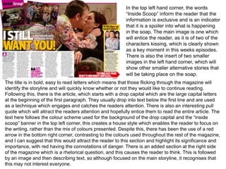
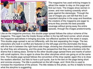
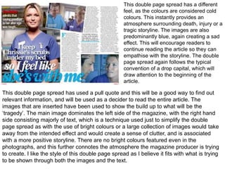
This document summarizes and analyzes the layout, design elements, and techniques used across multiple pages in a soap opera magazine. Key elements included enticing images, drop caps, pull quotes, and color schemes to attract and engage readers. Different page spreads used varying techniques - some used dominating central images with text insets, while others separated images and text or featured sad, blue tones to set the tone for tragic storylines. Overall the document examines how the magazine uses visual design to preview stories and intrigue readers without fully revealing episode plots.