n


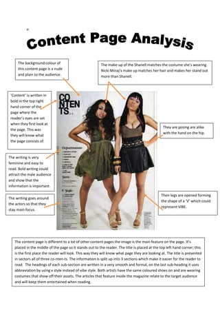
     The background colour of                            The make-up of the Shanell matches the costume she’s wearing.
     this content page is a nude                         Nicki Minaj‘s make up matches her hair and makes her stand out
     and plain to the audience.                          more than Shanell.


 ‘Content’ is written in
 bold in the top right
 hand corner of the
 page where the
 reader’s eyes are set
 when they first look at
                                                                                                They are posing are alike
 the page. This was
                                                                                                with the hand on the hip.
 they will know what
 the page consists of.


The writing is very
feminine and easy to
read. Bold writing could
attract the male audience
and show that the
information is important.

                                                                                               Their legs are opened forming
The writing goes around
                                                                                               the shape of a ‘V’ which could
the actors so that they
                                                                                               represent VIBE.
stay main focus.


   The content page is different to a lot of other content pages the image is the main feature on the page. It’s
   placed in the middle of the page so it stands out to the reader. The title is placed at the top left hand corner; this
   is the first place the reader will look. This way they will know what page they are looking at. The title is presented
   in sectors all of three co-nten-ts. The information is split up into 3 sections which make it easier for the reader to
   read. The headings of each sub-section are written in a very smooth and formal, on the last sub-heading it uses
   abbreviation by using v style instead of vibe style. Both artists have the same coloured shoes on and are wearing
   costumes that show off their assets. The articles that feature inside the magazine relate to the target audience
   and will keep them entertained when reading.
The ‘V’ represents the title of VIBE.                           The title of the content page is written in bold
     It also ties in with the name of the                            and split up to fit on the page. Its written in
     magazine and the ‘V’ that shows up                              white so it will stand out on the page and entice
     in the background.                                              the audience and tell them what is going to be
                                                                     placed inside the magazine.


                                                                                                       The main titles are
The pose and position of
                                                                                                       written in a feminine
Ciara could be very
                                                                                                       font and in a bigger
engaging to the male
                                                                                                       font than all the
audience and make them
                                                                                                       other information.
what o carry on reading
what’s inside the
magazine. Her legs attract
the readers to the title of
the page.


                                                                                                       Ciara is making clear eye
                                                                                                       contact with audience
Her costume matches the
                                                                                                       and show they want to
background and the nude
                                                                                                       interact with them and
colours that being
                                                                                                       entice them to read
portrayed throughout the
                                                                                                       more and buy the
content page.
                                                                                                       magazine.


     This content page is different to many other content pages as the main image isn’t in the middle its down the bottom
     this could be like this to keep the image in the readers head as the bottom right is the last place a person looks at
     when reading. The title is distinctive and is easy to read, it tells the reader what the page entails. The page it’s self
     tell the reader what the magazine has inside. The mode of address is informal and youthful. The list that the content
     page shows relates to all the information inside the magazine. It’s split up into two sections fashion and features.

Content page analysis

  • 1.
    n The background colour of The make-up of the Shanell matches the costume she’s wearing. this content page is a nude Nicki Minaj‘s make up matches her hair and makes her stand out and plain to the audience. more than Shanell. ‘Content’ is written in bold in the top right hand corner of the page where the reader’s eyes are set when they first look at They are posing are alike the page. This was with the hand on the hip. they will know what the page consists of. The writing is very feminine and easy to read. Bold writing could attract the male audience and show that the information is important. Their legs are opened forming The writing goes around the shape of a ‘V’ which could the actors so that they represent VIBE. stay main focus. The content page is different to a lot of other content pages the image is the main feature on the page. It’s placed in the middle of the page so it stands out to the reader. The title is placed at the top left hand corner; this is the first place the reader will look. This way they will know what page they are looking at. The title is presented in sectors all of three co-nten-ts. The information is split up into 3 sections which make it easier for the reader to read. The headings of each sub-section are written in a very smooth and formal, on the last sub-heading it uses abbreviation by using v style instead of vibe style. Both artists have the same coloured shoes on and are wearing costumes that show off their assets. The articles that feature inside the magazine relate to the target audience and will keep them entertained when reading.
  • 2.
    The ‘V’ representsthe title of VIBE. The title of the content page is written in bold It also ties in with the name of the and split up to fit on the page. Its written in magazine and the ‘V’ that shows up white so it will stand out on the page and entice in the background. the audience and tell them what is going to be placed inside the magazine. The main titles are The pose and position of written in a feminine Ciara could be very font and in a bigger engaging to the male font than all the audience and make them other information. what o carry on reading what’s inside the magazine. Her legs attract the readers to the title of the page. Ciara is making clear eye contact with audience Her costume matches the and show they want to background and the nude interact with them and colours that being entice them to read portrayed throughout the more and buy the content page. magazine. This content page is different to many other content pages as the main image isn’t in the middle its down the bottom this could be like this to keep the image in the readers head as the bottom right is the last place a person looks at when reading. The title is distinctive and is easy to read, it tells the reader what the page entails. The page it’s self tell the reader what the magazine has inside. The mode of address is informal and youthful. The list that the content page shows relates to all the information inside the magazine. It’s split up into two sections fashion and features.