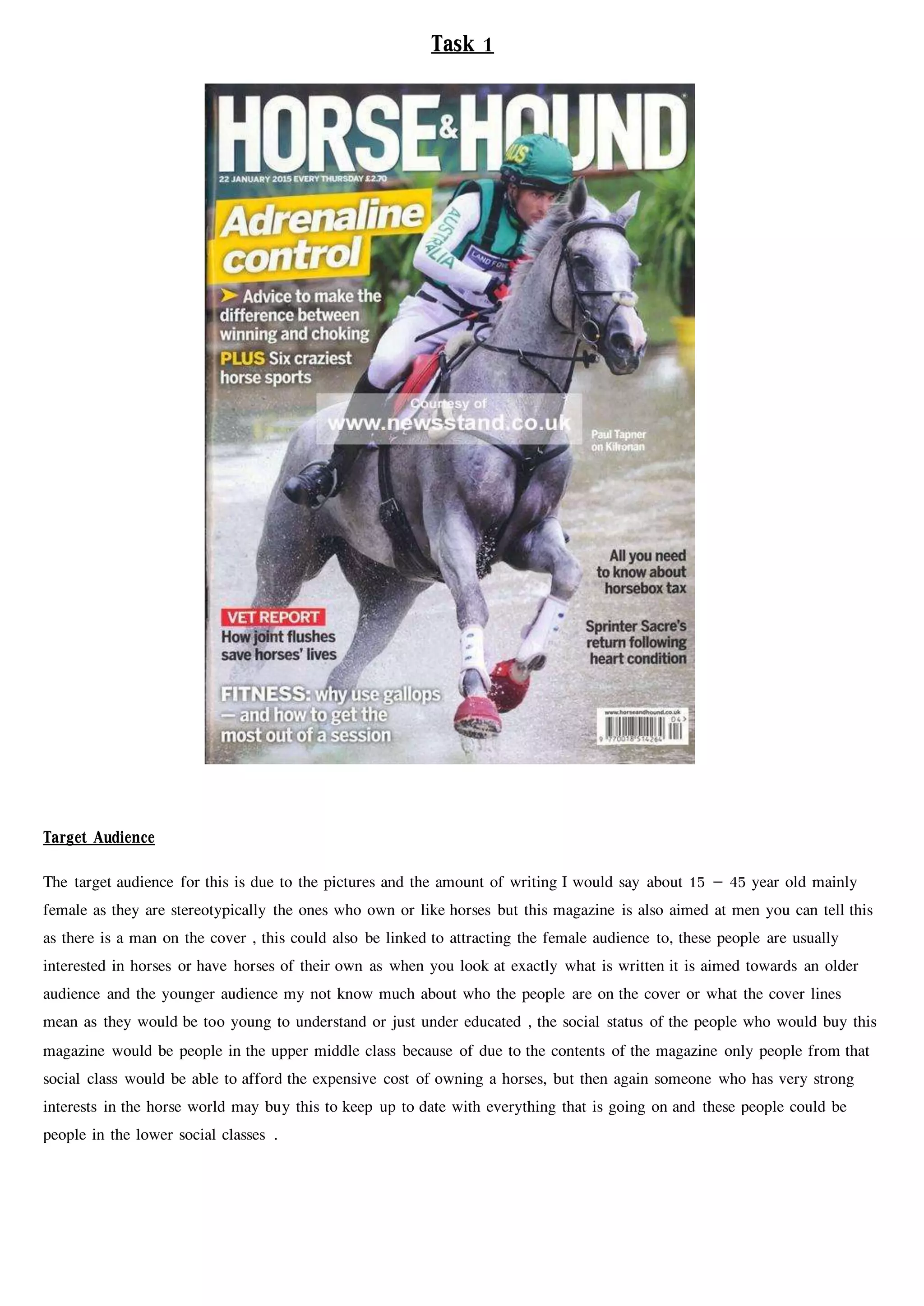
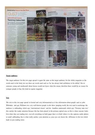
Target Audience
The target audience for this is due to the pictures and the amount of writing I would say about 15 – 45 year old mainly
female as they are stereotypically the ones who own or like horses but this magazine is also aimed at men you can tell this
as there is a man on the cover , this could also be linked to attracting the female audience to, these people are usually
interested in horses or have horses of their own as when you look at exactly what is written it is aimed towards an older
audience and the younger audience my not know much about who the people are on the cover or what the cover lines
mean as they would be too young to understand or just under educated , the social status of the people who would buy this
magazine would be people in the upper middle class because of due to the contents of the magazine only people from that
social class would be able to afford the expensive cost of owning a horses, but then again someone who has very strong
interests in the horse world may buy this to keep up to date with everything that is going on and these people could be
people in the lower social classes .
Task 1
Text
The text on the cover of this magazine in quite a formal font it is also bold so that it catches the audience eye when they look
at it the main cover, on this magazine the white writing with the yellow background which say ‘adrenaline control’ attracts you
attention the most this has been placed he as when you read something there is the first place you look so they put that there
to catch you attention so you but the magazine they have then used more white writing with a red background to make you
want to buy the magazine further as where that is placed is the last place you look when reading therefore these things put
together anchor the audience.
Colours
The colours on the magazine are quite natural except from the yellow and red background behind two of the cover lines, the
yellow background just being used to get the reader attention because its bright and the red being used because the writing in
front of it says vet report’ which to many horse overs means danger as the colour represents, the cover is natural because it is
a picture of an eventer called Paul Tapner going through a water jump at badminton horse trails, this is the cover because he
won at badminton and because of this success he was chosen to be on the cover to again anchor the audience because if the
reader knows about horses they would know about his struggle to get his victory, overall all of the text on the cover in formal
and the magazine it made to inform their specific audience.
Design & layout
Using the Gutenberg principle to analyse the cover in the primary optical are is the name of the magazine and one of the
main cover lines ‘adrenaline control’, in the strong fallow area there is the horse and the rider heard with no writing, in the
terminal area is two cover lines ‘ all you need to know about horsebox tax’ and ‘sprinter scare’s return following heart
condition’ followed by the barcode, and finally in the weak fallow area is ‘ VET REPORT’, ‘how joint flushes save horses
lives’ and ‘FITNESS : why use the gallops – and how to get the most out of your session’.
Genre codes and conventions
The genre of this magazine is equestrian weekly magazine aimed at people in the horse world, the mise en scene of this
magazine is horses and the style is formal as it is an informational magazine, the language used is horse related such as the
terms in the weak fallow area which says ‘the gallops’ which to horsey people is a place but if some who was no into horses
would have no idea what that meant or what the person was talking about, and finally the bit which anchors you to the
magazine is the text in the primary optical area which says ‘Adrenaline control’ which attracts the audience of the magazine to
read the rest of the article in the magazine and to buy it to read the rest of the magazine due to the cover lines on the
magazine.
Target Audience
The target audience for this is due to the pictures and the amount of writing I would say about 18 –65 year old with
mainly female audience as they are stereotypically the ones who own or like horses but this magazine is also aimed at
men as some men do own horses and want to know more about them,, these people are usually interested in horses or
have horses of their own as when you look at exactly what is written it is aimed towards an older audience due to the
lack of bright colours which ‘horse & hound’ has and the younger audience my not know much about who the people
are on the cover or what the cover lines mean as they would be too young to understand or just under educated which
terms such as ‘shivers’ , the social status of the people who would buy this magazine would be very much the same
as ‘horse & hound’ with them being people in the upper middle class because of due to the contents of the magazine
only people from that social class would be able to afford the expensive cost of owning a horses, but then again
someone who has very strong interests in the horse world may buy this to know more about horses and these people
could be people in the lower social classes .
Text
The text on the cover of this magazine in quite a informal font it is also bold so that it catches the audience eye when
they look at it the main cover but it the sizes of the font on each cover line varies in size to get the reader attention this
is a good things but it also makes the magazine look aimed at a younger audience than what the actual text suggests, on
this magazine the green and orange writing is what catches you attention first as in is placed in the first place you look
when you read a magazine cover, also the blue writing at the bottom is placed there for the same reason as this is the last
place the readers look when looking at a magazine cover this would have been put there to make sure that the reader will
buy the magazine to read more about the cover line .
Colours
The colours on the magazine are quite strange at the actual title is orange and so is the main cover line this may have
been used to get the attention of the reader but the actual background picture is quite natural and un- edited, the colours
on the cover lines also adds up to make the reader buy such as the red writing which says ‘the case of the “vicious”
horse’ this being in red shows danger making the reader want to know what the story is about leading to the buying the
magazine to find out what the cover line in implying.
Design & layout
Using the Gutenberg principle to analyse the cover in the primary optical are is the name of the magazine, the little tag
line which says ‘the horse owners resource’ and a flash which says ‘ how long reigning helps detect lameness, in the
strong fallow area there is part of the horses face, a flash which says ‘avoid colic treatment delays’ and there is also the
date and the issue number, in the terminal area there is the barcode and the display until date, and finally in the weak
fallow area there is two more cover lines and the website of the magazine.
Genre codes and conventions
The genre of this magazine is equestrian monthly magazine aimed at people in the horse world, the mise en scene of this
magazine is horses and the style is formal as it is an informational magazine, the language used is horse related such as
the terms in the primary optical area which says ‘lameness’ and ‘long reining’ which to horsey people and are term
which only horse people would know so if you didn’t not have a horse or know anything about horses you would have
no idea what that meant or what the person was talking about, and finally the bit which anchors you to the magazine is
the text in the weak fallow area which says ‘The case of the “vicious” horse ’ which attracts the audience of the
magazine to read the rest of the article in the magazine and to buy it to read the rest of the magazine due to the cover
lines on the magazine.
Target audience
The target audience for this two page spread is again the same as the target audience for the whole magazine as the
words used in the body text are there are words used such as ‘he has always had confidence in his ability’ this to
someone young and uneducated about horses would not know what this means therefore there would be no reason for
younger people to buy this kind on equine magazine.
Text
The text in this two page spread in formal and very informational as it has information about people such as john
Whittaker and guy Williams two very well-known people in the show jumping world, the text used to anchorage the
audience is subheading which says ‘international classes’ and the headline underneath which says ‘Twomey take two’
this catches the reader attention because this has been placed in the primary optical area as this is where anyone looks
first when they are reading text, over all everything on both pages that is in bold where it is the captions under photos
or small subheading this is what really catches your attention as your eyes are drawn the difference in the text which
leads to you reading more.
Colours
The colours used on this two page spread are mainly reds oranges, red suggests danger and energy as all of the text on
the page is about show jumping which is a very dangerous sport to be part of but at the same time require energy from
both horse and rider, there is also oranges which is used alongside black to make sure the black stands out.
Design & Layout
In the primary optical area there is ‘0.67’ which catches the reader attention straight away as it big and stands out, in the
strong fallow area there is a quote from guy Williams saying ‘I’m not planning on doing that much talking’ this is placed
here as the way people read text is from left to right so once you have looked in the primary optical area you move
straight across the this part when you will see a well-known show jumper and a small article about him, in the weak
fallow area there is a picture of charlotte flack on her horse jumping the puissance and an article next to it related to the
picture and finally in the terminal area there is the rest of different article and a picture which is captioned ‘the new
Michael mac memorial trophy goes to guy Williams and Casper de muze’ this is placed here as this is the final-laced
anyone looks when reading a magazine.
Genre codes and conventions
The genre of this magazine is an equestrian monthly magazine aimed at people within the horse world for example,
people with a horse or people with an interest in horses and what going on, the mise en scene of these pages is show
jumping and the show jumping world, the style of these pages is formal as the magazine overall informational, I know
this because of the of the language which is used such as ‘Twomey takes two’ this to someone who doesn’t know
anything about horses has no idea, where as someone who knows about the horse world knows what this means and
finally the part which anchors you to the magazine I feel is in the middle which is the picture of Billy Twomey with
Ardcolum Duke because next to the picture there’s the writing in the primary optical area which is related to the picture
over all anchoring the reader to the rest of the text.

Doc2

  • 1.
    Target Audience The targetaudience for this is due to the pictures and the amount of writing I would say about 15 – 45 year old mainly female as they are stereotypically the ones who own or like horses but this magazine is also aimed at men you can tell this as there is a man on the cover , this could also be linked to attracting the female audience to, these people are usually interested in horses or have horses of their own as when you look at exactly what is written it is aimed towards an older audience and the younger audience my not know much about who the people are on the cover or what the cover lines mean as they would be too young to understand or just under educated , the social status of the people who would buy this magazine would be people in the upper middle class because of due to the contents of the magazine only people from that social class would be able to afford the expensive cost of owning a horses, but then again someone who has very strong interests in the horse world may buy this to keep up to date with everything that is going on and these people could be people in the lower social classes . Task 1
  • 2.
    Text The text onthe cover of this magazine in quite a formal font it is also bold so that it catches the audience eye when they look at it the main cover, on this magazine the white writing with the yellow background which say ‘adrenaline control’ attracts you attention the most this has been placed he as when you read something there is the first place you look so they put that there to catch you attention so you but the magazine they have then used more white writing with a red background to make you want to buy the magazine further as where that is placed is the last place you look when reading therefore these things put together anchor the audience. Colours The colours on the magazine are quite natural except from the yellow and red background behind two of the cover lines, the yellow background just being used to get the reader attention because its bright and the red being used because the writing in front of it says vet report’ which to many horse overs means danger as the colour represents, the cover is natural because it is a picture of an eventer called Paul Tapner going through a water jump at badminton horse trails, this is the cover because he won at badminton and because of this success he was chosen to be on the cover to again anchor the audience because if the reader knows about horses they would know about his struggle to get his victory, overall all of the text on the cover in formal and the magazine it made to inform their specific audience. Design & layout Using the Gutenberg principle to analyse the cover in the primary optical are is the name of the magazine and one of the main cover lines ‘adrenaline control’, in the strong fallow area there is the horse and the rider heard with no writing, in the terminal area is two cover lines ‘ all you need to know about horsebox tax’ and ‘sprinter scare’s return following heart condition’ followed by the barcode, and finally in the weak fallow area is ‘ VET REPORT’, ‘how joint flushes save horses lives’ and ‘FITNESS : why use the gallops – and how to get the most out of your session’. Genre codes and conventions The genre of this magazine is equestrian weekly magazine aimed at people in the horse world, the mise en scene of this magazine is horses and the style is formal as it is an informational magazine, the language used is horse related such as the terms in the weak fallow area which says ‘the gallops’ which to horsey people is a place but if some who was no into horses would have no idea what that meant or what the person was talking about, and finally the bit which anchors you to the magazine is the text in the primary optical area which says ‘Adrenaline control’ which attracts the audience of the magazine to read the rest of the article in the magazine and to buy it to read the rest of the magazine due to the cover lines on the magazine.
  • 3.
    Target Audience The targetaudience for this is due to the pictures and the amount of writing I would say about 18 –65 year old with mainly female audience as they are stereotypically the ones who own or like horses but this magazine is also aimed at men as some men do own horses and want to know more about them,, these people are usually interested in horses or have horses of their own as when you look at exactly what is written it is aimed towards an older audience due to the lack of bright colours which ‘horse & hound’ has and the younger audience my not know much about who the people are on the cover or what the cover lines mean as they would be too young to understand or just under educated which terms such as ‘shivers’ , the social status of the people who would buy this magazine would be very much the same as ‘horse & hound’ with them being people in the upper middle class because of due to the contents of the magazine only people from that social class would be able to afford the expensive cost of owning a horses, but then again someone who has very strong interests in the horse world may buy this to know more about horses and these people could be people in the lower social classes .
  • 4.
    Text The text onthe cover of this magazine in quite a informal font it is also bold so that it catches the audience eye when they look at it the main cover but it the sizes of the font on each cover line varies in size to get the reader attention this is a good things but it also makes the magazine look aimed at a younger audience than what the actual text suggests, on this magazine the green and orange writing is what catches you attention first as in is placed in the first place you look when you read a magazine cover, also the blue writing at the bottom is placed there for the same reason as this is the last place the readers look when looking at a magazine cover this would have been put there to make sure that the reader will buy the magazine to read more about the cover line . Colours The colours on the magazine are quite strange at the actual title is orange and so is the main cover line this may have been used to get the attention of the reader but the actual background picture is quite natural and un- edited, the colours on the cover lines also adds up to make the reader buy such as the red writing which says ‘the case of the “vicious” horse’ this being in red shows danger making the reader want to know what the story is about leading to the buying the magazine to find out what the cover line in implying. Design & layout Using the Gutenberg principle to analyse the cover in the primary optical are is the name of the magazine, the little tag line which says ‘the horse owners resource’ and a flash which says ‘ how long reigning helps detect lameness, in the strong fallow area there is part of the horses face, a flash which says ‘avoid colic treatment delays’ and there is also the date and the issue number, in the terminal area there is the barcode and the display until date, and finally in the weak fallow area there is two more cover lines and the website of the magazine. Genre codes and conventions The genre of this magazine is equestrian monthly magazine aimed at people in the horse world, the mise en scene of this magazine is horses and the style is formal as it is an informational magazine, the language used is horse related such as the terms in the primary optical area which says ‘lameness’ and ‘long reining’ which to horsey people and are term which only horse people would know so if you didn’t not have a horse or know anything about horses you would have no idea what that meant or what the person was talking about, and finally the bit which anchors you to the magazine is the text in the weak fallow area which says ‘The case of the “vicious” horse ’ which attracts the audience of the magazine to read the rest of the article in the magazine and to buy it to read the rest of the magazine due to the cover lines on the magazine.
  • 5.
    Target audience The targetaudience for this two page spread is again the same as the target audience for the whole magazine as the words used in the body text are there are words used such as ‘he has always had confidence in his ability’ this to someone young and uneducated about horses would not know what this means therefore there would be no reason for younger people to buy this kind on equine magazine. Text The text in this two page spread in formal and very informational as it has information about people such as john Whittaker and guy Williams two very well-known people in the show jumping world, the text used to anchorage the audience is subheading which says ‘international classes’ and the headline underneath which says ‘Twomey take two’ this catches the reader attention because this has been placed in the primary optical area as this is where anyone looks first when they are reading text, over all everything on both pages that is in bold where it is the captions under photos or small subheading this is what really catches your attention as your eyes are drawn the difference in the text which leads to you reading more.
  • 6.
    Colours The colours usedon this two page spread are mainly reds oranges, red suggests danger and energy as all of the text on the page is about show jumping which is a very dangerous sport to be part of but at the same time require energy from both horse and rider, there is also oranges which is used alongside black to make sure the black stands out. Design & Layout In the primary optical area there is ‘0.67’ which catches the reader attention straight away as it big and stands out, in the strong fallow area there is a quote from guy Williams saying ‘I’m not planning on doing that much talking’ this is placed here as the way people read text is from left to right so once you have looked in the primary optical area you move straight across the this part when you will see a well-known show jumper and a small article about him, in the weak fallow area there is a picture of charlotte flack on her horse jumping the puissance and an article next to it related to the picture and finally in the terminal area there is the rest of different article and a picture which is captioned ‘the new Michael mac memorial trophy goes to guy Williams and Casper de muze’ this is placed here as this is the final-laced anyone looks when reading a magazine. Genre codes and conventions The genre of this magazine is an equestrian monthly magazine aimed at people within the horse world for example, people with a horse or people with an interest in horses and what going on, the mise en scene of these pages is show jumping and the show jumping world, the style of these pages is formal as the magazine overall informational, I know this because of the of the language which is used such as ‘Twomey takes two’ this to someone who doesn’t know anything about horses has no idea, where as someone who knows about the horse world knows what this means and finally the part which anchors you to the magazine I feel is in the middle which is the picture of Billy Twomey with Ardcolum Duke because next to the picture there’s the writing in the primary optical area which is related to the picture over all anchoring the reader to the rest of the text.