Embed presentation


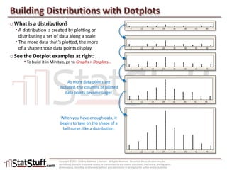
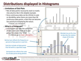
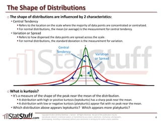
This document discusses distributions and how they can be formed and visualized using dotplots and histograms. It defines what a distribution is, how dotplots and histograms work to plot data values, and how the shape of distributions is influenced by their central tendency and variation. Key aspects covered include how histograms are better for displaying larger continuous data sets than dotplots by grouping values into bins, and how the kurtosis of a distribution indicates the shape of its peak near the mean value. The document provides examples and instructs readers to create and analyze dotplots and histograms of sample metric data.
