Digipak question 2
•Download as PPTX, PDF•
0 likes•70 views
This is showing and explaining my ideas for our digipak, and what backgrounds, colours and costumes we will be using for the front, inside and back of our digipak.
Report
Share
Report
Share
Recommended
Digipack Question 2
The document discusses ideas for the design of a music video and single packaging. It proposes overlaying the colors yellow, red, and purple in the outside portion. For the inside, a spiral background in the same colors is suggested. A bold white font with the song title is proposed for the strip. Keeping it simple, like Calvin Harris' disc design, is recommended for the disc portion with the artist and song name. Neon hearts on a black background is the idea generated for the back cover to keep the colors vibrant.
Slideshare
The document proposes cover designs for a music single that aims to attract young female viewers. The front cover would use pink and blue gels to overlay images of the artist and a collaborator, inspired by a music video. The inside cover features mid-shots of posed images of the artist and collaborator overlaid with bright colors, continuing the theme. A black background with bright title text is proposed for the strip to contrast and attract viewers. Drawings covering the disc are suggested to make it seem hand-drawn and appeal to their target audience.
Digipak designs
This is the comparison of digipak albums with similar artist- Deap Vally, and had the comparison in digipak design and finally state the effect of our design in marketing and building up the star images
Media evaluation question 1.odp12
The media product uses conventions of the indie genre through stylistic choices that convey a simple yet appealing aesthetic. A dark blue color motif ties the products together and references the band name "Zulu Wolves" and winter. Photographs on the digipak use close-ups and striking color backgrounds to portray the light mood of indie music. The poster employs a plain but distinctive font to represent the genre's casual style. Filming in an urban setting for the music video also follows conventions commonly used in indie videos. Feedback from fans informed the decision to depict the band members wearing everyday clothes without prominent branding.
Media evaluation question 1.odp1
This document discusses how the media product uses, develops, or challenges conventions of real media products in three key areas:
1. The costumes worn by the band in the music video are simple, casual clothes in light colors to reflect the casual style commonly seen in indie music fans and videos.
2. The setting of the music video was chosen to be an urban area, which is a convention of many indie music videos that are often filmed in cities around people.
3. For the album packaging, a six-panel digipak was used to have space for band photos and nature images, relating to the indie genre. A wolf and dark blue were used on the cover to reference the band and album names
5 Digipack Features
The document discusses various digipacks and posters for music albums. It analyzes how the visual elements, themes, and imagery shown in the digipacks relate and correspond to the posters for each album. Specific elements that are compared between the digipacks and posters include themes, outfits, logos, images of band members, track listings, and background imagery. The goal appears to be examining the visual continuity and links between how each album is represented in its digipack and poster.
Digipak progression and final product
The document describes the process of designing a digipak album cover for a fictional Avenged Sevenfold album. It discusses editing the album art image in Photoshop, choosing fonts and colors, adding elements like the parental advisory logo and Warner Brothers logo, and designing the front, back and inside layout. The goal was to create a design matching Avenged Sevenfold's style while also conveying the dark, nightmare theme of the fictional album.
Meida digipak analysis
The Digipak for the album "10,000 Days" by the heavy metal band Tool uses gloomy colors and lens effects on the cover to set a dark tone. Inside, vibrant colors create a contrasting positive energy. Pictures feature illusion and eye imagery relating to the gothic theme. In the booklet, double images can be viewed in 3D through lenses, adding interest. It lists credits to recognize contributions.
The Kaiser Chiefs Digipak is designed like a vintage box with bold text. Inside are fake money, CDs, and a poster to include extra items. The retro style aims to invoke the band members' childhoods. Colors on the CD reflect a fun personality contrasting the gambling theme portrayed
Evaluation Question 2 - Script
The students created a music video, magazine advertisement, CD, and booklet to promote a single. They aimed to create synergy between the ancillary texts and the music video through consistent use of color, font, images, and narrative elements. Pink text was used throughout to relate to the singer's pink dress in the video. The same black and white photo used on the magazine ad and CD cover created a singular identity. Feedback confirmed the audience found the products effective at conveying the pop genre and narrative of the song.
10. the digipak
The document describes the concept and design of a digipak for a rock music album called "Here & Now". The main cover features a hut in Hunza, Pakistan where the band reunited. The biography page shows the path leading to the hut. The disc image keeps the design simple, including only the band, album, and label names. The back cover photo taken at a music studio features a keyboard to represent the music within.
Digipak Draft
1. The document discusses the design of a digipak for a music project, including the use of Adobe Fireworks to draft the design.
2. Colors like black, dark pink, and purple were used against colorful backgrounds to make text and images stand out and represent the pop genre.
3. Images from the music video were included on the cover and booklet pages to link the digipak visually to the video and create identity.
Digipak analysis
The document summarizes the design choices for a Digipak album cover for the song "When I Was A Youngster." Several elements were included to reinforce a theme of childhood simplicity and imagination. The front cover features the title in bold white font and a cartoon-styled photo related to children's play. Inside pages depict the characters throwing a ball across landscapes incorporating floating elements and a world disc matching the song's lyrics. Color schemes, images and interactions between pages were all selected to represent childhood fun and dreams in a cohesive design.
Media 2
The document discusses the design of a digipak created to promote a music video. Key elements were kept consistent between the digipak and video to create a recognizable brand, including using similar color schemes and imagery. Iconic images from the video, like a megaphone and dollar sign, were featured to connect the digipak content to themes in the video. Photos from the video were also included to introduce the artist in a personal way. The overall design was meant to effectively promote the music video and band through visual consistency that would appeal to the target audience.
Pitch
The document discusses plans for a promotional package for the artist Sub Focus. It will include a music video for his song "Endorphins" as well as a digipak containing his album "Torus" and the music video. The music video will feature a surreal narrative of a teenage boy getting chased in a forest by people in animal masks until he joins them. Both the music video and digipak will incorporate surrealistic effects and natural imagery shot on location in the forest to create continuity across the products. The promotional package aims to appeal to Sub Focus' target audience of 16-24 year olds interested in various music genres and dance music specifically.
Evaluation question 2
The combination of the band's main album and ancillary texts is effective because:
1) All media products share similarities to create brand recognition and stick to the band's genre.
2) The color blue is used throughout promotional materials to represent the album's nickname.
3) Referencing songs through album artwork follows industry conventions and highlights singles to potential buyers.
Media final evalaution 1 with screen shots
The music video uses conventions of indie music videos such as a narrative storyline, scenes of the band playing, and close-ups of band members and instruments. Locations include outdoor urban settings and costumes are casual clothes.
The digipak uses conventions like photos of band members against a nature backdrop, contrasting colors like blue, and a light, casual font style.
The poster displays the band name, album name and song titles, release date, tour dates, record label, and a small album cover image, following conventions to promote the band, album, and upcoming shows.
Evaluation Activity 2
The document discusses the color scheme, imagery, and stylistic elements used to create consistency across various promotional materials for a music project. A nude color palette was chosen to portray naturalness. The same font and small flower detail were used on the digipak and poster to maintain consistency. Props from the music video, like torn photographs, were also incorporated into the digipak design to clearly link the materials. Mise-en-scene elements like natural makeup and a white dress in the video were reflected in the digipak to connect the story and emotion portrayed.
Digipack
The document discusses the design of a Digipak for a music group's album "I feel Love". It describes the front cover as featuring a colorful original image created in Coral Draw. The inside panels contain still shots from the music video that represent love through roses and were edited with effects in Coral Draw. The back cover lists the seven album songs in white font on a black background and includes a barcode.
A2 Digipak
The document describes the design elements of a Digipak created to package the music of TGFA and their song "I Feel Love". The front cover was designed in Coral Draw to add special effects to the image. The inside panels feature still images from the music video - the left has red roses and the right has edited blue roses with effects added in Coral Draw. The back lists the seven album songs in white font on a black background and includes a barcode.
Evaluation Q1
The document discusses how the media product, a music video for the song "Undone - The Sweater Song" by Weezer, adheres to conventions of real music videos and the alternative rock genre. Key elements that were included are shots of the band performing, a narrative, and attention to genre-appropriate mise-en-scene, edits, and lyrics-visuals relationships. The designed digi-pack and magazine ad also aim to follow conventions of existing media formats to appear authentic.
stuff
The document discusses design choices for a DVD cover, including using a simple black font against a brick wall background for the title "ON A MISSION" to make it stand out. Similar font style and color would be used for the track listing. A continuous brick wall background on the front and back covers was selected to provide visual flow.
Flatplan 2
Our updated digipak will include a variety of colors. The old digipak had a front and back cover that told different stories with different colors that did not look appealing. The new front and back covers still have a relationship through their symbolism of love, although they have different colors. The front cover has a hint of green to link it to the back without looking random. Samples of the old and new digipak designs are provided showing improvements made.
Logo
The document discusses the design of a school magazine logo. Students instructed Noel to use the school logo and make it more dynamic. Noel removed the original white background and replaced it with a distorted brick wall. The red on black color scheme works well and catches the eye. Noel also used a graffiti font for the magazine title as decided by the students. The final logo design reflects both contemporary and traditional elements, matching the magazine's intended ethos.
Ancilary texts
The group created a music video, digipak, and website to promote their hip hop artists. They linked the ancillary products through consistent use of color schemes and fonts to reinforce the style and message of the music video. Bright colors and a unique 3D font were used across all products to create visual cohesion and clarity that all items were related. Feedback confirmed the linking of the products made it clear they were all part of the same brand.
Evaluation question 2
The document discusses the development process of creating a music video and additional promotional materials for an indie band. The video was originally shot in color but was changed to black and white to better suit the genre. The characters were also changed from a couple to band members to make the story more relatable. Additionally, the filming location was moved to a rural area to enhance the indie feel. For the digipak and poster, conventions from other indie materials were followed like using band photos, names and logos to create recognition, while also including extra content like guitar tabs and lyrics to engage audiences.
Evaluation1
This document discusses how the media product, a music video for the song "Synesthesia", uses and develops the forms and conventions of real dance music videos. It aimed to match audience expectations for the genre, including features like dancing, a DJ, strobe lights, and bright colors. The video uses a simple structure with two scenes rather than a narrative. Signs and symbols were used in conventional ways to signify a party. The artist's face and clothing were also used in typical fashion to identify her. The packaging and website were also designed to conform to standard forms and conventions for this genre of music.
Analysisoflyrics
The document analyzes and summarizes the lyrics of the song "Let Me Be Loved" by Rilo Kiley. It discusses the themes of love and progression in relationships expressed in the song. It also examines the genre, meaning, audience, and ideas for a potential music video to accompany the song.
Digipak experimentation
The document discusses experimentation with the design of a digipak for a solo artist named Soraya. It explores different designs for the front cover, including changing the font, placement of text, and use of colors. Different photo manipulations of the artist are also tested, including overlays of lights and paint splatters. The final design incorporates a vibrant paint background for the track listing and simple, gradient designs for the CD and lyrics pages.
Neon jungle digipak
The album cover for Neon Jungle's album "Welcome to the Jungle" features individual portrait photos of each band member placed together in a line. This layout has been used on albums by other girl groups like Destiny's Child and the Pussycat Dolls. Each girl is posed differently but all have fierce expressions with bold makeup. The album title is in block capitals in the same color as the band name for visibility. The back cover maintains the edgy black theme with white text listing the songs and production credits. Overall the cover promotes the band's image through close-up photos of each member in a style commonly seen on girl group albums.
More Related Content
What's hot
Evaluation Question 2 - Script
The students created a music video, magazine advertisement, CD, and booklet to promote a single. They aimed to create synergy between the ancillary texts and the music video through consistent use of color, font, images, and narrative elements. Pink text was used throughout to relate to the singer's pink dress in the video. The same black and white photo used on the magazine ad and CD cover created a singular identity. Feedback confirmed the audience found the products effective at conveying the pop genre and narrative of the song.
10. the digipak
The document describes the concept and design of a digipak for a rock music album called "Here & Now". The main cover features a hut in Hunza, Pakistan where the band reunited. The biography page shows the path leading to the hut. The disc image keeps the design simple, including only the band, album, and label names. The back cover photo taken at a music studio features a keyboard to represent the music within.
Digipak Draft
1. The document discusses the design of a digipak for a music project, including the use of Adobe Fireworks to draft the design.
2. Colors like black, dark pink, and purple were used against colorful backgrounds to make text and images stand out and represent the pop genre.
3. Images from the music video were included on the cover and booklet pages to link the digipak visually to the video and create identity.
Digipak analysis
The document summarizes the design choices for a Digipak album cover for the song "When I Was A Youngster." Several elements were included to reinforce a theme of childhood simplicity and imagination. The front cover features the title in bold white font and a cartoon-styled photo related to children's play. Inside pages depict the characters throwing a ball across landscapes incorporating floating elements and a world disc matching the song's lyrics. Color schemes, images and interactions between pages were all selected to represent childhood fun and dreams in a cohesive design.
Media 2
The document discusses the design of a digipak created to promote a music video. Key elements were kept consistent between the digipak and video to create a recognizable brand, including using similar color schemes and imagery. Iconic images from the video, like a megaphone and dollar sign, were featured to connect the digipak content to themes in the video. Photos from the video were also included to introduce the artist in a personal way. The overall design was meant to effectively promote the music video and band through visual consistency that would appeal to the target audience.
Pitch
The document discusses plans for a promotional package for the artist Sub Focus. It will include a music video for his song "Endorphins" as well as a digipak containing his album "Torus" and the music video. The music video will feature a surreal narrative of a teenage boy getting chased in a forest by people in animal masks until he joins them. Both the music video and digipak will incorporate surrealistic effects and natural imagery shot on location in the forest to create continuity across the products. The promotional package aims to appeal to Sub Focus' target audience of 16-24 year olds interested in various music genres and dance music specifically.
Evaluation question 2
The combination of the band's main album and ancillary texts is effective because:
1) All media products share similarities to create brand recognition and stick to the band's genre.
2) The color blue is used throughout promotional materials to represent the album's nickname.
3) Referencing songs through album artwork follows industry conventions and highlights singles to potential buyers.
Media final evalaution 1 with screen shots
The music video uses conventions of indie music videos such as a narrative storyline, scenes of the band playing, and close-ups of band members and instruments. Locations include outdoor urban settings and costumes are casual clothes.
The digipak uses conventions like photos of band members against a nature backdrop, contrasting colors like blue, and a light, casual font style.
The poster displays the band name, album name and song titles, release date, tour dates, record label, and a small album cover image, following conventions to promote the band, album, and upcoming shows.
Evaluation Activity 2
The document discusses the color scheme, imagery, and stylistic elements used to create consistency across various promotional materials for a music project. A nude color palette was chosen to portray naturalness. The same font and small flower detail were used on the digipak and poster to maintain consistency. Props from the music video, like torn photographs, were also incorporated into the digipak design to clearly link the materials. Mise-en-scene elements like natural makeup and a white dress in the video were reflected in the digipak to connect the story and emotion portrayed.
Digipack
The document discusses the design of a Digipak for a music group's album "I feel Love". It describes the front cover as featuring a colorful original image created in Coral Draw. The inside panels contain still shots from the music video that represent love through roses and were edited with effects in Coral Draw. The back cover lists the seven album songs in white font on a black background and includes a barcode.
A2 Digipak
The document describes the design elements of a Digipak created to package the music of TGFA and their song "I Feel Love". The front cover was designed in Coral Draw to add special effects to the image. The inside panels feature still images from the music video - the left has red roses and the right has edited blue roses with effects added in Coral Draw. The back lists the seven album songs in white font on a black background and includes a barcode.
Evaluation Q1
The document discusses how the media product, a music video for the song "Undone - The Sweater Song" by Weezer, adheres to conventions of real music videos and the alternative rock genre. Key elements that were included are shots of the band performing, a narrative, and attention to genre-appropriate mise-en-scene, edits, and lyrics-visuals relationships. The designed digi-pack and magazine ad also aim to follow conventions of existing media formats to appear authentic.
stuff
The document discusses design choices for a DVD cover, including using a simple black font against a brick wall background for the title "ON A MISSION" to make it stand out. Similar font style and color would be used for the track listing. A continuous brick wall background on the front and back covers was selected to provide visual flow.
Flatplan 2
Our updated digipak will include a variety of colors. The old digipak had a front and back cover that told different stories with different colors that did not look appealing. The new front and back covers still have a relationship through their symbolism of love, although they have different colors. The front cover has a hint of green to link it to the back without looking random. Samples of the old and new digipak designs are provided showing improvements made.
Logo
The document discusses the design of a school magazine logo. Students instructed Noel to use the school logo and make it more dynamic. Noel removed the original white background and replaced it with a distorted brick wall. The red on black color scheme works well and catches the eye. Noel also used a graffiti font for the magazine title as decided by the students. The final logo design reflects both contemporary and traditional elements, matching the magazine's intended ethos.
Ancilary texts
The group created a music video, digipak, and website to promote their hip hop artists. They linked the ancillary products through consistent use of color schemes and fonts to reinforce the style and message of the music video. Bright colors and a unique 3D font were used across all products to create visual cohesion and clarity that all items were related. Feedback confirmed the linking of the products made it clear they were all part of the same brand.
Evaluation question 2
The document discusses the development process of creating a music video and additional promotional materials for an indie band. The video was originally shot in color but was changed to black and white to better suit the genre. The characters were also changed from a couple to band members to make the story more relatable. Additionally, the filming location was moved to a rural area to enhance the indie feel. For the digipak and poster, conventions from other indie materials were followed like using band photos, names and logos to create recognition, while also including extra content like guitar tabs and lyrics to engage audiences.
Evaluation1
This document discusses how the media product, a music video for the song "Synesthesia", uses and develops the forms and conventions of real dance music videos. It aimed to match audience expectations for the genre, including features like dancing, a DJ, strobe lights, and bright colors. The video uses a simple structure with two scenes rather than a narrative. Signs and symbols were used in conventional ways to signify a party. The artist's face and clothing were also used in typical fashion to identify her. The packaging and website were also designed to conform to standard forms and conventions for this genre of music.
What's hot (18)
Similar to Digipak question 2
Analysisoflyrics
The document analyzes and summarizes the lyrics of the song "Let Me Be Loved" by Rilo Kiley. It discusses the themes of love and progression in relationships expressed in the song. It also examines the genre, meaning, audience, and ideas for a potential music video to accompany the song.
Digipak experimentation
The document discusses experimentation with the design of a digipak for a solo artist named Soraya. It explores different designs for the front cover, including changing the font, placement of text, and use of colors. Different photo manipulations of the artist are also tested, including overlays of lights and paint splatters. The final design incorporates a vibrant paint background for the track listing and simple, gradient designs for the CD and lyrics pages.
Neon jungle digipak
The album cover for Neon Jungle's album "Welcome to the Jungle" features individual portrait photos of each band member placed together in a line. This layout has been used on albums by other girl groups like Destiny's Child and the Pussycat Dolls. Each girl is posed differently but all have fierce expressions with bold makeup. The album title is in block capitals in the same color as the band name for visibility. The back cover maintains the edgy black theme with white text listing the songs and production credits. Overall the cover promotes the band's image through close-up photos of each member in a style commonly seen on girl group albums.
Task 9 initial ideas
- The document outlines initial ideas for a music video for the song "All The Things She Said" by T.A.T.U.
- The music video will feature two artists, Georgia and Emilie, and tell a narrative story of their forbidden love and the difficulties they face from a society that does not accept their relationship.
- Key elements of the planned narrative include scenes set in a field, forest, and library that represent the privacy and isolation the two women experience, as well as a kitchen scene where one artist is lectured by her parents about her relationship.
Creation of digipak
This document discusses the process of designing a digipak for the band Rosetown. It explores various sources of inspiration, including album artwork from Oh Wonder, The 1975, Rihanna, Adele and Ariana Grande. Key aspects that were inspired include a monochrome color scheme, incorporating water reflections which were important to the music video concept, and using bold colorful fonts for the title while keeping the rest of the design monochrome. The designer synthesized these various inspirations into a draft digipak design with a black and white effect, water reflections, and the album name in baby pink with the band name in white.
Pitch
This document outlines a student film project to create a music video for the song "Jealous" by Labrinth. It discusses choosing the song, shortening the length, casting actors in the roles of the jealous man and his ex-girlfriend and her new boyfriend. It describes filming locations of the man's house, a park, and a bridge and includes a storyboard. It also mentions the equipment needed and costumes/props for the characters. The target audience is identified as teens and young adults aged 16-25. Ideas are proposed for album art and a movie poster to promote the project.
Task 9 initial ideas
This document outlines initial ideas for a music video for the song "All The Things She Said" by T.A.T.U. The music video will tell a narrative story of two artists, Georgia and Emilie, who fall in love but face difficulties from society for their relationship. It will feature locations like a field, forest, and library that represent their privacy and segregation. The narrative aims to match the song's lyrics and tempo about struggles of a same-sex relationship. It will also include a performance portion to suit the mixed genres of pop and rock.
Creating My Japop Cd Cover
The document summarizes the process of creating a CD cover for a fictional Japop artist named Jess. It discusses choosing an image from a photo shoot, editing the image in Photoshop and PowerPoint, and experimenting with different designs and layouts for the cover. The final design features Jess sitting on a chair in front of a blue backdrop, with a hand-drawn heart placed near her name and the song title. Comparisons are made to CD covers from jazz and pop artists to highlight similarities and differences between the styles.
Digipack powerpoint
The document analyzes and summarizes the design elements of several artists' digipaks, or album packaging, including Katy Perry, Lily Allen, Kesha, and Miley Cyrus. Key elements discussed include prominent display of the artist name over the album title, use of distinctive fonts and colors as a consistent style, inclusion of track listings and other information on the back, and emphasis on simple yet eye-catching cover designs that represent the artist's brand.
Researching cd covers for digipack ideas
The document discusses and analyzes the cover designs of several music albums. It examines elements like the artist/album title placement, imagery used, color schemes, and consistency between the front and back covers. Key points analyzed include how the covers represent the artist's brand, genre of music, and theme of the album. The purpose is to understand how cover design conveys information about the music to attract audiences.
Digipack analysis
The document summarizes the artwork for an electronica album. The album cover features the eye of a girl transformed into a barrage of colors and sounds. The title is in black and white to stand out from the colorful background. Additional details like the track listing, sleeve color, and disc color all continue the themes of colors and the girl's eye depicted on the front cover to provide continuity throughout the album packaging.
Danny vaughn 4
This document is a collection of photos and memories about Danny Vaughn throughout his life from childhood to adulthood. It includes photos of Danny with family and friends at different stages of life from being a young boy to growing older. Short captions and quotes accompany the photos and provide context about Danny and memories shared with loved ones.
Issue18
Into The Crowd Magazine is an online music magazine based in Toronto and the US dedicated to showcasing music, media, and pop culture. It promotes and shares music from both established and up-and-coming artists around the world through its website, social media platforms, and YouTube channel. The magazine is published every two months and features interviews, photos, and articles on various artists in different genres.
Digipaks
The document compares and contrasts the digipak designs of albums by Miley Cyrus, Ellie Goulding, and Jessie J. Miley Cyrus' digipak opens as a poster with revealing images of herself targeted towards a male audience. Ellie Goulding's opens conventionally with close-up peaceful images relating to her album's theme of "halcyon days." Jessie J's has a bright white cover with monochrome interior pages that reference being alive versus not alive through images and colors.
Planning Double Page Spread
The double page spread features an interview with rising country star Amber Roberts. A large portrait photo of Roberts is placed on the right page with the interview text wrapping around it. The interview discusses Roberts' musical influences, writing her first song at a young age, her family's musical background, and her journey to performing at the Grand Ole Opry. Roberts hopes to top the charts with her upcoming debut album.
Lesson Plan for Lyric Poetry
A sample of Detailed lesson plan for Lyric Poetry. I used the song of One Direction here. All have courtesy
Atomic kitten digipak
The document summarizes the design elements of an Atomic Kitten album cover from the early 2000s. It notes that the cover features the girl band in a high key pink and blue background, with each member looking at the camera. Pink is used throughout to convey a feminine, girly theme. The font and layout are also designed to have a soft, curvy style befitting of a girl band at the time.
Lesson 32
The document provides instructions for making a paper pet in 7 steps: 1) Color the pattern, 2) Cut out the pattern along thick black lines, 3) Fold along broken lines, 4) Curl the body part to form a cylinder, 5) Glue the gray tab to keep it in place, 6) Curl the top part and glue to the main body, 7) Glue the wings to the gray and wait for it to dry.
Similar to Digipak question 2 (19)
More from bekkawearon2
Question 3
The document discusses planning, filming, and receiving feedback for a music video targeted at females aged 15-20. Questionnaires informed the choice of clothing, locations, and editing techniques like varied camera angles and colors. While initially considering typical music video elements, the filmmakers opted to portray the women in more modest, fashionable clothing and used unique locations to appeal to their target audience. Feedback praised the video's creativity, production design, and success in reaching teenagers. The only suggested change was incorporating more varied camera angles.
Production
The production schedule outlines filming locations and shots for a music video over several dates in November and December. Key locations included Trafalgar Square, Westminster, Covent Garden, and China Town in London, as well as Margate. Shots included lip syncing, off guard shots in arcades and on trains, scenes using different colored lights and a light box, and projection effects of water, glitter, and spirals for the two main characters.
Storyboard
The document outlines the scenes of a music video being filmed in Margate Dreamland. It describes filming the two main girls lip syncing the song in front of colorful backgrounds at Dreamland in the first scene. The second scene has the girls dancing in front of a green screen with colored projections. Scene three takes place at Soho lights and gods own junkyard with neon signs. Scene four only features the singers in front of a water ink projection with varied projections. The fifth scene cuts between quick shots of London and Margate before using a blur transition and spinning illusion effect for the closing titles.
Survey
This document appears to be a survey collecting information about music video viewers such as their gender, age, music preferences, how often they watch music videos, what devices they use to watch, and their preferences regarding solo artists vs groups and male vs female artists. It collects both multiple choice responses and short written answers.
Costume and prop research
The document discusses props and costumes for a music video. It mentions using glitter on faces and hair to represent a festival theme, as well as fairy lights and backdrop projections of ink water, balloons, and bumper cars. For costumes, the dancers will wear mesh tops to appeal to teenage girls, along with edgy outfits inspired by the clothing brand Miss Guided.
Survey
The document appears to be a survey that asks questions about music preferences. It asks about the respondent's gender, age, music genres liked, music video viewing habits, devices used to watch music videos on, favorite retail shops, preferences between female/male and solo/group artists, and favorite artists. Pie charts and columns of data are included showing response percentages for some of the multiple choice questions.
Question 1
This document discusses stereotypical conventions and characters commonly found in thriller films. It notes that thrillers often feature stalkers, victims, criminals, psychopaths, murderers and heroes. Common murder weapons shown include guns, knives, fire and rope. It then compares the opening of a potential thriller film to the 2012 film Sinister, noting they both involve a character moving into an isolated new home alone where they discover disturbing photos or videos. Their costumes of dark, casual clothing may also symbolize impending danger.
Question 2
This document discusses how different social groups are represented in media. It analyzes representations of class, gender, and age in the author's thriller opening as well as in other films and TV shows. The main character in the opening is a dominant working class woman who is independent, going against stereotypes of women being weak and passive. Younger and older female characters are shown as middle class through their tidy appearance. An elderly character in Downton Abbey upholds stereotypes of upper class elderly women wearing luxurious materials.
More from bekkawearon2 (8)
Recently uploaded
一比一原版加拿大多伦多大学毕业证(uoft毕业证书)如何办理
一模一样【微信:A575476】【加拿大多伦多大学毕业证(uoft毕业证书)成绩单Offer】【微信:A575476】(留信学历认证永久存档查询)采用学校原版纸张、特殊工艺完全按照原版一比一制作(包括:隐形水印,阴影底纹,钢印LOGO烫金烫银,LOGO烫金烫银复合重叠,文字图案浮雕,激光镭射,紫外荧光,温感,复印防伪)行业标杆!精益求精,诚心合作,真诚制作!多年品质 ,按需精细制作,24小时接单,全套进口原装设备,十五年致力于帮助留学生解决难题,业务范围有加拿大、英国、澳洲、韩国、美国、新加坡,新西兰等学历材料,包您满意。
【业务选择办理准则】
一、工作未确定,回国需先给父母、亲戚朋友看下文凭的情况,办理一份就读学校的毕业证【微信:A575476】文凭即可
二、回国进私企、外企、自己做生意的情况,这些单位是不查询毕业证真伪的,而且国内没有渠道去查询国外文凭的真假,也不需要提供真实教育部认证。鉴于此,办理一份毕业证【微信:A575476】即可
三、进国企,银行,事业单位,考公务员等等,这些单位是必需要提供真实教育部认证的,办理教育部认证所需资料众多且烦琐,所有材料您都必须提供原件,我们凭借丰富的经验,快捷的绿色通道帮您快速整合材料,让您少走弯路。
留信网认证的作用:
1:该专业认证可证明留学生真实身份
2:同时对留学生所学专业登记给予评定
3:国家专业人才认证中心颁发入库证书
4:这个认证书并且可以归档倒地方
5:凡事获得留信网入网的信息将会逐步更新到个人身份内,将在公安局网内查询个人身份证信息后,同步读取人才网入库信息
6:个人职称评审加20分
7:个人信誉贷款加10分
8:在国家人才网主办的国家网络招聘大会中纳入资料,供国家高端企业选择人才
→ 【关于价格问题(保证一手价格)
我们所定的价格是非常合理的,而且我们现在做得单子大多数都是代理和回头客户介绍的所以一般现在有新的单子 我给客户的都是第一手的代理价格,因为我想坦诚对待大家 不想跟大家在价格方面浪费时间
对于老客户或者被老客户介绍过来的朋友,我们都会适当给一些优惠。
选择实体注册公司办理,更放心,更安全!我们的承诺:可来公司面谈,可签订合同,会陪同客户一起到教育部认证窗口递交认证材料,客户在教育部官方认证查询网站查询到认证通过结果后付款,不成功不收费!
Fashionista Chic Couture Mazes and Coloring AdventureA
Fashionista Chic Couture Maze & Coloring Adventures is a coloring and activity book filled with many maze games and coloring activities designed to delight and engage young fashion enthusiasts. Each page offers a unique blend of fashion-themed mazes and stylish illustrations to color, inspiring creativity and problem-solving skills in children.
Colour Theory for Painting - Fine Artist.pdf
This document is all about Colour Theory for Fine Artist / Painter.
My storyboard for a sword fight scene with lightsabers
My storyboard for a sword fight scene with lightsabers
Ealing London Independent Photography meeting - June 2024
Photographs from trip to American Deep South
All the images mentioned in 'See What You're Missing'
We've gathered together all of the images mentioned in Will Gompertz's 'See What You're Missing'
Dino Ranch Storyboard / Kids TV Advertising
Storyboard produced for the TV commercial of a toy from the children's show “Dino Ranch”
一比一原版美国亚利桑那大学毕业证(ua毕业证书)如何办理
一模一样【微信:A575476】【美国亚利桑那大学毕业证(ua毕业证书)成绩单Offer】【微信:A575476】(留信学历认证永久存档查询)采用学校原版纸张、特殊工艺完全按照原版一比一制作(包括:隐形水印,阴影底纹,钢印LOGO烫金烫银,LOGO烫金烫银复合重叠,文字图案浮雕,激光镭射,紫外荧光,温感,复印防伪)行业标杆!精益求精,诚心合作,真诚制作!多年品质 ,按需精细制作,24小时接单,全套进口原装设备,十五年致力于帮助留学生解决难题,业务范围有加拿大、英国、澳洲、韩国、美国、新加坡,新西兰等学历材料,包您满意。
【业务选择办理准则】
一、工作未确定,回国需先给父母、亲戚朋友看下文凭的情况,办理一份就读学校的毕业证【微信:A575476】文凭即可
二、回国进私企、外企、自己做生意的情况,这些单位是不查询毕业证真伪的,而且国内没有渠道去查询国外文凭的真假,也不需要提供真实教育部认证。鉴于此,办理一份毕业证【微信:A575476】即可
三、进国企,银行,事业单位,考公务员等等,这些单位是必需要提供真实教育部认证的,办理教育部认证所需资料众多且烦琐,所有材料您都必须提供原件,我们凭借丰富的经验,快捷的绿色通道帮您快速整合材料,让您少走弯路。
留信网认证的作用:
1:该专业认证可证明留学生真实身份
2:同时对留学生所学专业登记给予评定
3:国家专业人才认证中心颁发入库证书
4:这个认证书并且可以归档倒地方
5:凡事获得留信网入网的信息将会逐步更新到个人身份内,将在公安局网内查询个人身份证信息后,同步读取人才网入库信息
6:个人职称评审加20分
7:个人信誉贷款加10分
8:在国家人才网主办的国家网络招聘大会中纳入资料,供国家高端企业选择人才
→ 【关于价格问题(保证一手价格)
我们所定的价格是非常合理的,而且我们现在做得单子大多数都是代理和回头客户介绍的所以一般现在有新的单子 我给客户的都是第一手的代理价格,因为我想坦诚对待大家 不想跟大家在价格方面浪费时间
对于老客户或者被老客户介绍过来的朋友,我们都会适当给一些优惠。
选择实体注册公司办理,更放心,更安全!我们的承诺:可来公司面谈,可签订合同,会陪同客户一起到教育部认证窗口递交认证材料,客户在教育部官方认证查询网站查询到认证通过结果后付款,不成功不收费!
哪里购买美国乔治城大学毕业证硕士学位证书原版一模一样
原版一模一样【微信:741003700 】【美国乔治城大学毕业证硕士学位证书】【微信:741003700 】学位证,留信认证(真实可查,永久存档)offer、雅思、外壳等材料/诚信可靠,可直接看成品样本,帮您解决无法毕业带来的各种难题!外壳,原版制作,诚信可靠,可直接看成品样本。行业标杆!精益求精,诚心合作,真诚制作!多年品质 ,按需精细制作,24小时接单,全套进口原装设备。十五年致力于帮助留学生解决难题,包您满意。
本公司拥有海外各大学样板无数,能完美还原海外各大学 Bachelor Diploma degree, Master Degree Diploma
1:1完美还原海外各大学毕业材料上的工艺:水印,阴影底纹,钢印LOGO烫金烫银,LOGO烫金烫银复合重叠。文字图案浮雕、激光镭射、紫外荧光、温感、复印防伪等防伪工艺。材料咨询办理、认证咨询办理请加学历顾问Q/微741003700
留信网认证的作用:
1:该专业认证可证明留学生真实身份
2:同时对留学生所学专业登记给予评定
3:国家专业人才认证中心颁发入库证书
4:这个认证书并且可以归档倒地方
5:凡事获得留信网入网的信息将会逐步更新到个人身份内,将在公安局网内查询个人身份证信息后,同步读取人才网入库信息
6:个人职称评审加20分
7:个人信誉贷款加10分
8:在国家人才网主办的国家网络招聘大会中纳入资料,供国家高端企业选择人才
➒➌➎➏➑➐➋➑➐➐ Dpboss Satta Matka Matka Guessing Kalyan Chart Indian Matka Satta ...
➒➌➎➏➑➐➋➑➐➐ Dpboss Satta Matka Matka Guessing Kalyan Chart Indian Matka Satta ...➒➌➎➏➑➐➋➑➐➐Dpboss Matka Guessing Satta Matka Kalyan Chart Indian Matka
➒➌➎➏➑➐➋➑➐➐ Dpboss Satta Matta Matka Kalyan Chart Indian Matka Dpboss Matka Kalyan panel Chart Matka Guessing Satta Matka Heart Touching Romantic Love Shayari In English with Images
Explore our beautiful collection of Romantic Love Shayari in English to express your love. These heartfelt shayaris are perfect for sharing with your loved one. Get the best words to show your love and care.
一比一原版(UniSA毕业证)南澳大学毕业证成绩单如何办理
UniSA毕业证【微信95270640】(南澳大学毕业证高仿学位证书((+《Q微信95270640》)))购买UniSA毕业证修改UniSA成绩单购买南澳大学毕业证办UniSA文凭办高仿毕业证南澳大学毕业证购买修改成绩单挂科退学如何进行学历认证留学退学办毕业证书/ 出国留学无法毕业买毕业证留学被劝退买毕业证(非正常毕业教育部认证咨询) University of South Australia
办国外南澳大学南澳大学毕业证假文凭教育部学历学位认证留信认证大使馆认证留学回国人员证明修改成绩单信封申请学校offer录取通知书在读证明offer letter。
快速办理高仿国外毕业证成绩单:
1南澳大学毕业证+成绩单+留学回国人员证明+教育部学历认证(全套留学回国必备证明材料给父母及亲朋好友一份完美交代);
2雅思成绩单托福成绩单OFFER在读证明等留学相关材料(申请学校转学甚至是申请工签都可以用到)。
3.毕业证 #成绩单等全套材料从防伪到印刷从水印到钢印烫金高精仿度跟学校原版100%相同。
专业服务请勿犹豫联系我!联系人微信号:95270640诚招代理:本公司诚聘当地代理人员如果你有业余时间有兴趣就请联系我们。
国外南澳大学南澳大学毕业证假文凭办理过程:
1客户提供办理信息:姓名生日专业学位毕业时间等(如信息不确定可以咨询顾问:我们有专业老师帮你查询);
2开始安排制作毕业证成绩单电子图;
3毕业证成绩单电子版做好以后发送给您确认;
4毕业证成绩单电子版您确认信息无误之后安排制作成品;
5成品做好拍照或者视频给您确认;
6快递给客户(国内顺丰国外DHLUPS等快读邮寄)。让我们的父母幸福快乐地度过一生挽着清风芒耀似金的骄阳如将之绽放的花蕾一般静静的从远方的山峦间缓缓升起这一片寂静的城市默默的等待着它的第一缕光芒将之唤醒那飘散在它前方的几层薄云像是新娘的婚纱一般为它的光芒添上了几分淡淡的浮晕在悄无声息间这熙和的阳光默默的照射在大地上像是母亲的手轻轻抚摸熟睡中的孩子般柔情似水五月的盛夏从这一缕柔情中揭开了第一抹的清香清晨本是繁华喧闹的街道此时只有稀薄的人群围着冒着层聋
HOW TO USE PINTEREST_by: Clarissa Credito
This tutorial offers a step-by-step guide on how to effectively use Pinterest. It covers the basics such as account creation and navigation, as well as advanced techniques including creating eye-catching pins and optimizing your profile. The tutorial also explores collaboration and networking on the platform. With visual illustrations and clear instructions, this tutorial will equip you with the skills to navigate Pinterest confidently and achieve your goals.
Fed by curiosity and beauty - Remembering Myrsine Zorba
Speech at the conference in the memory of Myrsine Zorba.
Recently uploaded (20)
Fashionista Chic Couture Mazes and Coloring AdventureA
Fashionista Chic Couture Mazes and Coloring AdventureA
My storyboard for a sword fight scene with lightsabers
My storyboard for a sword fight scene with lightsabers
Ealing London Independent Photography meeting - June 2024
Ealing London Independent Photography meeting - June 2024
All the images mentioned in 'See What You're Missing'
All the images mentioned in 'See What You're Missing'
➒➌➎➏➑➐➋➑➐➐ Dpboss Satta Matka Matka Guessing Kalyan Chart Indian Matka Satta ...
➒➌➎➏➑➐➋➑➐➐ Dpboss Satta Matka Matka Guessing Kalyan Chart Indian Matka Satta ...
Heart Touching Romantic Love Shayari In English with Images
Heart Touching Romantic Love Shayari In English with Images
Fed by curiosity and beauty - Remembering Myrsine Zorba
Fed by curiosity and beauty - Remembering Myrsine Zorba
Digipak question 2
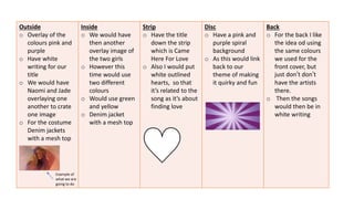
- 1. Outside o Overlay of the colours pink and purple o Have white writing for our title o We would have Naomi and Jade overlaying one another to crate one image o For the costume Denim jackets with a mesh top Inside o We would have then another overlay image of the two girls o However this time would use two different colours o Would use green and yellow o Denim jacket with a mesh top Strip o Have the title down the strip which is Came Here For Love o Also I would put white outlined hearts, so that it’s related to the song as it’s about finding love Disc o Have a pink and purple spiral background o As this would link back to our theme of making it quirky and fun Example of what we are going to do Back o For the back I like the idea od using the same colours we used for the front cover, but just don’t don’t have the artists there. o Then the songs would then be in white writing