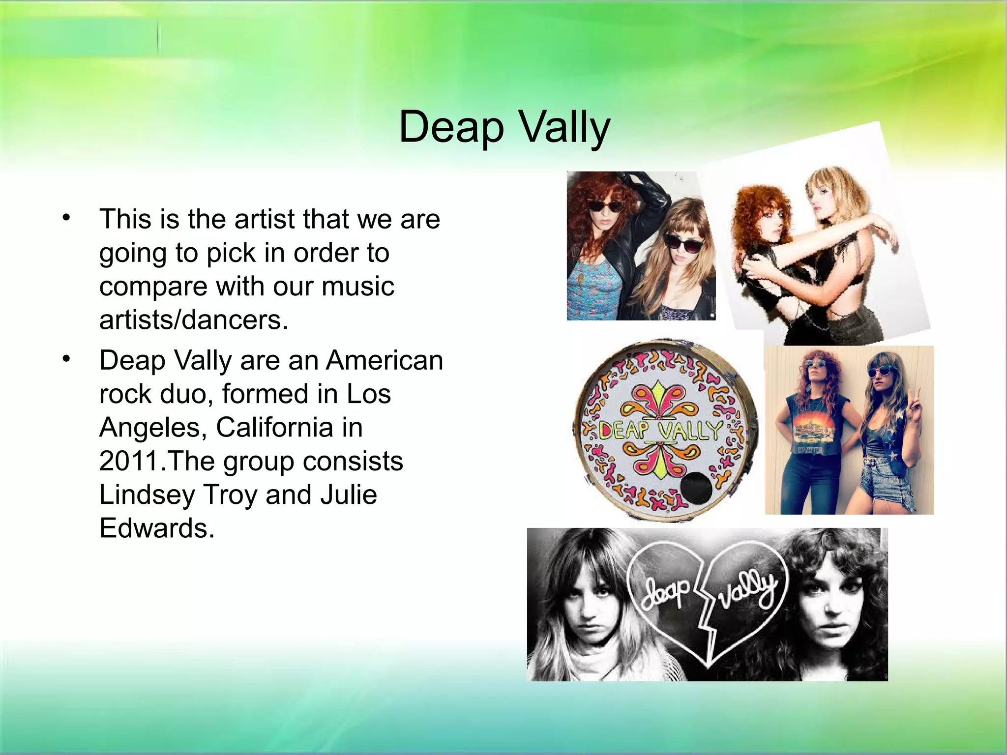
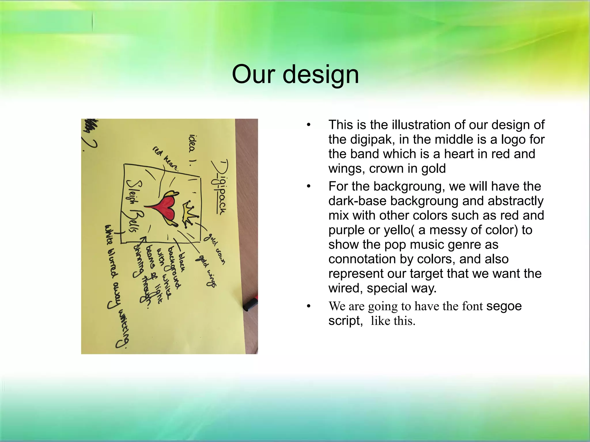
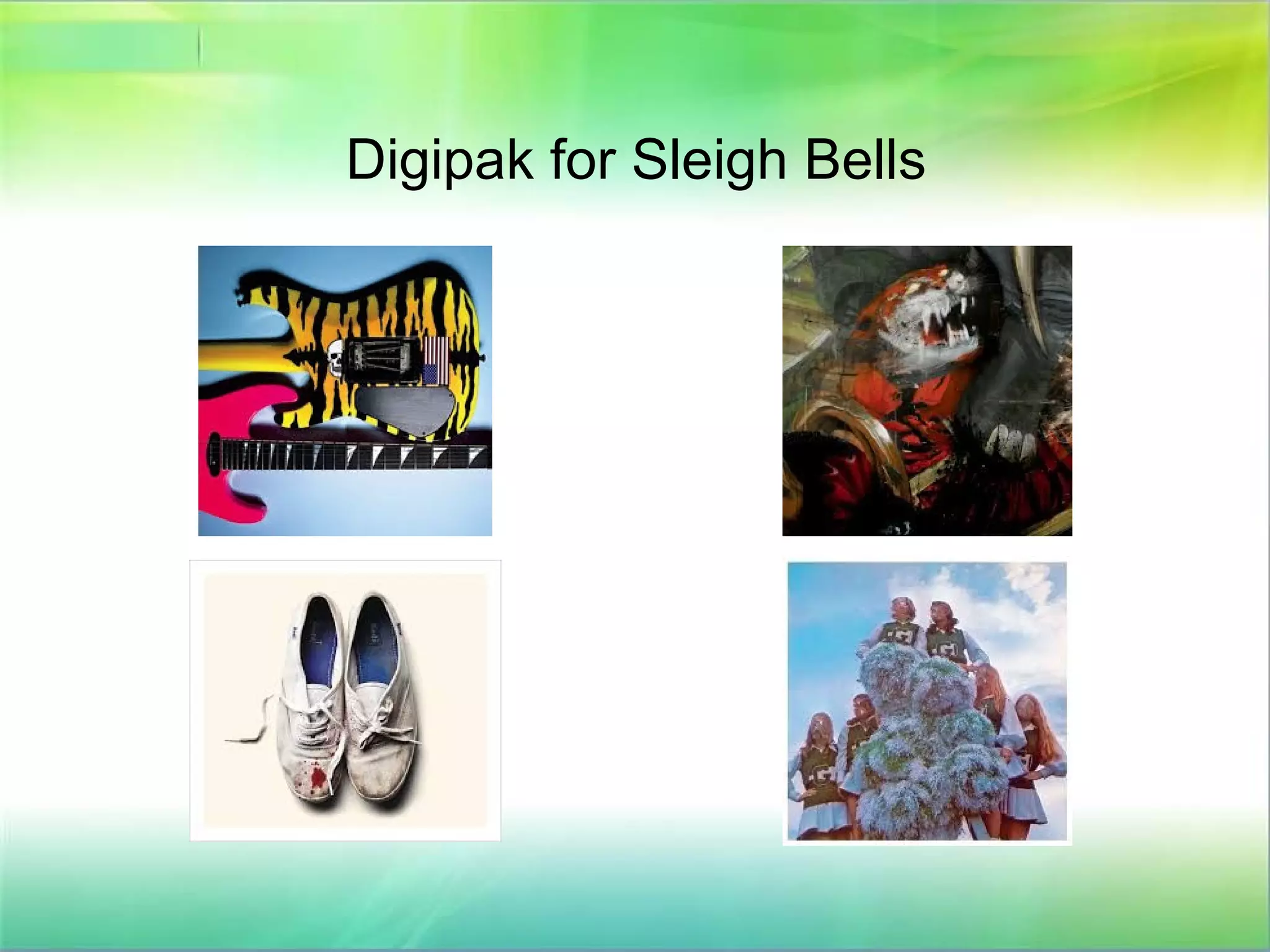
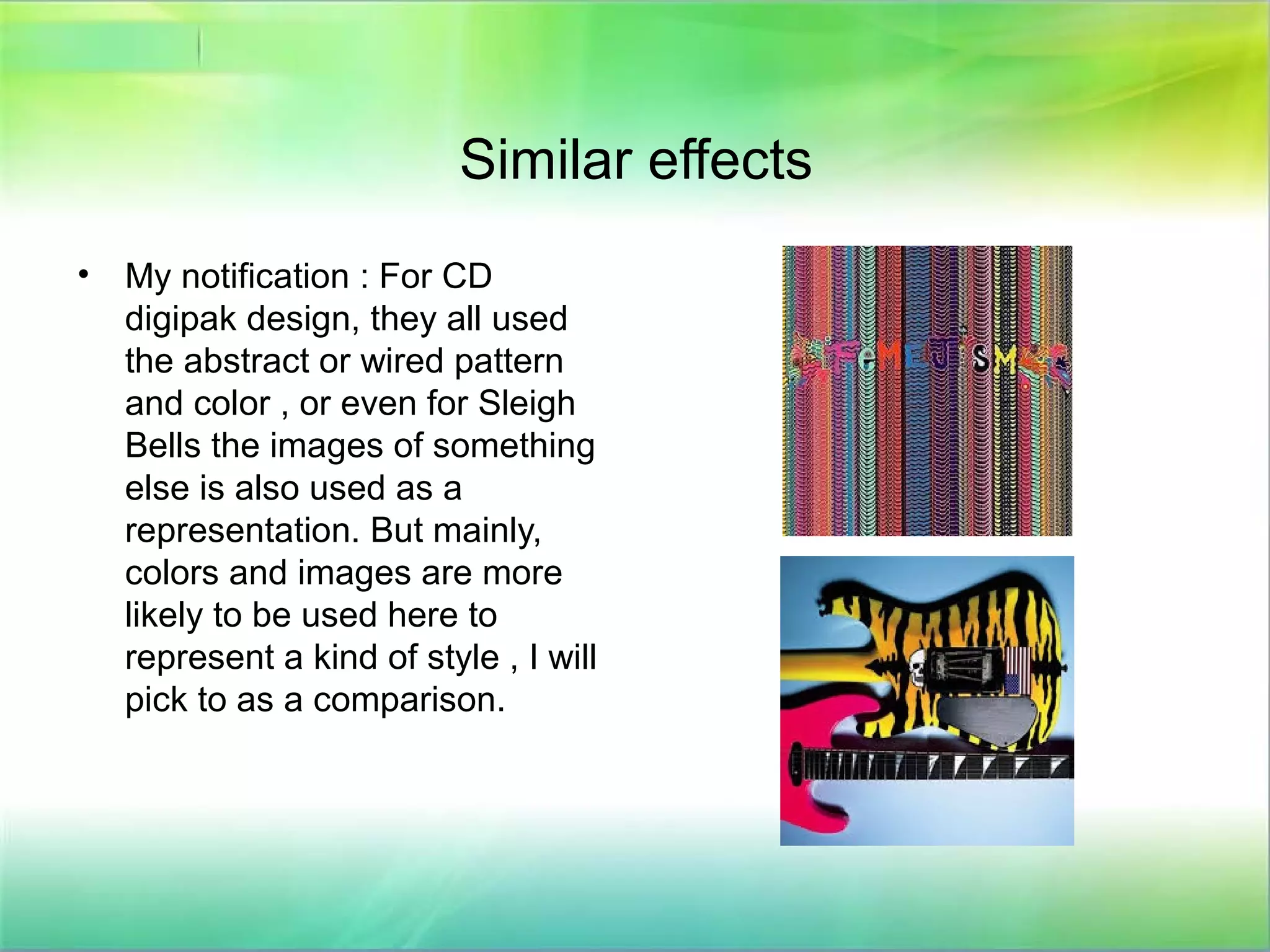
Digipak designs
Compare with Deap Vally and Sleigh Bells.
Deap Vally
• This is the artist that we are
going to pick in order to
compare with our music
artists/dancers.
• Deap Vally are an American
rock duo, formed in Los
Angeles, California in
2011.The group consists
Lindsey Troy and Julie
Edwards.
Our design
• This is the illustration of our design of
the digipak, in the middle is a logo for
the band which is a heart in red and
wings, crown in gold
• For the backgroung, we will have the
dark-base backgroung and abstractly
mix with other colors such as red and
purple or yello( a messy of color) to
show the pop music genre as
connotation by colors, and also
represent our target that we want the
wired, special way.
• We are going to have the font segoe
script, like this.
• In another word, we show the
band name ( we will use our own
name afterwards) and the
backgroung is used as
connotation for the genre, the logo
is for a kind of illustration.
• I show a kind of example below:
Digipak design from Deap Vally
• I selected two digipak design from the
list of Deap Vally CD digipak, because
I think these two are close to the ideas
that I mentioned.
• The first one, is in the similar structure because
they also used the logo, this is same as we put
logo in the middle. More importantly, the logo is
also about a heart! And therefore, write artists
name in the middle.
• The second digipak design, is about the
background colors. Let's not say the logo and the
title yet, the backgroung is also linked to the
way we coloring the backgroung of the digipak
as different colors mix together. Not regularly,
but abstractly.. The only difference is that it is
light color based, and we want dark setting
based and with other colors.
Digipak for Sleigh Bells
All digipak for Deap Vally
Similar effects
• My notification : For CD
digipak design, they all used
the abstract or wired pattern
and color , or even for Sleigh
Bells the images of something
else is also used as a
representation. But mainly,
colors and images are more
likely to be used here to
represent a kind of style , I will
pick to as a comparison.
Design with star image-
for our music production.
• Because we are producing a pop and dancing based music, we use
a loge a massive colors as background to represent the creativity
and also a kind of mysterious that what will be in the music video ?
Because we did the same way in our website, so the digipak design
fits with our website and has the same effect of attracting audiences
attention as they could be interested to find out more.
• This is really helpful for branding becauese the huge logo will be
really effective, and the abstract art design can leace a massive
space for audiences to image what the music is about, and in
another way to emphasize the mysterious character.

Digipak designs

  • 1.
    Digipak designs Compare withDeap Vally and Sleigh Bells.
  • 2.
    Deap Vally • Thisis the artist that we are going to pick in order to compare with our music artists/dancers. • Deap Vally are an American rock duo, formed in Los Angeles, California in 2011.The group consists Lindsey Troy and Julie Edwards.
  • 3.
    Our design • Thisis the illustration of our design of the digipak, in the middle is a logo for the band which is a heart in red and wings, crown in gold • For the backgroung, we will have the dark-base backgroung and abstractly mix with other colors such as red and purple or yello( a messy of color) to show the pop music genre as connotation by colors, and also represent our target that we want the wired, special way. • We are going to have the font segoe script, like this.
  • 4.
    • In anotherword, we show the band name ( we will use our own name afterwards) and the backgroung is used as connotation for the genre, the logo is for a kind of illustration. • I show a kind of example below:
  • 5.
    Digipak design fromDeap Vally • I selected two digipak design from the list of Deap Vally CD digipak, because I think these two are close to the ideas that I mentioned. • The first one, is in the similar structure because they also used the logo, this is same as we put logo in the middle. More importantly, the logo is also about a heart! And therefore, write artists name in the middle. • The second digipak design, is about the background colors. Let's not say the logo and the title yet, the backgroung is also linked to the way we coloring the backgroung of the digipak as different colors mix together. Not regularly, but abstractly.. The only difference is that it is light color based, and we want dark setting based and with other colors.
  • 6.
  • 7.
    All digipak forDeap Vally
  • 8.
    Similar effects • Mynotification : For CD digipak design, they all used the abstract or wired pattern and color , or even for Sleigh Bells the images of something else is also used as a representation. But mainly, colors and images are more likely to be used here to represent a kind of style , I will pick to as a comparison.
  • 9.
    Design with starimage- for our music production. • Because we are producing a pop and dancing based music, we use a loge a massive colors as background to represent the creativity and also a kind of mysterious that what will be in the music video ? Because we did the same way in our website, so the digipak design fits with our website and has the same effect of attracting audiences attention as they could be interested to find out more. • This is really helpful for branding becauese the huge logo will be really effective, and the abstract art design can leace a massive space for audiences to image what the music is about, and in another way to emphasize the mysterious character.
  • 10.
    Design with starimage- for our music production. • Because we are producing a pop and dancing based music, we use a loge a massive colors as background to represent the creativity and also a kind of mysterious that what will be in the music video ? Because we did the same way in our website, so the digipak design fits with our website and has the same effect of attracting audiences attention as they could be interested to find out more. • This is really helpful for branding becauese the huge logo will be really effective, and the abstract art design can leace a massive space for audiences to image what the music is about, and in another way to emphasize the mysterious character.