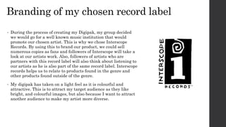
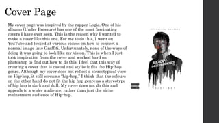
Evaluation question 1
Digipak
Branding of my chosen record label
• During the process of creating my Digipak, my group decided
we would go for a well known music institution that would
promote our chosen artist. This is why we chose Interscope
Records. By using this to brand our product, we could sell
numerous copies as fans and followers of Interscope will take a
look at our artists work. Also, followers of artists who are
partners with this record label will also think about listening to
our artists as he is also part of the same record label. Interscope
records helps us to relate to products found in the genre and
other products found outside of the genre.
• My digipak has taken on a light feel as it is colourful and
attractive. This is to attract my target audience as they like
bright, and colourful images, but also because I want to attract
another audience to make my artist more diverse.
Cover Page
• My cover page was inspired by the rapper Logic. One of his
albums (Under Pressure) has one of the most fascinating
covers I have ever seen. This is the reason why I wanted to
make a cover like this one. For me to do this, I went on
YouTube and looked at various videos on how to convert a
normal image into Graffiti. Unfortunately, none of the ways of
doing it was going to look like my vision. This is when I just
took inspiration from the cover and worked hard on
photoshop to find out how to do this. I feel that this way of
creating a cover that is casual and stylistic fits the Hip-hop
genre. Although my cover does not reflect a stereotypical view
on Hip-hop, it still screams “hip-hop.” I think that the colours
on the other hand do not fit the hip hop genre as a stereotype
of hip hop is dark and dull. My cover does not do this and
appeals to a wider audience, rather than just the niche
mainstream audience of Hip-hop.
Back Panel
• The back panel is just a simple idea that has no effect
from ancillary texts. This is because all of the
templates that I looked at did not really have any
effect on my work. I don’t really like how most of the
back panels contained an image next to the writing. I
feel that the images on the rest of the panels takes the
audience away from the cover and distances them from
the album. This is why I didn’t include another image
on the back and kept it plain and simple. For this
reason, I feel that my back panel does not fit the
conventions of a normal Hip-hop back panel.
Inside panel
• My inside panel was really easily done. I wanted
something that had continuity between the cover. This is
why I added in the same image, but also added in the
stylistic symbol ‘D,’ taken from my magazine
advertisement. This just to add continuity between the
two. I believe this does not suit the conventions of Hip-
hop as most artists add information about the albums
creation, shoutouts to family or friends and also other
artists who worked on the album or collaborations. I feel
like my inside cover looks much better without any
information on it as it carries on the idea of simplicity
and authenticity through my album.
Disk
• For my disk, I added my main image with a simple
message that is a slight Easter egg from my music
video. This was taken from my magazine
advertisement draft which was then changed later for
my final version. Because I really liked the writing, I
wanted to keep it and add it onto my inside cover, until
I had the idea of adding it onto my disk. I feel that my
disk does fit into the hip hop conventions but it isn’t
normal for a disk to have a main image on. I took this
idea from Eminem’s album ‘Curtain Call’ and thought
it would be a really nice idea.
Fonts
• The fonts I used span across my magazine advertisement
and my digipak. I used Arial, freehand and a font
downloaded from adobes website. I also used a very fancy
font for the title of Distinct for my advertisement. The
reason I used these fonts across my work is to just add
continuity and so each piece of worked resembled one
another. I didn’t put any of the font in bold as I believe the
writing looks much more stylistic in a simple and skinny
form. I believe that the fonts fit the conventions of Hip-
hop as our sub genre in Hip-hop is mainstream Hip-hop.

Evaluation question 1 powerpoint

  • 1.
  • 2.
    Branding of mychosen record label • During the process of creating my Digipak, my group decided we would go for a well known music institution that would promote our chosen artist. This is why we chose Interscope Records. By using this to brand our product, we could sell numerous copies as fans and followers of Interscope will take a look at our artists work. Also, followers of artists who are partners with this record label will also think about listening to our artists as he is also part of the same record label. Interscope records helps us to relate to products found in the genre and other products found outside of the genre. • My digipak has taken on a light feel as it is colourful and attractive. This is to attract my target audience as they like bright, and colourful images, but also because I want to attract another audience to make my artist more diverse.
  • 3.
    Cover Page • Mycover page was inspired by the rapper Logic. One of his albums (Under Pressure) has one of the most fascinating covers I have ever seen. This is the reason why I wanted to make a cover like this one. For me to do this, I went on YouTube and looked at various videos on how to convert a normal image into Graffiti. Unfortunately, none of the ways of doing it was going to look like my vision. This is when I just took inspiration from the cover and worked hard on photoshop to find out how to do this. I feel that this way of creating a cover that is casual and stylistic fits the Hip-hop genre. Although my cover does not reflect a stereotypical view on Hip-hop, it still screams “hip-hop.” I think that the colours on the other hand do not fit the hip hop genre as a stereotype of hip hop is dark and dull. My cover does not do this and appeals to a wider audience, rather than just the niche mainstream audience of Hip-hop.
  • 4.
    Back Panel • Theback panel is just a simple idea that has no effect from ancillary texts. This is because all of the templates that I looked at did not really have any effect on my work. I don’t really like how most of the back panels contained an image next to the writing. I feel that the images on the rest of the panels takes the audience away from the cover and distances them from the album. This is why I didn’t include another image on the back and kept it plain and simple. For this reason, I feel that my back panel does not fit the conventions of a normal Hip-hop back panel.
  • 5.
    Inside panel • Myinside panel was really easily done. I wanted something that had continuity between the cover. This is why I added in the same image, but also added in the stylistic symbol ‘D,’ taken from my magazine advertisement. This just to add continuity between the two. I believe this does not suit the conventions of Hip- hop as most artists add information about the albums creation, shoutouts to family or friends and also other artists who worked on the album or collaborations. I feel like my inside cover looks much better without any information on it as it carries on the idea of simplicity and authenticity through my album.
  • 6.
    Disk • For mydisk, I added my main image with a simple message that is a slight Easter egg from my music video. This was taken from my magazine advertisement draft which was then changed later for my final version. Because I really liked the writing, I wanted to keep it and add it onto my inside cover, until I had the idea of adding it onto my disk. I feel that my disk does fit into the hip hop conventions but it isn’t normal for a disk to have a main image on. I took this idea from Eminem’s album ‘Curtain Call’ and thought it would be a really nice idea.
  • 7.
    Fonts • The fontsI used span across my magazine advertisement and my digipak. I used Arial, freehand and a font downloaded from adobes website. I also used a very fancy font for the title of Distinct for my advertisement. The reason I used these fonts across my work is to just add continuity and so each piece of worked resembled one another. I didn’t put any of the font in bold as I believe the writing looks much more stylistic in a simple and skinny form. I believe that the fonts fit the conventions of Hip- hop as our sub genre in Hip-hop is mainstream Hip-hop.