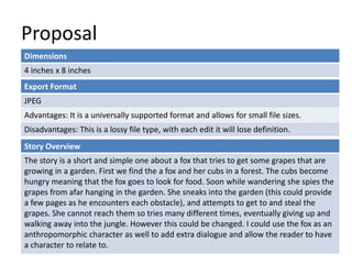
This document contains a student's proposal for a digital graphic narrative project. The proposal outlines a story about a fox trying to steal grapes from a garden. Key details include:
- The story will be 4 inches by 8 inches in size and target an audience ages 1-3.
- Pages will be created in Photoshop using paper cutout textures to resemble a scrapbook.
- Feedback on the proposal noted the file format choice was clear but dimensions and page count were missing.
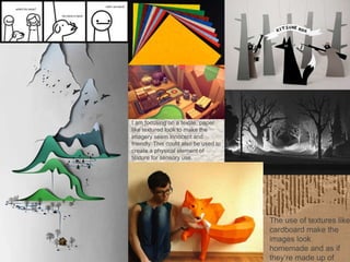
- Idea generation focused on using textile-like textures to make images seem innocent and friendly, potentially for sensory exploration. More development of ideas could have occurred.