Download to read offline


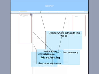
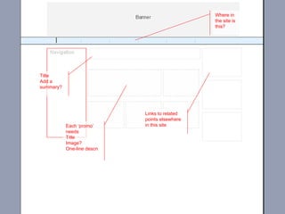
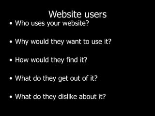


The document discusses the importance of understanding user behavior on the web, emphasizing that users typically scan rather than read content thoroughly. It provides strategies for enhancing website usability and engagement, particularly through effective writing, layout, and visual communication. Additionally, it outlines various audience types and their specific needs when navigating online resources.


