This document discusses various design principles including balance, proportion, repetition, dominance, contrast, direction, harmony, variety, symbolic meaning, and composition. It provides examples of each principle with images of architecture, art, jewelry and more. Balance is demonstrated through examples of a house, flowers, and jewelry. Proportion is shown through statues, a swimmer statue, and large flowers. Repetition is visible in bicycle wheels, triangles, and circular jewelry. Dominance uses lighting, color, and gestures to draw the eye. Contrast employs size, texture, light and dark. Direction is conveyed through curved lines, architecture, and ring design. Harmony and unity are achieved despite variety in shape and elements. Symbolic meaning is represented by
This Basic design Presentation serves the purpose of initiating creativity and there by appreciation of visual language.
Basic design studios help to unlock students creativity and enhance spatial perception.
This Basic design Presentation serves the purpose of initiating creativity and there by appreciation of visual language.
Basic design studios help to unlock students creativity and enhance spatial perception.
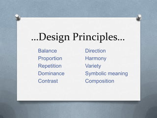
There are a lot of rules and best practices to consider when designing anything (regardless of the medium– website, print campaign, keynote presentation, etc.), and the process can easily become overwhelming to the uninitiated. Fortunately, various sets of principles exist to help lay out the general premise of a design. There are nine principles, and the process becomes vastly simpler after learning the concepts behind this set. Most of the time, after some practice and comprehension, the principles begin to work subconsciously within the back of your mind, guiding the creative process.
There are a lot of rules and best practices to consider when designing anything (regardless of the medium– website, print campaign, keynote presentation, etc.), and the process can easily become overwhelming to the uninitiated. Fortunately, various sets of principles exist to help lay out the general premise of a design. There are nine principles, and the process becomes vastly simpler after learning the concepts behind this set. Most of the time, after some practice and comprehension, the principles begin to work subconsciously within the back of your mind, guiding the creative process.
Pride in Place: A Museum/School CollaborationNancy Walkup
This presentation describes a multi-year collaboration between the North Texas Institute for Educators on the Visual Arts (NTIEVA) and the Wichita Falls Museum of Art, funded by the Priddy Foundation. It was presented at the Aspen Art Museum during the Mountain-Plains Museum Association Conference in Aspen, Colorado, September 30, 2014.
This is a reprint of an article from SchoolArts Magazine and an example of an art lesson from Davis Publication's 4th Grade textbook from the Explorations in Art digital curriculum.
The Art of Liquid Face Lift (Dermal Fillers)Osama Moawad
Soft tissue fillers are flexible substances that can be injected into the skin to improve the appearance of fine lines and wrinkles, plump lips, fill hollow cheeks, repair various facial imperfections, improve scars, and elevate deep folds. Perhaps nothing is more gratifying for cosmetic patients than having an immediate correction of rhytides or scars as a result of the injection of a dermal filler The result is a smoother, more youthful appearance with minimal "downtime" and maximum safety. Prof. Moawad uses a variety of soft tissue fillers, including, hyaluronic acid, and autologous fat (one's own fat) among others. Since filler substances do not involve major surgery and are generally cost-effective, men and women are using these youth-enhancing techniques more than ever. With the increasing desire for people to achieve a more youthful appearance, the aging baby boomer population, and the increased demand for "lunch-time procedures," the pharmaceutical market has responded by providing the cosmetic surgeon with an increasing number of options to meet the demands of the cosmetic patient.
2. …Balance… In this house we can see the principle of balance. The one side of the house is very solid and the other side has many more windows so therefore is less solid but together the whole house seems to be balanced.Itdoes not give me an uneasy feeling…how about you?
3. These are two examples of radial balance. We can find balance even in nature. We can see in the flower how the dark lines on the petals radiate from or towards the centre.Thisis effective in the overall balance of the flower. In the picture on the right we can see radial balance too. Even though there is a variety of colours in the spiral it is still balanced.
4. Here we see balance in a piece of jewellery. The flowers and leaves that are cut out are not evenly cut there is more solid pieces on the one side compared with the other side but even though it is uneven the designer has really been clever in creating balance. The designer also added black flowers that are stuck on the colour is different to the main metal used which I think adds to the overall balance.
5. …Proportion… Here proportion is seen very effectively. We see how big and overpowering these statues are compared to the people. The size of the statues could represent power and authority and it is demonstrated very effectively.
6. I thought this was a fun way to demonstrate proportion we can see how big the swimmer is compared to the bridge in the background. I love this statue…I think it is also clever how they made the grass look like water.
7. In these flowers we also see proportion. If you compare the size of the flowers to the people we can see how small the people are. Walking through a garden with such big flowers must make you feel really small and inferior. You can really understand how big the world is to insects…scary!
8. …Repetition… The picture below shows the principle of repetition as the bicycle wheels are repeated to form a circle and pattern. We can also see the element of closure because the wheels all make a circle. The repetition seen in the picture above is created by the artists use if the same “triangle“ shapes in different directions and colours. This picture gives us the feeling of unease because there is no real focal point but because of that we start to create flower shapes using the principle of proximity.
9. Repetition can also be seen in jewellery. The ring below is made up of circles. I think this is very interesting and creative. This neckpiece is made up of circle shaped discs repeated over and over in different positions and angles. I think there is balance and unity displayed here too.
10. …Dominance… In this painting the principle of dominance or focal point is displayed by making one of the figure in the painting in the light and the others in the shadow. We immediately look at the women because of the light and the fact that the men are both gesturing towards her with there hands.
11. I chose this picture because I think it is an excellent way of displaying dominance in everyday life without us even realising. We will immediately look at the red apple because it is a different colour even though it is the same fruit as the rest. This could be used as a marketing plan because people are more likely to buy the red apple then the green one because it stands out.
12. In this picture of the Last supper we see that Jesus is the focal point because he is in the centre of the table and all the disciples are either looking at Him or making hand gestures towards him. The walls on either side of the room also lead towards Him. I think this painting is a really good portrayal of Jesus and how powerful and almighty he is.
13. …Contrast… I just couldn’t get over how cute this picture is and it also shows us the element of contrast in size.
14. In this painting we can see the element of contrast again. The painter has used the contrast of light and dark to make the flower the focal point, Like the flower has a spotlight on it.Contrast is also used in the petals between the lighter pink and darker pink to allow the viewers to be able to really feel the softness of the petals. The background is a single texture which helps the flower stand out more.
15. In the piece of jewellery below we can see the contrasting texture between the smooth metals and the metal that looks crinkled. By using the smooth metal the designer has successfully emphasised the pearl. In the piece above the designer has used contrast with the oxidised silver and the gold to successfully create depth and a 3D effect.
16. In this architecture we can see the principle of contrast well. If we look at the modern looking building it is very geometrical where as the older looking building id more curvature. These two buildings are built right next to each other but they don’t look like they even come from the same era.
17. …Direction… These paintings show the principle of movement really well. The artist has used very curvy lines to create movement around the woman which makes her the focal point.
18. In this ring the designer has used the principle of direction to create a lot of movement in this ring.by making the metal all sort of flow into each other. We can also see closure here. I think because the designer has used round wire the movement is a lot more effective because your eyes feel at ease and can follow the wire more easily then if it was square wire for example
19. The architecture below is very angular but we can still feel direction. The points of the building almost form arrows which lead our eyes diagonally up or to the right. In the architecture abovewe can also feel direction and movement but I feel it is not as drastic as the more angular building. I think this is because of the 3 round structures at the top. All the columns direct our eyes up and at the top of each of the round structures there are crosses which also point upwards to where the almighty god is. I think this is effective.
20. …Harmony… I chose this image because even thought it is made up of lots of different shapes the painting still has unity and harmony.
21. These two pictures are made up of many different elements but there is still the element of harmony and unity in these designs.
22. In this image we can feel the harmony and unity. The picture is made up of many different lines and elements but even though the picture is very busy it still has a sense of harmony.
23. …Variety… Varieties of different colours…beads…wires…ribbon. We can find variety in many things in life.
25. …Symbolic Meaning… No matter where it is or what it is made of we know if we see a red ribbon shape its foe AIDS awareness. This is an example of symbolic meaning.
26. Kris Kuksi sculptures of 'churchtanks' are very well craftedwith the highest detail and made to look realistic as possible. The artworks also have a much deeper political meaning relating to the current wars in Iraq and Afghanistan. The meanings behind each piece relates to the idea of the Arabic world seeing the war as another religious conquest. I really like these sculptures not only for their deeper meaning but also the beautiful craft work. I really like how the idea of combining two differing and contrasting images of a church and tank, both separate objects are in reality.
27. Yin-yang is an ancient expression that looks upon that which is endless or eternal. In this painting the artist has used nature that is never-ending. the left half of the yin-yang sign is portrayed by the grey matter of the human brain which could represent the reasoning of humans. There is a lot of symbolic meaning that can be unpacked from this image.
28. …Composition… This composition by van Gogh's an example of a well balanced composition. All the elements of design that are present are all put together well and all work together very nicely.
29. This is a very striking black and white photo. It has all the elements of good composition. The perspective is excellent, the lighting is great and we can really feel the depth in the photo. The arrangement of the elements in the photo lead viewer’s eyes naturally from the railings to the structure at the end of the pier, the sea, and the dramatic cloud.avery good composition
30. This is a good composition because the rhythm of the piece flows through the changes in the sizes of the circles, and their inter-relationships with each other. In this piece by Louise Nevelson he successfully breaks the composition into thirds resulting in a successful artwork even without colour. Negative space help the composition to be more balanced.