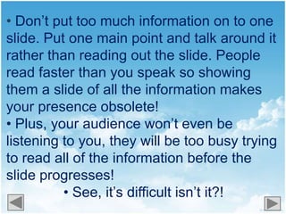
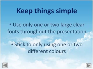
Death By PowerPoint
  (and how to avoid it)
How often have you watched a
PowerPoint presentation that
   made you feel like this?
Here’s some ideas of
  how to do it and
   things to avoid
Try using simple
background templates
     like this…
Or this...
They’re more interesting than the
standard PowerPoint templates and
           they’re free!
  See www.templatewise.com for
 more or google ‘free PowerPoint
 templates’ and see what you can
              find!
• Don’t put too much information on to one
slide. Put one main point and talk around it
rather than reading out the slide. People
read faster than you speak so showing
them a slide of all the information makes
your presence obsolete!
• Plus, your audience won’t even be
listening to you, they will be too busy trying
to read all of the information before the
slide progresses!
          • See, it’s difficult isn’t it?!
Don’t use too
  many colours
  or too many
different fonts!
Keep things simple
• Use only one or two large clear
fonts throughout the presentation

 • Stick to only using one or two
          different colours
Still paying attention?!
                           Good…
Make sure that your text is
        readable
 •Make it large enough – at least 40
                 pts.
•Make sure the text is the right colour
 so it is visible over the background
                  colour
If the text colour is too
       similar to the
  background colour it
    is difficult to read!
This doesn’t mean your
presentation has to be boring!
 Add illustrations, photos and videos!
              Or even a
How interesting has
this presentation been?
     (click relevant button)

     Very! I’d like to watch it again!

     Not very interesting, to be
     honest
You are now qualified to
make interesting PowerPoint
      presentations!

   The only things to remember are…
 Find new interesting background
templates
Stick to one or two fonts in one or two
colours
Make text big and bold
Make it entertaining! Add
photos, pictures, quizzes and videos!
Only add one point per slide – keep
   text to a minimum
But most importantly….
have       with it!


If you have any questions on preparing
PowerPoint presentations or eLearning
        contact a member of the
          LRC/eLearning team

Death by powerpoint

  • 1.
    Death By PowerPoint (and how to avoid it)
  • 2.
    How often haveyou watched a PowerPoint presentation that made you feel like this?
  • 4.
    Here’s some ideasof how to do it and things to avoid
  • 5.
    Try using simple backgroundtemplates like this…
  • 6.
  • 7.
    They’re more interestingthan the standard PowerPoint templates and they’re free! See www.templatewise.com for more or google ‘free PowerPoint templates’ and see what you can find!
  • 8.
    • Don’t puttoo much information on to one slide. Put one main point and talk around it rather than reading out the slide. People read faster than you speak so showing them a slide of all the information makes your presence obsolete! • Plus, your audience won’t even be listening to you, they will be too busy trying to read all of the information before the slide progresses! • See, it’s difficult isn’t it?!
  • 9.
    Don’t use too many colours or too many different fonts!
  • 10.
    Keep things simple •Use only one or two large clear fonts throughout the presentation • Stick to only using one or two different colours
  • 11.
  • 12.
    Make sure thatyour text is readable •Make it large enough – at least 40 pts. •Make sure the text is the right colour so it is visible over the background colour
  • 13.
    If the textcolour is too similar to the background colour it is difficult to read!
  • 14.
    This doesn’t meanyour presentation has to be boring! Add illustrations, photos and videos! Or even a
  • 15.
    How interesting has thispresentation been? (click relevant button) Very! I’d like to watch it again! Not very interesting, to be honest
  • 16.
    You are nowqualified to make interesting PowerPoint presentations! The only things to remember are…
  • 17.
     Find newinteresting background templates Stick to one or two fonts in one or two colours Make text big and bold Make it entertaining! Add photos, pictures, quizzes and videos! Only add one point per slide – keep text to a minimum
  • 18.
    But most importantly…. have with it! If you have any questions on preparing PowerPoint presentations or eLearning contact a member of the LRC/eLearning team