Dave analysis
•Download as PPT, PDF•
0 likes•939 views
Analysis of Dave from the movie Prometheus, using representation to find pick out certain aspects of his personality/character.
Report
Share
Report
Share

Recommended
Image Connotations
This document analyzes the connotations of various images related to concepts like strength, poverty, love, fear, desire, danger, weakness, loneliness, friendship, purity, and greed. For each image, the document explores both the direct denotation and deeper connotations that could be interpreted. It examines elements like camera angles, close-ups, anonymity, and blurring that provide additional implied meanings beyond the literal depictions. The goal is to demonstrate how visual elements can convey complex ideas and meanings beyond just the directly observable subjects of the images.
Convention and Codes AS Media
The front cover of a Jessie J album uses symbolic colors and imagery to represent her image and brand. The red background and pink font symbolize danger and femininity. Jessie J is depicted in black clothing with a fierce pose, contrasting with the pink text and reinforcing her image. Strategic placement of elements like barcodes avoids interfering with the main visuals, while a sell line and buzz words are used to intrigue and attract readers.
Image analysis
The artist painted their friend's face to look like a skull and used dark makeup to make him resemble a demonic being. They took a photo of him at night with flash for high contrast. In Photoshop, the artist increased saturation and contrast, made his eyes red, and gave him a sickly complexion to enhance the sinister and mysterious vibe. The messy hair, dark tone, red upside down cross, and direct eye contact with the camera were intended to make the audience uncomfortable and distrust the subject.
Social Group Representation
This is an analysis of how the social group of teenagers was represented in my coming of age film opening sequence.
How does your media product represent particular social
The media product represented some social groups through its characters. The main characters appeared to be of working class based on their clothing and language. While the characters were meant to seem young and vulnerable, more could have been done to represent different age groups through settings, props, and dialogue. Gender roles were portrayed through traditional stereotypes, with the male character being more dominant and the female playing a vulnerable role. For the future, overturning these stereotypes or allowing different power dynamics could provide more insight. The actors featured happened to all be of Afro-Caribbean ethnicity, so including a more diverse cast would engage more of the audience.
Digipack appearance
This document provides a template and design plan for a digipack for a pop music album by artists Caroline and Aino. The front cover features a black and white image of Caroline and Aino with a colorful triangular background, representing the mix of emotions addressed in their breakup-themed music. Interior pages continue the theme with close-up headshots and descriptions of the friends' bond and emotions conveyed through their styling and poses. The back cover is proposed to have a grayscale background and image with more somber expressions and lighting to contrast with the front and represent the hurt felt despite having fun.
Spaulding 09 4
Interpretive signs continue to evolve; there is no end. How will I ever stop this? Not to worry, the beat goes on...and on... enjoy the journey.
Question two
The document discusses how a media product represents teenagers. It introduces the protagonist as a typical teenage girl through photos showing her socializing with friends and family. These positive representations are meant to portray her as relatable. Stereotypical behaviors of fashion, social media, and texting are also used to characterize her as a teenager. The setting of her average home provides insight into her social class and makes her more relatable to audiences. The overall representation aims to portray a stereotypical teenage girl in a positive yet relatable way without using exaggerated stereotypes commonly seen in other coming of age films.
How does your media product represent particular social groups.
This document discusses how the film represents teenagers through its social groups, characters, clothing, makeup, props, sounds, camera angles, dialogue, and setting. Specifically, it focuses on two 17-year-old main characters, incorporates typical teenage fashion including hoodies and dark colors, shows makeup worn by girls to parties, includes unprepared teenagers needing a torch, uses ambient natural sounds, employs close-up shots of facial expressions, features sarcastic and impatient dialogue, and sets the story in an abandoned bunker as a rebellious party location.
Dbs analysis 2
Cher's facial expression and messy hair in the photograph convey a rebellious and wayward persona. She is staring at the camera with her fingertips to her mouth, seeming to say "oops" as if she has misbehaved. Her unusual twisted body pose and tight clothing further establish her as unique and unconventional, with extremes in her personality represented by her clashing striped and solid colored outfit.
Research into magazines
This document summarizes a magazine spread about an interview with Stephanie Syjuco. It describes the layout and design elements used, including placing Syjuco's name in pink to represent feminism. The date is published prominently in both corners. Black text is used to convey elegance. Pictures of handbags represent fashion. A neutral background provides softness. Subheadings are in brown. Syjuco's dressing is casual to look relaxed. Bold brown text grabs attention at the beginning of the interview. White text stands out against a navy background for a selling line about what Syjuco likes in women. The text is underlined to stand out from other writing.
Costumes
The document describes the clothing choices for characters in a film opening scene. Nike SB shoes and black skinny jeans are chosen to portray a typical teenager. A long white sleeve t-shirt is selected to give the main character qualities of goodness and innocence so the audience sympathizes with him. Gray Nike SB trainers and jeans maintain a neutral emotion while also hinting at loss and darkness. A dark green/blue long sleeve jumper is casual clothing suitable for the season and time of year, with the colors representing ambition and power for the character it is chosen for.
Analysis 1
The document analyzes the cinematography, editing, sound, mise-en-scene, and conventions used in the film trailer for The Time Traveler's Wife. It discusses how two shots are used to show the romantic relationship between the main characters. Close-ups reveal their emotions and a wide shot establishes their playful dynamic. Editing employs fades and shot-reverse-shot to signify commitment between the couple and build tension during arguments. Sound design utilizes dialogue to convey their affection and non-diegetic music to underscore dramatic life events and loneliness. Mise-en-scene features symbols of love and Christmas decorations to elicit sympathy. Overall, the trailer employs conventions of romantic genres and film forms to introduce
Ts case study updated
The music video for "Blank Space" by Taylor Swift challenges common media representations of her love life and relationships. Through exaggerated depictions of her lifestyle and relationships, the video aims to portray these ideas in a way that refutes how Taylor is often shown in the media. Various film techniques are used to develop Taylor's own image and perspective, contradicting how the media portrays her as constantly seeking attention through unsuccessful relationships. Overall, the video greatly exaggerates and distorts common media narratives about Taylor in order to establish her own representation and challenge preconceived notions about her character.
In what ways does your media product use
Our media product challenges conventions by using red fonts and imagery in titles and a character wearing red to represent romance semantically. It also uses Disney-princess style music that starts bubbly but ends confused to match a title sequence portraying time passing through a montage of multiple bad dates for the main character, with the music suggesting sarcasm after the men speak. The product develops forms by having the music and filming work smoothly together.
Analysis of mag and poster
This document analyzes conventions of magazines and posters. For magazines, it discusses common elements like the headline, image, date, and promotions. For posters, it examines how color, character positioning, word emphasis, and slogans/taglines can be used to convey meaning and foreshadow elements of the story. Red may symbolize danger or conflict, while blue could indicate depression. Black is often associated with fear, evil, and death. The direction characters face and colors used in words can provide clues about conflicts between characters and hardships they may experience. Overall, the poster aims to hint at the plot and get viewers interested in learning more about the characters and story.
Shelter advertisement
The document analyzes visual elements of an advertisement, noting that the use of "We" suggests the family is becoming homeless. Red eyes indicate crying, and pronouns like "We", "He", and "I" make the ad more personal. At the bottom, lots of information is provided. The three subjects have the same dead, expressionless looks. The direct address is almost a plea for help, representing a range of ages and genders but no ethnicity. Red writing implies fear while black backgrounds can symbolize depression or darkness, framing the subjects. The bold, sans-serif font makes the text stand out to audiences. A rhetorical question and emotional tagline aim to be specific and relatable to prompt action
02. mise en scene notes sheet (1)
The document discusses the concept of mise-en-scene and its key elements in film analysis. Mise-en-scene refers to everything visible in a scene, including costumes, props, lighting, location, and actor positioning/performance. These elements help establish meaning and allow the audience to understand what is happening. The document then provides examples analyzing how various mise-en-scene elements like color, costume, props, location, and lighting are used in different film scenes to convey specific meanings and moods.
Semiotics
This image is promoting Katy Perry's perfume "Killer Queen". It depicts Katy Perry sitting on a throne wearing red, with symbols of royalty like a crown and mirror. Her posture signifies power and control. The colors red and gold are associated with royalty, matching the perfume bottle. The thrown over sideways king's crown suggests female power overturning patriarchy. The image aims to portray Katy Perry as the "Queen" and convince viewers that wearing the perfume will make them feel powerful and confident.
Q2
The document discusses how the media product represents social groups such as young people and gender roles. For young people, the two main characters of Sarah and Danny are meant to represent teenagers/young adults to make the target audience feel represented. Danny's character portrays negative stereotypes often associated with teenagers, while Sarah subverts these stereotypes by wanting to succeed. For gender roles, Danny conforms to male stereotypes of being serious and aggressive through his facial expressions and chasing Sarah. Sarah conforms to female stereotypes of being weak and submissive through allowing Danny to chase her and expressing terror.
Katy perry
The digipack album cover for Katy Perry's "Teenage Dream" depicts her on a pink candyfloss cloud, representing the theme of dreaming. Pink is used throughout to portray Katy as girly and sweet. Her black hair and pale skin reference Snow White to seem magical and innocent. Technical elements like direct eye contact with the camera and bright lighting are intended to engage the audience and present the album desirably. The candy-themed setting establishes the cover as a conceptual piece representing Katy's dreamworld.
Media with mr coe Lonely
The document analyzes several photographs through descriptions of compositional elements like camera angle, framing, lighting, color, expressions, and positioning of subjects. For one photo, a woman hugging herself is shown in green against a backdrop, isolated through framing and color which conveys envy and isolation. Another photo shows a shadowed man looking down, appearing lonelier through his blackened appearance and lack of connection. A third photo depicts a girl looking away and slumped on a bench with a single vulnerable flower, reinforcing her sad and lonely emotions.
Evaluation question 2
This document discusses how media products represent certain social groups. Representation is how a person or group is perceived and presented in a media product. For example, a film about Christian themes would likely represent Christians by showing churches and priests. The document then discusses a film that represents an "average Joe" teacher through his mundane clothing, speech, and suburban home environment. However, when he enters his home, his true representation as a "Satan's worshipper" is shockingly revealed through dark lighting, ominous music, blood, a satanic bible, and scary black robe - contrasting his dual representations and effectively surprising the audience.
Question 2
The document discusses how a media product about a teenage relationship breakup could represent common stereotypes. It portrays the breakup as being over "silly reasons" and shows the boy quickly moving on while the girl becomes emotional and obsessive. The characters are all teenagers which helps create this image. For example, the boy is always casually dressed in a hoodie and jeans, acting like he doesn't care about the girl's feelings in a stereotypical way. Meanwhile, the ex-girlfriend is shown as being highly emotional and unable to let go, portraying teenage girls as vulnerable and silly.
About a Girl still analysis
This still shot from the film provides representations of class, gender, and emotional state. The run-down industrial buildings and graffiti-covered bridge in the background indicate it takes place in a lower-class, rough area. The girl's thick northern accent and use of slang further represent her lower-class status. Her plain clothing and lack of makeup subvert expectations for a 13-year-old girl and enhance her vulnerability, while also showing her independence and strength as the sole subject of the shot. The overall darkness and gloominess of the image add to the representation of her sad life experiences.
Film opening - Se7en
The opening sequence of "Seven" uses various camera shots and imagery to set a dark, mysterious, and unsettling tone. Close-ups of hands removing fingerprints and developing photos introduce the main character without revealing his face, creating intrigue. Religious icons and a book are juxtaposed with shots in red to suggest danger and mystery. Intercut titles and a screeching noise build suspense and tension. A picture of a crossed-out child foreshadows the film will involve a shocking child victim and not follow genre conventions.
Question 2 media as evaluation
The document discusses how a media product represents various social groups through stereotypes of class, age, gender, sexuality, ethnicity, disability and more. It focuses on representing childhood innocence through bright lighting, pyjamas and shots showing vulnerability. It provides a stereotypical view of women as maternal and caring through costuming and shots, and an anti-stereotypical isolated view. It also represents mental disability through a bloodied hospital gown, pale makeup, and lighting and shots to portray jumbled thoughts and a menacing nature after a child's death.
Power of Networking
This document promotes multi-level marketing (MLM) as a way for readers to achieve their big dreams and financial goals with little investment. It lists common dreams like luxury cars, homes, travel and education. It then argues that MLM provides the easiest and fastest way to achieve these dreams with little money required and no business experience needed. The document emphasizes that MLM allows people to be their own boss and earn residual income. It asks readers to consider if their current job will provide enough future income and security for their dreams and responsibilities. Notable business people who have endorsed MLM like Donald Trump and Bill Clinton are quoted. Contact information is provided at the end to join the presented MLM opportunity.
Title fonts
This document provides 10 different font style ideas for the title "JACK" to be used in the opening title sequence of a thriller film. Each idea shows the title "JACK" styled in a different font to convey various tones and moods that could be suitable for a thriller genre. The document aims to help choose a title font style for the opening credits.
More Related Content
What's hot
How does your media product represent particular social groups.
This document discusses how the film represents teenagers through its social groups, characters, clothing, makeup, props, sounds, camera angles, dialogue, and setting. Specifically, it focuses on two 17-year-old main characters, incorporates typical teenage fashion including hoodies and dark colors, shows makeup worn by girls to parties, includes unprepared teenagers needing a torch, uses ambient natural sounds, employs close-up shots of facial expressions, features sarcastic and impatient dialogue, and sets the story in an abandoned bunker as a rebellious party location.
Dbs analysis 2
Cher's facial expression and messy hair in the photograph convey a rebellious and wayward persona. She is staring at the camera with her fingertips to her mouth, seeming to say "oops" as if she has misbehaved. Her unusual twisted body pose and tight clothing further establish her as unique and unconventional, with extremes in her personality represented by her clashing striped and solid colored outfit.
Research into magazines
This document summarizes a magazine spread about an interview with Stephanie Syjuco. It describes the layout and design elements used, including placing Syjuco's name in pink to represent feminism. The date is published prominently in both corners. Black text is used to convey elegance. Pictures of handbags represent fashion. A neutral background provides softness. Subheadings are in brown. Syjuco's dressing is casual to look relaxed. Bold brown text grabs attention at the beginning of the interview. White text stands out against a navy background for a selling line about what Syjuco likes in women. The text is underlined to stand out from other writing.
Costumes
The document describes the clothing choices for characters in a film opening scene. Nike SB shoes and black skinny jeans are chosen to portray a typical teenager. A long white sleeve t-shirt is selected to give the main character qualities of goodness and innocence so the audience sympathizes with him. Gray Nike SB trainers and jeans maintain a neutral emotion while also hinting at loss and darkness. A dark green/blue long sleeve jumper is casual clothing suitable for the season and time of year, with the colors representing ambition and power for the character it is chosen for.
Analysis 1
The document analyzes the cinematography, editing, sound, mise-en-scene, and conventions used in the film trailer for The Time Traveler's Wife. It discusses how two shots are used to show the romantic relationship between the main characters. Close-ups reveal their emotions and a wide shot establishes their playful dynamic. Editing employs fades and shot-reverse-shot to signify commitment between the couple and build tension during arguments. Sound design utilizes dialogue to convey their affection and non-diegetic music to underscore dramatic life events and loneliness. Mise-en-scene features symbols of love and Christmas decorations to elicit sympathy. Overall, the trailer employs conventions of romantic genres and film forms to introduce
Ts case study updated
The music video for "Blank Space" by Taylor Swift challenges common media representations of her love life and relationships. Through exaggerated depictions of her lifestyle and relationships, the video aims to portray these ideas in a way that refutes how Taylor is often shown in the media. Various film techniques are used to develop Taylor's own image and perspective, contradicting how the media portrays her as constantly seeking attention through unsuccessful relationships. Overall, the video greatly exaggerates and distorts common media narratives about Taylor in order to establish her own representation and challenge preconceived notions about her character.
In what ways does your media product use
Our media product challenges conventions by using red fonts and imagery in titles and a character wearing red to represent romance semantically. It also uses Disney-princess style music that starts bubbly but ends confused to match a title sequence portraying time passing through a montage of multiple bad dates for the main character, with the music suggesting sarcasm after the men speak. The product develops forms by having the music and filming work smoothly together.
Analysis of mag and poster
This document analyzes conventions of magazines and posters. For magazines, it discusses common elements like the headline, image, date, and promotions. For posters, it examines how color, character positioning, word emphasis, and slogans/taglines can be used to convey meaning and foreshadow elements of the story. Red may symbolize danger or conflict, while blue could indicate depression. Black is often associated with fear, evil, and death. The direction characters face and colors used in words can provide clues about conflicts between characters and hardships they may experience. Overall, the poster aims to hint at the plot and get viewers interested in learning more about the characters and story.
Shelter advertisement
The document analyzes visual elements of an advertisement, noting that the use of "We" suggests the family is becoming homeless. Red eyes indicate crying, and pronouns like "We", "He", and "I" make the ad more personal. At the bottom, lots of information is provided. The three subjects have the same dead, expressionless looks. The direct address is almost a plea for help, representing a range of ages and genders but no ethnicity. Red writing implies fear while black backgrounds can symbolize depression or darkness, framing the subjects. The bold, sans-serif font makes the text stand out to audiences. A rhetorical question and emotional tagline aim to be specific and relatable to prompt action
02. mise en scene notes sheet (1)
The document discusses the concept of mise-en-scene and its key elements in film analysis. Mise-en-scene refers to everything visible in a scene, including costumes, props, lighting, location, and actor positioning/performance. These elements help establish meaning and allow the audience to understand what is happening. The document then provides examples analyzing how various mise-en-scene elements like color, costume, props, location, and lighting are used in different film scenes to convey specific meanings and moods.
Semiotics
This image is promoting Katy Perry's perfume "Killer Queen". It depicts Katy Perry sitting on a throne wearing red, with symbols of royalty like a crown and mirror. Her posture signifies power and control. The colors red and gold are associated with royalty, matching the perfume bottle. The thrown over sideways king's crown suggests female power overturning patriarchy. The image aims to portray Katy Perry as the "Queen" and convince viewers that wearing the perfume will make them feel powerful and confident.
Q2
The document discusses how the media product represents social groups such as young people and gender roles. For young people, the two main characters of Sarah and Danny are meant to represent teenagers/young adults to make the target audience feel represented. Danny's character portrays negative stereotypes often associated with teenagers, while Sarah subverts these stereotypes by wanting to succeed. For gender roles, Danny conforms to male stereotypes of being serious and aggressive through his facial expressions and chasing Sarah. Sarah conforms to female stereotypes of being weak and submissive through allowing Danny to chase her and expressing terror.
Katy perry
The digipack album cover for Katy Perry's "Teenage Dream" depicts her on a pink candyfloss cloud, representing the theme of dreaming. Pink is used throughout to portray Katy as girly and sweet. Her black hair and pale skin reference Snow White to seem magical and innocent. Technical elements like direct eye contact with the camera and bright lighting are intended to engage the audience and present the album desirably. The candy-themed setting establishes the cover as a conceptual piece representing Katy's dreamworld.
Media with mr coe Lonely
The document analyzes several photographs through descriptions of compositional elements like camera angle, framing, lighting, color, expressions, and positioning of subjects. For one photo, a woman hugging herself is shown in green against a backdrop, isolated through framing and color which conveys envy and isolation. Another photo shows a shadowed man looking down, appearing lonelier through his blackened appearance and lack of connection. A third photo depicts a girl looking away and slumped on a bench with a single vulnerable flower, reinforcing her sad and lonely emotions.
Evaluation question 2
This document discusses how media products represent certain social groups. Representation is how a person or group is perceived and presented in a media product. For example, a film about Christian themes would likely represent Christians by showing churches and priests. The document then discusses a film that represents an "average Joe" teacher through his mundane clothing, speech, and suburban home environment. However, when he enters his home, his true representation as a "Satan's worshipper" is shockingly revealed through dark lighting, ominous music, blood, a satanic bible, and scary black robe - contrasting his dual representations and effectively surprising the audience.
Question 2
The document discusses how a media product about a teenage relationship breakup could represent common stereotypes. It portrays the breakup as being over "silly reasons" and shows the boy quickly moving on while the girl becomes emotional and obsessive. The characters are all teenagers which helps create this image. For example, the boy is always casually dressed in a hoodie and jeans, acting like he doesn't care about the girl's feelings in a stereotypical way. Meanwhile, the ex-girlfriend is shown as being highly emotional and unable to let go, portraying teenage girls as vulnerable and silly.
About a Girl still analysis
This still shot from the film provides representations of class, gender, and emotional state. The run-down industrial buildings and graffiti-covered bridge in the background indicate it takes place in a lower-class, rough area. The girl's thick northern accent and use of slang further represent her lower-class status. Her plain clothing and lack of makeup subvert expectations for a 13-year-old girl and enhance her vulnerability, while also showing her independence and strength as the sole subject of the shot. The overall darkness and gloominess of the image add to the representation of her sad life experiences.
Film opening - Se7en
The opening sequence of "Seven" uses various camera shots and imagery to set a dark, mysterious, and unsettling tone. Close-ups of hands removing fingerprints and developing photos introduce the main character without revealing his face, creating intrigue. Religious icons and a book are juxtaposed with shots in red to suggest danger and mystery. Intercut titles and a screeching noise build suspense and tension. A picture of a crossed-out child foreshadows the film will involve a shocking child victim and not follow genre conventions.
Question 2 media as evaluation
The document discusses how a media product represents various social groups through stereotypes of class, age, gender, sexuality, ethnicity, disability and more. It focuses on representing childhood innocence through bright lighting, pyjamas and shots showing vulnerability. It provides a stereotypical view of women as maternal and caring through costuming and shots, and an anti-stereotypical isolated view. It also represents mental disability through a bloodied hospital gown, pale makeup, and lighting and shots to portray jumbled thoughts and a menacing nature after a child's death.
What's hot (19)
How does your media product represent particular social groups.
How does your media product represent particular social groups.
Viewers also liked
Power of Networking
This document promotes multi-level marketing (MLM) as a way for readers to achieve their big dreams and financial goals with little investment. It lists common dreams like luxury cars, homes, travel and education. It then argues that MLM provides the easiest and fastest way to achieve these dreams with little money required and no business experience needed. The document emphasizes that MLM allows people to be their own boss and earn residual income. It asks readers to consider if their current job will provide enough future income and security for their dreams and responsibilities. Notable business people who have endorsed MLM like Donald Trump and Bill Clinton are quoted. Contact information is provided at the end to join the presented MLM opportunity.
Title fonts
This document provides 10 different font style ideas for the title "JACK" to be used in the opening title sequence of a thriller film. Each idea shows the title "JACK" styled in a different font to convey various tones and moods that could be suitable for a thriller genre. The document aims to help choose a title font style for the opening credits.
Unique Japan
This is small ppt which I made in order to introduce Japanese current situation and a bit of our culture (regarding marriage) for my Indian collegues in April-May, 2014.
I hope you will enjoy it.
If there's any inquiry, please feel free to ask me for better ppt.
Previously unknown film analysis terminology
This document discusses various film analysis terminology related to camera shots, angles, movements, editing techniques, and sound elements. It provides examples of aerial shots, canted angle shots, eyeline match, graphic match, action match, parallel editing, superimposition, synchronous/asynchronous sound, direct address, incidental music, and stings. Key shots and scenes discussed include bank robbery in The Dark Knight, hotel fight in Inception, LotR scenes with Frodo, shower murder in Psycho, bone/orbital platform in 2001, fence break in Hot Fuzz, chase in The Dark Knight Rises, and gambling in The Hangover.
Thriller Planning: Props
A presentation in which I discuss the various props we plan to use in our thriller opening sequence, why we are using them, and why we are using them over other similar props that we could have used. I also relate the props and ideas to other thriller movies where the props are relevant.
The Dark Knight movie poster analysis
An analysis of a movie poster for The Dark Knight, showing examples of how connotations are affected by various features.
Camera shots, angles and movements
Camera shots commonly used in movie making and what they are used for, with examples (pictures and gifs) of each given about the explanation, all from some good movies.
Thriller Planning: Character characteristics and costume
Thriller planning - what each character is going to wear throughout the thriller, why they are going to wear it, and the effects it will have upon our opening sequence.
Thriller planning: Sequence of events
This presentation details what is going to happen throughout our thriller movie, when it is going to happen and why it happens. I also slightly explain what effect it will have on the audience and on the narrative as a whole.
9 выпуск журнала Lashmaker
9 выпуск журнала Lashmaker. Lashmaker профессиональное печатное издательство для мастеров по наращиванию ресниц.
7 выпуск журнала Lashmaker
7 выпуск журнала Lashmaker.Lashmaker - профессиональное печатное издательство для мастеров по наращиванию ресниц.
Медиакит журнала Lashmaker
Размещение рекламы и публикация в журнале Lashmaker. Условия и стоимость рекламы в и публикация в журнале Lashmaker.
6 выпуск журнала Lashmaker
6 выпуск журнала Lashmaker. Lashmaker - профессиональное печатное издательство для мастеров по наращиванию ресниц.
Viewers also liked (15)
Thriller Planning: Character characteristics and costume
Thriller Planning: Character characteristics and costume
Similar to Dave analysis
Main image and representation analysis
This document analyzes the mise-en-scene, lighting, props, costumes, positioning and non-verbal communication depicted in magazine cover images of two rappers, Plies and Jay-Z. For Plies' image, the bright white background and green colors are analyzed as challenging stereotypes of rappers, while his exposed wealth, jewelry and facial expression aim to portray confidence and intimidation. Jay-Z's split blue and red coloring represents both trustworthy and confident sides, while his black costume, glasses and serious expression give the impression of mystery and a guarded personality. Both images aim to represent the rappers as bold, significant figures through their visual presentation.
Evaluation 2
The document discusses the effectiveness of combining a main product with ancillary texts like magazine ads and album packaging. It analyzes how the imagery, colors and layouts of the ancillary texts for a Lana Del Rey music video relate back to and reinforce the themes, emotions and imagery presented in the main video. Specifically, it notes how the sad expressions and color red in the ads reflect the somber and painful themes of the video, and how the simple white font and color of the artist's dress in the packaging mirrors elements from the video to tie it all together visually and conceptually.
Evaluation question 2
1) The document discusses the effectiveness of combining a film's main product (poster, short film) with ancillary tasks (magazine review).
2) Key elements like mise-en-scene, semiology, paradigm/syntagm, color scheme, shot types were considered to effectively represent the psychological thriller genre and story across products.
3) Feedback was that the poster and tasks portrayed the film's mood, characters, and narrative well while avoiding spoilers, through choices like Eve's vulnerable expression and white dress, Richard's worried look, and subtle narrative hints in still images.
Image analysis
The document contains analyses of images of various pop artists including Katy Perry, Little Mix, Lil Wayne, Beyonce, Miley Cyrus, Jessie J, Lady Gaga, Jay Z, Justin Timberlake, and One Direction. For each image, aspects like colors, poses, facial expressions, lighting, and proxemics are discussed to convey messages about the artists' personalities, styles, and careers. Key themes analyzed across the images include femininity, strength, rebelliousness, and youth.
Photographs
The document discusses photos taken of actors to represent characters in a magazine. Photos of Luke smiling were meant to portray him as good, though he is bitter. Photos of Luke with arms crossed were to portray anger and criminality. The chosen photo of Harry as Luke shows neutrality and creates mystery about his feelings. The photo of David in a shirt portrays him as mysterious and a "bad boy". Photos were edited for consistency and professionalism. A photo of Pete thinking was chosen to imply trouble for his character. Photos of a pregnant character smiling and unhappy were tried to portray her positively against stereotypes.
Saw micro
The short film Saw is set in a derelict industrial factory and hospital. David awakens trapped in the factory with a bear trap on his face. Through instructions from the villain Jigsaw on a television, David must find the key to the trap or it will activate. The contrasting hospital setting provides no escape from David's trauma. Editing uses rapid cuts to build tension as David searches desperately. The film's techniques isolate and manipulate the character to terrify the audience.
Poster analysis 2
1) The poster promotes the horror film "The Devil Inside" about a woman who is possessed by an evil spirit.
2) It uses an image of a possessed nun with unnatural white eyes and a sinister smile to represent the film's theme of possession.
3) The black and red colors symbolize evil and death and help the image stand out, drawing the audience's attention to convey the battle between good and evil in the film's narrative.
Costume and styling
The document summarizes the costumes and styling of 6 characters:
Ash wears black clothes suggesting mystery and power, but also fear and evil. Her casual clothes show she does not care about her appearance.
Don appears as the leader, wearing sophisticated yet dark clothes to seem powerful and mysterious.
Brenda wears pink, conveying femininity, caring and vulnerability in contrast to the powerful Ash.
Google, the nerd, wears glasses but casual clothes, subverting stereotypes while formal shoes maintain his image.
Johnny, the comedic character, has a relaxed style in t-shirt, jeans and hoodie to show his careless personality.
Johnny wears t-shirt, jeans
Poster analysis 2
1) The poster promotes the horror film "The Devil Inside" about demonic possession. It depicts a nun with unnaturally white eyes and a sinister smile to suggest she has been possessed.
2) Conventions of the poster include a dominant central image providing clues to the narrative, along with the film title, tagline "No Soul is Safe", and production information in a worn font.
3) Symbolism in the poster hints at the battle between good and evil, with the nun's religious imagery contrasted against the title referring to the devil. The white eyes and blank expression imply her soul has been taken.
Poster Research
The document summarizes research on posters and websites for the horror-thriller genre. It analyzes posters for the films "The Woman in Black" and "Hostage," noting how they prominently feature intimidated or hidden protagonists. It also reviews the websites for "The Woman in Black" and "Final Destination," highlighting how they establish an eerie tone through dark colors, film clips, and interactive elements like a moving background image. The analysis aims to help the author and Nicole design effective promotional materials for their own horror-thriller film poster and website.
Poster Research
The document summarizes research on posters and websites for the horror-thriller films The Woman in Black, Hostage, and Final Destination. The posters all feature the main characters prominently to convey an unsettling situation. The Woman in Black poster shows Daniel Radcliffe's half-hidden face to emphasize hidden elements, while the Hostage poster uses Bruce Willis' lack of eye contact to imply something being hidden. Both films' websites match the eerie feel of the posters to help identify the genre, using clips, tabs, and promotional content to engage the audience.
Poster Research
The document summarizes research on posters and websites for the horror-thriller genre. It analyzes posters for the films "The Woman in Black" and "Hostage," noting how they prominently feature intimidated or hidden protagonists. It also summarizes the website for "The Woman in Black," highlighting how it matches the poster's eerie feel and provides film clips and tabs for the audience. Finally, it analyzes the "Final Destination" website, praising how its main skull image that moves with the mouse creates a scary effect through simplicity and unnatural qualities, fitting the genre well.
Poster Research
The document summarizes research on posters and websites for the horror-thriller films The Woman in Black, Hostage, and Final Destination. The posters all feature the main characters prominently to convey an unsettling atmosphere. The Woman in Black poster emphasizes the protagonist's fear through use of half his face and a mysterious background figure. The Hostage poster focuses simply on the protagonist holding a gun. The Woman in Black and Final Destination websites effectively mimic the dark and supernatural feel of the respective posters to attract audiences.
Poster Research
The document summarizes research on posters and websites for the horror-thriller films The Woman in Black, Hostage, and Final Destination. The posters all feature the main characters prominently to convey an unsettling situation. The Woman in Black poster emphasizes the protagonist's fear through use of half his face and a mysterious background figure. The Hostage poster focuses simply on the protagonist holding a gun. The Woman in Black and Final Destination websites effectively mimic the dark and supernatural feel of the respective posters to attract audiences.
Poster Research
The document summarizes research on posters and websites for the horror-thriller films The Woman in Black, Hostage, and Final Destination. The posters all feature the main characters prominently to convey an unsettling atmosphere. The Woman in Black poster emphasizes the protagonist's fear through use of half his face and a mysterious background figure. The Hostage poster communicates thriller through a gun prop and colors. The Woman in Black and Final Destination websites effectively match the eerie feel of the posters to identify the films' genres through dark tones, film clips, and interactive elements.
The use of mise en-scene
The document discusses the use of mise-en-scene in the film production company Helk Productions' film. It defines mise-en-scene as the arrangement of scenery, props, etc. on a film set to send messages to audiences. Examples are provided of how costume, lighting, background/props, framing/angles, and body language were used as aspects of mise-en-scene in the film to convey meanings like the characters' class, the time period, emotions, and relationships between characters. Costume choices in particular helped imply meanings about the characters of Eve, Richard, and David.
How does your media product represent particular social groups?
The document discusses the character design and representation in an opening film sequence. For the character Jade, an emo/gothic style was used with vibrant hair, dark clothes, and heavy eyeliner to portray her as a loud, outspoken teenage character. However, her costume also represents her vulnerable personality. The character Vanessa is portrayed as an evil villain using lighting and her shadowy appearance without being seen. Some stereotypes like "mean black girl" and "vulnerable white girl" were reinforced through the characters and setting. The sequence was also meant to reference and subvert the character of Chloe Grace Moretz.
Poster analysis: The Inbetweeners & Project X
The document analyzes movie posters for Shutter Island and Orphan. For Shutter Island, the poster uses dark colors and mysterious imagery to highlight the isolated and secretive island. Leonardo DiCaprio's frightened facial expression creates suspense. For Orphan, the poster depicts the title character Esther with a demonic facial expression to suggest she is evil, while the tagline hints at her being unstable.
Adele rolling n the deep
The music video for Adele's "Rolling in the Deep" exemplifies several of Andrew Goodwin's features of music videos. It demonstrates the genre of a love song through graphical matches between Adele and a heavenly male figure representing her desires. Shots of an empty room and tall buildings also convey the aftermath of a broken relationship. The lyrics and visuals show a close relationship, with shots focused on Adele's face rather than her body. While the setting creates a vintage atmosphere, the video avoids explicit voyeurism and exploitation of Adele's body.
Individual analysis of lighting
This document analyzes and summarizes the symbolism and meaning conveyed through lighting in three different images. In the first image of a depressed man, blue lighting suggests feelings of depression and the man hiding his inner feelings and soul from view. The second image of Dakota Fanning and Robert De Niro shows De Niro in shadows to foreshadow his evil nature, while Dakota is brightly lit to represent her innocence. The third image of the character Jigsaw features bright light behind him to indicate he has turned away from goodness, while an encroaching black shadow threatens to destroy purity, linking to Jigsaw's role in destroying souls in his games.
Similar to Dave analysis (20)
How does your media product represent particular social groups?
How does your media product represent particular social groups?
More from seanbicklemedia
Thriller Evaluation Question 5: How did you attract/address your target audie...
The document discusses how the opening sequence of a thriller production targeted and attracted its intended 15-24 year old male and female audience. Specific elements like obstructing graphic violence, suburban settings relatable to the audience, casting relatable gender roles, distributing freely online, and revising for clarity were used to make the sequence appealing and understandable for the target demographic. Field research on gender preferences and the target audience's media consumption habits informed these creative and distribution decisions.
Thriller evaluation question 6 - technologies
In this presentation, I discuss what I have learnt about the various technologies I have used throughout the production of my media opening sequence.
Selfish Giant movie information
The Selfish Giant was a British drama film produced by Film4 and the BFI Film Fund with a relatively small budget of £1.4 million compared to other films. It was directed and written by British filmmaker Clio Bernard, set and filmed on location in Bradford, West Yorkshire, England. The film was critically acclaimed, winning the European Cinemas Award at Cannes in 2013 and Best British Film at the BAFTAs in 2014.
Thriller Planning Locations
The document discusses four potential locations for filming a thriller opening sequence. Location 1, a school field, was originally chosen but proved difficult to schedule filming. Location 2, Marriott's Way, was then selected as it had similar elements to the field but was publicly accessible. Location 3, a warehouse, was considered for its large dark space but local options could not be accessed. Location 4, a group member's garage, was ultimately chosen as it allowed for close-ups and interaction between characters while being conveniently accessible for filming.
Title fonts
This document provides 10 different font style ideas for the title "JACK" to be used in the opening title sequence of a thriller film. Each idea shows the title "JACK" styled in a different font to convey various tones and moods that could be suitable for a thriller genre. The document aims to help choose a title font style for the opening credits.
Dark knight rises opening scene analysis
The opening scene of The Dark Knight Rises establishes suspense through thriller conventions. It introduces three characters, seemingly trapping them and obscuring their roles, but ultimately revealing Bane as the villain. Bane is shot from low angles to represent his power as he threatens the agent and crashes the plane. The increasing pace, action, and Bane's growing dominance follow typical thriller narratives and conventions to engage the audience.
More from seanbicklemedia (6)
Thriller Evaluation Question 5: How did you attract/address your target audie...
Thriller Evaluation Question 5: How did you attract/address your target audie...
Recently uploaded
Best Ayurvedic medicine for Gas and Indigestion
Here is the updated list of Top Best Ayurvedic medicine for Gas and Indigestion and those are Gas-O-Go Syp for Dyspepsia | Lavizyme Syrup for Acidity | Yumzyme Hepatoprotective Capsules etc
Hemodialysis: Chapter 4, Dialysate Circuit - Dr.Gawad
- Video recording of this lecture in English language: https://youtu.be/kqbnxVAZs-0
- Video recording of this lecture in Arabic language: https://youtu.be/SINlygW1Mpc
- Link to download the book free: https://nephrotube.blogspot.com/p/nephrotube-nephrology-books.html
- Link to NephroTube website: www.NephroTube.com
- Link to NephroTube social media accounts: https://nephrotube.blogspot.com/p/join-nephrotube-on-social-media.html
Journal Article Review on Rasamanikya
Rasamanikya is a excellent preparation in the field of Rasashastra, it is used in various Kushtha Roga, Shwasa, Vicharchika, Bhagandara, Vatarakta, and Phiranga Roga. In this article Preparation& Comparative analytical profile for both Formulationon i.e Rasamanikya prepared by Kushmanda swarasa & Churnodhaka Shodita Haratala. The study aims to provide insights into the comparative efficacy and analytical aspects of these formulations for enhanced therapeutic outcomes.
Top-Vitamin-Supplement-Brands-in-India List
Swisschem Dermacare provides the Top 10 Vitamin Supplement Brands in India. To know more about us give us call at our official number
Top 10 Best Ayurvedic Kidney Stone Syrups in India
we have mentioned the best 10 ayurvedic Kidney Stone Syrups. You can check all these products and choose the best one for yourself.
A Classical Text Review on Basavarajeeyam
Basavarajeeyam is a Sreshta Sangraha grantha (Compiled book ), written by Neelkanta kotturu Basavaraja Virachita. It contains 25 Prakaranas, First 24 Chapters related to Rogas& 25th to Rasadravyas.
Cell Therapy Expansion and Challenges in Autoimmune Disease
There is increasing confidence that cell therapies will soon play a role in the treatment of autoimmune disorders, but the extent of this impact remains to be seen. Early readouts on autologous CAR-Ts in lupus are encouraging, but manufacturing and cost limitations are likely to restrict access to highly refractory patients. Allogeneic CAR-Ts have the potential to broaden access to earlier lines of treatment due to their inherent cost benefits, however they will need to demonstrate comparable or improved efficacy to established modalities.
In addition to infrastructure and capacity constraints, CAR-Ts face a very different risk-benefit dynamic in autoimmune compared to oncology, highlighting the need for tolerable therapies with low adverse event risk. CAR-NK and Treg-based therapies are also being developed in certain autoimmune disorders and may demonstrate favorable safety profiles. Several novel non-cell therapies such as bispecific antibodies, nanobodies, and RNAi drugs, may also offer future alternative competitive solutions with variable value propositions.
Widespread adoption of cell therapies will not only require strong efficacy and safety data, but also adapted pricing and access strategies. At oncology-based price points, CAR-Ts are unlikely to achieve broad market access in autoimmune disorders, with eligible patient populations that are potentially orders of magnitude greater than the number of currently addressable cancer patients. Developers have made strides towards reducing cell therapy COGS while improving manufacturing efficiency, but payors will inevitably restrict access until more sustainable pricing is achieved.
Despite these headwinds, industry leaders and investors remain confident that cell therapies are poised to address significant unmet need in patients suffering from autoimmune disorders. However, the extent of this impact on the treatment landscape remains to be seen, as the industry rapidly approaches an inflection point.
REGULATION FOR COMBINATION PRODUCTS AND MEDICAL DEVICES.pptx
It includes regulation of combination products and medical devices. FDA and industry liaisons.
Recently uploaded (20)
Hemodialysis: Chapter 4, Dialysate Circuit - Dr.Gawad
Hemodialysis: Chapter 4, Dialysate Circuit - Dr.Gawad
Vestibulocochlear Nerve by Dr. Rabia Inam Gandapore.pptx
Vestibulocochlear Nerve by Dr. Rabia Inam Gandapore.pptx
Top 10 Best Ayurvedic Kidney Stone Syrups in India
Top 10 Best Ayurvedic Kidney Stone Syrups in India
Cell Therapy Expansion and Challenges in Autoimmune Disease
Cell Therapy Expansion and Challenges in Autoimmune Disease
Ear and its clinical correlations By Dr. Rabia Inam Gandapore.pptx
Ear and its clinical correlations By Dr. Rabia Inam Gandapore.pptx
REGULATION FOR COMBINATION PRODUCTS AND MEDICAL DEVICES.pptx
REGULATION FOR COMBINATION PRODUCTS AND MEDICAL DEVICES.pptx
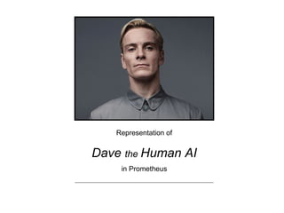
Dave analysis
- 1. Representation of Dave the Human AI in Prometheus
- 2. The positioning of the lighting has cast a natural shadow over the right side of his face, representing a split personality and hidden information.
- 3. Dave’s face is lacking any expression, concealing a lot about his personality and who he is as a person. The audience can therefore only assess the physicality of his character, not him as a person.
- 4. The grey colours used in the image represent Dave as a very cold and unwelcoming character who lacks compassion and loyalty, again tying in with the implication that he is evil.
- 5. The lack of a background in the image represents Dave as being very isolated. His attire matches the background, suggesting that he wants to go unnoticed. A lack of any other detail also represents him as an important character.
- 6. Whilst the camera is level with Dave’s eyes, he is looking down on the audience with his chin raised, representing him as being very narcissistic. It makes him appear to think he has more power than he actually has.
- 7. He is very smartly dressed with his shirt buttons done all the way up, his hair perfectly placed and cleanly shaven. This represents Dave as a very professional and almost too perfect person.