


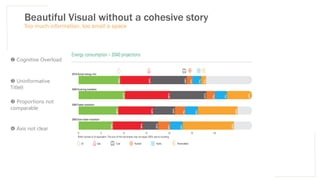


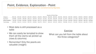


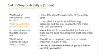
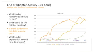
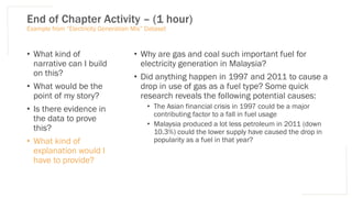


![Data Storyteller’s Toolbox – Pie Chart / Donut Chart
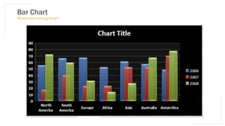
Do
• Add Data Labels Directly onto the Chart
• Use colors that are clearly distinguishable from one
another
• Try to limit the number of sub-categories being
used
• Choose an appropriate amount of white space in
the middle of the donut
Don’t
• Use multiple layers of Donuts – this is not a
Croissant
• Add Donut Explosion
• Use 3D effects – it doesn’t add any value to the
message
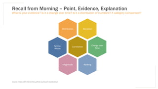
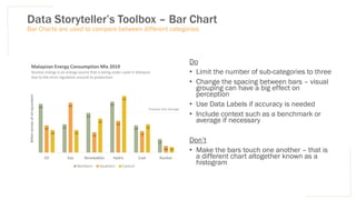
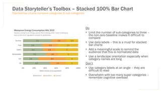
Compare Proportions to Whole
Oil 2
Gas 2
Renewables 3
Hydro 5
Coal 2.5
Nuclear 0.5
Malaysian Energy Consumption Mix 2019
Nuclear energy is an energy source that is being under-used in Malaysia
due to the strict regulation around its production
[billion tonnes of oil equivalent]](https://image.slidesharecdn.com/day3datastorytelling-210702013755/85/dataDay3storytelling-73-320.jpg)


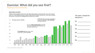


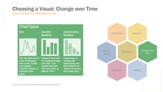
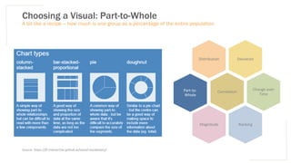
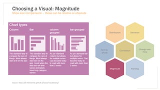
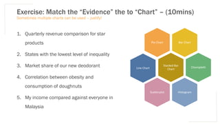
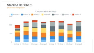
Here are potential matches between the evidence and charts: 1. Quarterly revenue comparison for star products - Line Chart 2. States with the lowest level of inequality - Choropleth 3. Market share of our new deodorant - Pie Chart 4. Correlation between obesity and consumption of doughnuts - Scatterplot 5. My income compared against everyone in Malaysia - Histogram The line chart is best for showing changes over time, which is needed for the quarterly revenue comparison. A choropleth map can show values for different states/regions. A pie chart works well for comparing relative market shares. A scatterplot allows viewing correlations between two variables. And a histogram can show the distribution of one


