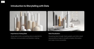
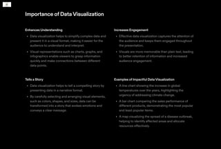
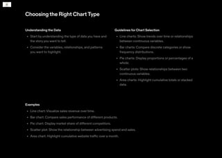
Storytellingwith Data
Introductionto Storytellingwith Data
Importance of Using Data
Using data to tell a compelling story is essential for
effective communication and decision-making.
Data Visualization
Visualizing data through charts, graphs, and other visual
representations helps to simplify complex information
and make it more accessible.
Importance ofDataVisualization
Enhances Understanding
Data visualization helps to simplify complex data and
present it in a visual format, making it easier for the
audience to understand and interpret.
Visual representations such as charts, graphs, and
infographics enable viewers to grasp information
quickly and make connections between different
data points.
•
•
Increases Engagement
Effective data visualization captures the attention of
the audience and keeps them engaged throughout
the presentation.
Visuals are more memorable than plain text, leading
to better retention of information and increased
audience engagement.
•
•
Tells a Story
Data visualization helps to tell a compelling story by
presenting data in a narrative format.
By carefully selecting and arranging visual elements,
such as colors, shapes, and sizes, data can be
transformed into a story that evokes emotions and
conveys a clear message.
•
•
Examples of Impactful Data Visualization
A line chart showing the increase in global
temperatures over the years, highlighting the
urgency of addressing climate change.
A bar chart comparing the sales performance of
different products, demonstrating the most popular
and least popular items.
A map visualizing the spread of a disease outbreak,
helping to identify affected areas and allocate
resources effectively.
•
•
•
Choosingthe Right ChartType
Understanding the Data
Start by understanding the type of data you have and
the story you want to tell.
Consider the variables, relationships, and patterns
you want to highlight.
•
•
Guidelines for Chart Selection
Line charts: Show trends over time or relationships
between continuous variables.
Bar charts: Compare discrete categories or show
frequency distributions.
Pie charts: Display proportions or percentages of a
whole.
Scatter plots: Show relationships between two
continuous variables.
Area charts: Highlight cumulative totals or stacked
data.
•
•
•
•
•
Examples
Line chart: Visualize sales revenue over time.
Bar chart: Compare sales performance of different products.
Pie chart: Display market share of different competitors.
Scatter plot: Show the relationship between advertising spend and sales.
Area chart: Highlight cumulative website traffic over a month.
•
•
•
•
•
Creating Effective Data Stories
Elements of a Compelling Data Story
Clear and concise message
Relevant and accurate data
Engaging visuals and storytelling techniques
Impactful and actionable insights
•
•
•
•
Structuring the Narrative
1. Introduction: Set the context and establish the
problem or question.
2. Data Exploration: Present the data and analyze key
trends or patterns.
3. Insights and Analysis: Draw conclusions and provide
meaningful insights.
4. Visual Storytelling: Use compelling visuals to
enhance the narrative.
5. Conclusion: Summarize the main findings and
provide recommendations or next steps.
EngagingYourAudience
Techniques for Capturing and MaintainingAttention
1. Start with a compelling hook: Begin your data
storytelling with a captivating anecdote or a thought-
provoking question to grab your audience's attention.
2. Tell a story: Structure your data presentation as a
narrative, with a clear beginning, middle, and end.
Use storytelling techniques such as character
development and suspense to keep your audience
engaged.
3. Keep it concise: Avoid overwhelming your audience
with too much information. Focus on the key insights
and data points that are most relevant to your
message.
4. Interact with your audience: Encourage audience
participation by asking questions, conducting polls,
or using interactive tools to keep them actively
engaged.
5. Use compelling visuals: Utilise eye-catching visuals
that are relevant to your data to capture and maintain
your audience's attention.
Case Studies
OrganisationA: Improving Customer Engagement
Organisation A uses data to identify customer
preferences and create personalised marketing
campaigns.
By analysing customer data, they were able to
increase customer engagement and drive sales.
Organisation B: Enhancing Operational Efficiency
Organisation B used data to optimise their supply
chain and improve operational efficiency.
By analysing data on inventory levels and customer
demand, they were able to reduce costs and improve
delivery times.
Organisation C: Informing Decision-Making
By analysing market trends and customer behaviour,
they were able to identify new growth opportunities
and make data-driven decisions.
•
•
•
•
•
Best Practices
KnowYourAudience
Understand who your
audience is and what
they care about.
Tailor your data to
resonate with their
interests and needs.
•
•
Tell a Compelling Story
Use data to support
and enhance your
narrative.
Craft a clear and
engaging storyline.
•
•
Keep it Simple
Avoid overwhelming
your audience with
complex data.
Clear visuals and
concise explanations.
•
•
Use Visuals Effectively
Design visually
appealing visuals that
are easy to interpret.
•
Provide Context
Explain the significance of your
data and its implications.
Help your audience understand
the relevance and impact of the
information.
•
•
BeTransparent
Communicate the source and
limitations of your data.
Acknowledge any biases or
uncertainties to maintain
credibility.
•
•
Practice Storytelling
Practicing improves your
delivery.
Seek feedback and refine your
presentation to maximise
impact.
•
•

Storytelling with Data_2024-2-24-23-24-15.pdf

  • 2.
  • 3.
    Introductionto Storytellingwith Data Importanceof Using Data Using data to tell a compelling story is essential for effective communication and decision-making. Data Visualization Visualizing data through charts, graphs, and other visual representations helps to simplify complex information and make it more accessible.
  • 4.
    Importance ofDataVisualization Enhances Understanding Datavisualization helps to simplify complex data and present it in a visual format, making it easier for the audience to understand and interpret. Visual representations such as charts, graphs, and infographics enable viewers to grasp information quickly and make connections between different data points. • • Increases Engagement Effective data visualization captures the attention of the audience and keeps them engaged throughout the presentation. Visuals are more memorable than plain text, leading to better retention of information and increased audience engagement. • • Tells a Story Data visualization helps to tell a compelling story by presenting data in a narrative format. By carefully selecting and arranging visual elements, such as colors, shapes, and sizes, data can be transformed into a story that evokes emotions and conveys a clear message. • • Examples of Impactful Data Visualization A line chart showing the increase in global temperatures over the years, highlighting the urgency of addressing climate change. A bar chart comparing the sales performance of different products, demonstrating the most popular and least popular items. A map visualizing the spread of a disease outbreak, helping to identify affected areas and allocate resources effectively. • • •
  • 5.
    Choosingthe Right ChartType Understandingthe Data Start by understanding the type of data you have and the story you want to tell. Consider the variables, relationships, and patterns you want to highlight. • • Guidelines for Chart Selection Line charts: Show trends over time or relationships between continuous variables. Bar charts: Compare discrete categories or show frequency distributions. Pie charts: Display proportions or percentages of a whole. Scatter plots: Show relationships between two continuous variables. Area charts: Highlight cumulative totals or stacked data. • • • • • Examples Line chart: Visualize sales revenue over time. Bar chart: Compare sales performance of different products. Pie chart: Display market share of different competitors. Scatter plot: Show the relationship between advertising spend and sales. Area chart: Highlight cumulative website traffic over a month. • • • • •
  • 6.
    Creating Effective DataStories Elements of a Compelling Data Story Clear and concise message Relevant and accurate data Engaging visuals and storytelling techniques Impactful and actionable insights • • • • Structuring the Narrative 1. Introduction: Set the context and establish the problem or question. 2. Data Exploration: Present the data and analyze key trends or patterns. 3. Insights and Analysis: Draw conclusions and provide meaningful insights. 4. Visual Storytelling: Use compelling visuals to enhance the narrative. 5. Conclusion: Summarize the main findings and provide recommendations or next steps.
  • 7.
    EngagingYourAudience Techniques for Capturingand MaintainingAttention 1. Start with a compelling hook: Begin your data storytelling with a captivating anecdote or a thought- provoking question to grab your audience's attention. 2. Tell a story: Structure your data presentation as a narrative, with a clear beginning, middle, and end. Use storytelling techniques such as character development and suspense to keep your audience engaged. 3. Keep it concise: Avoid overwhelming your audience with too much information. Focus on the key insights and data points that are most relevant to your message. 4. Interact with your audience: Encourage audience participation by asking questions, conducting polls, or using interactive tools to keep them actively engaged. 5. Use compelling visuals: Utilise eye-catching visuals that are relevant to your data to capture and maintain your audience's attention.
  • 8.
    Case Studies OrganisationA: ImprovingCustomer Engagement Organisation A uses data to identify customer preferences and create personalised marketing campaigns. By analysing customer data, they were able to increase customer engagement and drive sales. Organisation B: Enhancing Operational Efficiency Organisation B used data to optimise their supply chain and improve operational efficiency. By analysing data on inventory levels and customer demand, they were able to reduce costs and improve delivery times. Organisation C: Informing Decision-Making By analysing market trends and customer behaviour, they were able to identify new growth opportunities and make data-driven decisions. • • • • •
  • 9.
    Best Practices KnowYourAudience Understand whoyour audience is and what they care about. Tailor your data to resonate with their interests and needs. • • Tell a Compelling Story Use data to support and enhance your narrative. Craft a clear and engaging storyline. • • Keep it Simple Avoid overwhelming your audience with complex data. Clear visuals and concise explanations. • • Use Visuals Effectively Design visually appealing visuals that are easy to interpret. • Provide Context Explain the significance of your data and its implications. Help your audience understand the relevance and impact of the information. • • BeTransparent Communicate the source and limitations of your data. Acknowledge any biases or uncertainties to maintain credibility. • • Practice Storytelling Practicing improves your delivery. Seek feedback and refine your presentation to maximise impact. • •