
![Line Chart 3
Sangita Panchal
import matplotlib.pyplot as plt
plt.plot([1,2,3],[4,5,1])
plt.show()
import matplotlib.pyplot as plt
plt.plot([4,5,1])
plt.show()](https://image.slidesharecdn.com/lesson4datavisualizationreducedsyllabus-201107151023/85/Data-Visualization-2020_21-4-320.jpg)
![Line Chart 3
Sangita Panchal
import matplotlib.pyplot as plt
plt.plot([‘A’,’B’,’C’],[4,5,1])
plt.show()
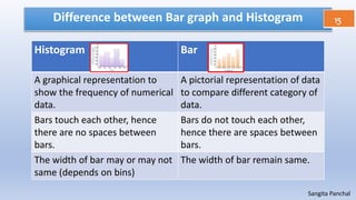
import matplotlib.pyplot as plt
plt.plot([1,5],[2,6])
plt.show()](https://image.slidesharecdn.com/lesson4datavisualizationreducedsyllabus-201107151023/85/Data-Visualization-2020_21-5-320.jpg)
![Line Chart
Try all the commands
4
Sangita Panchal
import matplotlib.pyplot as plt
x = ['A1','B1','C1']
y = [31,27,40]
x1 = ['A1','B1','C1','D1']
y1 = [12,20,19,17]
plt.plot(x,y,label = "Sr. School")
plt.plot(x1,y1,label = "Jr.School")
plt.title("Bus Info")
plt.ylabel("No. of Students")
plt.xlabel("Bus No.")
plt.legend()
plt.savefig("businfo")
plt.show()
Title
xlabel
ylabel Legend](https://image.slidesharecdn.com/lesson4datavisualizationreducedsyllabus-201107151023/85/Data-Visualization-2020_21-6-320.jpg)

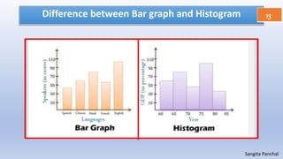
![Bar Chart 9
Sangita Panchal
import matplotlib.pyplot as plt
# Students in each section
x = ['A','B','C','D','E']
y = [31,27,40,43,45]
plt.bar(x,y,label = "No.of students")
plt.title("Section wise number of students")
plt.ylabel("No. of Students")
plt.xlabel("Section")
plt.legend()
plt.show()](https://image.slidesharecdn.com/lesson4datavisualizationreducedsyllabus-201107151023/85/Data-Visualization-2020_21-8-320.jpg)
![Bar Chart Horizontal 10
Sangita Panchal
import matplotlib.pyplot as plt
# Students in each section
x = ['A','B','C','D','E']
y = [31,27,40,43,45]
plt.barh(x,y,label = "No.of students")
plt.title("Section wise number of students")
plt.ylabel("No. of Students")
plt.xlabel("Section")
plt.legend()
plt.show()](https://image.slidesharecdn.com/lesson4datavisualizationreducedsyllabus-201107151023/85/Data-Visualization-2020_21-9-320.jpg)
![Bar Chart Stacked 11
Sangita Panchal
import matplotlib.pyplot as plt
# Number of students in each bus
x = [‘A’, ‘B’, ‘C’, ‘D’]
y = [31,27,40,32]
y1 = [12,20,19,17]
plt.bar(x,y,label = "Sr. School")
plt.bar(x,y1,label = "Jr.School")
plt.title("Bus Info")
plt.ylabel("No. of Students")
plt.xlabel("Bus No.")
plt.legend()
plt.show()](https://image.slidesharecdn.com/lesson4datavisualizationreducedsyllabus-201107151023/85/Data-Visualization-2020_21-10-320.jpg)
![Bar Chart – Multiple 12
Sangita Panchal
import matplotlib.pyplot as plt
import numpy as np
# Number of students in each bus
x = np.arange(1,5)
y = [31,27,40,32]
y1 = [12,20,19,17]
plt.bar(x+0,y,label = "Sr. School",width = 0.4)
plt.bar(x+0.4,y1,label = "Jr.School",width = 0.4)
plt.title("Bus Info")
plt.ylabel("No. of Students")
plt.xlabel("Bus No.")
plt.legend()
plt.show()](https://image.slidesharecdn.com/lesson4datavisualizationreducedsyllabus-201107151023/85/Data-Visualization-2020_21-11-320.jpg)
![Histogram 13
Sangita Panchal
import matplotlib.pyplot as plt
import numpy as np
# Marks obtained by 50 students
x = [5,15,20,25,35,45,55]
y = np.arange(0,61,10)
w = [2,3,8,9,12,6,10]
plt.hist(x,bins = y, weights = w,
label = "Marks Obtained")
plt.title("Histogram")
plt.ylabel("Marks Range")
plt.xlabel("No. of Students")
plt.legend()
plt.show()](https://image.slidesharecdn.com/lesson4datavisualizationreducedsyllabus-201107151023/85/Data-Visualization-2020_21-12-320.jpg)
![Histogram 13
Sangita Panchal
import matplotlib.pyplot as plt
import numpy as np
# Marks obtained by 50 students
x = [5,15,20,25,35,45,55,70,84,90,93]
y = [0,33,45,60,75,90,100]
w = [2,3,8,9,12,6,10,5,8,12,7]
plt.hist(x,bins = y, weights = w,
label = "Marks Obtained",
edgecolor = "yellow")
plt.title("Histogram")
plt.ylabel("Marks Range")
plt.xlabel("No. of Students")
plt.legend()
plt.show()](https://image.slidesharecdn.com/lesson4datavisualizationreducedsyllabus-201107151023/85/Data-Visualization-2020_21-13-320.jpg)


![CBSE Questions 18
Sangita Panchal
Rashmi wants to plot a bar graph for the department name on x
– axis and number of employees in each department on y-axis.
Complete the code to perform the following:
(i) To plot the bar graph in statement 1
(ii) To display the graph on screen in statement 2
import matplotlib as plt
x = [‘Marketing’, ‘Office’, ‘Manager’, ‘Development’]
y = [ 35, 29, 30, 25]
_______________________________ Statement 1
_______________________________ Statement 2](https://image.slidesharecdn.com/lesson4datavisualizationreducedsyllabus-201107151023/85/Data-Visualization-2020_21-19-320.jpg)
![CBSE Questions 19
Sangita Panchal
Rashmi wants to plot a bar graph for the department name on x
– axis and number of employees in each department on y-axis.
Complete the code to perform the following:
(i) To plot the bar graph in statement 1
(ii) To display the graph on screen in statement 2
import matplotlib as plt
x = [‘Marketing’, ‘Office’, ‘Manager’, ‘Development’]
y = [ 35, 29, 30, 25]
_______________________________ Statement 1
_______________________________ Statement 2
plt.bar(x,y)
plt.show()](https://image.slidesharecdn.com/lesson4datavisualizationreducedsyllabus-201107151023/85/Data-Visualization-2020_21-20-320.jpg)
![CBSE Questions 20
Sangita Panchal
Anamica wants to draw a line chart using a list of elements
named L. Complete the code to perform the following
operations:
(i) To plot a line chart using the list L
(ii) To give a y-axis label to the line chart as “List of Numbers”
import matplotlib.pyplot as plt
L = [10, 12, 15, 18, 25, 35, 50, 76, 89]
_______________________________ Statement 1
________________________________ Statement 2
plt.show()](https://image.slidesharecdn.com/lesson4datavisualizationreducedsyllabus-201107151023/85/Data-Visualization-2020_21-21-320.jpg)
![CBSE Questions 21
Sangita Panchal
Anamica wants to draw a line chart using a list of elements
named L. Complete the code to perform the following
operations:
(i) To plot a line chart using the list L
(ii) To give a y-axis label to the line chart as “List of Numbers”
import matplotlib.pyplot as plt
L = [10, 12, 15, 18, 25, 35, 50, 76, 89]
_______________________________ Statement 1
________________________________ Statement 2
plt.show()
plt.plot(L)
plt.ylabel(“List of Numbers”)](https://image.slidesharecdn.com/lesson4datavisualizationreducedsyllabus-201107151023/85/Data-Visualization-2020_21-22-320.jpg)
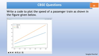


![CBSE Questions 25
Sangita Panchal
Consider the following graph . Write the code to plot it.
SOLUTION 1
import matplotlib.pyplot as plt
plt.plot([2,7],[1,6])
plt.show()
SOLUTION 2
import matplotlib.pyplot as plt
Y = [1,2,3,4,5,6]
X = [2,3,4,5,6,7]
plt.plot (X, Y)](https://image.slidesharecdn.com/lesson4datavisualizationreducedsyllabus-201107151023/85/Data-Visualization-2020_21-26-320.jpg)

![CBSE Questions 27
Sangita Panchal
Draw the following bar graph representing the number of students in
each class.
import matplotlib.pyplot as plt
Classes = ['VII','VIII','IX','X']
Students = [40,45,35,44]
plt.bar(classes, students)
plt.show()](https://image.slidesharecdn.com/lesson4datavisualizationreducedsyllabus-201107151023/85/Data-Visualization-2020_21-28-320.jpg)

![CBSE Questions 29
Sangita Panchal
Write a code to plot a bar chart to depict the pass
percentage of students in CBSE exams for the last four years
as shown below:
import matplotlib.pyplot as plt
objects= ["Year1","Year2","Year3","Year4"]
percentage=[82,83,85,90]
plt.bar(objects, percentage)
plt.ylabel("Pass Percentage")
plt.xlabel("Years")
plt.show()](https://image.slidesharecdn.com/lesson4datavisualizationreducedsyllabus-201107151023/85/Data-Visualization-2020_21-30-320.jpg)
![CBSE Questions 30
Sangita Panchal
Mr. Vinay wants to plot line charts to compare the trend in the price of diesel and
petrol over the last few weeks from the following data in Python Lists. Help him
write the complete code by filling in the blanks :
(i) To plot the price of diesel in statement 1
(ii) To plot the price of petrol in statement 2
(iii) To give a suitable heading to the graph in statement 3
(iv) To display the legends in statement 4
(v) To display the graph in statement 5
import matplotlib.pyplot as plt
petrol = [ 80 , 82 , 82.50 , 81, 81.50 ]
diesel = [ 73 , 77 , 74 , 74.5 , 75.4 ]
_____________________ Statement 1
_____________________ Statement 2
_____________________ Statement 3
_____________________ Statement 4
_____________________ Statement 5](https://image.slidesharecdn.com/lesson4datavisualizationreducedsyllabus-201107151023/85/Data-Visualization-2020_21-31-320.jpg)
![CBSE Questions 31
Sangita Panchal
Mr. Vinay wants to plot line charts to compare the trend in the price of diesel and
petrol over the last few weeks from the following data in Python Lists. Help him
write the complete code by filling in the blanks :
(i) To plot the price of diesel in statement 1
(ii) To plot the price of petrol in statement 2
(iii) To give a suitable heading to the graph in statement 3
(iv) To display the legends in statement 4
(v) To display the graph in statement 5
import matplotlib.pyplot as plt
petrol = [ 80 , 82 , 82.50 , 81, 81.50 ]
diesel = [ 73 , 77 , 74 , 74.5 , 75.4 ]
_____________________ Statement 1
_____________________ Statement 2
_____________________ Statement 3
_____________________ Statement 4
_____________________ Statement 5
plt.plot(diesel)
plt.plot(petrol)
plt.title(‘Price of Diesel vs petrol’)
plt.legend(‘Diesel’,’Petrol’)
plt.show()](https://image.slidesharecdn.com/lesson4datavisualizationreducedsyllabus-201107151023/85/Data-Visualization-2020_21-32-320.jpg)
![CBSE Questions 32
Sangita Panchal
Mr. Vinay wants to plot line charts to compare the trend in the price of diesel and petrol over
the last few weeks from the following data in Python Lists. Help him write the complete code
by filling in the blanks :
Following is the data ( in hours ) of screen time spent on a device by sample students:
6,6,5,7,9,7,4,5,4,5,7,8,4,5,7,6,5,7,8,4,3,3,6,5.
The data is plotted to generate a histogram as follows:
Fill in the blanks to complete the code:
(i) To plot the histogram from the given data in Statement1
(ii) To save the figure as “Plot3.png” in Statement2
import matplotlib.pyplot as plt
hours =[6,6,5,7,9,7,4,5,4,5,7,8,4,5,7,6,5,7,8,4,3,3,6,5]
______________________ # Statement1
______________________ # Statement2](https://image.slidesharecdn.com/lesson4datavisualizationreducedsyllabus-201107151023/85/Data-Visualization-2020_21-33-320.jpg)
![CBSE Questions 33
Sangita Panchal
Mr. Vinay wants to plot line charts to compare the trend in the price of diesel and petrol over
the last few weeks from the following data in Python Lists. Help him write the complete code
by filling in the blanks :
Following is the data ( in hours ) of screen time spent on a device by sample students:
6,6,5,7,9,7,4,5,4,5,7,8,4,5,7,6,5,7,8,4,3,3,6,5.
The data is plotted to generate a histogram as follows:
Fill in the blanks to complete the code:
(i) To plot the histogram from the given data in Statement1
(ii) To save the figure as “Plot3.png” in Statement2
import matplotlib.pyplot as plt
hours =[6,6,5,7,9,7,4,5,4,5,7,8,4,5,7,6,5,7,8,4,3,3,6,5]
______________________ # Statement1
______________________ # Statement2
plt.hist(hours)
plt.savefig(‘plot3.png’)](https://image.slidesharecdn.com/lesson4datavisualizationreducedsyllabus-201107151023/85/Data-Visualization-2020_21-34-320.jpg)
![Subplots 34
Sangita Panchal
import matplotlib.pyplot as plt
fig,a = plt.subplots(2,2)
import numpy as np
x = np.arange(1,5)
y = [25,23,19,16]
y1 = [15,20,25,35]
fig.suptitle("Four Graphs")
a[0][0].plot(x,y,color = "g")
a[0][0].set_title('Line chart')
a[0][1].bar(x,y,color = "r")
a[0][1].set_title('Bar chart')
a[1][0].hist(y1,weights = [9,12,15,25],bins
=[10,20,30,40],color = "y",edgecolor = "b")
a[1][0].set_title('Histogram chart')
a[1][1].barh(x,y)
a[1][1].set_title('Horizontal Bar chart')
plt.show()](https://image.slidesharecdn.com/lesson4datavisualizationreducedsyllabus-201107151023/85/Data-Visualization-2020_21-35-320.jpg)


1. The document discusses various types of plots that can be created using matplotlib in Python, including line plots, bar graphs, histograms, pie charts, frequency polygons, box plots, and scatter plots. 2. It describes how to customize plots by changing colors, styles, widths, and adding labels, titles, and legends. 3. Examples are provided for creating different plot types like line charts, bar graphs, histograms, and customizing aspects of the plots.