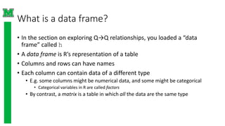
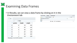
DEPARTMENT OF COMPUTER
SCIENCE & APPLICALION
SESSION(2019-20)
ATAL BIHARI VAJPAYEE VISHWAVIDYALAYA
SUBMITTED TO
DR. jeetendra gupta
PROFESSOR
SUBMITTED BY
UJJWAL MATOLIYA
B.Sc. 1ST YEAR
Roll no. 37
Assignment
R: Data Frames and Scatterplots
What is a data frame?
• In the section on exploring Q→Q relationships, you loaded a “data
frame” called h
• A data frame is R’s representation of a table
• Columns and rows can have names
• Each column can contain data of a different type
• E.g. some columns might be numerical data, and some might be categorical
• Categorical variables in R are called factors
• By contrast, a matrix is a table in which all the data are the same type
Examining Data Frames
• In Rstudio, we can view a data frame by clicking on it in the
Environment tab
Examining the data frame
• In this example, the data frame has three columns called gender,
height, and weight
• We can see this in code by checking the column names:
> colnames(h)
[1] "gender" "height" "weight”
• And we can access a single column using the $ operator:
> head(h$gender)
[1] 0 0 0 1 1 1
• Note head(…) gives the first few elements of an object
Getting the size of the data frame
• We can get the number of rows, the number of columns, or the
dimension (i.e. both) of the data frame:
> nrow(h)
[1] 81
> ncol(h)
[1] 3
> dim(h)
[1] 81 3
Scatterplots
• The basic plot(…) command can take two numeric vectors, in which
case it will produce a scatter plot
• So here we plot the height of the subjects as the x-value and the
weight as the y-value:
plot(h$height, h$weight)
Styling the plot
• Create labels for the axes with the xlab and ylab
parameters
• Use the col parameter to change the color of the
points
• In the following code, we first plot all points in blue,
then replot the points for the females in red:
> plot(h$height,h$weight,
xlab="Height (inches)",
ylab="Weight (lbs)",col="blue")
>points(h$height[h$gender==1],h$wei
ght[h$gender==1],col="red")
Subsetting vectors
• Use square brackets […] to access elements of a vector or data frame:
> h$height[c(1,2,3)]
[1] 72 67 65
> h$height[1:3] #equivalent to above
[1] 72 67 65
• You can also use logical (TRUE or FALSE) values to subset a vector:
> head(h$gender)
[1] 0 0 0 1 1 1
> head(h$gender == 1)
[1] FALSE FALSE FALSE TRUE TRUE TRUE
> h$height[h$gender == 1] # heights of rows with gender==1
(female)
[1] 67 63 54 66 64 57 66 67 68 65 70 64 64 63 60 69 65 67 62 66
[21] 65 63 58 56
Subsetting data frames
• Use square brackets with two values to select specific rows and
columns from a data frame
• Leave one blank to select all rows or columns
• First three rows, height (2) and weight (3) columns:
> h[1:3,2:3]
height weight
1 72 155
2 67 145
3 65 125
• Only the females (gender == 1), all columns:
> h[h$gender==1, ]
Other (better) ways to color the plot
• The col parameter can take a list with the same length as the number of points
• So we could do:
> ptCol <- h$gender # copy the gender column to a new
object
> ptCol[ptCol==1] <- "red" # replace 1 with "red”
> ptCol[ptCol==0] <- "blue" # replace 0 with "blue”
> plot(h$height, h$weight, col=ptCol, xlab="Height
(inches)", ylab="Weight (lbs)")
• The ifelse(…) function takes three parameters: a test, a value if the test is
TRUE, and a value if the test is FALSE.
• So we could also do:
> plot(h$height, h$weight, col=ifelse(h$gender==1,
"red", "blue"), xlab="Height (inches)", ylab="Weight
(lbs)")
Creating data frames
• In the course, the data frame was already created in a R data file
• Had to originally come from somewhere!
• You can create a data frame with the data.frame(…) function
h2 <- data.frame(gender=c(0,0,0,1,1,1),
height=c(72,67,65), weight=c(155,145,125))
• Usually more practical to read the data frame from a file:
h2 <- read.csv(“heights.csv”)
• Get help on the read.csv function (or any other function) using
?read.csv
Plotting with ggplot2
• The ggplot2 package provides functionality for more sophisticated plots
• Install the package, if you haven’t already
install.packages(“ggplot2”)
• Load the library
library(“ggplot2”)
• Let’s just fix the gender column:
h2 <- h
h2$gender <- ifelse(h2$gender==1, “Female”, “Male”)
• Start a plot with the ggplot(…) function, specifying the data to use and
the aesthetics, which can include a mapping to the x-axis and y-axis:
ggplot(h2, aes(x=height, y=weight))
• This just creates a blank plot
Scatterplots with ggplot2
• Add layers to a ggplot2 plot by adding layers to the plot, using
the various geom_xxx functions
• To create a scatterplot, use geom_point():
ggplot(h2, aes(x=height, y=weight)) +
geom_point()
• To color the points, simply use the color parameter:
ggplot(h2, aes(x=height, y=weight)) +
geom_point(aes(color=gender))
• To specify the colors, use scale_color_manual():
ggplot(h2, aes(x=height, y=weight)) +
geom_point(aes(color=gender)) +
scale_color_manual(values=c("blue","red"))
Learn more…
• Explore more with ggplot2
• Excellent tutorials from the University of Edinburgh Coding club (look
under “data visualization”)
• https://ourcodingclub.github.io/tutorials/
• Many other tutorials online:
https://www.google.com/search?q=ggplot2+tutorial

Data Frames and Scatterplots in R language ujjwal matoliya.pptx

  • 1.
    DEPARTMENT OF COMPUTER SCIENCE& APPLICALION SESSION(2019-20) ATAL BIHARI VAJPAYEE VISHWAVIDYALAYA SUBMITTED TO DR. jeetendra gupta PROFESSOR SUBMITTED BY UJJWAL MATOLIYA B.Sc. 1ST YEAR Roll no. 37 Assignment R: Data Frames and Scatterplots
  • 2.
    What is adata frame? • In the section on exploring Q→Q relationships, you loaded a “data frame” called h • A data frame is R’s representation of a table • Columns and rows can have names • Each column can contain data of a different type • E.g. some columns might be numerical data, and some might be categorical • Categorical variables in R are called factors • By contrast, a matrix is a table in which all the data are the same type
  • 3.
    Examining Data Frames •In Rstudio, we can view a data frame by clicking on it in the Environment tab
  • 4.
    Examining the dataframe • In this example, the data frame has three columns called gender, height, and weight • We can see this in code by checking the column names: > colnames(h) [1] "gender" "height" "weight” • And we can access a single column using the $ operator: > head(h$gender) [1] 0 0 0 1 1 1 • Note head(…) gives the first few elements of an object
  • 5.
    Getting the sizeof the data frame • We can get the number of rows, the number of columns, or the dimension (i.e. both) of the data frame: > nrow(h) [1] 81 > ncol(h) [1] 3 > dim(h) [1] 81 3
  • 6.
    Scatterplots • The basicplot(…) command can take two numeric vectors, in which case it will produce a scatter plot • So here we plot the height of the subjects as the x-value and the weight as the y-value: plot(h$height, h$weight)
  • 7.
    Styling the plot •Create labels for the axes with the xlab and ylab parameters • Use the col parameter to change the color of the points • In the following code, we first plot all points in blue, then replot the points for the females in red: > plot(h$height,h$weight, xlab="Height (inches)", ylab="Weight (lbs)",col="blue") >points(h$height[h$gender==1],h$wei ght[h$gender==1],col="red")
  • 8.
    Subsetting vectors • Usesquare brackets […] to access elements of a vector or data frame: > h$height[c(1,2,3)] [1] 72 67 65 > h$height[1:3] #equivalent to above [1] 72 67 65 • You can also use logical (TRUE or FALSE) values to subset a vector: > head(h$gender) [1] 0 0 0 1 1 1 > head(h$gender == 1) [1] FALSE FALSE FALSE TRUE TRUE TRUE > h$height[h$gender == 1] # heights of rows with gender==1 (female) [1] 67 63 54 66 64 57 66 67 68 65 70 64 64 63 60 69 65 67 62 66 [21] 65 63 58 56
  • 9.
    Subsetting data frames •Use square brackets with two values to select specific rows and columns from a data frame • Leave one blank to select all rows or columns • First three rows, height (2) and weight (3) columns: > h[1:3,2:3] height weight 1 72 155 2 67 145 3 65 125 • Only the females (gender == 1), all columns: > h[h$gender==1, ]
  • 10.
    Other (better) waysto color the plot • The col parameter can take a list with the same length as the number of points • So we could do: > ptCol <- h$gender # copy the gender column to a new object > ptCol[ptCol==1] <- "red" # replace 1 with "red” > ptCol[ptCol==0] <- "blue" # replace 0 with "blue” > plot(h$height, h$weight, col=ptCol, xlab="Height (inches)", ylab="Weight (lbs)") • The ifelse(…) function takes three parameters: a test, a value if the test is TRUE, and a value if the test is FALSE. • So we could also do: > plot(h$height, h$weight, col=ifelse(h$gender==1, "red", "blue"), xlab="Height (inches)", ylab="Weight (lbs)")
  • 11.
    Creating data frames •In the course, the data frame was already created in a R data file • Had to originally come from somewhere! • You can create a data frame with the data.frame(…) function h2 <- data.frame(gender=c(0,0,0,1,1,1), height=c(72,67,65), weight=c(155,145,125)) • Usually more practical to read the data frame from a file: h2 <- read.csv(“heights.csv”) • Get help on the read.csv function (or any other function) using ?read.csv
  • 12.
    Plotting with ggplot2 •The ggplot2 package provides functionality for more sophisticated plots • Install the package, if you haven’t already install.packages(“ggplot2”) • Load the library library(“ggplot2”) • Let’s just fix the gender column: h2 <- h h2$gender <- ifelse(h2$gender==1, “Female”, “Male”) • Start a plot with the ggplot(…) function, specifying the data to use and the aesthetics, which can include a mapping to the x-axis and y-axis: ggplot(h2, aes(x=height, y=weight)) • This just creates a blank plot
  • 13.
    Scatterplots with ggplot2 •Add layers to a ggplot2 plot by adding layers to the plot, using the various geom_xxx functions • To create a scatterplot, use geom_point(): ggplot(h2, aes(x=height, y=weight)) + geom_point() • To color the points, simply use the color parameter: ggplot(h2, aes(x=height, y=weight)) + geom_point(aes(color=gender)) • To specify the colors, use scale_color_manual(): ggplot(h2, aes(x=height, y=weight)) + geom_point(aes(color=gender)) + scale_color_manual(values=c("blue","red"))
  • 14.
    Learn more… • Exploremore with ggplot2 • Excellent tutorials from the University of Edinburgh Coding club (look under “data visualization”) • https://ourcodingclub.github.io/tutorials/ • Many other tutorials online: https://www.google.com/search?q=ggplot2+tutorial