Download to read offline
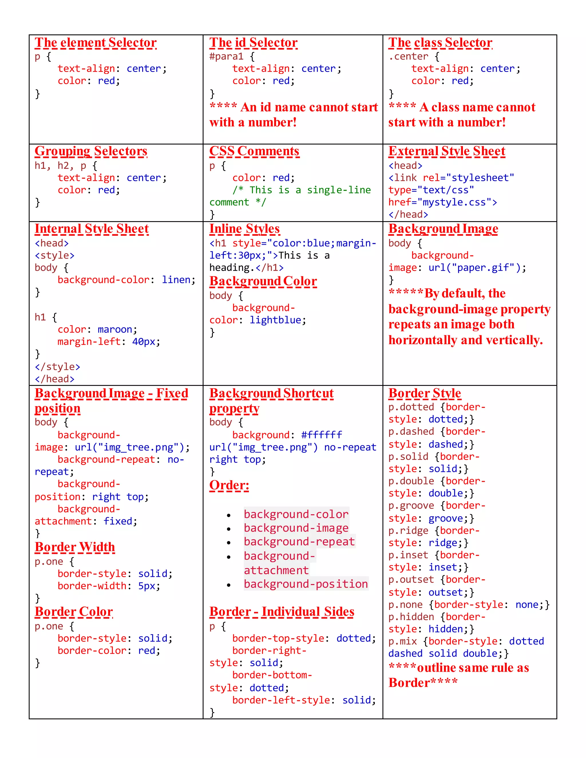
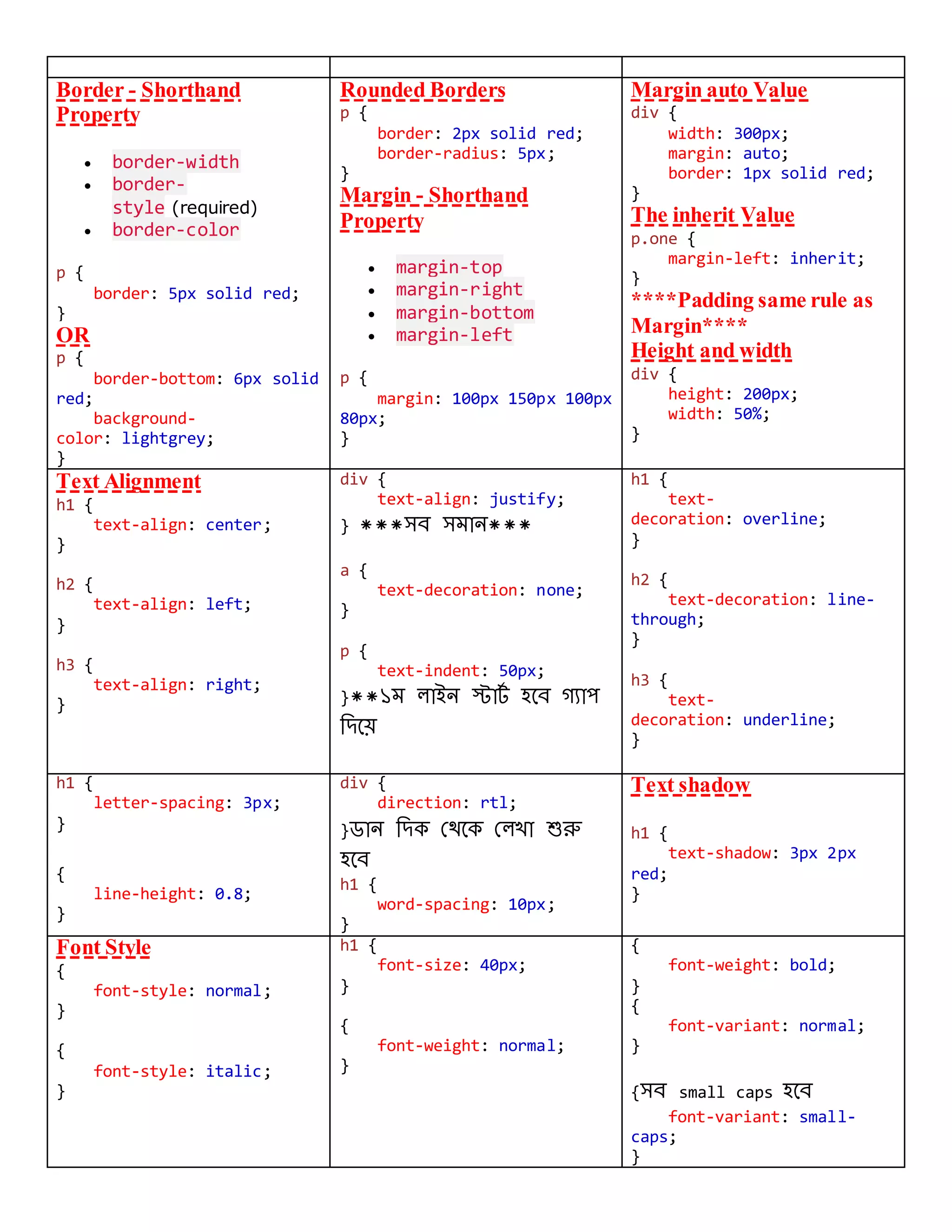
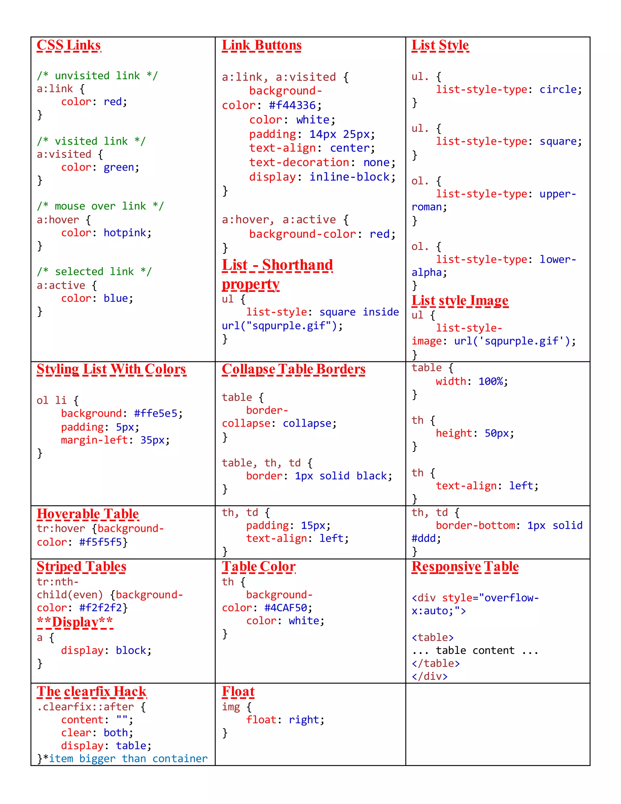
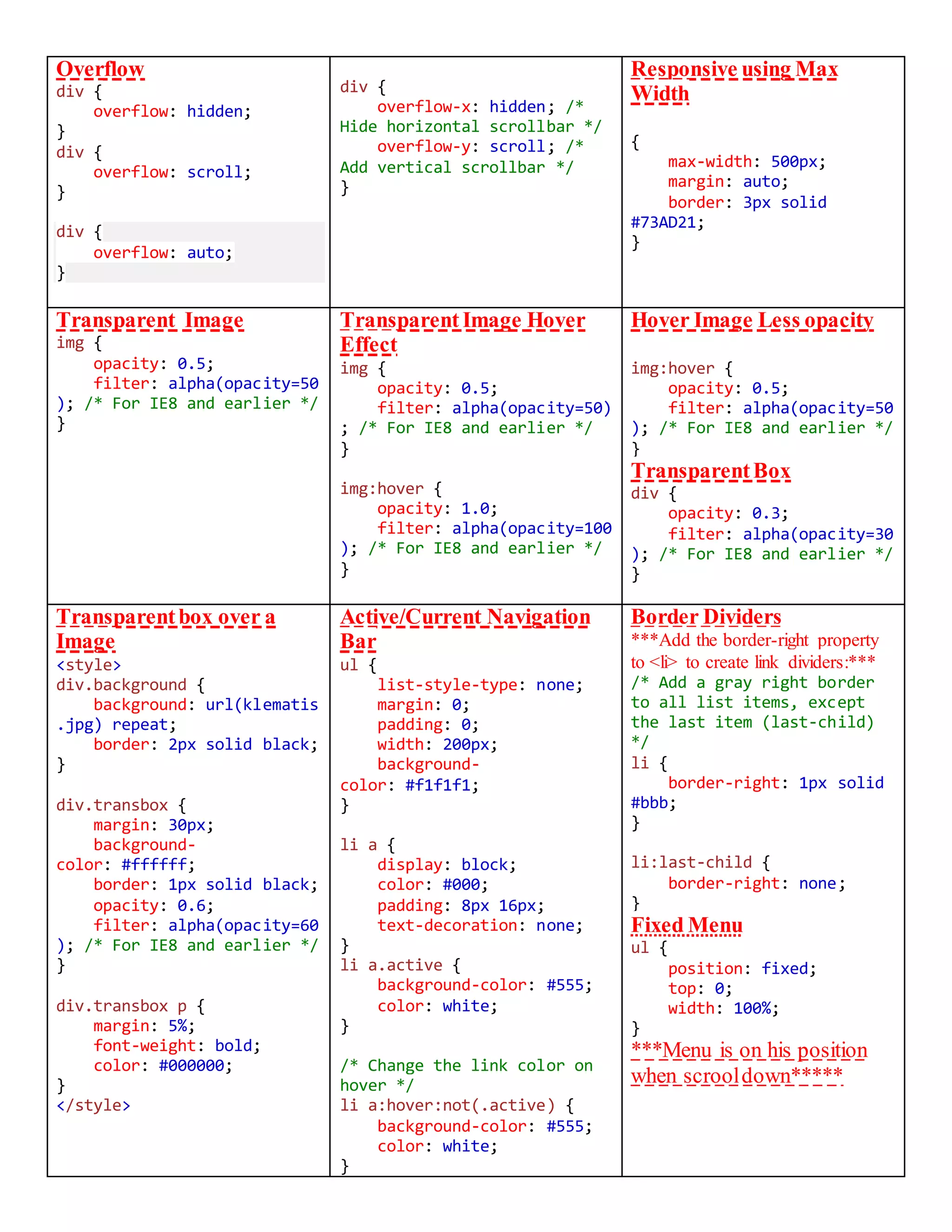
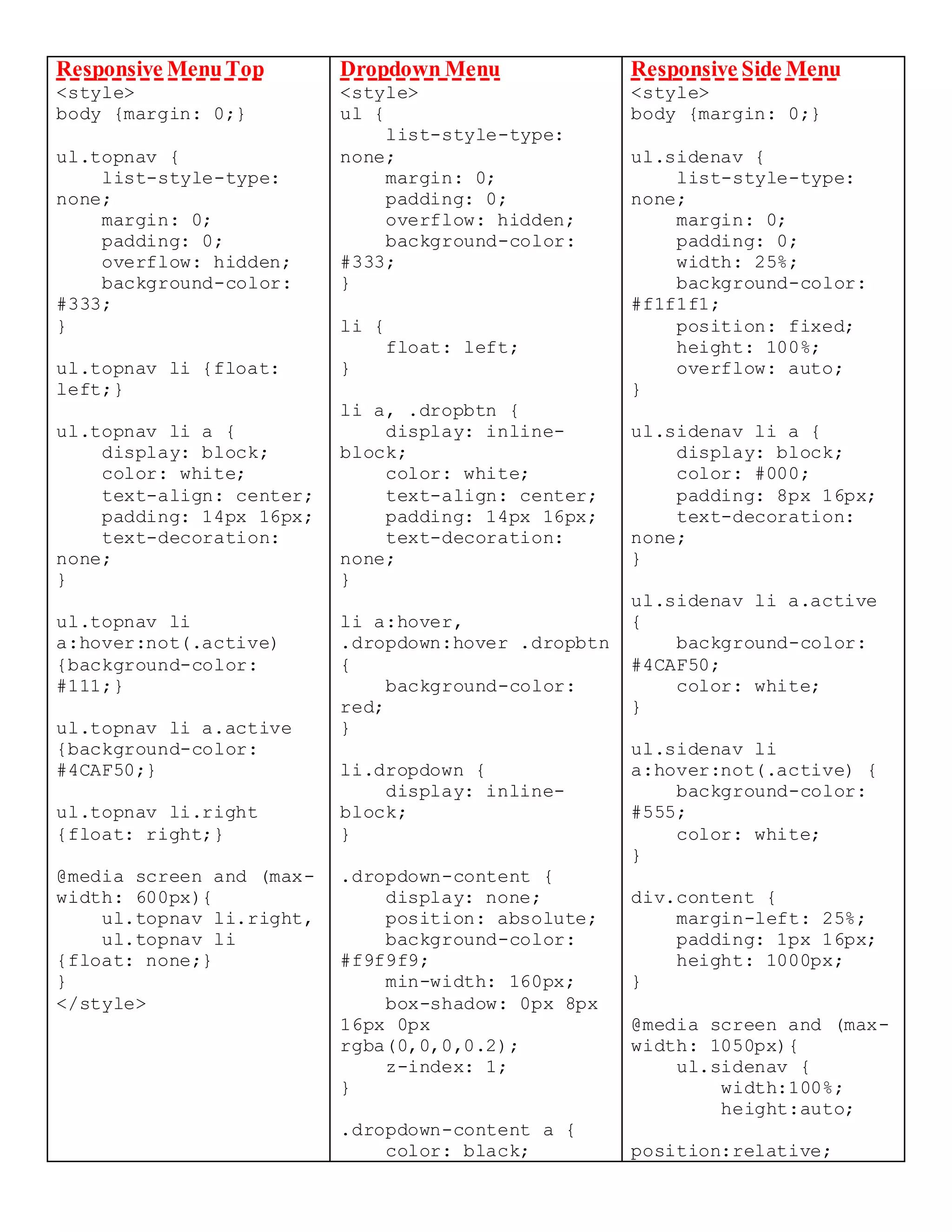
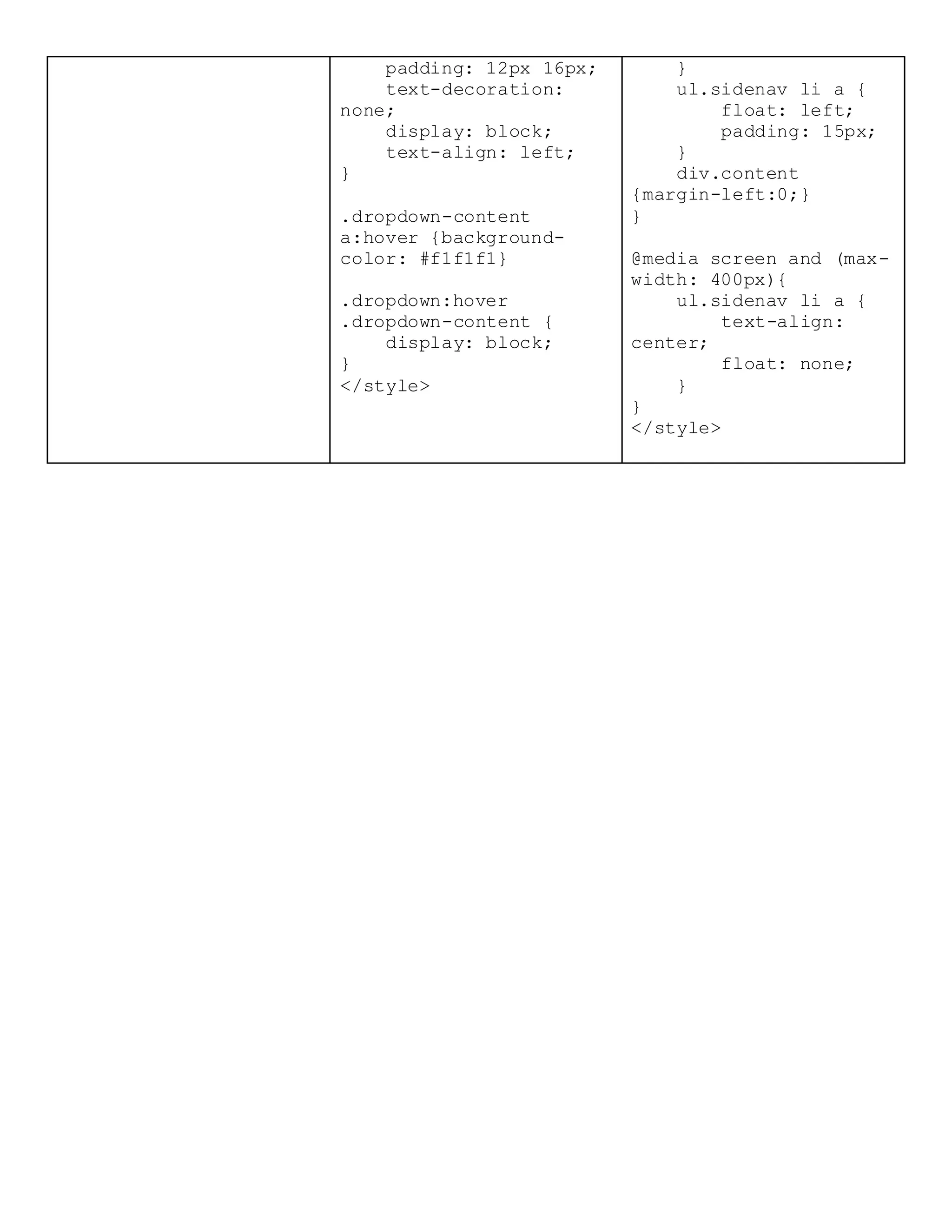

The document provides a comprehensive overview of CSS selectors, properties, and styling techniques, including element, class, and ID selectors, as well as background, border, margin, padding, and text styling. It also covers responsive design practices with media queries, navigation bars, dropdown menus, and table styling. Additionally, it highlights comments in CSS, the use of opacity for transparent elements, and other advanced styling features.


![[SUTD GDSC] Intro to HTML and CSS](https://cdn.slidesharecdn.com/ss_thumbnails/introtohtml-230215093923-21d7cfc6-thumbnail.jpg?width=640&height=640&fit=bounds)