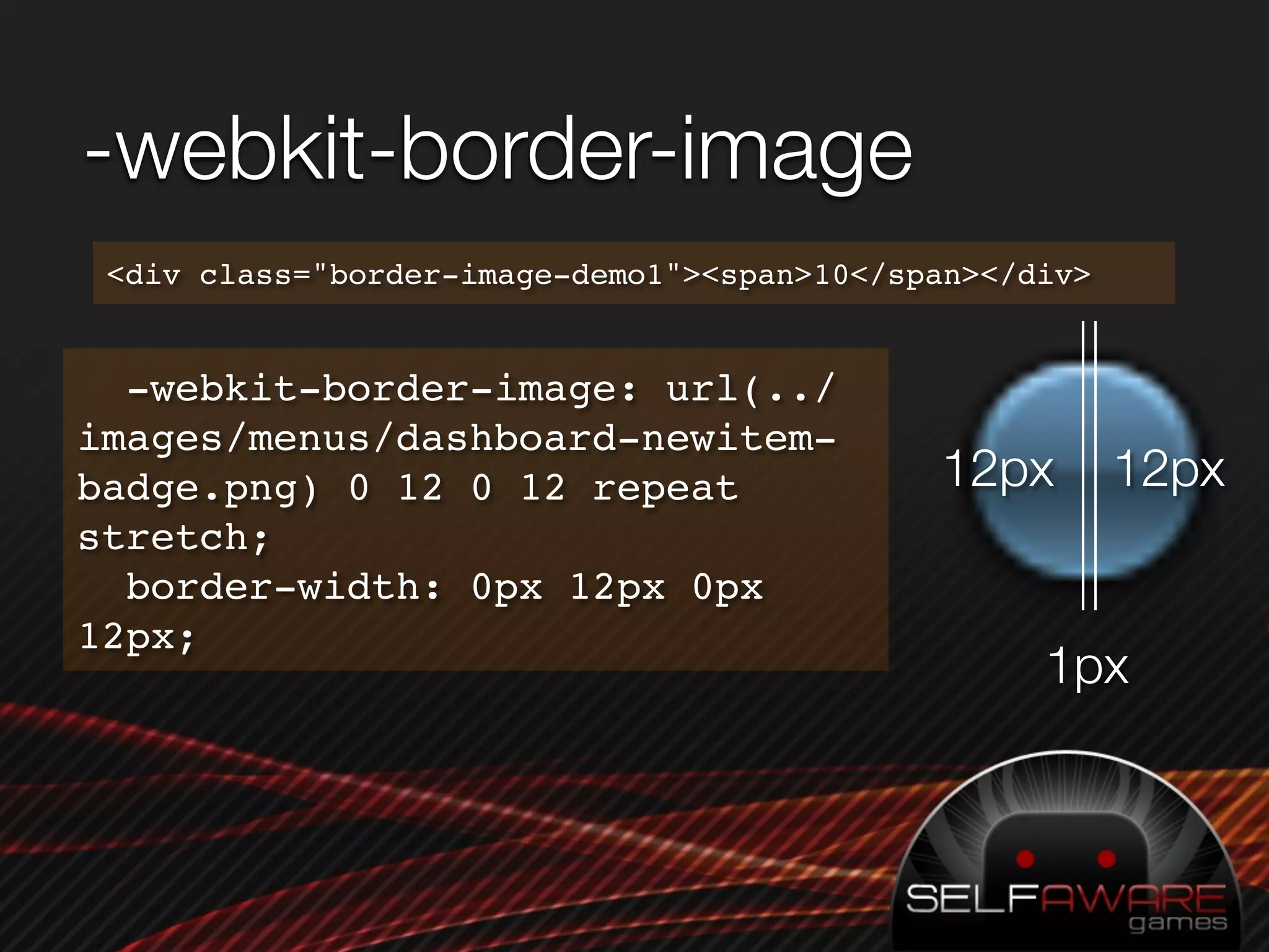
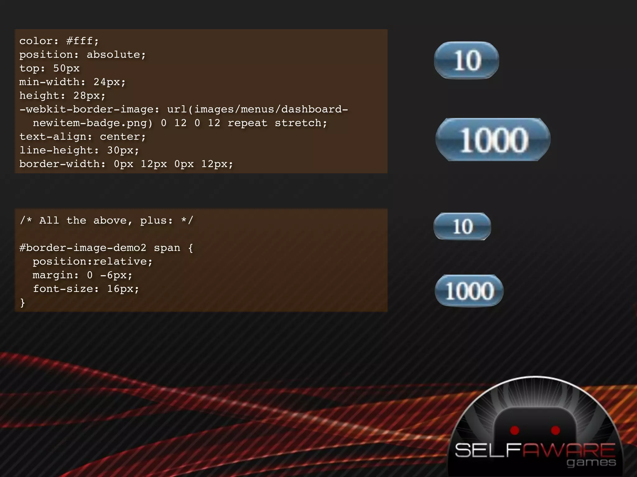
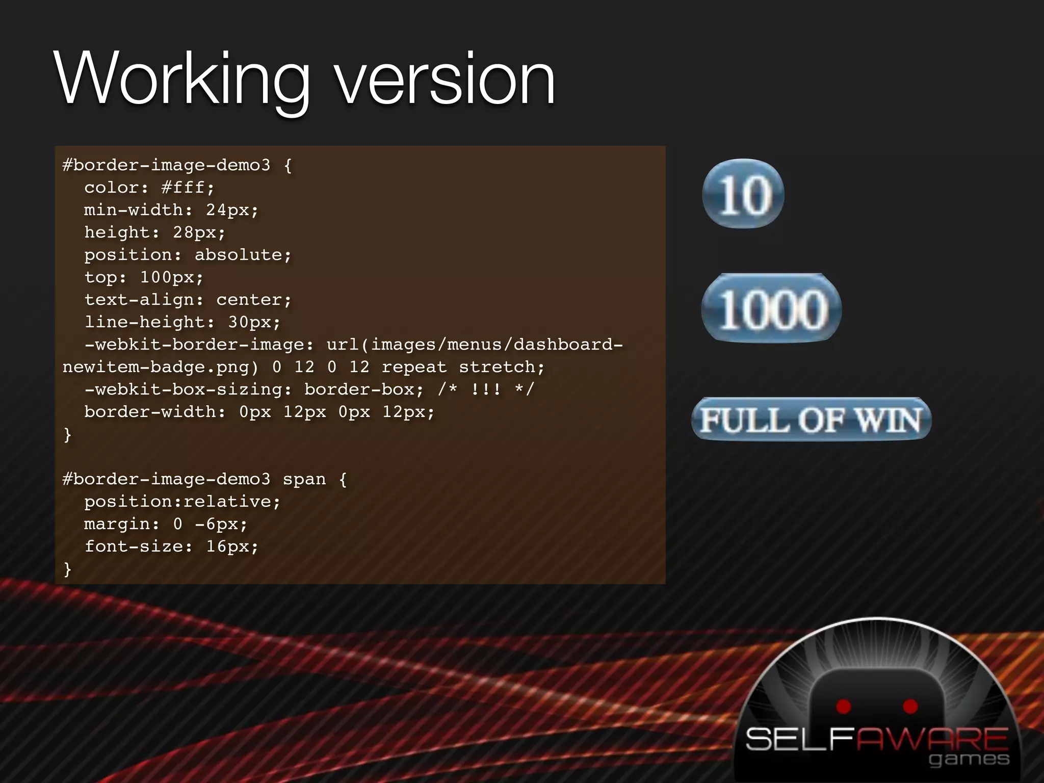
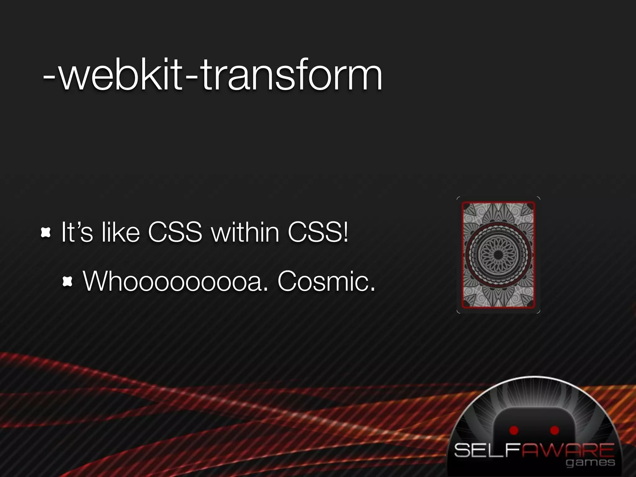
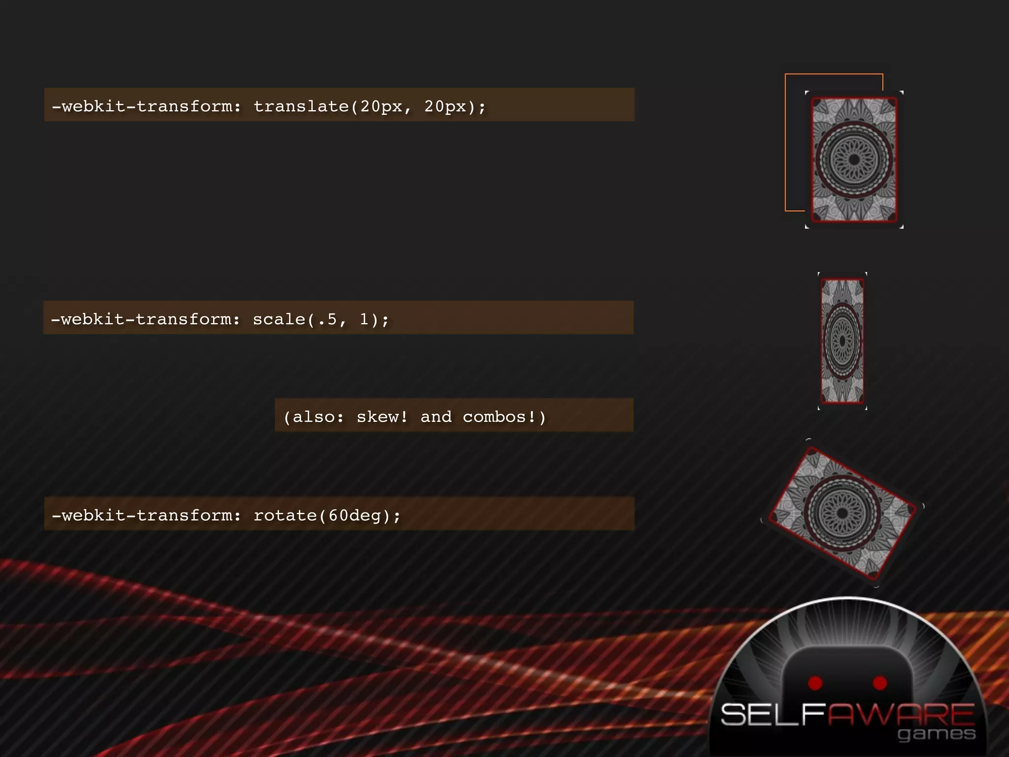
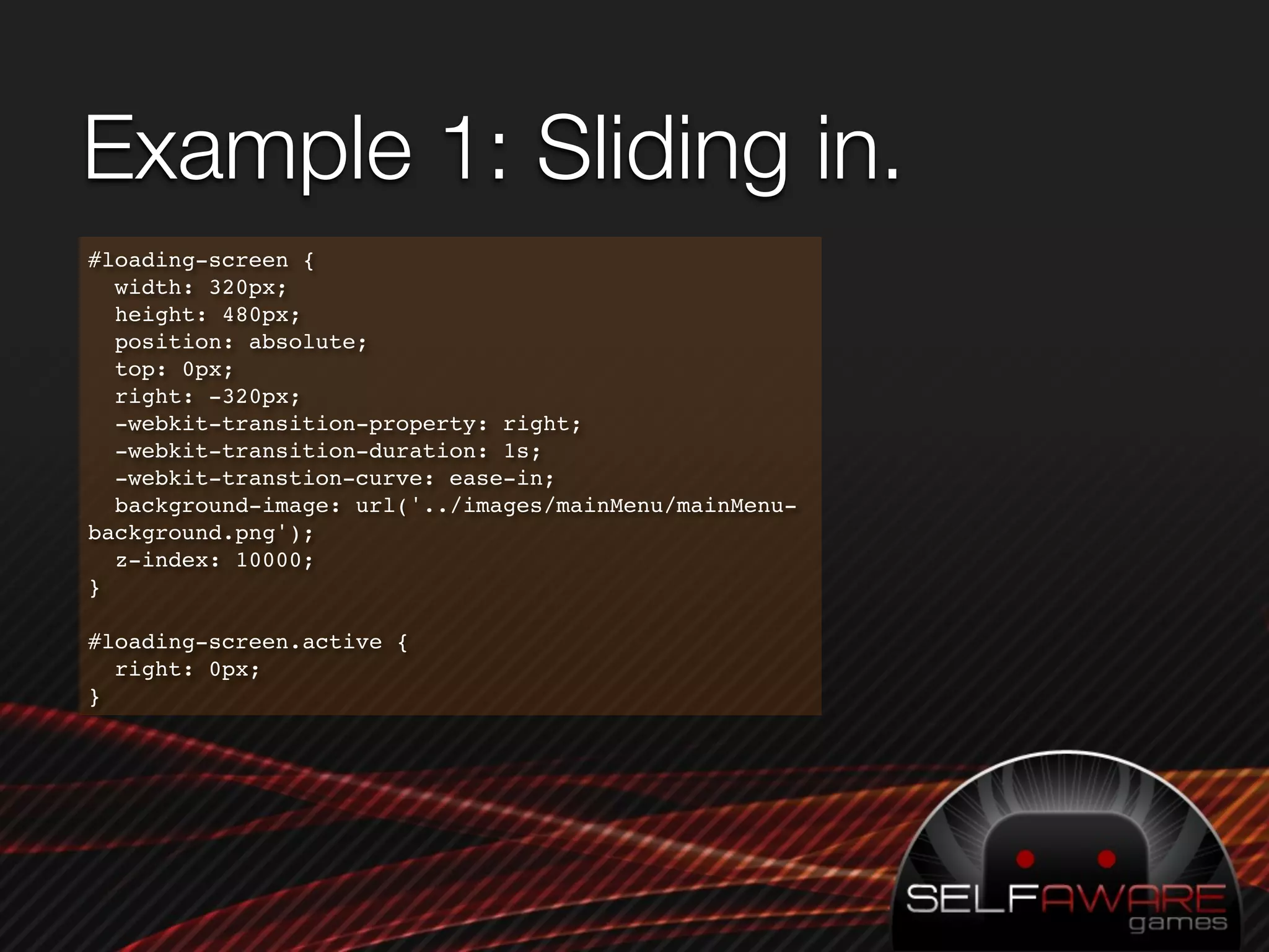
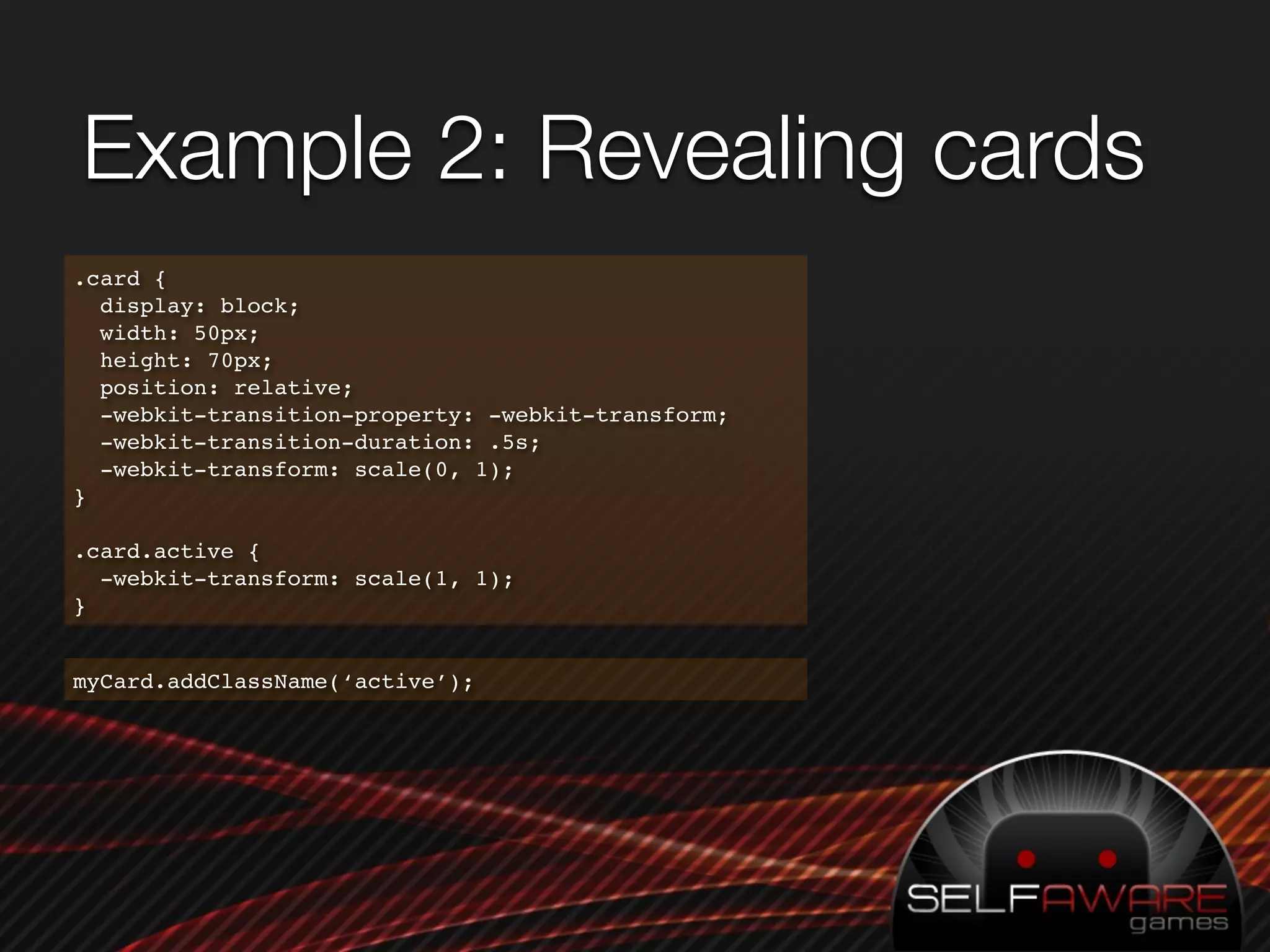
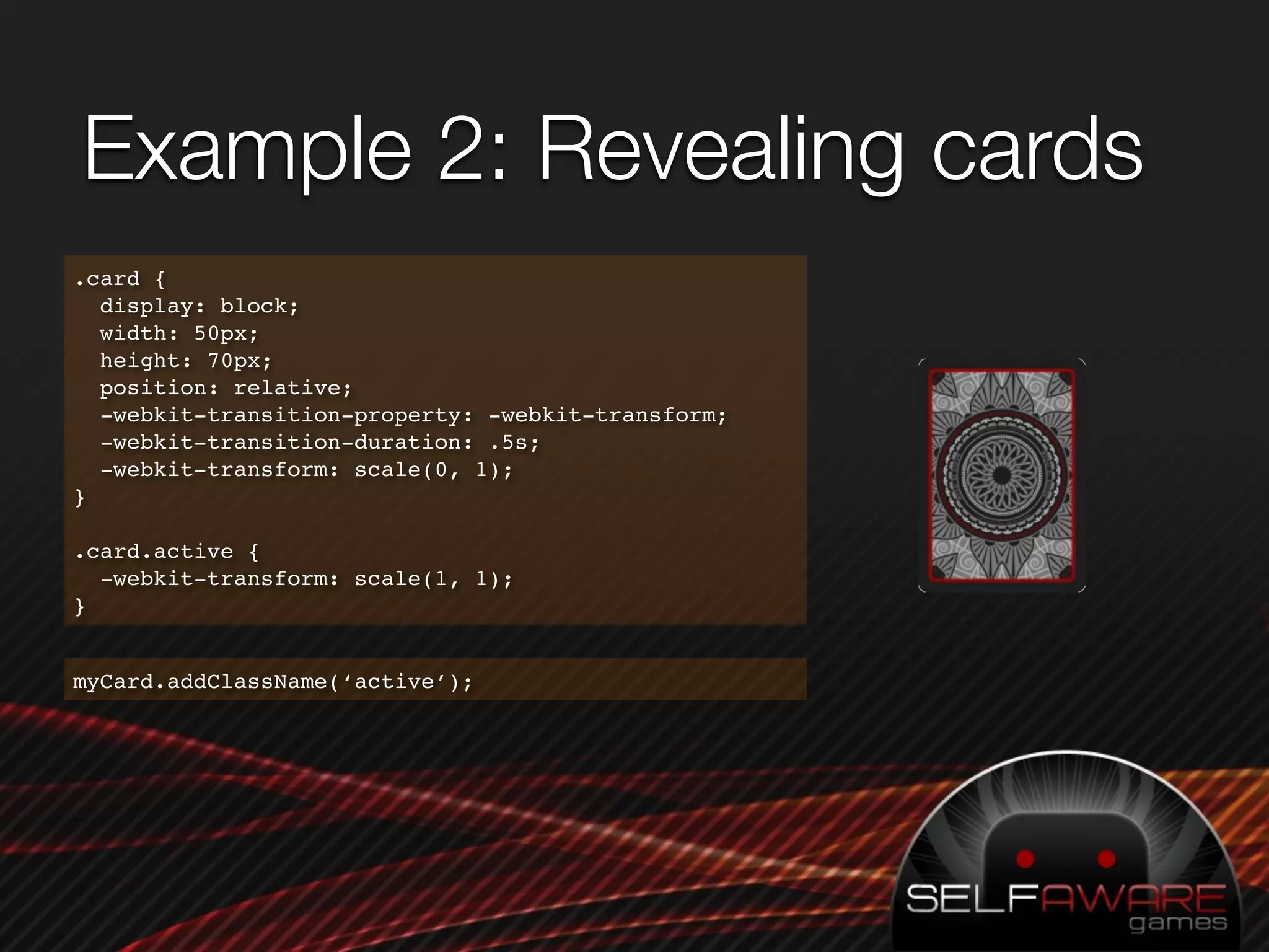
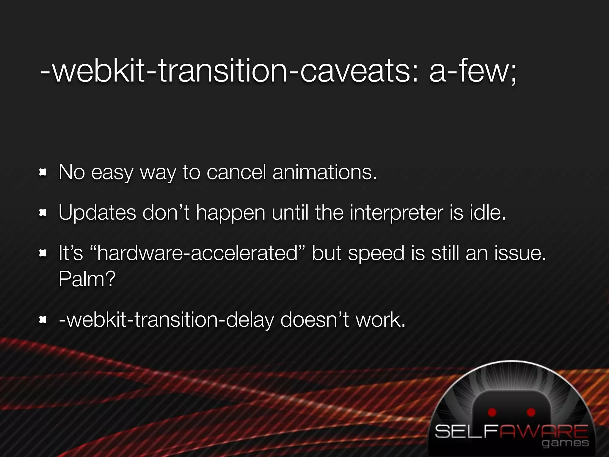
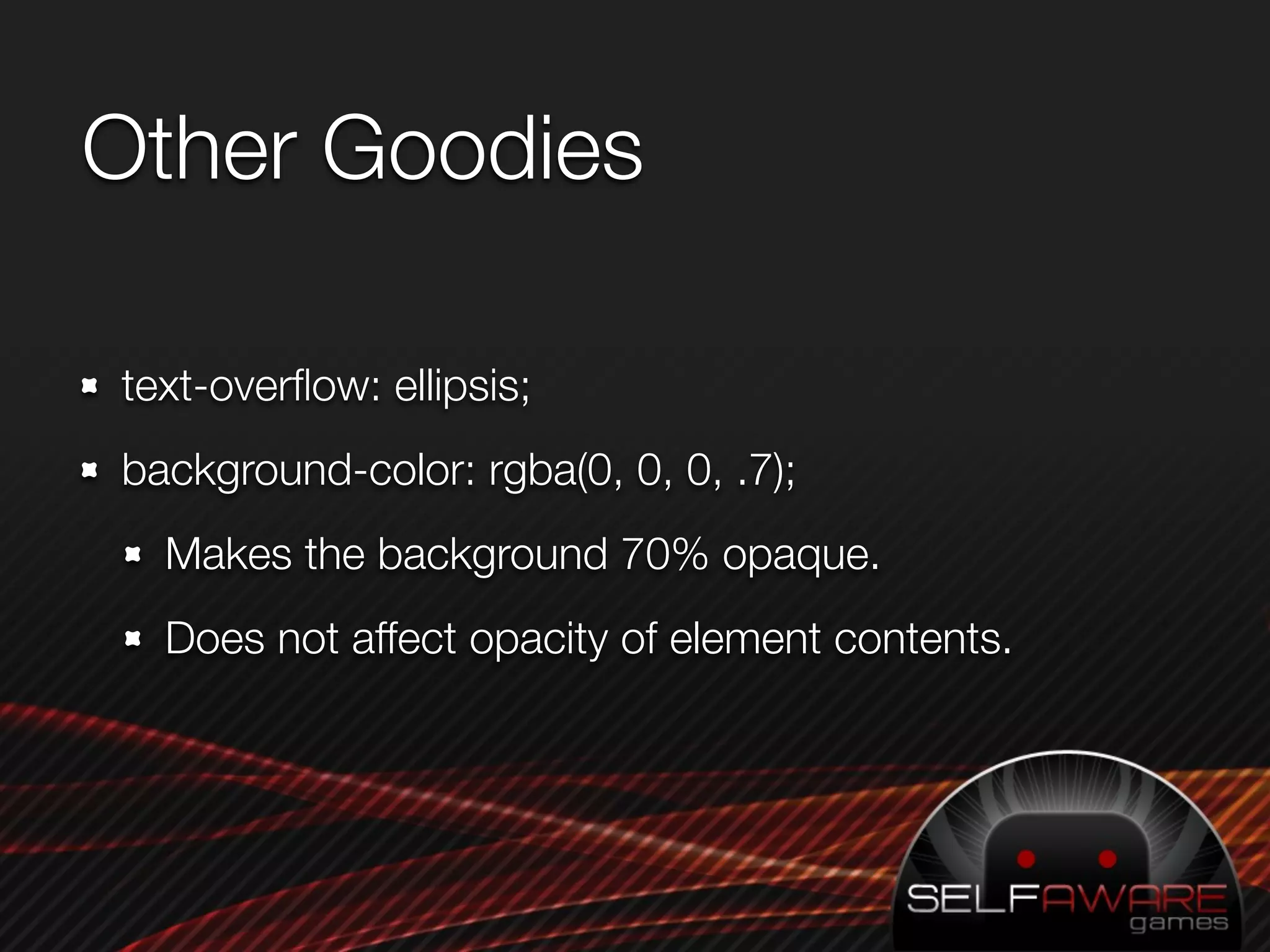
CSS3 Tricks

Dan Kurtz - dan@selfawaregames.com
What is Word Ace?
What is Word Ace?
What is Word Ace?
Why is CSS3 a Secret?


App coders don’t use CSS
Web programmers use lowest-common-denominator
CSS.
Holdovers from CSS2


Opacity
display: inline-block;
-webkit-border-image
 <div class="border-image-demo1"><span>10</span></div>


  -webkit-border-image: url(../
images/menus/dashboard-newitem-
badge.png) 0 12 0 12 repeat                  12px        12px
stretch;
  border-width: 0px 12px 0px
12px;
                                                   1px
color: #fff;
position: absolute;
top: 50px
min-width: 24px;
height: 28px;
-webkit-border-image: url(images/menus/dashboard-
  newitem-badge.png) 0 12 0 12 repeat stretch;
text-align: center;
line-height: 30px;
border-width: 0px 12px 0px 12px;


/* All the above, plus: */

#border-image-demo2 span {
  position:relative;
  margin: 0 -6px;
  font-size: 16px;
}
Working version
#border-image-demo3 {
  color: #fff;
  min-width: 24px;
  height: 28px;
  position: absolute;
  top: 100px;
  text-align: center;
  line-height: 30px;
  -webkit-border-image: url(images/menus/dashboard-
newitem-badge.png) 0 12 0 12 repeat stretch;
  -webkit-box-sizing: border-box; /* !!! */
  border-width: 0px 12px 0px 12px;
}

#border-image-demo3 span {
  position:relative;
  margin: 0 -6px;
  font-size: 16px;
}
-webkit-transform


It’s like CSS within CSS!
  Whooooooooa. Cosmic.
-webkit-transform: translate(20px, 20px);


-webkit-transform: scale(.5, 1);


                     (also: skew! and combos!)


-webkit-transform: rotate(60deg);
-webkit-transition

 Automatically animate an element when its properties
 change.
 Specify which properties to animate, their duration, and
 the curve.
Example 1: Sliding in.
#loading-screen {
  width: 320px;
  height: 480px;
  position: absolute;
  top: 0px;
  right: -320px;
  -webkit-transition-property: right;
  -webkit-transition-duration: 1s;
  -webkit-transtion-curve: ease-in;
  background-image: url('../images/mainMenu/mainMenu-
background.png');
  z-index: 10000;
}

#loading-screen.active {
  right: 0px;
}
Example 2: Revealing cards
.card {
  display: block;
  width: 50px;
  height: 70px;
  position: relative;
  -webkit-transition-property: -webkit-transform;
  -webkit-transition-duration: .5s;
  -webkit-transform: scale(0, 1);
}

.card.active {
  -webkit-transform: scale(1, 1);
}


myCard.addClassName(‘active’);
-webkit-transition-caveats: a-few;

 No easy way to cancel animations.
 Updates don’t happen until the interpreter is idle.
 It’s “hardware-accelerated” but speed is still an issue.
 Palm?
 -webkit-transition-delay doesn’t work.
Other Goodies

text-overflow: ellipsis;
background-color: rgba(0, 0, 0, .7);
  Makes the background 70% opaque.
  Does not affect opacity of element contents.
References
Supported CSS properties in WebKit:
  http://developer.apple.com/documentation/
  appleapplications/Reference/SafariCSSRef/Articles/
  StandardCSSProperties.html
CSS3 Showcase: http://css3.info
Me again: dan@selfawaregames.com

PreDevCampSF - CSS3 Tricks

  • 1.
    CSS3 Tricks Dan Kurtz- dan@selfawaregames.com
  • 2.
  • 3.
  • 4.
  • 5.
    Why is CSS3a Secret? App coders don’t use CSS Web programmers use lowest-common-denominator CSS.
  • 6.
  • 7.
    -webkit-border-image <div class="border-image-demo1"><span>10</span></div> -webkit-border-image: url(../ images/menus/dashboard-newitem- badge.png) 0 12 0 12 repeat 12px 12px stretch; border-width: 0px 12px 0px 12px; 1px
  • 8.
    color: #fff; position: absolute; top:50px min-width: 24px; height: 28px; -webkit-border-image: url(images/menus/dashboard- newitem-badge.png) 0 12 0 12 repeat stretch; text-align: center; line-height: 30px; border-width: 0px 12px 0px 12px; /* All the above, plus: */ #border-image-demo2 span { position:relative; margin: 0 -6px; font-size: 16px; }
  • 9.
    Working version #border-image-demo3 { color: #fff; min-width: 24px; height: 28px; position: absolute; top: 100px; text-align: center; line-height: 30px; -webkit-border-image: url(images/menus/dashboard- newitem-badge.png) 0 12 0 12 repeat stretch; -webkit-box-sizing: border-box; /* !!! */ border-width: 0px 12px 0px 12px; } #border-image-demo3 span { position:relative; margin: 0 -6px; font-size: 16px; }
  • 10.
    -webkit-transform It’s like CSSwithin CSS! Whooooooooa. Cosmic.
  • 11.
    -webkit-transform: translate(20px, 20px); -webkit-transform:scale(.5, 1); (also: skew! and combos!) -webkit-transform: rotate(60deg);
  • 12.
    -webkit-transition Automatically animatean element when its properties change. Specify which properties to animate, their duration, and the curve.
  • 13.
    Example 1: Slidingin. #loading-screen { width: 320px; height: 480px; position: absolute; top: 0px; right: -320px; -webkit-transition-property: right; -webkit-transition-duration: 1s; -webkit-transtion-curve: ease-in; background-image: url('../images/mainMenu/mainMenu- background.png'); z-index: 10000; } #loading-screen.active { right: 0px; }
  • 14.
    Example 2: Revealingcards .card { display: block; width: 50px; height: 70px; position: relative; -webkit-transition-property: -webkit-transform; -webkit-transition-duration: .5s; -webkit-transform: scale(0, 1); } .card.active { -webkit-transform: scale(1, 1); } myCard.addClassName(‘active’);
  • 15.
    Example 2: Revealingcards .card { display: block; width: 50px; height: 70px; position: relative; -webkit-transition-property: -webkit-transform; -webkit-transition-duration: .5s; -webkit-transform: scale(0, 1); } .card.active { -webkit-transform: scale(1, 1); } myCard.addClassName(‘active’);
  • 16.
    -webkit-transition-caveats: a-few; Noeasy way to cancel animations. Updates don’t happen until the interpreter is idle. It’s “hardware-accelerated” but speed is still an issue. Palm? -webkit-transition-delay doesn’t work.
  • 17.
    Other Goodies text-overflow: ellipsis; background-color:rgba(0, 0, 0, .7); Makes the background 70% opaque. Does not affect opacity of element contents.
  • 18.
    References Supported CSS propertiesin WebKit: http://developer.apple.com/documentation/ appleapplications/Reference/SafariCSSRef/Articles/ StandardCSSProperties.html CSS3 Showcase: http://css3.info Me again: dan@selfawaregames.com