Download as PDF, PPTX
![IE support
Make it work in IE 5-8 with JavaScript
http://code.google.com/p/css3-mediaqueries-js/
<!--[if lte IE 8]>
<script src="css3-mediaqueries.js"></script>
<![endif]-->
29](https://image.slidesharecdn.com/booklaunchreal-world-css3-110125082433-phpapp02/85/Real-world-CSS3-29-320.jpg)
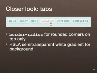
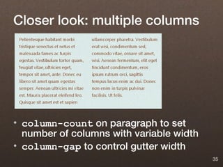

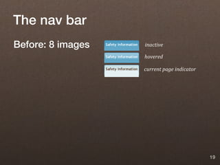
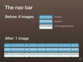
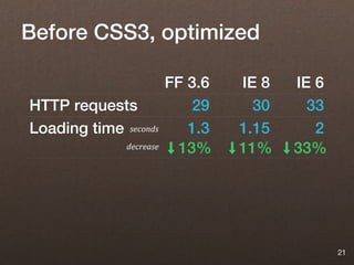
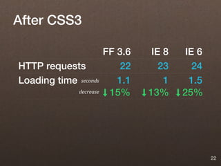
The document discusses using CSS3 in real-world projects. It recommends using stable CSS3 features that don't break without support, like border-radius, box-shadow, and multiple backgrounds. CSS3 can reduce development time through fewer images and HTTP requests. Media queries allow responsive designs for different devices. Features like gradients, transforms and animations can be used but require more testing. The document provides examples of CSS3 for navigation tabs, columns, and badges.


![Fundamental Progressive Enhancement [Web Design World Boston 2008]](https://cdn.slidesharecdn.com/ss_thumbnails/fundamental-progressive-enhancement-1228837595236419-9-thumbnail.jpg?width=640&height=640&fit=bounds)