CSS3 Tips & Techniques
           Stephanie	
  (Sullivan)	
  Rewis
                  @stefsull

  September  15,  2011  |  Register  at  www.uie.com
Don’t	
  go	
  overboard!
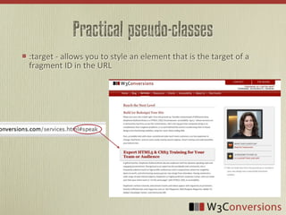
Practical pseudo-classes
:target	
  -­‐	
  allows	
  you	
  to	
  style	
  an	
  element	
  that	
  is	
  the	
  target	
  of	
  a	
  
fragment	
  ID	
  in	
  the	
  URL
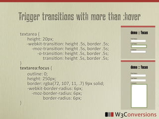
Trigger transitions with more than :hover
textarea	
  {
	
   height:	
  20px;


  -­‐webkit-­‐transi<on:	
  height	
  .5s,	
  border	
  .5s;


  -­‐moz-­‐transi<on:	
  height	
  .5s,	
  border	
  .5s;


  -­‐o-­‐transi<on:	
  height	
  .5s,	
  border	
  .5s;


  transi<on:	
  height	
  .5s,	
  border	
  .5s;
}
textarea:focus  {
	
   outline:	
  0;
	
   height:	
  250px;
	
   border:	
  rgba(72,	
  107,	
  11,	
  .7)	
  9px	
  solid;
	
   -­‐webkit-­‐border-­‐radius:	
  6px;


  -­‐moz-­‐border-­‐radius:	
  6px;


  border-­‐radius:	
  6px;	
  
}
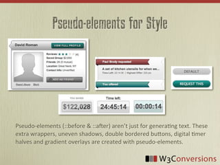
Pseudo-elements for Style


Pseudo-­‐elements	
  (::before	
  &	
  ::a4er)	
  aren’t	
  just	
  for	
  genera9ng	
  text.	
  These	
  
extra	
  wrappers,	
  uneven	
  shadows,	
  double	
  bordered	
  buBons,	
  digital	
  9mer	
  
halves	
  and	
  gradient	
  overlays	
  are	
  created	
  with	
  pseudo-­‐elements.
Beyond simple rounded corners
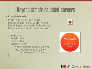
Complete  circle:
Width	
  and	
  height	
  are	
  equal
Radius	
  equals	
  half	
  of	
  width/height
If	
  padding	
  is	
  used—add	
  full	
  padding
Use	
  em	
  units	
  if	
  circle	
  contains	
  text

.reminder	
  {


  height:	
  9em;


  width:	
  9em;


  padding:	
  2em;


  -­‐webkit-­‐border-­‐radius:	
  6.5em;


  -­‐moz-­‐border-­‐radius:	
  6.5em


  -­‐border-­‐radius:	
  6.5em;
}
border-image, background-clip
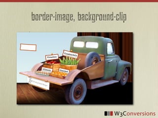
.nav	
  a	
  {


  -­‐webkit-­‐transform:	
  rotate(10deg);


  -­‐moz-­‐transform:	
  rotate(10deg);


  -­‐ms-­‐transform:	
  rotate(10deg);


  -­‐o-­‐transform:	
  rotate(10deg);


    transform:  rotate(10deg);
          border-­‐width:  8px;


  -­‐webkit-­‐border-­‐image:	
  url(../img/nav.png)	
  8	
  stretch;
	
                      	
  -­‐moz-­‐border-­‐image:	
  url(../img/nav.png)	
  8	
  stretch;


  -­‐o-­‐border-­‐image:	
  url(../img/nav.png)	
  8	
  stretch;


  border-­‐image:  url(../img/nav.png)  8  stretch;
          background-­‐color:  #FEFCFB;    
                          
          padding:  3px  5px;


  -­‐webkit-­‐background-­‐clip:	
  padding-­‐box;
	
                      -­‐moz-­‐background-­‐clip:	
  padding;


  background-­‐clip:  padding-­‐box;
}
Backgrounds Combined
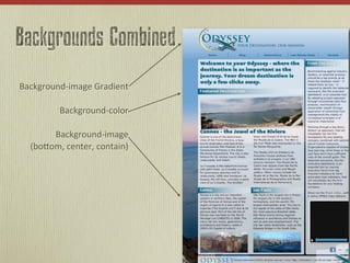
Background-­‐image	
  Gradient

           Background-­‐color

        Background-­‐image
   (boBom,	
  center,	
  contain)
CSS3 Tips & Techniques
           Stephanie	
  (Sullivan)	
  Rewis
                  @stefsull

  September  15,  2011  |  Register  at  www.uie.com

CSS3 Tips & Techniques

  • 1.
    CSS3 Tips &Techniques Stephanie  (Sullivan)  Rewis @stefsull September  15,  2011  |  Register  at  www.uie.com
  • 2.
  • 3.
    Practical pseudo-classes :target  -­‐  allows  you  to  style  an  element  that  is  the  target  of  a   fragment  ID  in  the  URL
  • 4.
    Trigger transitions withmore than :hover textarea  {   height:  20px;            -­‐webkit-­‐transi<on:  height  .5s,  border  .5s;          -­‐moz-­‐transi<on:  height  .5s,  border  .5s;                    -­‐o-­‐transi<on:  height  .5s,  border  .5s;                              transi<on:  height  .5s,  border  .5s; } textarea:focus  {   outline:  0;   height:  250px;   border:  rgba(72,  107,  11,  .7)  9px  solid;   -­‐webkit-­‐border-­‐radius:  6px;          -­‐moz-­‐border-­‐radius:  6px;                              border-­‐radius:  6px;   }
  • 5.
    Pseudo-elements for Style Pseudo-­‐elements  (::before  &  ::a4er)  aren’t  just  for  genera9ng  text.  These   extra  wrappers,  uneven  shadows,  double  bordered  buBons,  digital  9mer   halves  and  gradient  overlays  are  created  with  pseudo-­‐elements.
  • 6.
    Beyond simple roundedcorners Complete  circle: Width  and  height  are  equal Radius  equals  half  of  width/height If  padding  is  used—add  full  padding Use  em  units  if  circle  contains  text .reminder  {          height:  9em;          width:  9em;          padding:  2em;      -­‐webkit-­‐border-­‐radius:  6.5em;                    -­‐moz-­‐border-­‐radius:  6.5em                                      -­‐border-­‐radius:  6.5em; }
  • 7.
    border-image, background-clip .nav  a  {          -­‐webkit-­‐transform:  rotate(10deg);        -­‐moz-­‐transform:  rotate(10deg);            -­‐ms-­‐transform:  rotate(10deg);                  -­‐o-­‐transform:  rotate(10deg);                            transform:  rotate(10deg);          border-­‐width:  8px;          -­‐webkit-­‐border-­‐image:  url(../img/nav.png)  8  stretch;    -­‐moz-­‐border-­‐image:  url(../img/nav.png)  8  stretch;              -­‐o-­‐border-­‐image:  url(../img/nav.png)  8  stretch;                      border-­‐image:  url(../img/nav.png)  8  stretch;          background-­‐color:  #FEFCFB;                                        padding:  3px  5px;          -­‐webkit-­‐background-­‐clip:  padding-­‐box;   -­‐moz-­‐background-­‐clip:  padding;                      background-­‐clip:  padding-­‐box; }
  • 8.
    Backgrounds Combined Background-­‐image  Gradient Background-­‐color Background-­‐image (boBom,  center,  contain)
  • 9.
    CSS3 Tips &Techniques Stephanie  (Sullivan)  Rewis @stefsull September  15,  2011  |  Register  at  www.uie.com