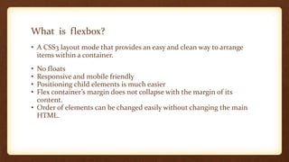
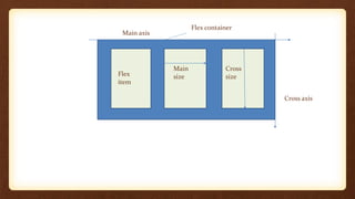
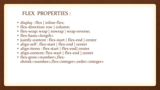
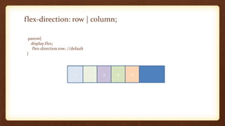
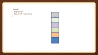
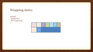
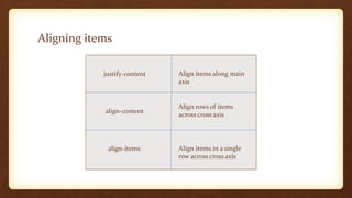
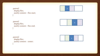
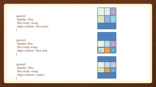
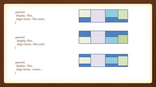
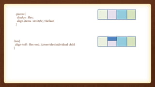
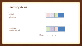
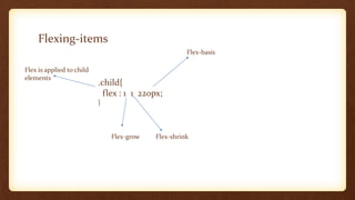
INTRODUCTION TO FLEX-BOX
-By Jyoti Gautam
What is flexbox?
• A CSS3 layout mode that provides an easy and clean way to arrange
items within a container.
• No floats
• Responsive and mobile friendly
• Positioning child elements is much easier
• Flex container’s margin does not collapse with the margin of its
content.
• Order of elements can be changed easily without changing the main
HTML.
Flex container
Flex
item
Cross
size
Main
size
Cross axis
Main axis
FLEX PROPERTIES :
• display : flex | inline-flex;
• flex-direction: row | column;
• flex-wrap: wrap | nowrap | wrap-reverse;
• flex-basis:<length>
• justify-content : flex-start | flex-end | center
• align-self : flex-start | flex-end | center
• align-items : flex-start | flex-end| center
• align-content: flex-start | flex-end | center
• flex-grow:<number>,flex-
shrink:<number>,flex:<integer>,order:<integer>
flex-direction: row | column;
.parent{
display:flex;
flex-direction:row; //default
}
1 2 3 4 5
.parent{
display:flex;
flex-direction:column;
}
2
3
4
5
1
Wrapping-items:
.parent{
display:flex;
flex-wrap:wrap;
}
1 2 3 4 5 6 7
8 9
Aligning items
justify-content
align-content
align-items
Align items along main
axis
Align rows of items
across cross axis
Align items in a single
row across cross axis
.parent{
display:flex;
justify-content : flex-start;
}
.parent{
display:flex;
justify-content : flex-end;
}
.parent{
display:flex;
justify-content : center;
}
1 2 3
1 2 3
1 2 3
.parent{
display : flex;
flex-wrap : wrap;
align-content : flex-start;
}
.parent{
display: flex;
flex-wrap :wrap;
align-content : flex-end;
}
.parent{
display : flex;
flex-wrap : wrap;
align-content : center;
}
1 2 3
4 5 6
4 5 6
1 2 3
1 2 3
4 5 6
.parent{
display : flex;
align-items : flex-start;
}
.parent{
display: flex;
align-items : flex-end;
}
.parent{
display : flex;
align-items : center ;
}
.parent{
display : flex;
align-items : stretch; //default
}
.box{
align-self : flex-end; //overrides individual child
}
Ordering items
.child{
order : 0;
}//default
1 2 3
.box1{ order : 1 }
.box3{ order : -1 }
3 2 1
Order -1 0 1
Flexing-items
.child{
flex : 1 1 220px;
}
Flex is applied to child
elements
Flex-grow Flex-shrink
Flex-basis

Introduction to flexbox