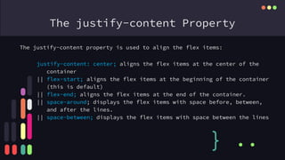
Flexbox in CSS
{
}
...
Flexbox basically a layout module of CSS
Before the Flexbox Layout module, there were four layout modes:
• Table, for two-dimensional table data
• Positioned, for explicit position of an element
} ..
First of all we need a container where all the elements are direct
child of the container.
Property of Container.
• flex-direction
• flex-wrap
• flex-flow
• justify-content
• align-items
• align-content
The flex-direction Property
The flex-direction property defines in which direction the
container wants to stack the flex items.
} ..
flex-direction: column - stacks the flex items vertically (from top to
bottom).
|| column-reverse;- value stacks the flex items vertically (but from
bottom to top)
|| row;- value stacks the flex items horizontally (from left to right)
row-reverse;- stacks the flex items horizontally (but from right to
left)
The flex-wrap Property
The flex-wrap property specifies whether the flex items should
wrap or not.
} ..
flex-wrap: wrap;- specifies that the flex items will wrap if necessary
|| nowrap;- specifies that the flex items will not wrap (this is default)
|| wrap-reverse;- specifies that the flexible items will wrap if
necessary, in reverse order.
row-reverse;- stacks the flex items horizontally (but from right to left)
**The flex-flow property is a shorthand property for setting both the
flex-direction and flex-wrap properties.
flex-flow: row wrap;
The justify-content Property
The justify-content property is used to align the flex items:
} ..
justify-content: center; aligns the flex items at the center of the
container
|| flex-start; aligns the flex items at the beginning of the container
(this is default)
|| flex-end; aligns the flex items at the end of the container.
|| space-around; displays the flex items with space before, between,
and after the lines.
|| space-between; displays the flex items with space between the lines
The align-items Property
The align-items property is used to align the flex items.
} ..
align-items: center; aligns the flex items in the middle of the
container
|| flex-start; aligns the flex items at the top of the container
|| flex-end; aligns the flex items at the bottom of the container
|| stretch; stretches the flex items to fill the container (this is
default)
CSS Flex Items
The align-content property is used to align the flex lines.
} ..
The flex item properties are:
• order
• flex-grow
• flex-shrink
• flex-basis
• flex
• align-self
}
...
The order Property: The order property specifies the order of the
flex items.
<div class="flex-container">
<div style="order: 3">1</div>
<div style="order: 2">2</div>
<div style="order: 4">3</div>
<div style="order: 1">4</div>
</div>
The flex-grow Property: The flex-grow property specifies how much a
flex item will grow relative to the rest of the flex items.
<div class="flex-container">
<div style="flex-grow: 1">1</div>
<div style="flex-grow: 1">2</div>
<div style="flex-grow: 8">3</div>
</div>
Make a Image
Gallery
{
}
...
What is The Hero Section.
As the first thing people see when they visit your
website, a hero section is the area that immediately
shows up on the screen under your logo and menu.
• What you have to offer
• Why people should trust you
• The benefits of working with you
• What action they should take next
Any Questions?
{
} ..
..
Rashedul Islam Emon
email: emonrasedul@gmail.com
Phone: +8801837995395
{
} ..
..

digital swifton

  • 1.
  • 2.
    Flexbox basically alayout module of CSS Before the Flexbox Layout module, there were four layout modes: • Table, for two-dimensional table data • Positioned, for explicit position of an element } .. First of all we need a container where all the elements are direct child of the container. Property of Container. • flex-direction • flex-wrap • flex-flow • justify-content • align-items • align-content
  • 3.
    The flex-direction Property Theflex-direction property defines in which direction the container wants to stack the flex items. } .. flex-direction: column - stacks the flex items vertically (from top to bottom). || column-reverse;- value stacks the flex items vertically (but from bottom to top) || row;- value stacks the flex items horizontally (from left to right) row-reverse;- stacks the flex items horizontally (but from right to left)
  • 4.
    The flex-wrap Property Theflex-wrap property specifies whether the flex items should wrap or not. } .. flex-wrap: wrap;- specifies that the flex items will wrap if necessary || nowrap;- specifies that the flex items will not wrap (this is default) || wrap-reverse;- specifies that the flexible items will wrap if necessary, in reverse order. row-reverse;- stacks the flex items horizontally (but from right to left) **The flex-flow property is a shorthand property for setting both the flex-direction and flex-wrap properties. flex-flow: row wrap;
  • 5.
    The justify-content Property Thejustify-content property is used to align the flex items: } .. justify-content: center; aligns the flex items at the center of the container || flex-start; aligns the flex items at the beginning of the container (this is default) || flex-end; aligns the flex items at the end of the container. || space-around; displays the flex items with space before, between, and after the lines. || space-between; displays the flex items with space between the lines
  • 6.
    The align-items Property Thealign-items property is used to align the flex items. } .. align-items: center; aligns the flex items in the middle of the container || flex-start; aligns the flex items at the top of the container || flex-end; aligns the flex items at the bottom of the container || stretch; stretches the flex items to fill the container (this is default)
  • 7.
    CSS Flex Items Thealign-content property is used to align the flex lines. } .. The flex item properties are: • order • flex-grow • flex-shrink • flex-basis • flex • align-self
  • 8.
    } ... The order Property:The order property specifies the order of the flex items. <div class="flex-container"> <div style="order: 3">1</div> <div style="order: 2">2</div> <div style="order: 4">3</div> <div style="order: 1">4</div> </div> The flex-grow Property: The flex-grow property specifies how much a flex item will grow relative to the rest of the flex items. <div class="flex-container"> <div style="flex-grow: 1">1</div> <div style="flex-grow: 1">2</div> <div style="flex-grow: 8">3</div> </div>
  • 9.
  • 10.
    What is TheHero Section. As the first thing people see when they visit your website, a hero section is the area that immediately shows up on the screen under your logo and menu. • What you have to offer • Why people should trust you • The benefits of working with you • What action they should take next
  • 12.
  • 13.
    Rashedul Islam Emon email:emonrasedul@gmail.com Phone: +8801837995395 { } .. ..